I just staged a property to sell in a high-end suburb of Nashville. The realtor who hired me sent some preview photos last week, asking what color the dining room should be painted.
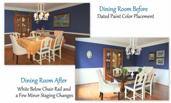
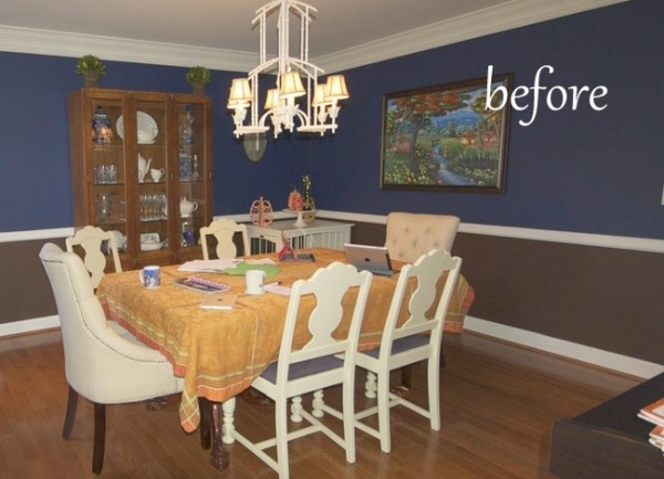 before
Let me put you in my shoes – what might you do to make the biggest impact (for the least amount of money) in showcasing this dining room? What kind of impression would you want to make on homebuyers?
One of things I preach in my Expert Psychological Staging course is the power of the right paint color and right paint color placement. Sometimes when choosing the “perfect” paint color, people apply it in the wrong places with the wrong finish. The result is lackluster at best, dated at worst.
As soon as I saw the photo above, I knew there were some really great elements in this room that could be better highlighted with the right color placement. I told the Realtor to have the homeowner to paint the area below the chair rail the same white and same finish as the trim color. It took a little convincing, but the homeowner agreed and this was the room when we arrived to stage on Tuesday:
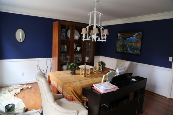
after painting, before staging
Just a few staging tweaks were required at that point, such a change of art, a bit of furniture placement, and tabletop and hutch styling. There was very little required to turn the “before” into this:
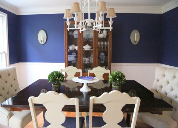
after
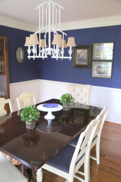
Psychological Staging™ is more than just furniture arrangement and accessory styling. It’s also about choosing the right paint colors and color placement to get the desired effect.
These kind of before-and-after transformations are what I live for! If starting your own business in the field of design is your dream, you can start by attending my next 3-day course in January to learn my system and become an Expert Psychological Stager™. There are 5 spots left, so give yourself the gift of a new career this Christmas by signing up here!
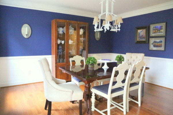
after
And for the rest of you reading, you have one more day to win a subscription to Everyday Home magazine. We’re giving away 10 subscriptions, so your odds are great!








Fantastic! It looks so fresh! Wonderful, inviting space!
Thanks, MarySue!!!
Looks so much better…. If budget allows, I love the look of a rug to warm up the space.
I have been eyeing that light fixture on Pinterest for some time now. It comes in some really awesome colors!
Yes, a great graphic rug would be the perfect edition. I LOVE the painted bamboo fixture – I wish I had a good place to put one in my house!
Definitely much better color placement! Looks really nice and much more welcoming and put together. Great job!
Thank you, Kelly 🙂
much better now. looks great.
Wow!! I thought that the brown AND the blue were both wrong!! But it was really a matter of changing the brown. Pretty smart!!
Nice job, congratulations Kristie!!
What a beautiful transformation and I love that blue in the dining room. I’ve used a similar one several times and it has such a strong impact. Funny thing about chair rails, I love what you did here but are they really necessary? Often I suggest the same color both on top and bottom to give the room a larger presence. You’re work is so beautiful Kristie 🙂
Lovely! So glad you took the green ears off the hutch. 🙂
Oh my how fabulous this looks! Great job Kristie!! Dy. ing. over the light fixture!! Any idea if she wants to sell it before she sells the house? Big thanks!
That certainly freshened it up. What is your favorite paint finish? I despise flat paint.
I’m with you, Beth. I use eggshell on walls, and semi-gloss or gloss on trim. For below the chair rail in this home, I specified the same finish as the trim (semi-gloss). If you don’t, it won’t look like the same white!
I like the candle sconces in the DR and use of white with the deep jewel tone blue. Where are the sconces from?
Melissa,
I don’t know where the sconces came from, as they belonged to the homeowner. Sorry! I love them, too 😉