Did you know that color placement is as important as your choice of colors? This is something I spoke a lot about in my recent Color Workshop here in Nashville. You probably know that certain color combinations and undertones of neutrals can appear dated. But did you know that the way you choose to place color in a room also can make a home looked either dated or current?
 Color Changes Everything / photo by Matt Barker
This recent Brentwood Color Consultation illustrates this idea perfectly. Let’s start with the color placement in the dining room. When this family recently moved into their new home, the dining room sported two shades of green, above and below the chair rail.
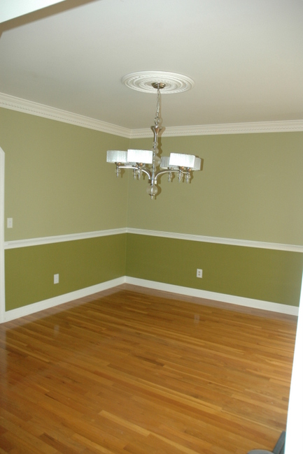
Dining Room Before Color Consultation
Don’t feel bad if you have a similar look in your home. But you should know that this kind of color placement looks a bit dated in 2012. We chose an on-trend neutral for the walls above the chair rail and painted below the chair rail in the same color and finish as the trim.
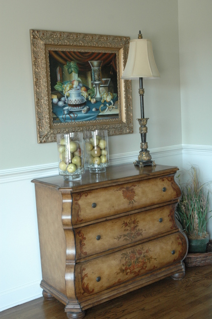
Neutral Walls, Trim Color Below Chair Rail
Then, we put this luscious emerald color on the ceiling!
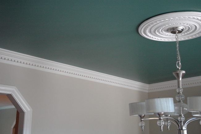
Emerald Green Ceiling
Isn’t this a fresh, updated look for a dining room with crown moulding and a chair rail?
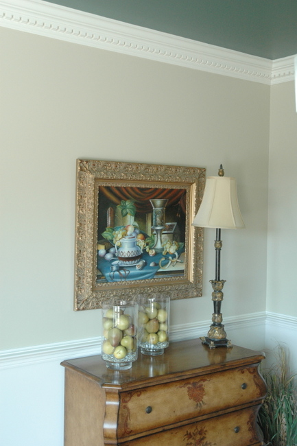
After Color Consultation
Here’s the very bossy trey ceiling in the master bedroom. Yes, we know you are a trey ceiling. Yes, we see you. Could you quit yelling at us, please???
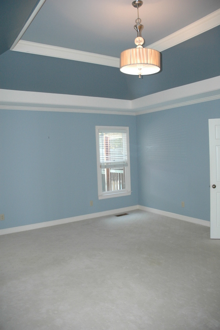
Trey Ceiling Before Color Consultation
A more sophisticated and restful solution: we chose a pleasing color for the walls only and painted the entire tray out white like the trim. Another good option would have been to apply a whisper of a color on the flat, uppermost part of the trey ONLY.
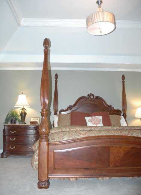
After Color Consultation
Now here’s one that drives me nutty: the ever-popular racing stripe! This is the before of my client’s young daughter’s bedroom.
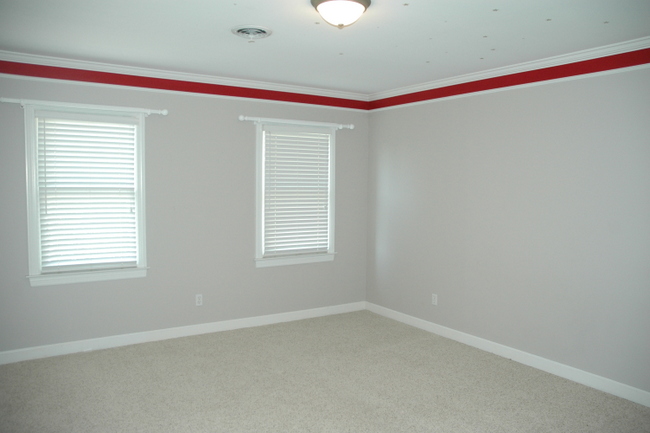
Before Color Consultation
If you have a dropped piece of trim that runs around the top of the room, simply fill it in with trim paint. Now it looks like one big, expensive piece of crown moulding.
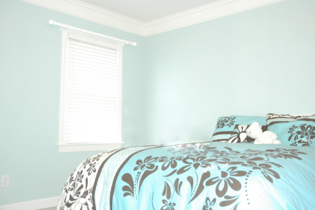
Girl’s Bedroom After Color Consultation
Ring, ring, ring! 1988 called. They want their bathroom back.
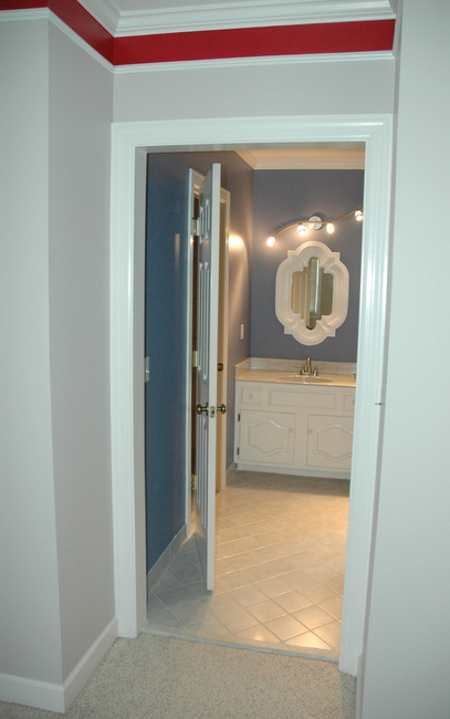
Before Color Consultation
We calmed things down with a neutral that works with the tile, countertop, and carpet from the adjoining bedroom. Soooo much better.
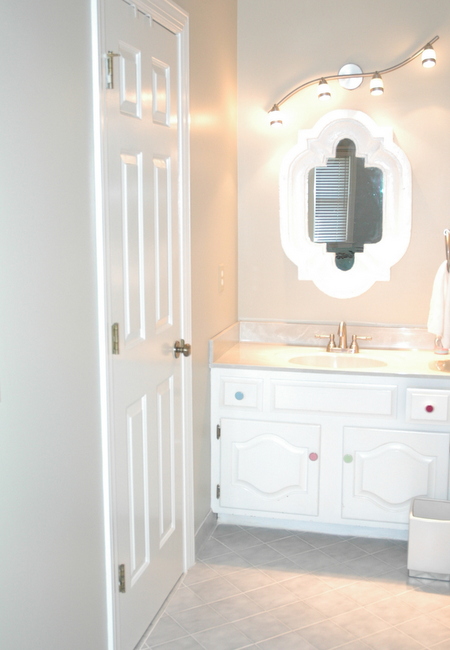
Bathroom After Color Consultation
Can you see how much color placement effects whether a space reads dated or current? The Decorologist thinks it’s as important as the color itself! If you need help with choosing colors or color placement, check out my Color Workshop Video here.










I’ll be linking to your post today on my post today! Great input. I try to describe such things to clients, but it’s great to have it in post format to refer to. Thanks! The same is true with general color palettes in a home… Some just scream dated.
Thanks, Kristy! Can’t wait to read your post 🙂
It’s up! http://www.hypheninteriors.com/2012/09/ten-painting-tips-10-more-tomorrow.html – I’m doing a series on painting basics and tips. I also have a whole list of greiges by brand in case you may be interested. They were contributed by other bloggers/ designers.
Kristy, great painting tips. I would love to have your list of greiges since I’m in the market for a client at the moment. Beth@homestagingdesignsca.com
Thanks!
Okay, you stopped me. I was going to go for that green/green color in my hallway.
Well that was a narrow escape 😉 Glad to be of service!
ah..the two toned colors above and below the chair rail. I see that ALL the time and you are right..it totally dates the room. Great post Kristie.
” Ring, ring, ring! 1988 called. They want their bathroom back.”
har har !
CONGRATS on all the good things happening for the Decorologist. You deserve them. I’m seeing your Tennesseean articles pretty regular now.
Thanks, Paul!
The green paint with the orangey wood floors…and what’s with the red stripe? You’ve made some great updates, as always!
Please join the home blogger’s directory,
http://Www.theblogsisters.com
The events calendar should be up soon. Maybe you could post your workshops there?
All the best!,
Barbara
Thanks, Barbara – I’ll do that!
HI Kristie!
Some of the “after” pictures have a big glare and it makes it hard to see your work!
I’m about to paint my teenaged daughter’s attic bedroom and this post has me wondering what to do. Since it’s up on the third floor, the angled ceiling starts at probably about 6 feet on the sides, and on the ends, it’s tall up to the point of the ceiling. There’s a piece of white trim that goes all around the room at the point where the wall meets the ceiling on the sides, if that makes sense. It’s a really cool room with lots of neat architectural details. Right now, it’s painted green under the trim and a cream color over. With such high trim like that (I don’t think you can really call it a chair rail), would you still paint the lower portion the same color as the trim?
This is GREAT! I love the whole thing, and your cute comments make it really funny!
You are goooood!
That’s the first I’ve heard anyone else say that rooms talk (yell) at them–I say that too!
I once moved into an older home that every room said “FIX ME”‘ then the next room would say to me “No, fix ME”. I tried to work with a friend last year, on a shoestring budget, who’s whole house was from the 80’s and, really, crying, no weeping, for change….but alas and alack, the friend couldn’t bring HERself to change anything, not even furniture arrangement. Had to leave that scene. It must be a pleasure when someone actually is willing to go forward!! Beautiful, Kristie! OOO–what is the name/or # of the emerald green shade? It’s lovely!
In this post, I cannot see clearly any pictures in the after as they are all over-exposed in terms of lighting to me. They are too bright to recognize the color
Joy,
Sorry, some of the photos do appear a bit over-exposed. The point isn’t the specific color, but the color placement – which I hope the photos show well enough. It’s difficult being my own photographer!
I totally agree, and what I’m holding my breath on is what we’re going to see with burgundy on the walls now that it’s back on the runway! Eeek, can we please not go back to the 90’s feature wall fall-back?
Love the emerald green ceiling Kristie. Really makes the room! And, why would anyone paint that red strupe around the ceiling? They should be very thankful they called you! 🙂 Great job!
Kristie, I love when you do posts like this one. It is helpful, informative, educational, and pertains to everyone not just a specific type of person. These are concepts that are actually do-able for everyone and not just people living in big fancy houses with unlimited income. I also appreciate the positive, upbeat tone of the article. Good job! Thanks! Amy
Really nice paint selections, Kristie! Love the green dining ceiling!
As always, you bring up really good points that I’ll have to store in my memory bank for future clients. There is soooo much discussion about current colours but very little about current placement. Great post Kristie!
I like when you show these examples too. My favorite is that first one – with the update to the wall color and painting the ceiling that pretty emerald green – the crown really jumps out and looks great. The racing stripe is real bad. You’d be so proud and probably understand exactly where I’m coming from, but as I’m getting more and more comfortable with color some real estate photos really make me cringe. People need color help! 🙂
I’d have to semi-disagree. When you have a tray ceiling in a bedroom that is HUGE I think it’s better to have color but it needs to be the right color of course – to ground it, make the room more cozy and to add more dimension to the room instead of staring up at a bit white “coffinâ€. So probably better wording for this blog should be “Is the WRONG color making your room look old?†It’s not so much the placement that will screw up or date a room but the color. Love that emerald ceiling! Gorgeous.
I always appreciate your input and viewpoint, Donna! However, I do think the wrong color placement really can make a room look as dated as the wrong color can. For those cavernous trey ceilings, I usually recommend either a very light or very dark color on the uppermost flat part of the trey, but never on the slants or on the portions that make it look like stripes. That looks dated to me. Ah, different strokes for different folks 😉
So I followed this advice and LOVE the transformation! My teenaged daughter’s room (we’re slowly doing our whole house) had high trim and I worried that painting the wall the same white color as the trim would be overkill. I decided to add color in other ways, and LOVE, LOVE, LOVE it!
Thank you so much for all of the great advice!
http://scravings.blogspot.com/2012/11/sweet-16-room-reveal.html
Not using color is indeed timeless…
Sounds like you have more to say, Amber – do tell!
I’m working with a client moving into a brand new, very white high-end condo with west-facing floor to ceiling windows in every room. They are interested in greys, although all the flooring is brown/beige.
I thought a mid-range tone would be good so it doesn’t wash out in the afternoon. The ceilings are 9 or 10′ high. I was going to go lighter on the ceiling, but after seeing your emerald green…..hmmmmmm.
Any thoughts or suggestions in this case.
I know this post isn’t recent, but the white under the chair rail is exactly what I’m looking to do in my home. My question: for the white part of the wall, did you use the same finish (sheen) as the trim (i.e. Semi-gloss) or did you use the same as the wall (Flat/eggshell)?
Nicole,
Great question, and the answer is very important to a good outcome. You need to paint the area beneath the chair rail in the SAME FINISH and SAME COLOR as your trim. If you paint it flat or eggshell in the same color as the trim, the white will read differently than it does on the trim and it will look OFF. Treat it as if it were millwork (with semi-gloss), not drywall (with eggshell), and it will look fabulous!!! Good luck and let us know how it turns out!
Just found your site and I’m in love! Now that it’s 2016 does this still apply? I have two shades of grey with a chair rail. I am mortified now that I read this and ready to change the bottom to match the chair rail in order to not look dated and old haha.
Hi Diana and welcome! I am STILL recommending going trim color beneath the chair rail, all in the same finish (semi-gloss, usually). Don’t be mortified, but I think you’ll like it if you brighten up your color below that chair rail 😉