If you’re reading this blog, it’s pretty likely that you are not afraid of color. But is there a certain color that scares you? I recently posed this question on The Decorologist Facebook page and got some interesting responses.
In my informal poll, 36% were most scared of the color orange. That’s not to say you shouldn’t paint a room in your home orange, if that’s what you like. However, you should never paint a room orange if you are planning on selling your home anytime soon.
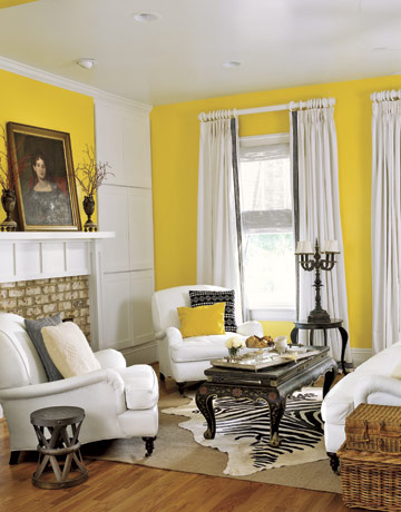
16% were afraid of yellow, and 16% were afraid of red. Not terribly surprised by the red, but a little surprised by the yellow. The yellow response probably has to do with the fact that the “right” yellow paint is notoriously difficult to choose – it’s easy to go too lemony or too gold really fast.
source
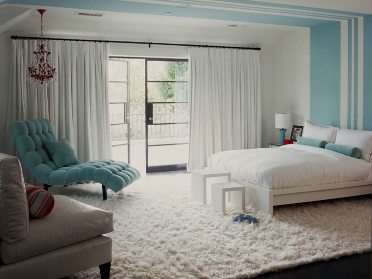
One guy said he was afraid of white, and one very colorful lady (I know this for a fact) said she was afraid of “clear.” This bedroom by Burham Designs is about the color of the bedroom that I helped her decorate last year.
After spending last week becoming a certified True Colour Expert under the tutelage of internationally-acclaimed colourist, Maria Killam, my head is literally swimming with colors. After my training, I would have sworn Maria would say she was scared of pinky-beige. Then she posts something like this and throws me for a loop!
It makes you think: even scary colors aren’t so frightening when the context is right. But when it’s wrong, it’s REALLY wrong . . .
If you want to make sure you don’t get your colors wrong in your home’s context, schedule a Color Consultation with a certified True Colour Expert – that’s me, The Decorologist!





I read all about Maria’s “pinky beige”….I am afraid of “clear” because I really NEED color….alll over….
yes dianne, you are a bossy color kind of gal! color is good for the soul, isn’t it?
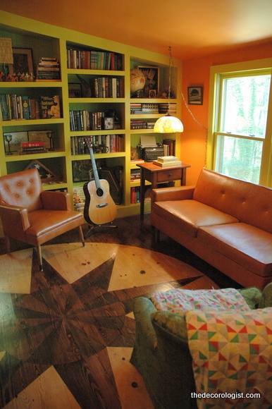
Love that orange office with green bookshelves! I am afraid of all neon colors… 🙂
Vanessa,
That office is a perfect example of scary colors that work in the right context. I used an intense orange, baby poop yellow, and lime green (in the back of the bookcases) – each of which looked positively frightening on their own. But everyone LOVES the way this office turned out – not to say they would choose it for themselves, but they see that it “works.”
I would have to say that finding the right yellow is the scariest for me. Those ‘screaming’ yellows!! Scary!
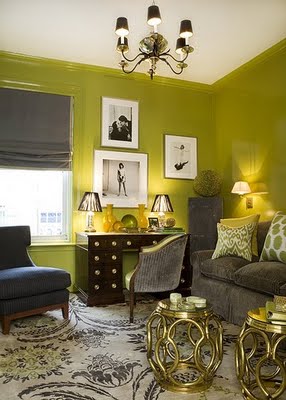
I am fascinated by the green in the first photo — I am still trying to figure out when the context is right for the trim/walls to all be the same color. It def works there. The gloss, the complimentary colors, even the ceiling that looks white (may not be? may be a very pale taupe-y grey?). Nice.
i am not a big fan of same wall color and trim – but i’ve mainly seen it done in a matte finish on both walls and trim, which is BAD in my book. It’s usually done to “make the trim go away,” which seems stupid to me most of the time and if it needs to go away, then just remove it already! I think this green scenario works because the trim is in high gloss, so there is still definition/contrast.
I’m not afraid of color. BUT, there are some colors I really don’t like. For example, the green in the first picture. I would not want to spend any time in that room. It makes me physically queezy. Might be great for someone else, but not me.
I am lovin’ all the rest…..
Great question! I used to think the only color that scared me was a screamy tacky coral. But an incredible design by M Interiors completely proved me wrong. So I would say no-there is none, it’s all about the colors you mix it with. There’s always that hue that will come to the rescue and make the bad one shine!
Liking that orange room. My Auburn married Oklahoma State (both orange) and we have orange everywhere but not on purpose. Maybe we should be more purposeful about it. 🙂
Don”t you think we are scared of the colors we remember as a child and think that if we use them we are ‘dating’ ourselves or have created our mom’s house? For me the it would be those avocodo greens, harvest golds and a touch of light, almost country blue. All of a sudden I’m 15 & in my mom’s living room – or the turquoise of a Florida room circa 1966-74.
Thanks for branching me out of my beige/tan mode.
I think you’re definitely on to something, Pam. Our history really impacts our biases in regard to color! Sounds like fodder for a blog post . . .
I am most scared of orange and was interested to see I am in good company. Not only do I not like it in my home, I do not like it in my closet. Funny when I first got married in the early 70s that was a popular color and I used it a lot as an accent color. Now my second scariest color is purple even though it is my favorite color. Just hard to use it in my home and feel like it looks right.
Funny, I would have said white as well.
I am most afraid of beige. I have never found one that didn’t look dreary to me. They are either too pinkish or too yellowish. Either way they always seem icky and depressing to me, and I end up painting a “real” color over them.
Sounds good to me, Jean! Color all the way 😉