You wouldn’t put ketchup on your steak, now would you? That would be treating it like a hamburger.

When you paint your architectural trim like drywall, it’s like putting ketchup on a steak. It cheapens it – takes it for granted. Here’s an example: this is a “before” of a coffered ceiling in a client’s home. It doesn’t look bad, but parts of it are painted out like the drywall:
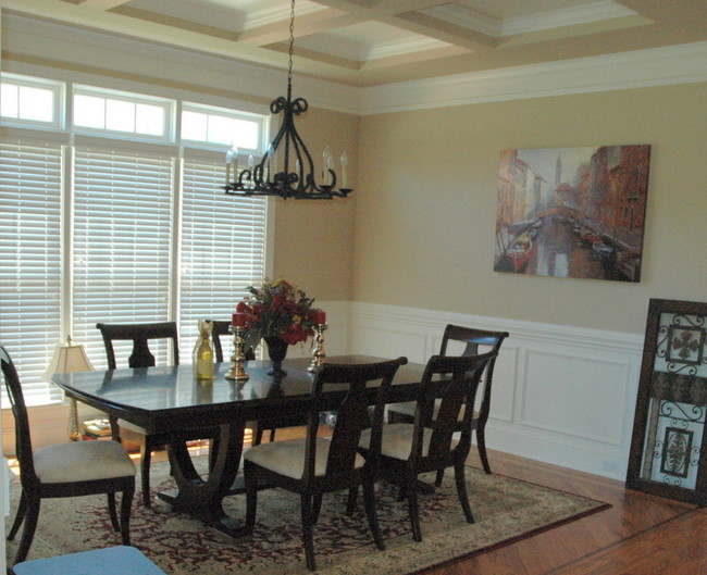
Coffered Ceiling As Hamburger
We painted out the coffered ceiling completely in the existing trim color (white) and in the same finish (gloss). The coffered ceiling now reads high-end, more sophisticated. Like a nice, juicy steak.
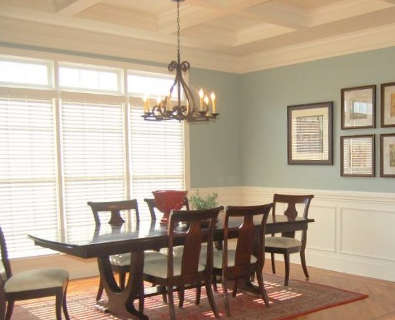
Coffered Ceiling as Steak
Do you need another example to convince you? Ok, here’s an example of columns that were painted like a hamburger – see the ketchup?
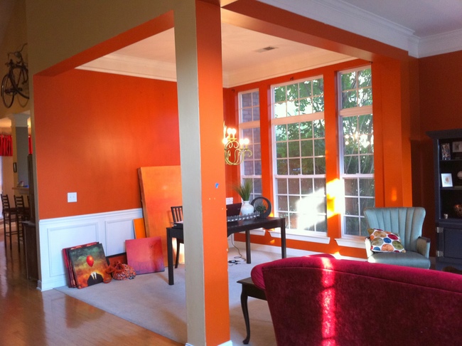
Columns as Hamburger
Columns should not read as drywall – they should read as architectural trim. Painting them out like trim, rather than drywall is the right thing to do.
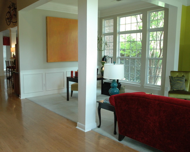
Columns as Steak
See what I mean? For more advice about paint effects that will make your rooms look updated, read my article about treyed ceilings here, and creating a color palette that flows here and here.








Like always, you put it in words everyone can “get”!! I love it and I’m stealing it! 😉
I love your analogy. Your visuals really made your point. I love how you take the time to show the importance of getting every single detail right in a room. Great post, as usual 🙂
What a huge difference, we have basic flat columns in our living room with no trim. They need something to make them a bit more interesting.
I totally agree!
Kristie, this is great advice and one I will be sharing and using with my clients. Another great benefit of painting out the pillars in trim paint is how much more durable they would be. And washable. All those finger prints easily wiped off.
Thank you.
So true about the glossier paint, Heidi. Thanks for sharing with your peeps!
I can’t wait to do this at our house! The columns in the entry way/dining room will look amazing and it will make the dining room look so classy. I’ll send you after pictures when it is complete!
I can’t wait! Your hamburger columns prompted me to write this post!
hah! love this explanation!
Love it Kristie!!! What is that beautiful blue in the new dining room? I need to see if that color will work in my Kitchen!
Allison, that color is Benjamin Moore’s Imperial Gray.
Agree! As always 🙂 But with the befores & afters, you would have to be living on another planet not to!!! What’s to love in the befores, what’s not to in the afters? Have a great weekend, Kristie, and good luck with the closet project…
Kristie, unbelievable! You really showed them your stuff. Very nice work indeed.
Well done, Kristie — you win the headline of the week award (who wouldn’t be just a little curious to read this!) — and then you just tied it up in a bow with those great examples…
I agree with you. I have a coffered ceiling in my 20’s Spanish style home. It was painted an ugly gaudy brown. The first thing I did is paint it a glossy bright white. That’s my taste anyways. I do love people painting things that fit them. That’s important I think in making a house a home. So to each his own:)
Thank you for your comment, Lucy! Just to clarify, I am not against painting trim a color other than white – I am only against treating it the same as the drywall in the same room.
I totally agree, Kristie!! The only problem in our area is that most (no, almost ALL) homes have texture on their drywall, and it’s usually a heavy sprayed texture like heavy orange peel or Monterey. You’d have to refloat the areas in question, which adds to the expense and no longer makes it a DIY job. But I think you’re absolutely right, it’s so worth it!
LIsa
Great post, great title and great content! Good job Kristie!
Great advice with a wonderful analogy! I love BM’s Imperial Gray. I’ve used in it many houses and it never fails to look amazing and ‘work’ despite the style of the house. Thanks for your great blog.
That’s why people hire the professionals! Go go girl!
You really have a gift for explaining design concepts in everyday language. I completely agree that the coiffured ceiling looks so much better in all trim color. Do you think this advice applies to the tray ceilings often found in master bedrooms? I am at a loss for what to do with mine, which is painted a combination on wall color and trim color.
Wow, great explanation. We have a weird column in our home, too, and as I’m preparing to repaint the lower level, I have no idea what to do with the thing! This is definitely food for fault.
Hm, how much do you charge to drive up to Columbus? 😉
Agree! But totally guilty of slapping on the ketchup 🙁 I know once we move I’ll be more inclined to paint the trim the right way and not the easy way.
Please help. I’m looking to make the wall that anchors my bed an accent wall. My head board is Virgin Wood, oak kind of, and the color of the room right now is like a beige sandy color. The rest of the furniture on the room is a medium cherry wood, in some places darker that others. My bed is positioned on a long wall but I’m trying to get a deeper feeling so in relation with the paralele wall looks like I have the same length. How can I make my bed wall look deeper? Thanks! Love how serious you take design rules and the way you explain them! 🙂
Daysi,
How about a dark moody blue or green? That should give you that deep effect you are wanting, and will be a nice contrast with your oak and cherry.
Thanks! I will be looking for some options on that direction. I love green but I don’t want my mom to go ” OMG green on the wall too?” so probably I’ll go with the blue. Thanks for answering so quick. I will let you know how it goes 😉
What is the accent color on the back wall of your BEAUTIFUL bedroom picture? I’d like to use a color like that for my bedroom accent color. Thanks
Sandi,
There is no bedroom in this post – which bedroom are you referring to?
hi my accent wall is Bm caliente and i looking for nice trendy color (gray or taupe etc) to go with it. i have white tile and dark cabinet and chocolate furniture, Please help
Can you help? If I have a blank wall in the living room, can I simply wall mount an electric fireplace and place a “beam” mantel above it? I would like to wall mount my TV above the mantel. Would that look hideous or would it work?