I’m at the beach this week, so it seems fitting to share a recent home make-over with a touch of turquoise. The homeowner had a penchant for neutrals, but wanted to inject turquoise into her color scheme.

Kristie Barnett
You might recognize the living room from an old post of mine called “One Day Makover.” That one day makeover was the beginning of my relationship with this client who has been working toward making this new home her own. This is the before of the living room:

Kristie Barnett
That first day, I rearranged my client’s furniture and helped her re-think how she was going to use her public spaces. You’ll see more about that in a bit. Remember this family photo wall I created? Since then, my seamstress made custom pillows to fit her style exactly.

Kristie Barnett
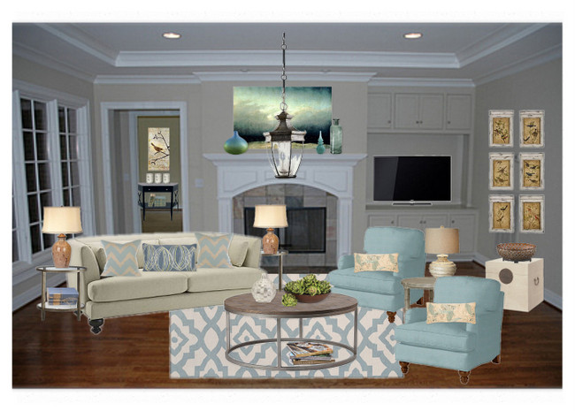
Here’s another before of the entire living room:

Kristie Barnett
After creating a new furniture arrangement throughout the house (no new furniture was bought), we started interjecting the turquoise color in carefully selected spots.

Kristie Barnett
Here’s a view of the right side of the room before:

Kristie Barnett
We traded out the piano for an airy console table and a pair of lamps from the bedroom. I stacked a couple of mirrors to reflect light and add a little glamour. My client painted this wooden dresser stored in the garage according to my instructions.

Kristie Barnett
I chose a fun Benjamin Moore turquoise called Spirit in the Sky. One of my all-time favorite songs, by the way! Here’s another piece we decided to paint turquoise:

Kristie Barnett
This fun dresser makes a great spot for keys and such in the entry of my client’s beautiful home. We found the gorgeous lamp in downtown Franklin, TN.

Kristie Barnett
Here’s a before as you enter the home – the door is to the right.

Kristie Barnett
Now the entry is warm and welcoming. It’s really important to my client to only use accessories and art that have specific meaning to her family – we used lots of family photographs and things passed down from her family of origin.

Kristie Barnett
Now, if you follow my blog you already know I like to shake up a floorplan if it isn’t working for the family I am decorating for. This was formerly a living room, but it was adjacent to another living room (which seems redundant, no?). The previous owners of this house set their home up in a similar way, which influenced my client in how she set up hers when her family moved in. See how the dining room is at the back of the space in front of the french doors.

Kristie Barnett
We moved the dining room into this space, which is directly next to the kitchen. And we exchanged the crystal light fixture with this large burlap pendant from Pottery Barn to better-fit my client’s style.

Kristie Barnett
While this area was formerly for dining:

Kristie Barnett
Now it’s a sitting area where my client can read a magazine as she watches her children playing in the backyard. The bookcase (formerly dark green) was also painted in our Spirit in the Sky. I really love the pillows – I came up with the design and my seamstress from Ruffled Linens brought them to life.

Kristie Barnett
My goal is always to take the things that are important to my client and make it all come together in a beautiful and cohesive way. I hope that’s what I’ve done here.

Kristie Barnett
If you need help making your decor dreams come true, contact [email protected] to schedule your appointment today!


How beautiful! I love the look of painted furniture, and the turquoise gives a serene ambience to the home! I also love the rearrangement of space! Awesome work, as always! 🙂
people are surprised when such a punchy color can look serene – it’s the combination of the turquoise and textural neutrals that makes it work.
What type of paint did you use, flat, matte, satin,etc? Luv the color!
This house looks like a home!
Thanks, Cindy! For the furniture: eggshell paint covered with MinWax non-yellowing Polycrylic in satin finish.
another score for kristie! this is awesome. im writing this color down right now. i have a large sideboard that i have been needing to paint for over a year and it is screaming for a dose of color! thanks.. i am loving your work!
thank you, heather! that color is so yummy on furniture 🙂
what a harmony!
beautiful and peaceful – I especially love that floor globe! also enjoyed seeing all the photo collages on the wall. something I am contemplating!
you can do it! start by laying all your frames out on the floor and play around with the arrangement 🙂
BRAVO!!! LOVE IT. HAVE FUN AT THE BEACH! ALL KINDS OF COLOR INSPIRATION THERE!
thank you, lajuana! oh, the gift of the sea . . .
So-o-o beautiful!! I’d love to see a post about the layered frames & what you used to achieve this look.
Warmly, Michelle
Wow, what’s not to love with this fab transformation! Awesome work Kristie!!! My favorite little ode to the past is the rotary dial phone on the bench. That’s so much fun! Love the collage of frames above it too 🙂
I really like the way you have just injected some colour precisely and subtley. I love the turquoise ruffle on the cushion and the turquoise throw just casually draped over the arm of the sofa to match the chest of drawers. Beautiful work Kristie!
LOVE it! LOVE the turquoise and LOVE reworking the space! NICELY DONE!!! Huge fan of your work and that cute dresser!
thanks ashley – i’m kinda in love with that dresser, too!
I hear the psychologist coming out when you reference the family of origin! Great integration, Kristie, of style and family history. I love how you so beautifully take what is important to the client and bring the space to life.
oops, that old psych lingo spills out when i least expect it! thank you for the kind words, lezlie 🙂
Very pretty! do you know by any chance what color is used on the walls? they look lovely with the turquoise accents.
i actually don’t know what color that is – it was done by the previous owners. it’s a light yellow on the lemon side. we’re actually considering changing the wall color soon to something a tad warmer.
wow..even though I do this for a living I am still never tire of seeing before and after pictures. What a great job! Love it all!…esp. the turquoise dresser your client painted.
How beautiful Kristie! And your photography is really great. Love that last shot of the dresser and looking into the living room. Love that color turquoise too. Just love it all! Beautiful girlfriend!
Thanks Kelly! I’ve been working on the photography- took a private lesson on photographing interiors, and it really helped me!
Really appreciate seeing how you pulled this clients home together, with key punches of colors & a few elements of the unexpected – all without going over the top for her. Very inspiring.