It’s really cool to do color and design consultations with those in a similar realm of work, but a recent color consultation I did an online with Natalie Gallagher of Refined Rooms was particularly interesting to me. You see, Natalie and I have a lot in common! She was previously a clinical psychologist, but is now working in the field of professional organization and home staging. And she’s a blogger, too.
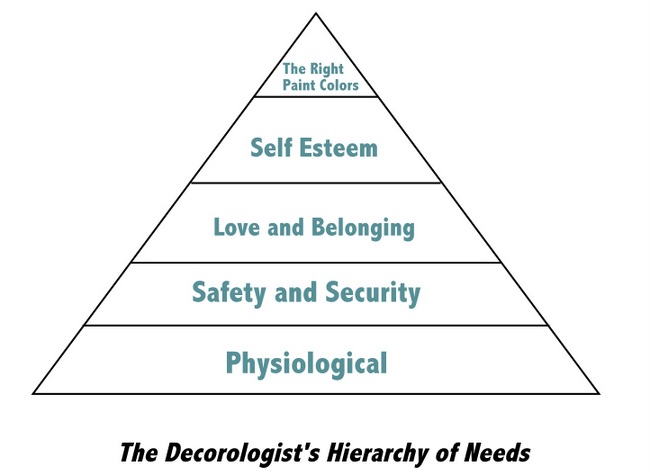
Ok, before you say a word, I realize that organization is NOT my strength, so we have some differences! But like for many people in the design field, it can be a difficult thing to make decisions for yourself that you make every day for other people, and that certainly includes choosing paint colors. I altered psychologist Abraham Maslow’s Hierarchy of Needs to illustrate how important I deem paint color choices:
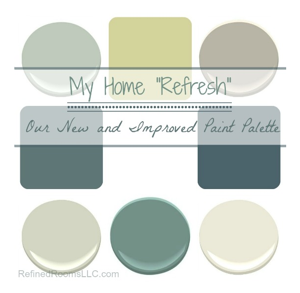
So Natalie contacted me to consult on a new color scheme for her home. She had already painted her master bedroom, bathroom, and daughter’s room in colors she felt good about. But she needed some objective guidance as to which paint colors would work best in her open-concept areas, as well as some specific recommendations for color placement that would really make it all come together.
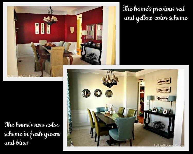
Here is the “before” and “after” of her dining room:
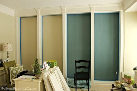
Did you notice the dark ceiling paired with the lighter walls? Here’s a photo of the office in process as the backs of the bookcases are being painted to add some drama against the main neutral we decided upon, Benjamin Moore Sweet Spring.
Hop over to Natalie’s blog, Refined Rooms, to see her entire article and photos, as well as great advice about organizing your home!
Carpet One recently interviewed and featured me and one of my bedroom designs on their blog, Beautiful Design Made Simple. You can check it out here.
Before I go, I wanted to show you this:
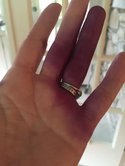
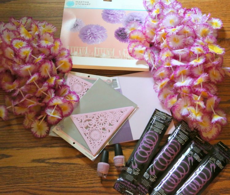
No, it’s not a bruise from a horrible injury, it’s the purple dye I can’t get off my hands after tie-dying camp t-shirts! I’m off to pack for my 7th year as a counselor at Camp Sonrise. The designated color for the 5th grade girls this year is LAVENDER. Here is some of what I’m bringing to spruce up the cabin:
Wish me luck this weekend! Better yet, wish me a few good hours of sleep . . .
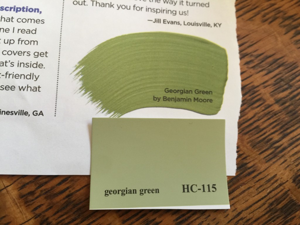


After taking your online course on choosing the right paint colors, I, too, settled on Benjamin Moore Sweet Spring for the majority of my main floor. I used it in my country kitchen, entry way, staircase, and open family room. The color subtly changes with the light to suggest shades of green, blue, and gray, but only ever-so-slightly. It pairs beautifully with shades of mineral and spa, so popular right now. It took three tries to get it right….my husband graciously painted then repainted the kitchen, twice. And this followed wall paper removal! Sweet Spring was the perfect amount of green while remaining neutral. Your online course was exactly what I needed to guide me. Thank you!
Karen,
I’m so glad your color worked out so well, and thanks for letting me know! I’m glad you learned what you needed from the online course. For anyone else interested in the online video course, here’s the link:
https://thedecorologist.com/product/just-right-paint-color-workshop-videos/
I love your triangle diagram! I do think that “the right paint colors” needs to be proportionately larger though, as it contributes to all of the areas listed beneath.
Yes Sandy,
I almost put “the right paint colors” on the bottom of the triangle . . .
Kristie,
The modified version of Maslow’s Hierarchy of Needs is awesome!
Thanks for your spot-on color recommendations, as well as the great shout out on your blog. I will keep you updated as the redesign continues to unfold here at Chez Gallagher. In the meantime, have a blast at Camp Sonrise!
Thank you, Natalie – I can’t wait to see more!!!
I really like how you improved the color scheme in Natalie’s dining room. It looks pretty good with red walls, but they kind of seem to scream a bit too loudly for such an intimate space. It seems like painting the walls a light cream color and pairing it with green and blue furniture looks best. The circular mirror on the far wall is also a very nice touch. Thanks for posting these pictures!
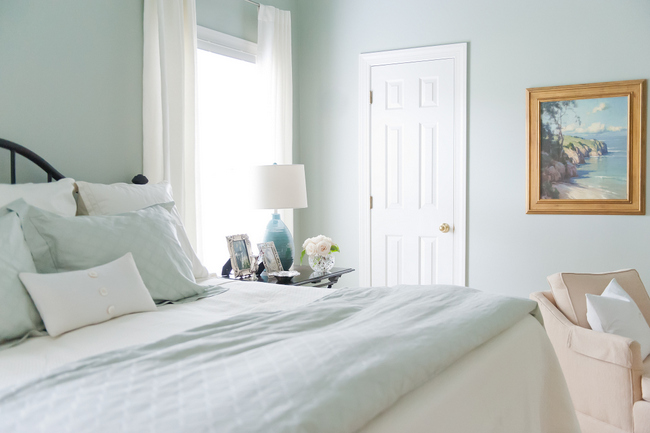
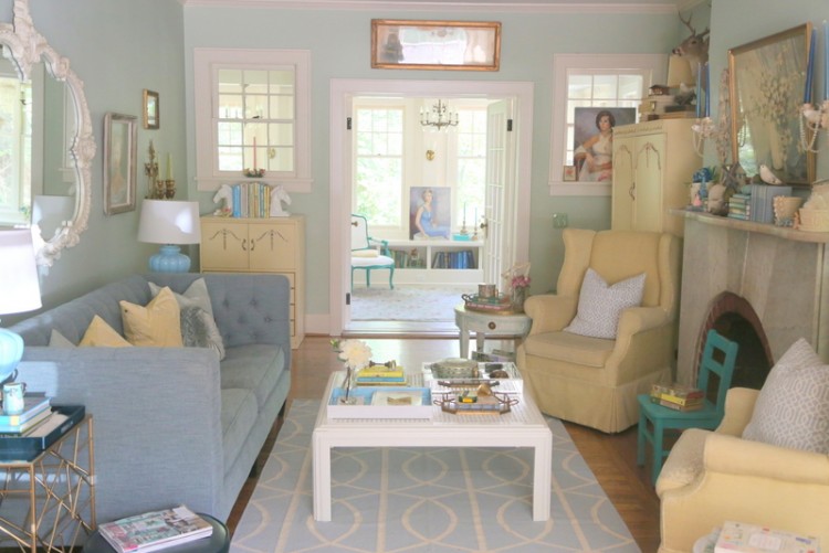
What is the name blue wall color in the bedroom? It is so soothing!