People often ask me what paint colors they should use to paint the apartment or condo they are living in. But what paint colors for a rental property? Few people ask that question. I think this is a question that SHOULD be asked more, because paint color can make or break the success of a rental property.
Whether it’s an air bnb that rents by the week or a townhouse with a longer-term lease, the right paint colors can make the kind of first impression that results in a renter signing on the dotted line.
I’m going to share some before and afters of a rental where I recently specified paint colors, but first I’m going to tell you which general colors you should avoid when painting your rental property. I know it’s easier to just add an additional coat of the existing color, but usually that existing color is some dark muddy tan, yellow gold, or taupe. Those colors aren’t doing your rental any favors, especially in vacant rooms void of architecture.
dark tan
gold
taupe
Plus, it’s the color of every other apartment in the complex, amiright? You shouldn’t go crazy with color, but I suggest you paint a subtle color that looks fresh and stands out in a person’s memory. What paint colors for a rental property would I recommend? I suggest choosing a light gray-blue, gray-green, or in SOME cases, the same white as the trim. Despite the current popularity of white rooms, it’s not often the best choice for throughout a rental property. But you’ll see further into the post where I specified white walls in one space (and you’ll see why). But first, let’s start with this living room of a rental painted in a dark tan color:
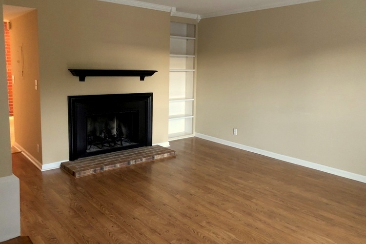 before
In this space, we decided to go with a light gray blue for the wall color:
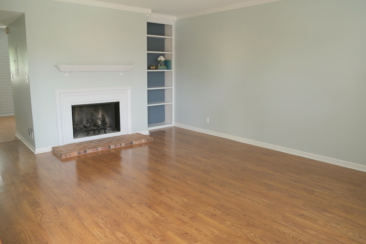 after
after
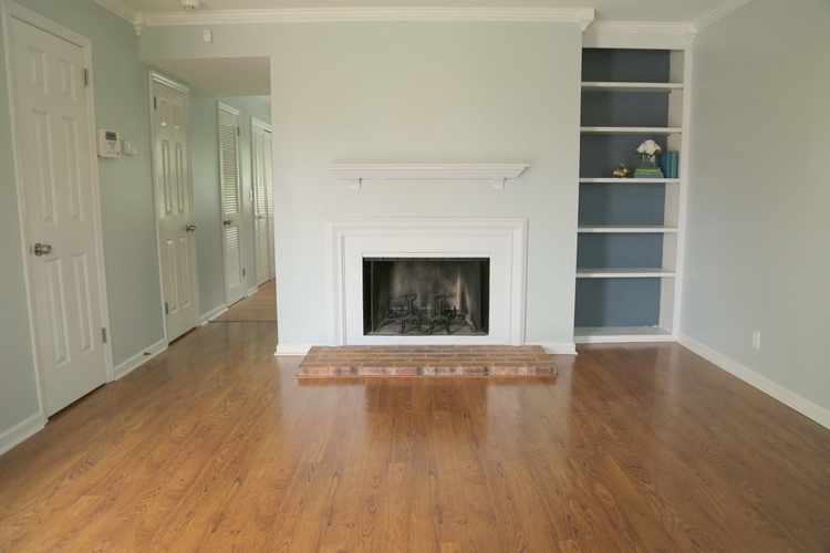 after
after
And of course, you’ll notice I laid in a dark moody blue in the backs of the bookcases to create a memory point of this architecture that isn’t standard in many similar units. The black on the fireplace surround and mantel seemed a bit heavy, so that went white like the existing trim.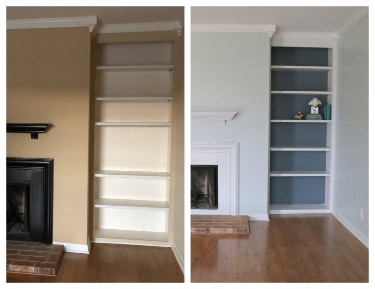
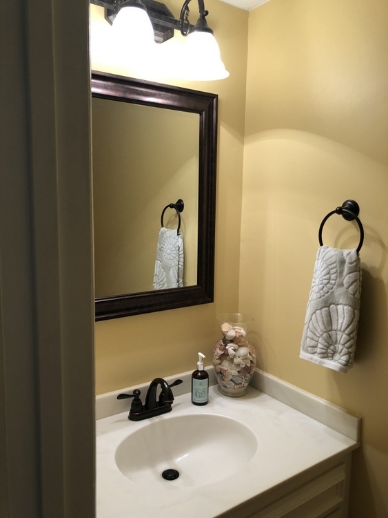
One of the bathrooms looked like this before:
 before
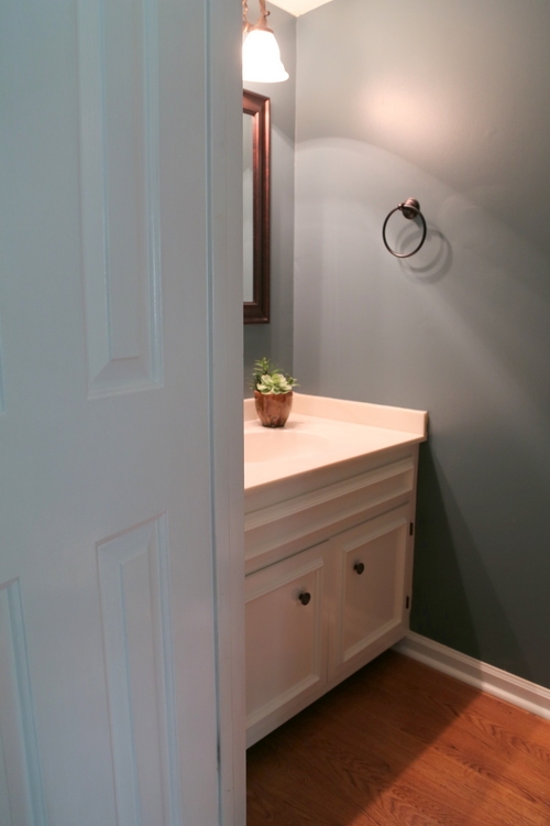
In order to update this bathroom and make sense of the accent color in the bookcases, I brought the same blue in for the walls here:
 after
after
Here’s a before and after of the second bathroom in the unit: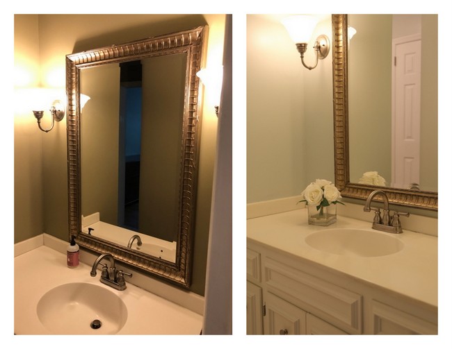 before ———-> after
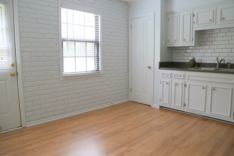
Now let’s take a look at the kitchen, which had its challenges. The cabinets are white, which is good. But the dark brown-gold walls create choppy stripes above and below the upper cabinets and really darken the space.
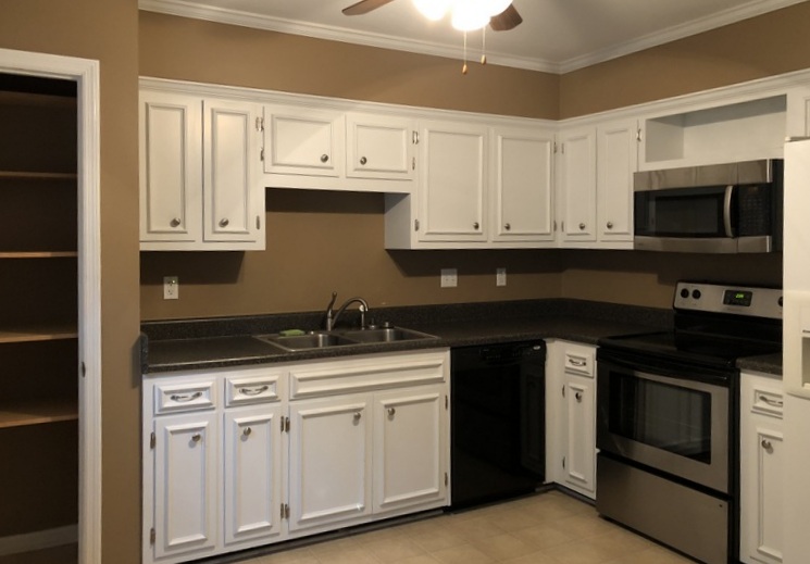 before
From another vantage point, you can see there is a faux red brick wall on one side of the kitchen. I actually like the idea and texture of that, but it further chopped up the room and made it even darker.
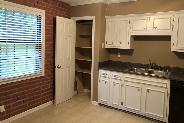 before
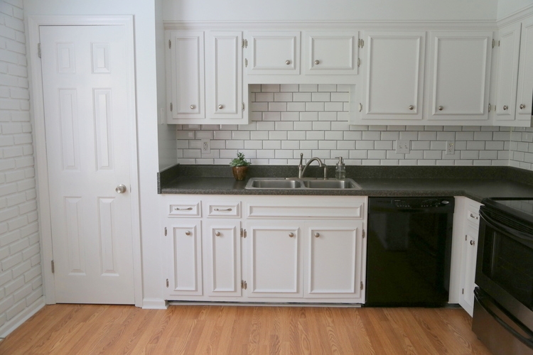
I recommended white walls to match the cabinets, a simple subway tile backsplash, and wood laminate flooring to replace the yellowed vinyl and to match with the rest of the unit. Notice how updated the kitchen looks with the soffit painted white like the cabinets. The laminate countertop stayed, as did the existing appliances, fixtures, and hardware:
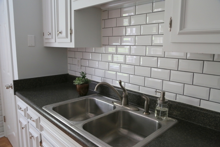
I chose a dark grout to add dimension and tie in with the countertop. The glossy beveled tiles bounce light around the room, further brightening the kitchen.
And you’ll notice the faux red brick is now white like the walls, trim, and cabinet – which makes the room bright and feel larger.
The place needed to be painted, and guess what? It doesn’t cost any more to paint the right colors than it does to paint the wrong ones! Or maybe I should say: it costs more to paint the wrong colors than the right colors, because it makes a difference in how quickly a property rents.
My last LIVE Expert Psychological Stager™ course is March 5-7, 2020 in Nashville, and there are only a few spots left! We spend a lot of time in this RESA-accredited certification course on specific paint colors and paint color placement, and you can find out more about it here.
Overwhelmed with color trends? Want to know how to choose the BEST neutrals, colors, and color combinations? Wish there was a no-fail system that creates cohesive and beautiful color schemes for any home with any finishes?
Now there is! I’ve been doing this for years, and now I’ll teach you how (including all the specific colors in BOTH Benjamin Moore and Sherwin-Williams paints). You can find out more HERE.


I love this! I agree. Ugly costs the same as pretty. What a wonderful way to make a rental property crisp and lovely.
Thank you so much, Michelle!
As always, you are right in point. I’d much rather rent your “afters” than those “befores”.
Thank you so much! I think this would be a happy apartment to live in 🙂
The change is shockingly amazing. So much beauty in the colours you chose. Thanks for posting this dramatic before and after!
I grew up in a rental and all the walls were white because we were not aloud to paint. This explains why I hate all white walls now, reminds me of being trapped in a color I couldn’t change ever. I am in my 40’s now and just now started liking white walls with an accent color wall. These colors would have been awesome back in my child hood! Great choices.
Thank you so much, Niki! It’s always interesting how colors – especially wall colors – can provoke emotions based on our memories from the past or from childhood. I once had a client who couldn’t stand ANY shade of green because of her memories of being a a green hospital room for over a month during a childhood illness. Colors are so powerful in memory, for good and for bad!
The rental looks so much better! What paint colors did you use for the light blue-gray, dark moody blue, and white?
Great color for rental property. I usually use dark colors for my rental properties. Actually, I don’t have much idea for decoration, and color. So, I prefer the colors that help me to easy to clean up. The tenants will have some change in need.
I disagree with the color you painted in some cases… I think you should stay with off white to light beige or off white to cool greys for rental property. Depending on trends. It tends to go back and forth about every ten years. The color on some of your walls were too specific and not universal in my opinion.
Both of the two couples who viewed it the first day wanted to sign on the dotted line before day’s end. And one of those couples still live there now! The proof is in the pudding.
good information
very useful words
nice words
thanks for sharing