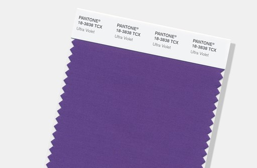
Have you heard the news? The 2018 Pantone Color of the Year is Ultra Violet.
I’m 100% sure my mother-in-law will be very happy! Whether you love it or hate it, don’t put too much stock in it.
Pantone started the “Color of the Year” mania back in the year 2000 as a marketing ploy, and boy-howdy, they struck gold with that one. Color is extremely powerful and influences our purchasing choices so much – it’s estimated that 85% of our purchases are made based on their color. I talk about this in depth when training home stagers, as the colors you use in staging homes can truly impact how quickly a house sells.
Hardly anyone had even heard of Pantone before 2000, but the marketing genius of Color of the Year changed that! Everybody has since jumped on this bandwagon, with paint companies announcing their own Color of the Year every fall. Here’s a few of the bigger paint companies’ picks for 2018:
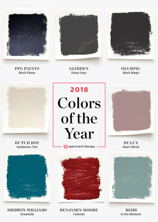
You’ll notice there’s not a lot of consistency, and very little rhyme or reason to the various choices.
As for Pantone, they are saying that they hope that blue and red, the colors used to designate America’s liberal and conservative politics, can become a more harmonious purple:
“It’s truly a reflection of what’s needed in our world today,” Laurie Pressman, vice president of the Pantone Color Institute, told The New York Times.
“It’s also the most complex of all colors because it takes two shades that are seemingly diametrically opposed — blue and red — and brings them together to create something new,” added Leatrice Eiseman, Pantone’s executive director.
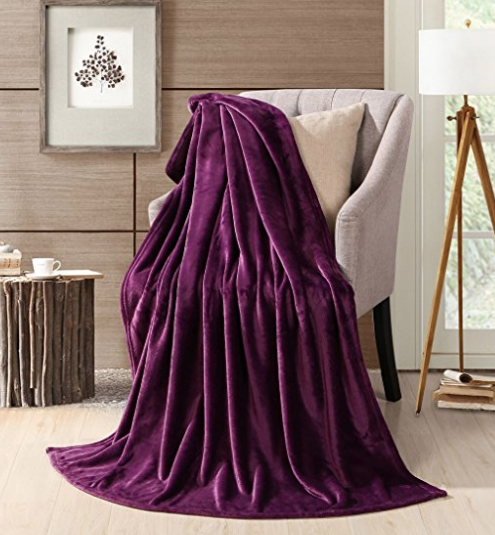
Although blue and green are exceedingly more popular, purple makes the top 3 for women’s favorite color. If you know a woman who loves purple, this might make a great Christmas gift this year:
Interestingly, it makes the top 3 for men’s most HATED color. Given current events, the battle of the sexes may have influenced the choice of the 2018 Pantone Color of the Year.
Sadly, my pick didn’t make the cut. But I still betcha we’ll be seeing more of my choice in the coming year than you will see this purple.
What do you think? I’d love to hear your reaction to the news of next year’s “big color.”


Oh Kristie,
No words, other than purple eye shadow it is!
This might possibly their worst choice ever.
But Barney lovers will be thrilled!
Yeah, it’s all kinds of Barney. They could at least have muted it down, made it a little more sophisticated. At this point, I think they just pick the least likely color on purpose to make sure no one could possibly guess it!
It’s a terrible choice. how does that compliment any colors currently used in homes? I don’t think it will work with the Tuscan brown so many people have still in there houses.
Pantone colors get pushed into fashion first – we’ll see if it gets any traction. If it doesn’t get popular their first, it’ll fizzle before it hits decor. Even if it does go big in fashion, like Marsala did a few years ago, doesn’t mean it’ll ever hit interior design – Marsala sure didn’t!
I love it. We have a Porsche 911 GT3 RS in the colour Ultra Violet, with yellow brake calipers and seatbelts. Google the car – it is absolutely stunning! UV is a great colour for a pedicure as well 🙂
Wow Lynn, that’s some kind of dream car! Lucky lady 🙂
can. not. even.
it’s all about that dolla bill….
who in the world will use this??
It’s marketing genius, draws so much attention – I mean, look at us! We’re all talking about it. But it means little else . . . $$$
My goodness gracious.That will be a hard color to work into all but a pre teen bedroom or a funeral parlor.
The new season of The Crown starts tomorrow night, I could wrap myself up in that purple robe and feel very royal.
Thanks for the reminder about The Crown, Rita! I’m looking forward to that and to Victoria in January! Hallelujah . . .
Lavender, yes, but this is extremely bold 😉
That’s a lovely color…in small doses. Very few people would want to paint a room in that color, but it will make for nice accents and clothing.
For the record, Barney is a softer, redder purple. He also had green accents that did not go well with his shade of purple/fuschia. My kids are out of the Barney stage now but I vividly remember the particular dinosaur.
I do like purple, but I don’t own any purple clothes and I would never paint anything in my house purple! So I guess I just like it from afar! Ha!
Elizabeth,
I’ve had a lavender bedroom for many years, and it’s lovely and peaceful. This purple is BOLD!
My mother-in-law will be so happy too! 😉 I love to WEAR purple, but I don’t like to decorate with it much other than in bouquets.
Blergh! I don’t pay much attention to these “picks” . And color forecasting probably makes a difference in the textile mills of China and Italy but seems very irrelevant to me. Though I am a big fan of plums and purples (especially tulips) as an accent. That said, I did just do a GORGEOUS library in F&B Brinjal– perfect complement to golden/orange pine floors.
Jean, I would love to see the library you did! Did you use Brinjal on all the walls and millwork?
I love this. Pretty funny, ’cause ultra violet is a color we can’t even see. What for next year, infra-red?
That’s it, Sandy!!! Infra-red for 2019, hahaha!!!
Absolutely love it!
Not a fan….at all. I get the symbolism but they could not have picked a more polarizing color. I guess it just reflects the current state of our country.
Linda,
Interesting that you mention the word polarizing – I’ve seen such extreme reactions to both this color and Ben Moore’s Caliente. In my home staging course, I teach my students to avoid both red and purple in staging because they are such polarizing colors. You either love ’em or hate ’em. So they aren’t a safe bet when trying to appeal to a wide audience.