This week I got to stage a beautiful historic property to sell. It was a Bed & Breakfast for years, and formerly served as a girls’ academy in the early 20th century. Staging a home like this is a challenge. While you want to make it appeal to the widest audience possible, you have to realize that most of the people interested in buying that type of home are attracted to historically-decorated interiors.
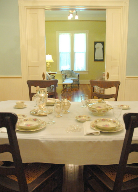
Staged Historic Property
So, a balance must be struck. I’m going to share 3 things that were important to freshening up this older home. These tips are applicable whether you are selling your home, or you just want to update without losing the character of your older home.
If the wallpaper in your home was put up in the 1970’s or 1980’s, chances are it doesn’t look historic. It looks like the 1980’s version of historic.
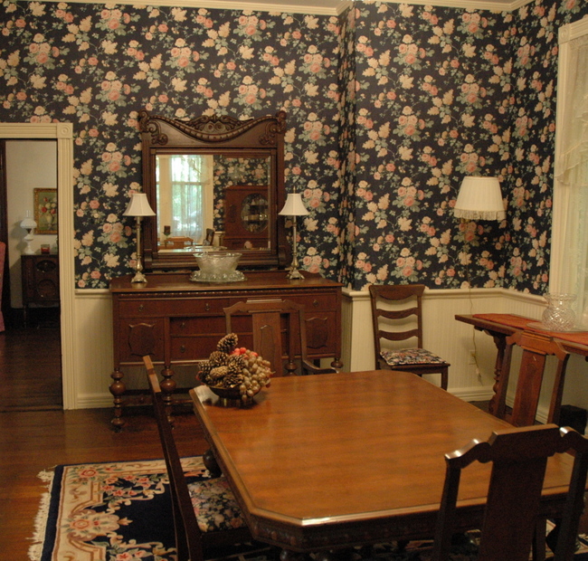
Victorian Dining Room Before
Replace wallpaper with a historic-appropriate wall color. Some great historic colors include Benjamin Moore‘s Palladian Blue, Georgian Green, and Adams Gold.
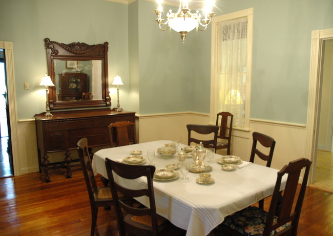
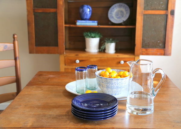
Staged Dining Room
Ok, next tip: pair down any fussy draperies and window coverings. I know they were used historically, but they block natural light and views to outside.
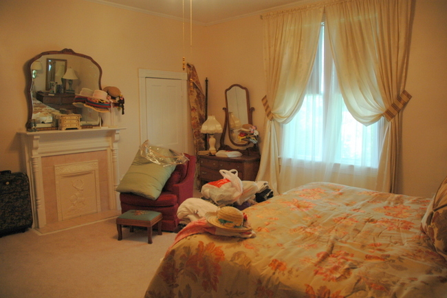
Bedroom Before
Too much lace and window sheers can make rooms feel darker and gloomy – just take them down. It’ll make everything brighter and more inviting!
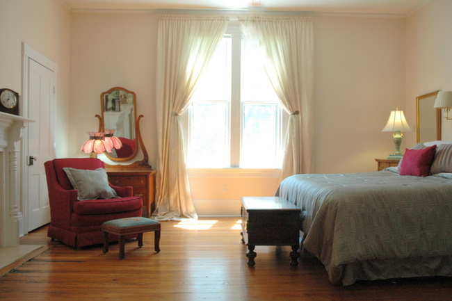
Staged Bedroom
And finally, put the focus on the architecture by toning down the patterns and ornate decor.
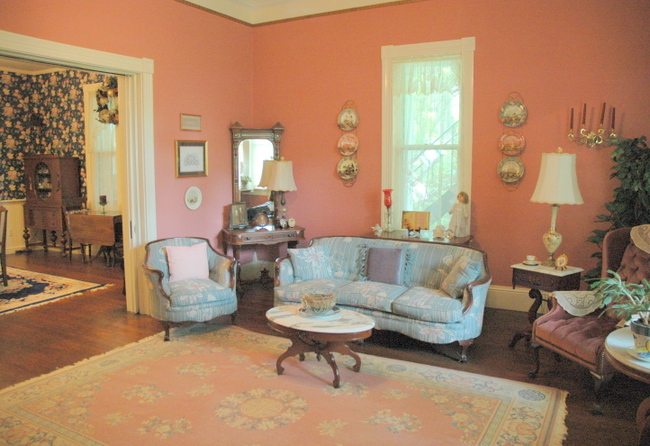
Living Room Before
By painting the bright pink room a color that is easier on the eye and removing busy patterns and rugs, the room is now all about the beautiful architecture: the wood floors, the tall ceilings, the pocket doors, the gorgeous trim.
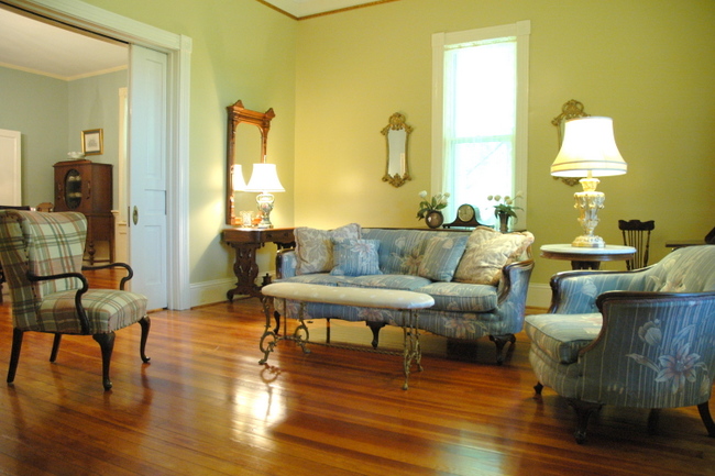
Staged Living Room
This beautiful home still retains its historic charm, but it can now stand up to the competition in the real estate market. Any other ideas for freshening up an older home?






this is my friend’s home…who unfortunately lost it in her divorce…it looks great…you did a good job
Dianne,
No, this home is in Mt. Pleasant and the couple living there are not divorcing – it must look like your friend’s home, though!
I too live in a 100 year old home. We put it on the market in March and it has an offer on it. My focus on making it seem more appealing to a variety of shoppers and not just those who want something historic was to keep our furniture and window coverings, accessories, rugs, etc. current. We have a spatterning of antiques but no more than the average home owner. Doing that really lets the details of the house shine in a way that doesn’t overwhelm the modern buyer. It feels less fussy and more just like a great home with details you can’t find anymore.
Holly,
Sounds like you did all the right things – good insight!!!
Great job Kristie! Love the “’80s version of historic” dining room transformation. That sort of wallpaper seemed to be in every B&B of the era, along with shiny brass faucets in the bathrooms, and teddy bears on the beds.
Ah yes, the teddy bears . . .
Great Post kristie, it is a balancing job between keeping the charm and updating it at the same time..often on a very tight budget. You did a great job though. Hope it sells quickly!
Amazing transformation, Kristie. I love Georgian Green in almost any house! I like to add contemporary toss pillows to older print or plaid furniture to give a space a more updated look. Let us know when it sells.
very nice… I wonder when to use a rug on wood floor and when not to…
Joy,
I use rugs to define conversation/seating areas, but I usually don’t use them when staging just because it makes the room feel bigger without any rugs.
Great tips, and the staging looks authentic. I love the colours you chose… what a gem this beautiful character home is.
The house is transformed!!!!
Looks great! Love your color choices
Beautiful job! I would change my mind about selling. 🙂
You gave this home a breath of wonderful fresh air, Kristie!
Makes me realize, when I go to sell my current home I will remove the area rug in the
living room. We are in a resort town in the western NC mountains. The outside of our (Spec)
home has rustic details, but I kept the inside with it’s higher coffered ceilings and historic profile
trim, more classical. So I’m guessing that all of the advice for an historical home would apply.
You also used one of my favorite color combos: green + blue. The recommendation to remove excess
window treatments goes for any house (to me). Beautiful work– Bravo!!!
PS: I love the 1st photo of the staged DR table. It so brings back the grace of a quieter, lovely time.
At least in my imagination! It looks like Limoges…
It’s amazing what going from wall paper to paint did to that room! It feels so much brighter and bigger, but doesn’t lose it’s historic charm with the change. And letting in more light is always a good idea!
These are such great changes. I love your work!
Warmly, Michelle
Great post, I love the color you choice.