You know how I love to rethink and repurpose spaces, right? I wanted to show you this happy space I worked on this week. I did a paint color consultation with this Nashville client a few months back, and this week I returned to arrange furniture and hang art.
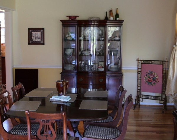
This is the space as it was before – a traditional dining room with dark wood furniture. The wall color was a butter yellow above the chair rail, and a golder version of the yellow below the chair rail.
before
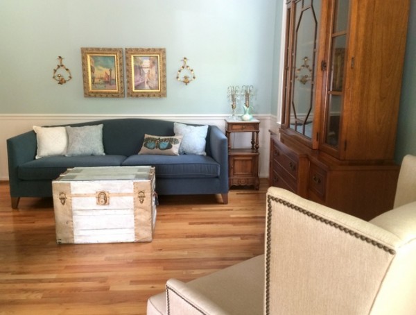
We swapped the dining room with the living room, and this is the progress we made this week:
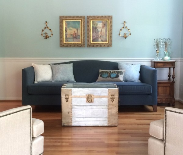
after
Here’s another shot of the room when it was set up for dining:
before
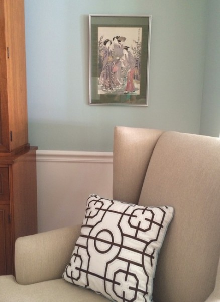
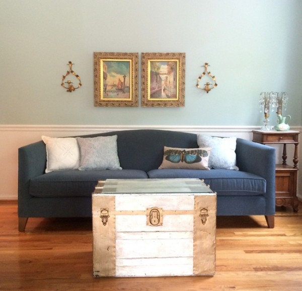
after
My client was thrilled that we were able to incorporate her great-aunt’s gold sconces that were packed away because she couldn’t figure out how or where to use them. I think they are just perfect here!
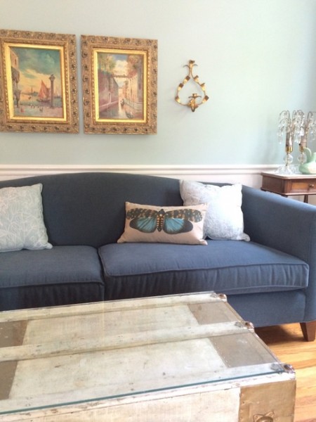
Mr. Man is taking me on a surprise day trip today and I’m feeling generous, so I’ll tell you what the wall paint color is. We decided on the perfect minty blue, Benjamin Moore Palladian Blue HC-144, to freshen up this entire space. Although we raided a few bedrooms to put together this pillowscape, we are going to replace them with larger, down-filled throw pillows that will take everything up a notch!
Benjamin Moore Palladian Blue HC-144
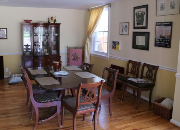
Wondering about the “new” dining room? It’s not quite ready for it’s close-up, but it’s already pretty fabulous with it’s new paint color scheme and AMAZING new winter gold light fixture.
I can’t wait to see what Mr. Man has planned for us today – I have a guess based on a couple of hints he gave me, and I really hope I’m right!!!


Looks so much brighter and prettier!
Have a great ‘secret’ day!! I love surprises. Let us know what adventure you went on.
Once again, you’ve inspired me. I painted most of the rooms on my first floor a neutral beige, and I’m left with deciding on a color for my dining room and living room. I’ve been thinking about choosing a similar blue to make things more interesting and colorful. It works with the color scheme of my house, and my style and furnishings are similar to this. I think I’m going to go for it and pick a nice muted turquoise… since viewing your color workshop video, I have a few colors in mind. Thanks for giving me the courage to take the leap!
Loroy,
Yes, you should go for it! Let me know what color you choose and how it turns out 🙂
Yay! I’m so glad you were “feeling generous!” 🙂 The wood tones look so much prettier paired with the blue/gray/green wall color. A sweet friend of mine and her family recently moved into a new house. The previous owners had painted the living room walls fleshy beige with a poop brown accent wall behind the fireplace. While her husband was gone on a business trip, she repainted the living room a color similar to Palladian Blue. I had suggested she might need to paint her oak fireplace trim white, but after she painted the walls, the fireplace looked beautiful! When her husband got home and first walked into the living room, he thought she had bought new furniture. Ha! She and I joked that a pretty blue makes all things new. 🙂
Jenny,
You are so right! Blues and greens are a fantastic backdrop to dark wood furnishings – they make the wood look richer, every time. I usually don’t use this clean of a blue for a living room, but this client really likes fresh colors and lives in a 70-year old home with rooms that are quite separated, not an open-concept floorplan. Love your story about your friend’s husband thinking she had purchased new furniture!!!!
This looks so pretty. I painted our dining room Palladian Blue above the chair rail last summer, and it makes me feel so happy every time I walk by. I’m sure your client is going to feel the same way, Kristie. Great work!