Rooms always look their best when the furniture is balanced on the architecture. But what if you have a room with multiple focal points that don’t line up with each other?? This is a common problem for homeowners and was a big issue in my client’s living room project.
Let’s start out with the “before” photos. First, look at the furniture in relation to the focal point opposite the entry: the bank of windows.
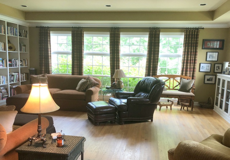 before
The conversation area in this room certainly doesn’t balance on them. Most people don’t think about a bank of windows as a focal point, but it certainly is! There are multiple focal points in this space, and you are about to see two more.
If there is a fireplace in the room, it is always an architectural focal point.
If possible, the furniture placement should be balanced on the fireplace. The sofas are equidistant from the fireplace here, but the conversation area is soooo far away from it.
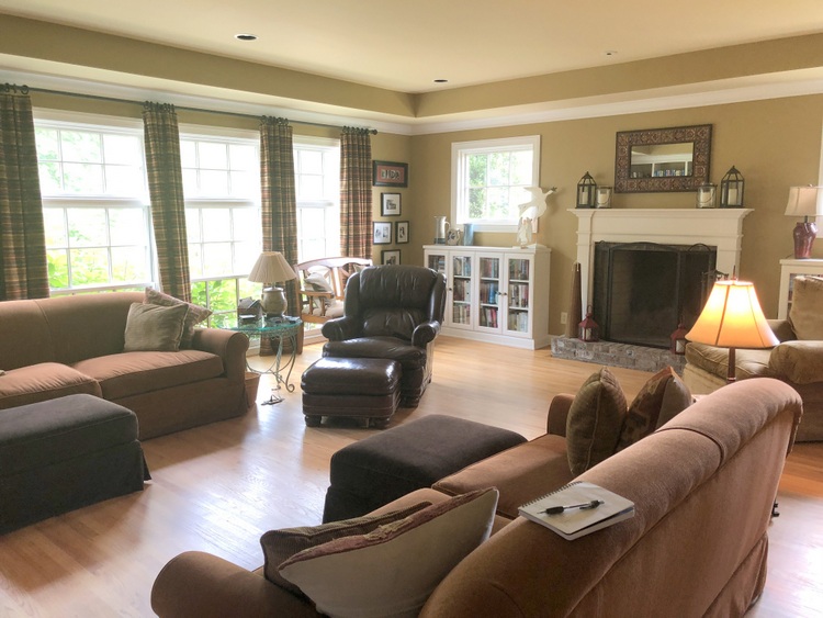 before
Finally, we have to consider that ruthless tyrant of the living room.
Yes, I’m talking about the television!
The television has certainly mastered this living room. The furniture is oriented close to this end of the room (vs. the fireplace end) to cluster near the television. BUT, you can see the furniture is not balanced on the television.
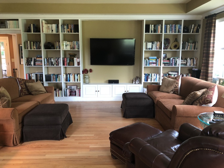 before
The biggest problem in this living room? The fireplace and the television are not lined up to one another on opposite ends of the room. So the furniture doesn’t know where to go or what to orient on. And the window is ignored altogether.
What do you do when you have multiple focal points in a living room? Never fear, The Decorologist is here!
We wanted to brighten and freshen her living room, bringing in an updated color scheme and a few new furniture pieces. The sofas were in great shape, so we opted to retain those and work them into our new color scheme. As you are about to see, COLOR changes the entire feeling of the room. But getting the furniture arrangement right is incredibly important in making this room feel balanced and welcoming.
Now I’ll show you the befores/afters of this room. Let’s start with how it looks upon entry, which is the most important view of the room!
 before
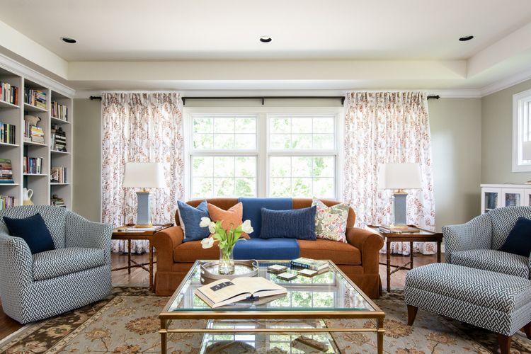 after by The Decorologist
Can you feel the shift in BALANCE?
Now the room’s furniture is centered and balanced on the bank of windows. The new color scheme includes dark blue, russet, and grayed green. Don’t you love those club chairs from Merridian Home Furnishings?
 before
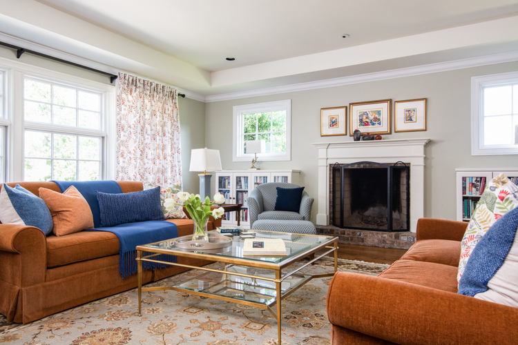 after by The Decorologist
The sofas are still centered on the fireplace, but now they are closer to it than they were before. One of the chairs is nestled up to it – can’t you imagine reading a book beside a nice roaring fire this winter?
What’s new in the room? The paint colors, drapery panels, pair of club chairs, tables, lamps, pillows, and throws. The rug was moved in here from the dining room, and the art and other decor already belonged to the homeowner.
 before
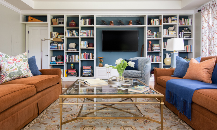 after by The Decorologist
We couldn’t balance the furniture on ALL of the focal points, but 2 out of 3 ain’t bad!
Moving the sofas AWAY from the television actually makes it easier to view it. The chair nearest the television is actually a swivel chair, so it can address the conversation area OR turn towards the television for viewing. Best of both worlds, right? Plus, the chair is low enough so it doesn’t block the tv.
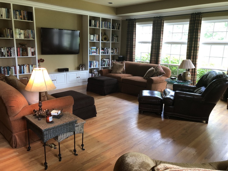 before
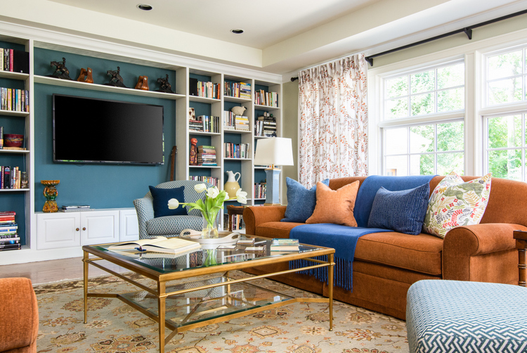 after by The Decorologist





very nice job!
Thank you!
Love this – great transformation!
Thank you, Anne-Marie! I really enjoyed working on this house and with this client. 🙂
Hello: I have a fireplace in the corner……..yes, the CORNER of my family room and have decided there is no way to be able to use it as a focal point without totally chopping up the room into other, unusable spaces. Have you dealt with this before on your blog? Thanks so much!!
Hi Martha,
Here are a couple of old posts that address this issue: https://thedecorologist.com/how-to-arrange-furniture-in-a-room-with-a-corner-fireplace/
https://thedecorologist.com/a-sure-fire-way-to-tell-if-your-furniture-arrangement-is-wrong/
The before pictures make the room look busy and sort of uncomfortable. The afters are so much more welcoming and relaxing. You really transformed that space well.
Would you have ever considered placing the two sofas back to back in the center of the room? Would there have been enough room for that configuration?
Yes, Cathy! This definitely is the kind of room that could have been configured that way, with a table table between the two back-to-back sofas. Great idea!
Great info and I am really enjoying the new “old” home journey. So fun!
Thank you for following along, Regina! 😉
It turned out beautiful! I especially love the blue background in the bookcase. I also love that you were able to work with the existing sofas. They look 100x better with the new wall and accent colors. Great job!
Thank you so much, Jenny! I love it when I can use some of the existing furniture in a whole new color scheme. The cost savings of not having to replace these sofas (that were still in great shape and comfy) enabled us to do lots of other great things in this house! 🙂
The room is so much brighter, lighter, and appealing now! Wonderful job! This reminds me of when we built our house 25 years ago. A decorator came over (we had ordered some furniture from her place of business), and I asked her how to arrange my family room furniture. She looked and said, “Hmmm… you have three focal points here.” I remember feeling so surprised, as I thought the fire place was the only focal point. She came up with a quick arrangement, and it is still that way today, even though furnishings, fabrics, and paint have changed.
A good decorator is worth her weight in gold!!