Do you ever walk into a room and feel as though things are off-balance? I do – all the time. It’s a curse. As an Interior Decorator and Home Stager, it’s my mission to balance out every room I am asked to design or stage. Last week, I speed-staged a formal home in Brentwood, TN. This was the living room arrangement in its “before” state:
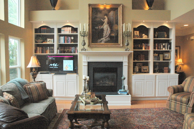
Living Room Before Staging
Can you guess what was bugging me? The rug was off-center from the fireplace and bookcases, the sofa was off the rug, the coffee table wasn’t centered on the rug, and the chairs were too far away from the sofa and fireplace. With a few adjustments, the room felt a lot better to me:
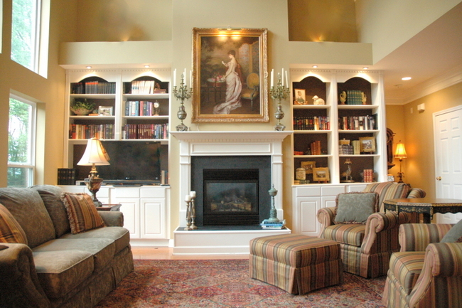
After Speed Staging by The Decorologist
Here is a view of the “before” from above – sometimes viewing from above gives you a different perspective as to whether or not the furniture arrangement works. Notice that you can’t even see the two chairs in this photo because they are so far separated from the rest of the seating.
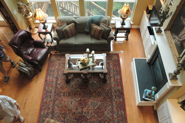
Aerial View of Living Room Before Staging
Now doesn’t this just feel more “right?” The listing photography looks much better because of it – and we all know how important that is! If you don’t know, you should read this.
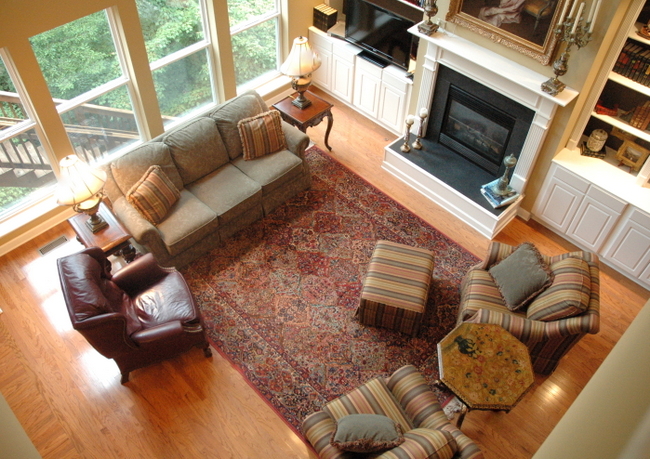
Staged Living Room by The Decorologist
Try it yourself in your own living room and see what a difference a little balance can make!





In regard to simple things that can make or break a room, I found your article to be one of the most useful and informative that I’ve encountered. My best girlfriend initially had her living room furniture arranged in a cozy little conversation niche — she then broke the seating up and arranged it against opposing walls because her children liked it better that way. They said that it made the room “look bigger.” This is one of my pet decorating peeves — owners who think that the intent of decorating is to make a room appear as large as possible while sacrificing the possibility of quiet conversation.
Thanks, Terry. Bigger isn’t always better, haha! But actually, if you could see this whole room – it actually does look larger with the seating clustered together closer. There’s a lot more room to get into the room and better flow around the conversation area.
Kristi-do you think the room would be even more balanced if the leather chair wasn’t there? I love that it took such a simple change to make that room look sooo much better.
Absolutely, Lisa. But that of course is the MAN CHAIR, and cannot be removed and must face the tv. You know how it is 😉
Just reducing the amount of “stuff” is a welcome change!
So sorry that this is off topic, but do you know what the wall paint color is in this living room? And what are your thoughts on this color for this room? I have a similar living room and am vacillating on my paint color choice which I believe is similar to this room's color (mine is Ben Moore Amulet). Many thanks!