Now that summer’s in full swing, you may need some inspiration for a bedroom makeover. I’ve got one I hope you’ll like – the master bedroom of the beach vacation property I designed over the winter (and pay attention to the tip about oversized bedding).

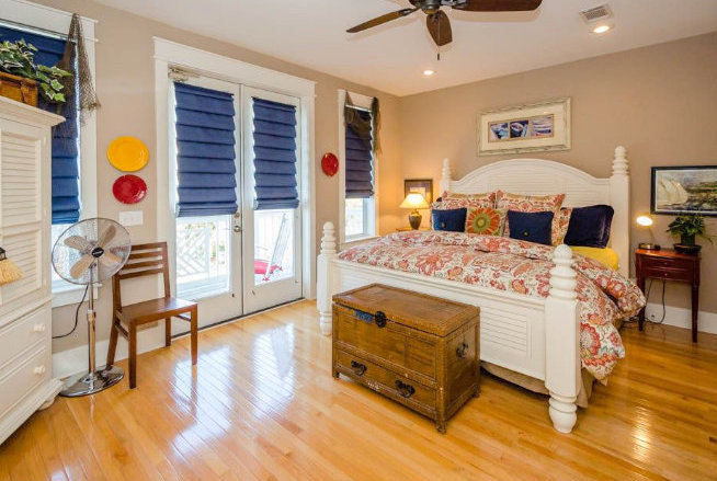
When my family rents a house for our annual beach vacation, it’s either beach-themed to the hilt or it’s decorated like a regular old house you’d have anywhere else (only it’s near the beach). I prefer a look that nods to the location, but feels a bit more luxe. Here is the way this master bedroom appeared when the new owner purchased it:
 before
Did I mention that it came with all the furnishings? Well, most of it was donated to a charity organization so that I could have my way with the place. We actually decided to keep the bed and dresser to use elsewhere in the home, but everything else was cleared out.
EXCEPT for the window treatments. Although the owner was willing to replace them, I knew that would significantly cut into the overall budget allotted for the new design. So I decided to keep them and work them into the new design for this bedroom.
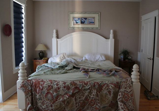
The fleshy beige wall color and orange hardwood stain were first to go. Sherwin-Williams Tradewind SW6218 was my choice for the walls to balance the navy blue of the window treatments.
The other side of the room was previously overstuffed with furniture and decor.
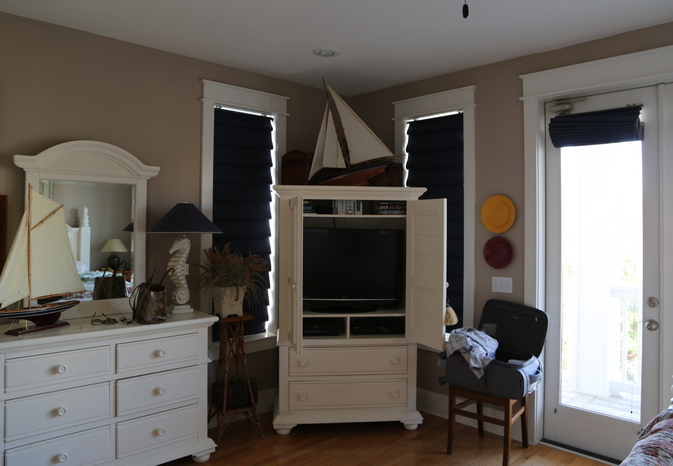 before
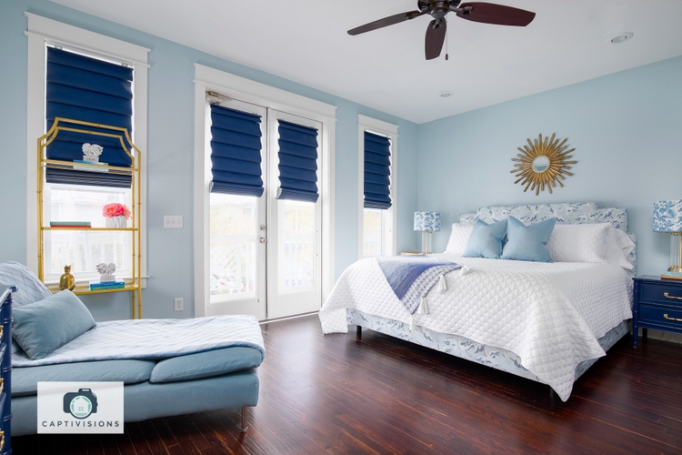
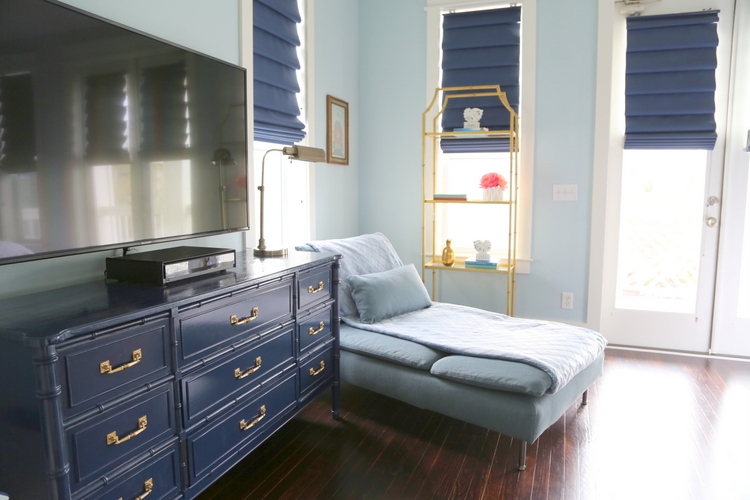
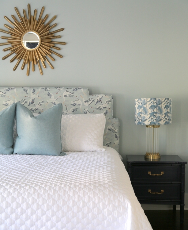
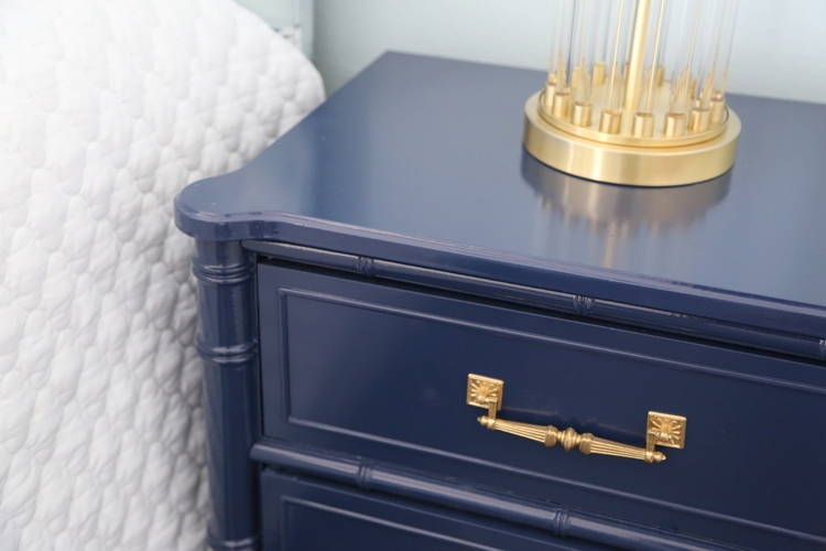
Now it feels purposeful and peaceful. The chaise is the perfect spot for reading or catching up on emails. It can even serve as an extra bed for a young child who might get spooked and want to sleep in her parents’ room during vacay. I had the bamboo-detailed dresser and side table lacquered in Sherwin-Williams Naval to match the window treatments. I wasn’t able to do that color matching onsite! I’m proud to say that the color I selected for the furniture turned out to be a perfect match to the window treatments several states away . . .
The bed before:
And after:
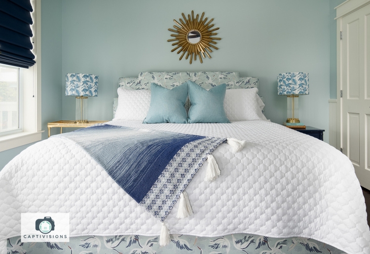
I want to point out that this white quilted coverlet is an oversized king, which is difficult to find. Have you noticed that bedding is routinely undersized and typically comes up short on one side?
It’s the bane of my existence, I tell you!
I was thrilled to find an “oversized” quilted coverlet (and the included shams), which I purchased in multiples because the price was so good. Here’s where you can find it – you’re welcome! This oversized bedding is completely washable and bleachable, which is ideal for any bed (especially for a rental property).
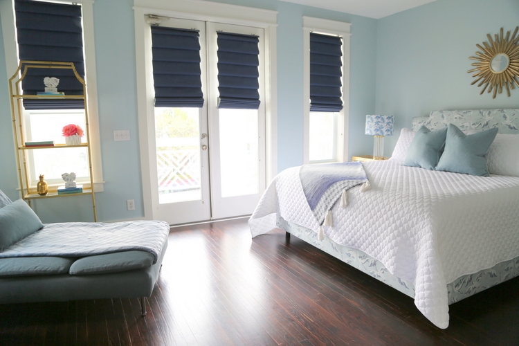
This 2nd story bedroom has a lovely covered balcony where guests can take their coffee in the morning.
The fabric of the new upholstered bed was the inspiration for the entire space. I mean, THOSE CRANES!!! I love that bed so much. The lampshades were a lucky find that worked surprisingly well on either side of the bed.
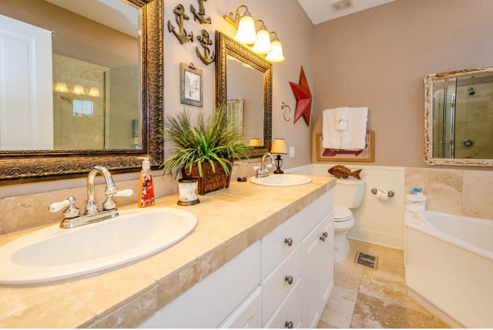
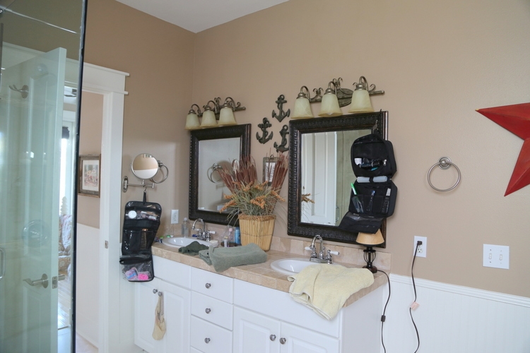
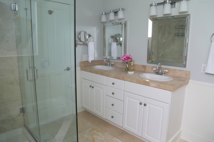
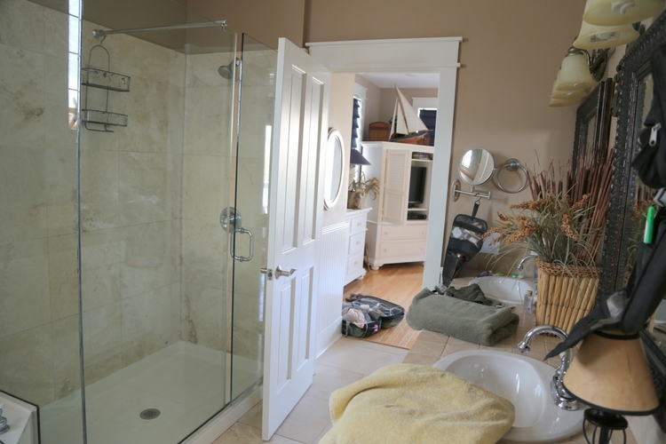
The master bathroom required we keep the existing cabinets, countertops, and flooring.
 before
I did what I often do – work with what the good Lord gives me. I think it turned out really nicely:
I was able to purchase new lighting and mirrors, which made a huge difference. Here’s the before:
 before
Mirrors with beveled mirror frames always look classy.
One last before shot:
 before
Sometimes less is more, don’t you agree?
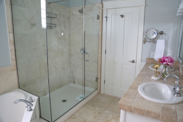
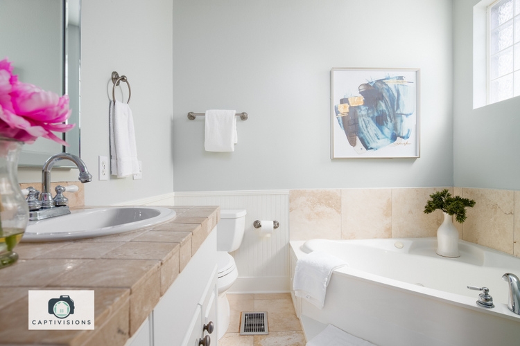
I actually chose a more muted version of the master bedroom wall color in this space, because Tradewind was too bright compared to the stone in the bathroom. I will admit to you – if I had this bathroom to do again, I think I would paint the walls the same white as the trim and put the blue color on the ceiling. I think that would tone down the travertine a bit more, which I’d prefer.
So the real question is: would you be happy to spend your vacation in a bedroom like this one? This property is 20 steps to the neighborhood pool and 65 yards to the beach on the stretch of idyllic 30A between Seaside and Rosemary Beach, Florida. You can find out when it’s available to rent here.
This post includes an affiliate link, which means I get a very small commission if you purchase – but don’t worry, it doesn’t cost you a dime more!


Love the crane fabric. Where did you get it?
Hi Martha,
Thank you! The upholstered bed is from One Kings Lane.
Kristie, there is nothing I do not love about this bedroom! That crane fabric is so subtle and beautiful. It looks great on the body of the bed as well. Those lampshades are genius. I could not agree with you more about quilt size. With mattresses increasing in depth, I purchased a king quilt for my queen bed. Lastly, can you reveal what the blue paint color is on the night stand? Thanks, and thanks for all the inspiration.
Thank you, Joanne! The paint color on both the dresser and night stand is Sherwin-Williams Naval SW6244 🙂
So pretty!! You are so right regarding “less is more”. When we look at rental property, we’re always drawn to the homes that are not overstuffed! We need space to put our belongings without feeling crowded. If you can, could you tell us what you meant by “lacquered”? Did the painter do something specific to increase durability other than paint the dresser and nightstand? I love SW Naval and it would be a perfect re-do on my tween son’s baby blue dresser.
Thank you! Actually, we achieved a “lacquered” look by simply using high gloss, oil-based paint.
Hi Kristie, I would love to rent this home one day! Everything you’ve done is so serene and beautiful. How respectful of you to work with some existing features to stay within budget. I agree with you on the oversized bedding! When my girls each went to college I bought them full/queen comforters for their dorm beds and they loved the extra width. The crane fabric is dreamy! I love cranes and the blues are so pretty. Thanks for showing us more of the beach house!
Thank you, Laura! I hope you can vacation there someday, too! 🙂
Hi Kristie,
I love your before and afters always so good.
The muted version of the bedroom paint color looks lovely with the travertine and white would have been great too.
Would you share the color you did use? I think it would be a great color for my sister to use in a spare bedroom/craft room she’s putting together .
Thanks much
Thank you, Alysa. The bathroom color is Sherwin-Williams Sea Salt – it’s a great color!
Thank you for the oversized king info. I live in Colorado and really need a duvet/comforter for the warmth. Any finds in that category by chance?? Love your designs!!
Thank you, Laura! I found the bedding by googling “oversized king coverlet,” so try “oversized king comforter.”
I just love how you tie everything together!! Yes, the “new” bedroom is so peaceful, but grounded. The blue of the dresser and nightstand looks so elegant matching the window coverings! I would feel “luxe” staying here!
Oh, thank you, Paula! You are so sweet!
Easily one of my favorite re-do projects you’ve shown so far! Amazed at the difference in the bathroom even with keeping most of it in place. We have a small bathroom in a beach condo we have but the bathroom ceilings are lower than the rest of the unit. Love the idea of blue on the ceiling but I’m wondering if that would make the ceiling look higher or lower. Can’t picture it in my mind.
July,
Thanks so much! Although you can’t see it in these pictures, we painted the ceilings the same color as the walls (there is no crown molding). To answer your question, if your walls are a light neutral or white, a light blue ceiling actually makes the room appear taller. I’d go for it if I were you!
Kristie, another stunning update! I love the lacquered Furniture. Did you do this yourself or have someone do the work for you? I have a dresser I would love be to paint.
Beautiful design!
Sarah,
This is not truly lacquered, but we wanted to achieve a lacquer look. We used high gloss, oil-based paint (Sherwin-Williams).
Your bathroom wall color is beautiful, do you have the name? Everything looks fantastic 🙂
Yes, Jennifer, the bathroom wall and ceiling color is Sherwin-Williams Sea Salt. Glad you like it!
Thank you so much!
Simply fabulous!!! You once again completed a more than stellar look! It is welcoming and the statement is time to relax in the coolness if the night! I just love it!!! Thank you for the great post!!!!!
Thank you so much, Sylvia!
Looks lovely and not too beachy themed! How would BM Maritime White look in the bathroom?
I’m not sure – but I’d likely do the same white as the trim, but in an eggshell finish. That’s typically the best way not to screw up! 😉
It’s all just lovely, but I’m so thankful to hear you say you would probably do white walls to tone down the travertine! We have that boring beige (IMO) travertine EVERYWHERE in our new home and I can’t afford to change it all out right now. Our huge master bath is up for painting next and I’ve really been leaning towards white walls in there to try to tone down the travertine. I may look at Sea Salt for the ceiling, though I’m actually thinking of using a dark greige (from the veins in the granite counters) to help balance the dark cabinetry in there. We have tall ceilings and lots of light so I think it could work. Would love any feedback you have about that!
It’s gorgeous, Kristie. Clean and fresh! But – here is where I can no longer repress my request for you to please put together an Amateur Decorologist’s Paint Colour Collection. It would come in two very large rings of colour sample cards from a variety of paint manufacturers, and would be called ,“Kristie SaysYes™️” and “Absolutely Not™️“, respectively, and, while the first ring would list the colors by number only, cross referencing (more appropriate) colour names such as “Those Cranes!” And “I Want To Paint It Black,” the “No Ring” would include custom names from historic Decorologist Blog posts, such as “Band Aid Pink” And “Fleshy Beige”, “Dining Room Red,” And “Just No.”. 🤣 I feel like this is the path to making your blogging millions.
You had me at ‘beachy’! I love what you’ve done with this space, and I think you’ve worked a few small miracles in the bathroom. Your ‘if I had it to do over again’ idea makes sense, but if you didn’t mention it, I wouldn’t have given it a second thought. I also really like where you placed the etagere – who would have thought to put it in front of a window like that, but you did and it works beautifully! Yes, I would be happy to spend my vacation in a bedroom like this 🙂
Beautiful update! I would love to stay here!
Hi Kristie,
As always, this was perfect. Did you paint the dresser and night stand? If so what color are they?
Lydia,
Thanks! Both the dresser and night stands are painted Sherwin-Williams Naval, high gloss.
so, I rushed out and got the “oversized” coverlet for my king bed. Well 118 is wayyyyyyy too big (my bed height is 25 inches floor to top of mattress). It’s not quite a bedspread and it’s too long for a proper coverlet. So disappointed….. I’m going to try the “Marriott” ruched bedding. I love the look every time I stay at a Marriott.
What a difference decluttering and a simple color make!
What color did you use on the trim?
I used Benjamin Moore White Dove on the trim, in semi-gloss finish. 🙂