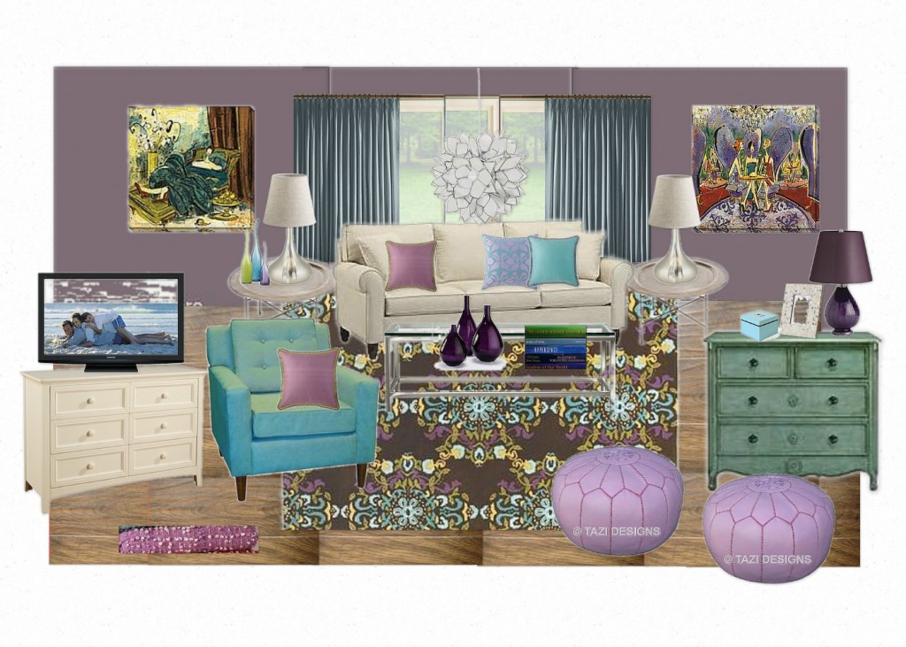
Happy Friday, fellow Decor Junkies! Today I’m sharing a Virtual Design I did for a client’s living room a few months back. The inspiration for the entire room was the fabulously fun rug, plus the pair of art pieces you see below:
Virtual Design by The Decorologist
My client had recently purchased the rug and also wanted to use her existing art in the new room. I love the color combination of blue, purple, and teal! When I create these kind of Virtual Designs for long distance clients, I provide a list of resources and prices of all the items included in the design. That way they can simply order the items they love or find similar items on their own to achieve the look of the Inspiration Board.
Would love to hear what you think about this design and color combination! Have a lovely weekend.









yes, the rug and painting are beautiful. I feel that there is too much color in the overall design, and it made the rug and pictures no longer stands out and buried in the room. In other words, all the items here created too much distractions which made it lack of focus. Maybe more neutral color on the wall and drapes will balance it better. sorry if this is too straight as I’m not good with wording.
Joy,
My client is a very colorful girl! This room was previously bright, dark green and it gets tons of natural sunlight.
en, maybe because this is only an inspiration instead of the final design… After all the pieces go to right position, the design may show its effect. thank you.
Yeah, the tricky thing about these Inspiration Boards is that they don’t reflect the exact floor plan – it’s more about “casting a vision” for the room. I do floor plans, too, if they are needed. But in this case, we discussed all the furniture placement over the phone. Have a great weekend, Joy!
She’s correct..it is a sunroom. What wall color would you suggest
it’s great that this room will have lots of shine. All I’m saying that I felt the current design will get the pictures and rug buried in all the colors instead of standing out. A neutral wall color, e.g a light gray that can be derived from the darkest color from the rug, may be used instead of the wall being color as well. Just my two cents.
since painting wall is not that hard, maybe you can experiment with one wall –the wall with pictures/window. Paint half of the all with the designed color , and paint the other half a neutral gray color-light grey. then hang the pictures and feel the effect.
You pulled the colors from the rug and artwork beautifully Kristie. I love that rug too! The colors in the room look so fresh and fun! The hanging light is so cool too. Have a great weekend!
I love this color scheme. Would love to see the finished product when she’s done.
I absolutely LOVE this room Kristie! Your eye for pulling things together is just uncanny 🙂 Where in the world did your client find that rug, Ive been looking for something like that for the longest time lol. And what would you call the color on the walls? It’s a really gorgeous dusky purple! Well done once again, looking forward to seeing more inspiration boards!
Crystal