For many years, no one wanted mint green anything. But over the last couple of years, mint green has been everywhere.
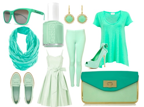
Lately, I’ve seen it finally trickle down into home decor. And I’m loving it! The most current light greens are not olive or sage or limey. The freshest green paint colors are a bit like retro jadite, a slightly grayed mint.
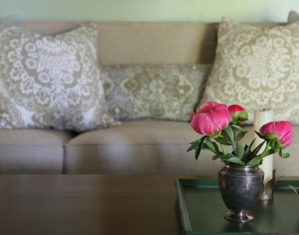
the new spa blue?
Let me show you how this worked in a recent client’s home. This was her living room before:
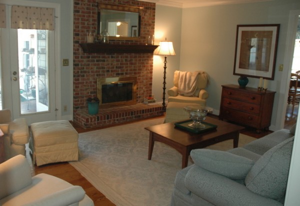
living room before
This was a room with very little natural light during much of the day – the french doors lead onto a covered back porch. My client was ready for a new wall color, new upholstery, and a new rug. When I suggested that painting the fireplace would brighten the room, she was all in.
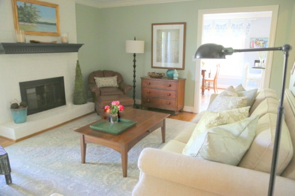
living room after
She loved how the grayed mint felt warmer than the previous light blue, while still brightening the space. The mint is a nice complement to the periwinkle blue in the kitchen. And what a difference the painted fireplace brick made!
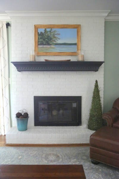
painted fireplace brick
Although the red brick was not unattractive, it was not working with the clean blue color on the wall. An earthy fireplace like this begs for warmer colors all around.
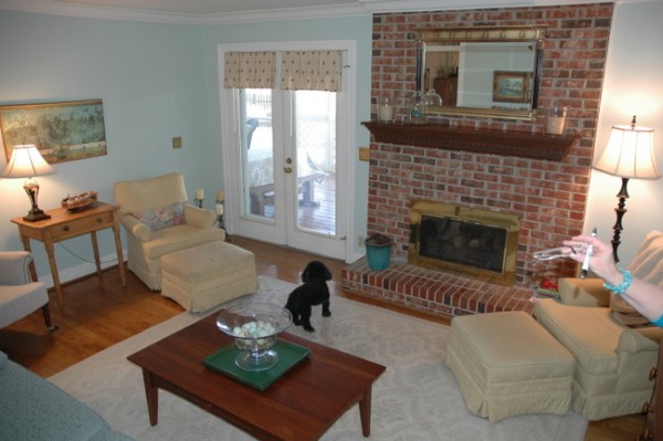
before
My client wanted a fresh and “happy” look. The fireplace is painted out with latex paint in trim color, while the gold fireplace insert was painted with a heat-resistant black paint you can find at any hardware store. The updated window treatment is a big improvement over the previous valances on the french doors.
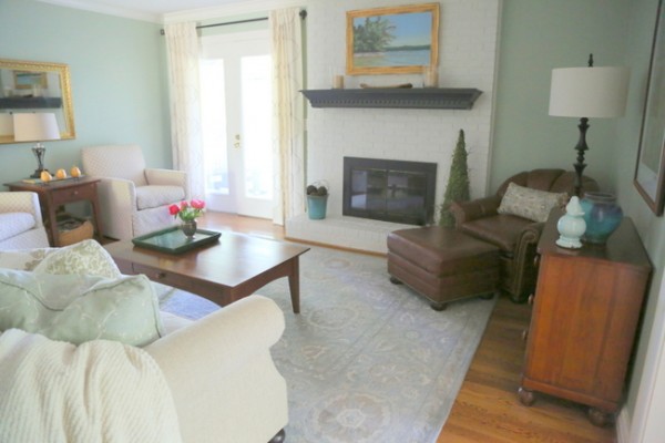
after
Here’s a before photo from the entry of the kitchen. This is a better representation of the paint color she started out with.
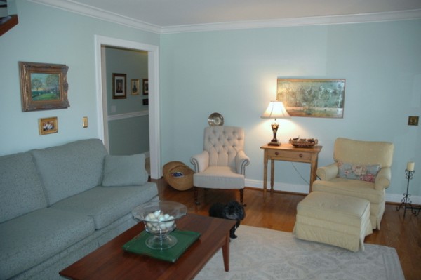
living room before
The after features the greener paint color and new seating, pillows, and rug.
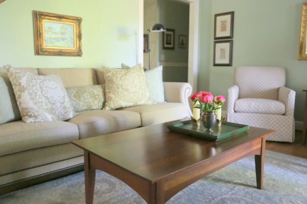
living room after
Let’s talk about the change that went down in the dining room. Before, the room was nondescript with a boring neutral above and below the chair rail.
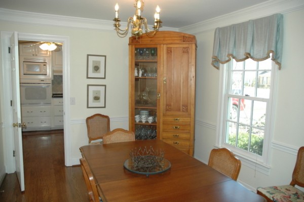
dining room before
We decided to continue the grayed mint color in the dining room and hallway, making it our “superneutral” in this home. Doesn’t the wood furniture look so much richer in the after?
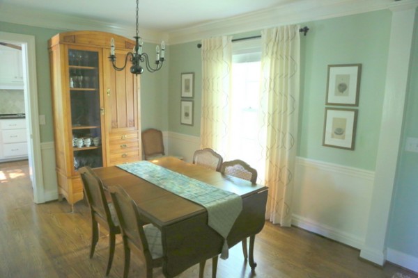
dining room after
I suggested she paint the dated brass chandelier black – did you notice that change? Also, the new window treatments are definitely an improvement over the former valance.
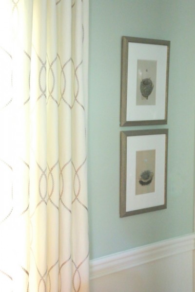
after
So, what do you think? Could mint green be the new spa blue? If you want to know more about the latest in paint color trends paint color placement, check out my Color Workshop video here.








Love it! Thank you for taking that cabinet out of the corner too.
Love, love, love green! The mint green you used to paint your client’s room looks like the green that was in my kitchen/family room/breakfast room before we painted it BM Pearl Gray (which I also am loving). We had the green for at least 10 years, and I wanted to keep it, but the decorator said I needed a change! haha! You decorators!!! I love both colors, and change is good! We live on the water and the Pearl Gray works well in our room. But I still love the green!
Your client’s home is so much improved! I will agree that the green works so much better than the blue in her home. And all the other little tweaks you did really upgraded the look! I always enjoy seeing your magic!
I have always liked that color and have used variations of it in my living room and kitchen, and contemplating it for the exterior.
Didn’t know I was on-trend–just working with the existing colors of the harvest gold olush rug (which I hate, but I was outvoted) oatmeal curtains, yellow walls and ceilings. Soulnds horrible, but dark wood bookcases and couch and turquoise and brass accents made it work pretty well, especially after I found some tribal pillow covers in those exact colors and 60s glass. All rather retro, and similar to what my grandmother had in her house for years, except with paneled walls and celery green carpet.
She had a custom ranch built in the early 60s, and it has the exact same platinium finished ranch casing and ranch style picture windows I have, but my house is actually 125 years old. My house is a mashup of bungalow meets mid-century modern thanks to total makeovers circa 1925 and1960, and jadeite green/min/sage green type color is the perfect mediator–was really popular c. 1920 or so until about 1965. Been an interesting journey to figure out how to meld the two, and I have learned a lot in the process.
Wow Kathy, your home sounds really interesting – I LOVE old homes and all things “retro!”
Excellent! I was wondering about the potential for some of the lovely blues not working the best in low light rooms that needed warming up. I certainly see that this green maintains the peaceful quality of what is essentially a cool color, while being distinctly warmer than the blue. i really like your rearrangement of her dining room hutch and your placement of the artwork symmetrically on the wall with the window. Love the touch of black with the repainted chandelier (what a positive change), and it looks like you repainted the fireplace mantel also!
I think your grayed down selection of mint green could have real longevity as an interior color–I’m sold.
That after looks fantastic! I am a huge fan of the greyed mint, it’s soothing, neutral, but still adds a splash of individuality and even a little bit retro. I love it. It goes well with mid century and/or an eclectic vibe too, I think. I did my whole living/dining/entry in it. If I could figure out how to add a pic I would post it 🙂
Amber,
I’d love it if you posted a photo of it on The Decorologist Facebook page!
What a timely post! I am ‘one of those’ that have been narrowing down my blue/green choices for several weeks. For where I live, BM paladin blue is just too gray but the following colors are still being considered: BM Antique glass, BM 618 robin’s nest, leisure green, antiguan sky and let it rain.
What color is the paint below the chair rail in the dining room? It looks kind of creamy.
Diane,
The color below the chair rail is white like the trim.
Thanks for responding. I’m unsure what color paint would look good if you happen to have oak trim. Any suggestions?
No, sorry I dislike this color. Too trendy,
I totally agree. I thought the light blue with the fireplace as it was was very pretty. I thought the fireplace anchored the room and gave it depth. Dislike the painted fireplace.
Great color Kristie! It just makes the room look fresh and crisp. The white really pops a lot more-and the fireplace-hello!!!. Went from looking drab and sad to fab! But I hate to say my favorite part of the post is the one accessory you all didn’t change-the cute little photo-bomber black puppy! With that little one-the room is truly complete! 🙂
For sure mint green could be the next spa blue. I think this mint green color is going to take off in home decor. Looks fantastic! Love it all. Thanks for taking the cabinet out of the corner.
I love the changes you made to this home….since it belongs to one of my favorite people, I get to spend quite a bit of time there!
I’ve always loved mint green and have always been more of a green person than a blue kind of girl. Looks fabulous!
So delighted with all of the changes! You have touched every room in my house and they are much more beautiful because of your amazing talents!!
I think it is very on-trend–and for once, I’m on it already! I painted my headboard wall mint green (Martha Stewart feldspar) in January and I am now adding Benjamin Moore’s wythe blue to the area between the picture rail and the ceiling in my living room. Wythe Blue is a bit too dark to be considered “mint” exactly, but it is in the family!
What was the name of the paint colour and company– you used here? I always enjoy tracking down the paint chips! Thanks.
In one of your online workshops you mentioned that a person is either a green person or a blue person. I think it was your paint workshop. I’ve always wondered what you meant about that. Will you talk more about it in your book?
Wow, we used a mint bluey-green in our attic last fall! Not a colour I would ever choose for our main floor. But when it came to lightening up the attic, white was too stark, and somehow we chose this mint green colour, and with white accents & white fluffy area rugs, our attic bedroom for overnight guests is quite adorable. This colour was a real surprise to me. I doubted it, but I’m a believer. (But for the rest of the house, I like more saturated colours)
What color exactly is it you used? I love it!
Charlotte,
If you are interested in specific paint color schemes in my posts, please contact my assistant at [email protected] for details.