If you follow me on Facebook or Instagram, you may know that I recently returned from a trip of a lifetime with my family to the UK. I took a million (ok, actually only 2000) photos while we were there so that I could remember all the amazing things I saw. Because there are so many row houses in London, many like to make a statement with their front door paint colors. There were so many that made me smile, I decided to match them to Sherwin-Williams colors in case you wanted to try one of these gorgeous colors on your own home!
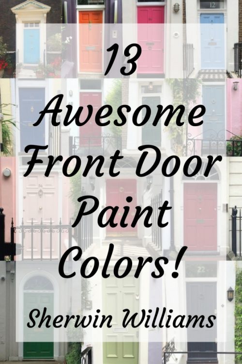
Peruse these lovely front doors and make sure to pay close attention to my VERY IMPORTANT SECRET for choosing front door paint colors at the end of this post!
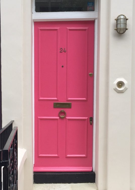
Most of us would not be brave enough to paint a front door pink – let alone our entire house – but this is the sweetest shade of bubblegum I’ve ever seen on an exterior:
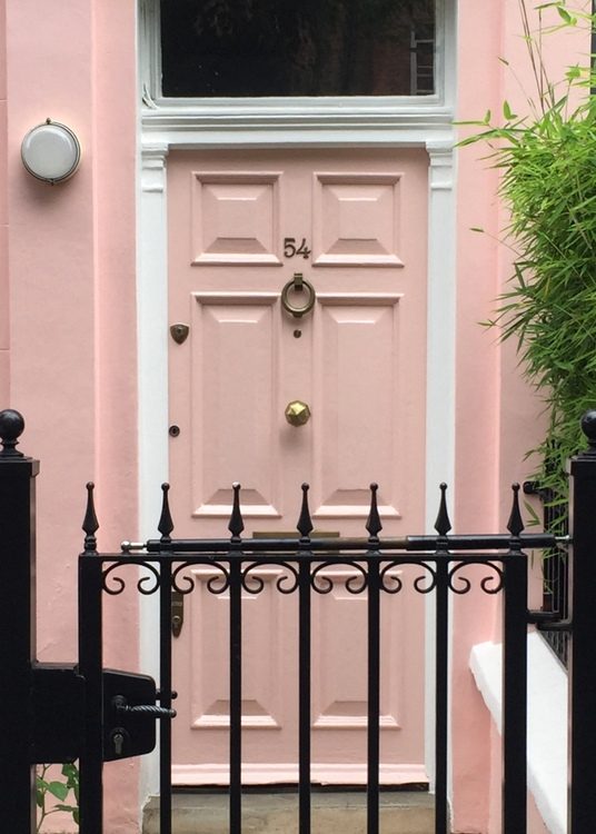
try Sherwin-Williams Pink Shadow SW0070
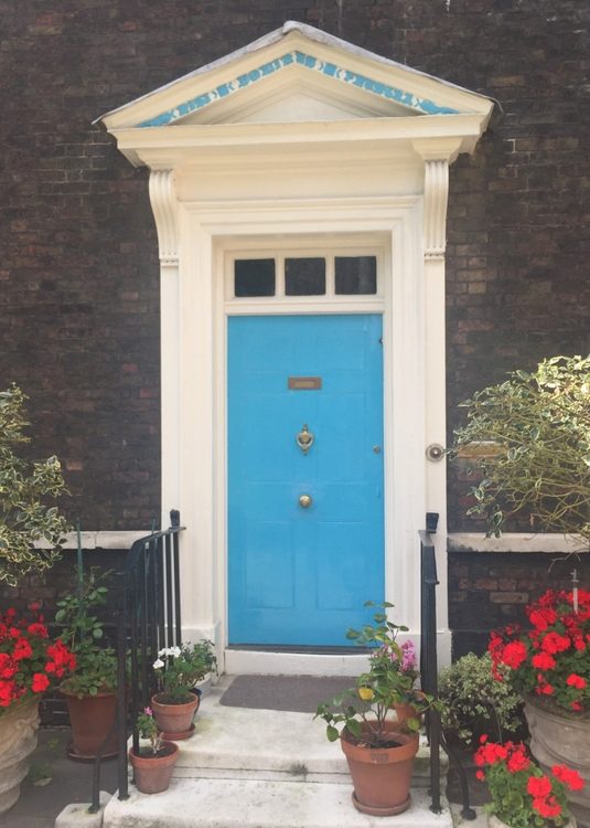
It seems to me that cornflower blue is very English. It’s the blue found in popular British designer Cath Kidson and Laura Ashley fabrics.
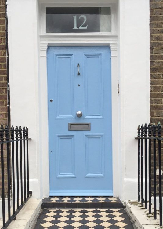
try Sherwin-Williams Porch Ceiling SW9063
try Sherwin-Williams Heartthrob SW6866
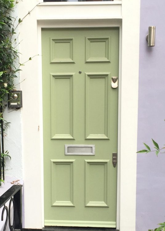
try Sherwin-Williams Parakeet SW6711
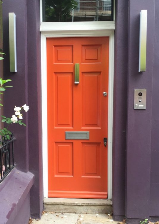
try Sherwin-Williams Obstinate Orange SW 6884
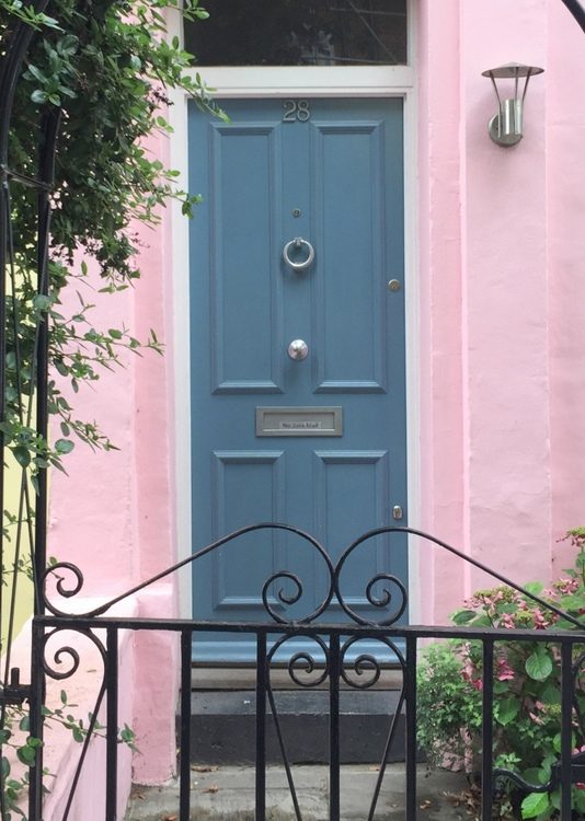
In the ritziest sections of London, the most common door color is a glossy black. Somewhere between a naval and a royal blue, this next door color in one of the most commonly seen alternative to that popular black:
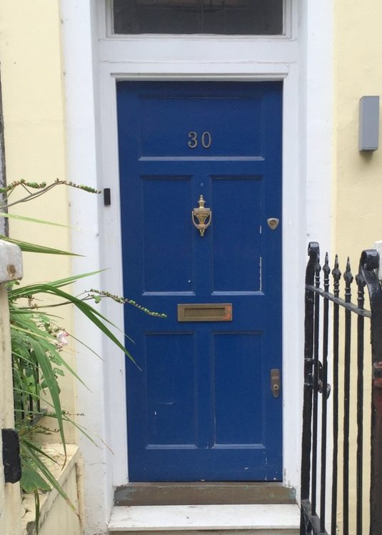
try Sherwin-Williams Hyper Blue SW6965
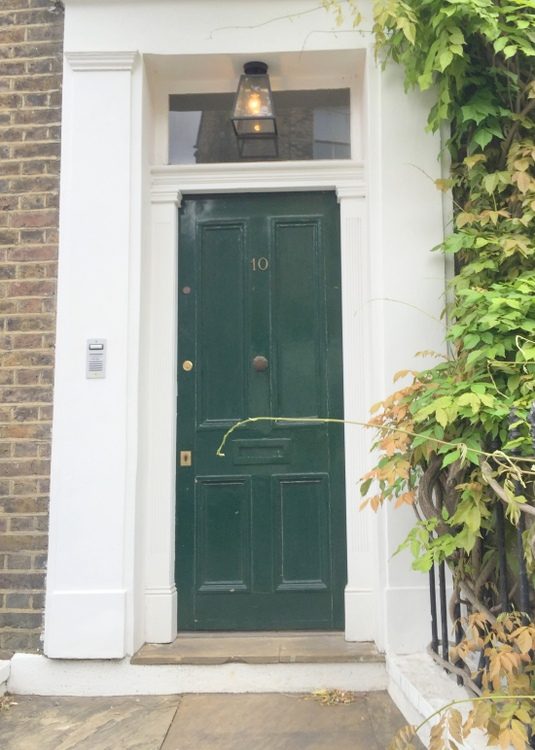
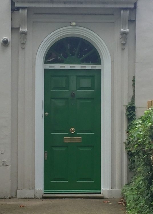
try Sherwin-Williams Billiard Green SW0016
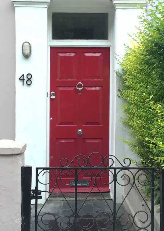
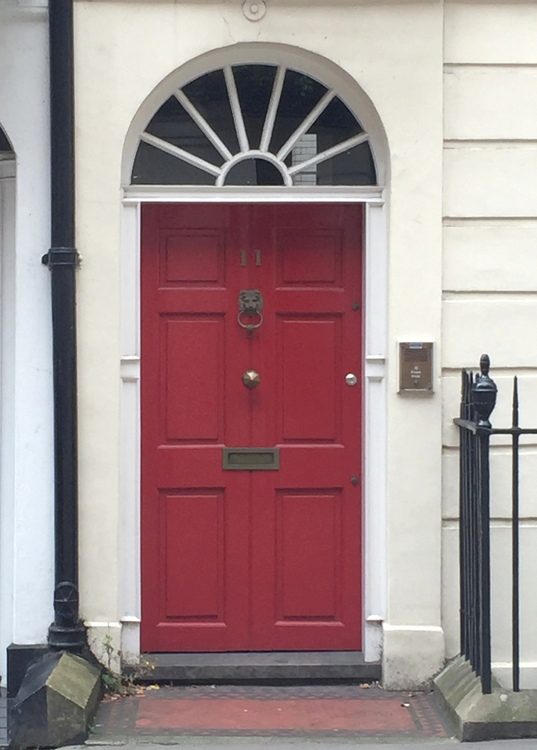
try Sherwin-Williams Positive Red 6871
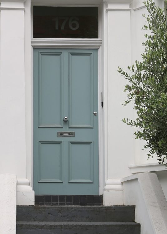
try Sherwin-Williams Turkish Tile SW7610
try Sherwin-Williams Alexandrite SW0060
try Sherwin-Williams Dutch Tile Blue SW0031
try Sherwin-Williams Exuberant Pink SW6840
 try Sherwin-Williams Dynamic Blue SW6958
It was a little tricky for me to get all these photos. This time of year is peak season for tourists in London, so every time I stopped to take these photos I hindered the progress of the VERY FAST WALKERS all around me! As I was snapping one of them, I noticed a man and his son stopping to stand behind me. As I finished shooting and stepped away, I realized they lived in the house I was taking photos of and were waiting for me to get off their entry stoop! Yes, I’m THAT lady . . .
Anywho, now it’s time to share my very important tip for choosing front door paint colors to avoid the mistake of trying to “match” a photo of one you want:
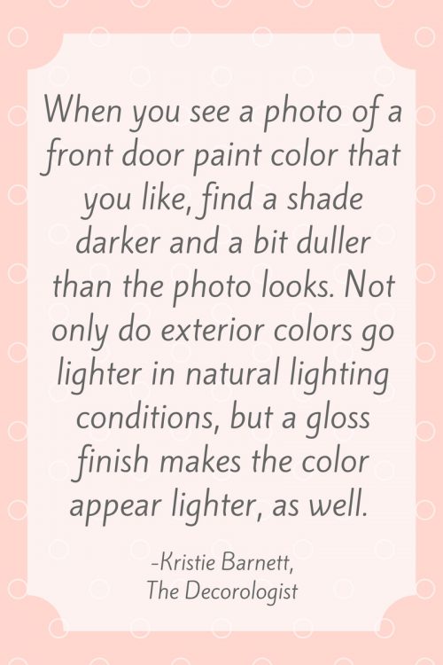
Plus, over time the color fades from the exposure to natural elements.
If you simply “match” the color in the photo to a fandeck, your result will be a noticeably lighter and brighter door color. The glossier you decide to paint your front door, the darker the color you should choose. I hope that helps! If you want to learn more about picking paint colors for your interior, check out my Just the Right Paint Color instructional video.


Thanks for taking these photos! They are lovely. My husband bought some spray paint for our front door and I’m slightly terrified how that will turn out. Is spray painting a front door a big no-no? He’s planning to remove the door, clean, and then seal after the coats.
Well, it’s a big no-no if you are using canned spray paint – not sure you can get an even coat! But if you are using a professional paint sprayer, sure.
The best finish on a front door I’ve ever had was with spray paint. I would remove the door, and not paint it in place. If you’re experienced with spray paint, it’s no problem. Lots of light coats, and nothing heavy. Of course tape everything off. It’s a very durable finish and can be very smooth. Prep is important. Sand and clean it well.
Thanks for that input, Susie! I haven’t used spray can paint this way, but I’ve certainly used it for hanging light fixtures and small decorative items. I’ve tried it on small tables, but always got paint drips and had to go back and put on the final coat with a paint brush and latex paint. An actual paint sprayer is preferable, but like you said, if you are experienced with spray paint (from a can) it can work!
Thank you, Susie!
I painted my front door hot pink a couple months ago and it brings such happiness! I shared a few photos here, it is hard to get a clear picture because of the screen door though!
http://andthenwetried.com/2017/06/dark-teal-house-paint-reveal/
Wow, Michelle – your door is beautiful! Very similar to the color of the one I posted – love it and thanks for sharing!
excellent information once again my friend!! and your photographs are beautiful♥
Thank you, Elizabeth!
I will definitely be considering a few of these blues for my front door. The siding on our house is a soft yellow so blue should work nicely.
Yes, a blue would be lovely with yellow siding!
Such a great assortment of colors! I have a few I saved for our front door and trim makeover
Great! What color family are you considering for your front door, Anne?
Love this! So fun to see the variety of beautiful color choices for front doors. Thanks Kristie!
You’re welcome, Lynne! Thanks for commenting 🙂
Love your front door photos, Kristie! They remind me of the doors in Newport, RI. Is the pink door the same color of the house? I have never been to the UK and did not expect to see such colorful houses! When the doors are painted black, are the homes traditional colors? I think my favorites are the pink, the brighter red one, and cornflower blue. Thanks for sharing your beautiful photos!
Thank you, Laura! Not all doors in London are so interesting colors. Most of these were taking in Notting Hill – the last vivid blue one is from the Queen’s quarters at the Tower of London. We spent a lot of time in Kensington, where the door colors were maybe 80% gloss black. That royal blue color is pretty popular, and you see the occasional red door. Outside of London, like in the Cotswolds where the homes are 300+ years old, the doors are much more subdued in color – which I will likely share in an upcoming post. As for the houses in London, in most areas the houses are connected row houses that are all the same color like cream or they have brick facades. We shopped the Portobello Road markets on a Saturday, and there were very brightly colored houses there and up into Notting Hill. I also saw some in less expensive neighborhoods, but I’m sure that in the upper crust neighborhoods where many of the buildings are listed as historically significant, there are specific restrictions on what you can do in regard to altering the exteriors – I’m sure that includes colors, much like many homeowner’s associations do here in the states.
I’d love to hear some insight regarding Laura’s question from some of my British readers!
Hi Kristie. Just wondering–did you actually carry a Sherwin Williams fan deck with you and hold it up to the door to match it?? If you did, that is admirable bravery, and dedication to being a life-long learner in the field of color consulting! And we get to benefit from the expertise you share. Thanks!
I view those brightly colored doors as the attempt to stand out as an individual among all the similar looking homes–how would you psycho-analyze it, though, LOL?
Kristin, my wife and I recently traveled to London and fell in love with not only the color of the front doors but the texture too. What techniques or specific paint would you recommend so that we might replicate the delicious thickness and shine so common on doors often exposed to difficult weather. Thanks.
John,
I’m not sure about the texture, but to get a high shine I go with an oil-based paint in high gloss finish. It’s more durable and holds it’s shine much better than a latex paint. Some of the doors I saw in the more expensive areas like Kensington were definitely lacquered. Another route would be applying a high gloss, non-yellowing polyurethane over your perfectly-painted door. Thanks for reading!
Seeing the lovely pink door brought back memories of my childhood. One of our neighbors painted his entire house pink. It was the talk of the neighborhood. His son became known as “Pink (first name)”. Decades later my sister saw him at their class reunion and automatically called him by that name! In spite of all that, my sister painted her front door PINK! Thanks for the laugh, photos and painting tip.
A twist on your tip: We like to paint our garage doors the same color as our house. They turn out a beautiful shade lighter than the main body of the house. It can be a simple solution for someone who wants a little variation, but does not want white doors.
Great tip for the garage doors – I’m assuming you paint them in a higher sheen finish than the body, which results in a shade lighter than the house? Just want to clarify that point for readers! Thanks, Lyn!
Lovely photos. I like the idea 😀
I have a beige sided ranch with brown shutters and a brown metal roof. What color should I paint my front door. My front porch is beige also
Gorgeous colors! Adds life to the exterior.
Do you have to seal your front door after painting it ?
I have a SWPeppercorn grey house white trim. I’m considering a taupe or cream or beige front door. Have any suggestions?