Last week I was invited by California Closets to tour the 2017 O’More Designer Showhouse. It’s a beautiful home in Nashville with lots of great design ideas for those of us who can’t get enough of such things!
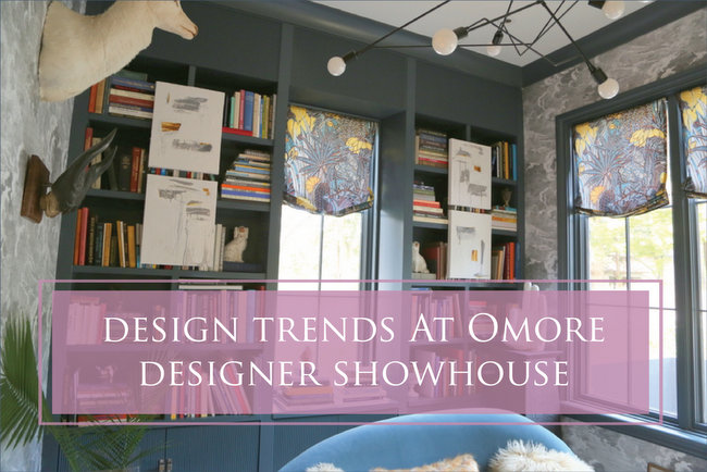
There was so much to talk about, I decided to make a video highlighting all the design trends and my thoughts on the details of the showhouse. Watch the video and find out how you can win a pair of tickets to tour the home yourself:
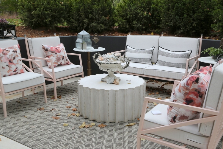
I’ve included all the photos featured in my video for you to peruse or pin for inspiration in your own home. All the photography was taken by me. Here’s the outdoor living space with touches of blush pink by Red Leaf Interiors:
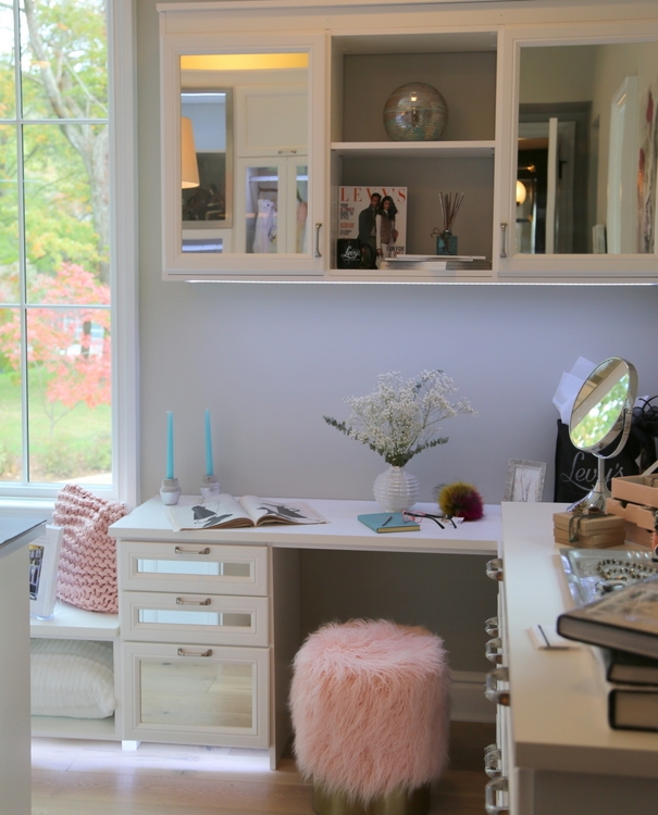
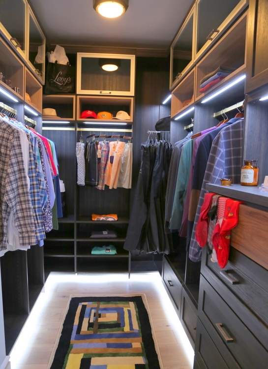
“Her” closet by California Closets of Nashville:
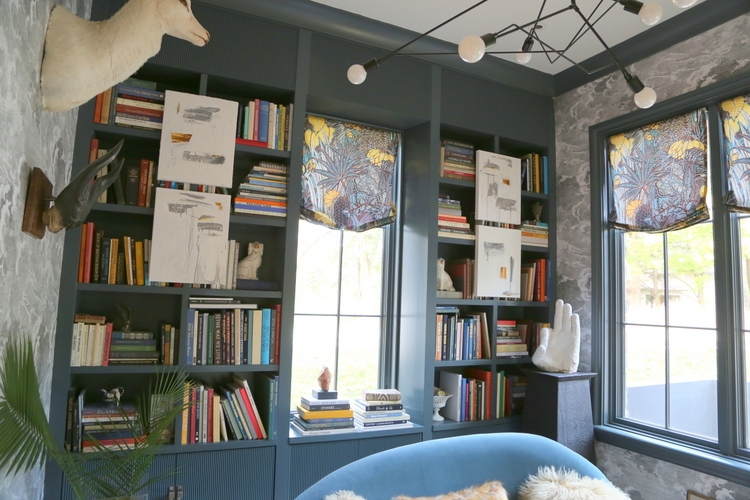
Fabulous eclectic library by Kimberly Kelly:
Dark outdoor living space on screened-in porch by Robert Brown:
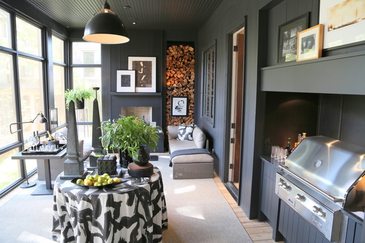
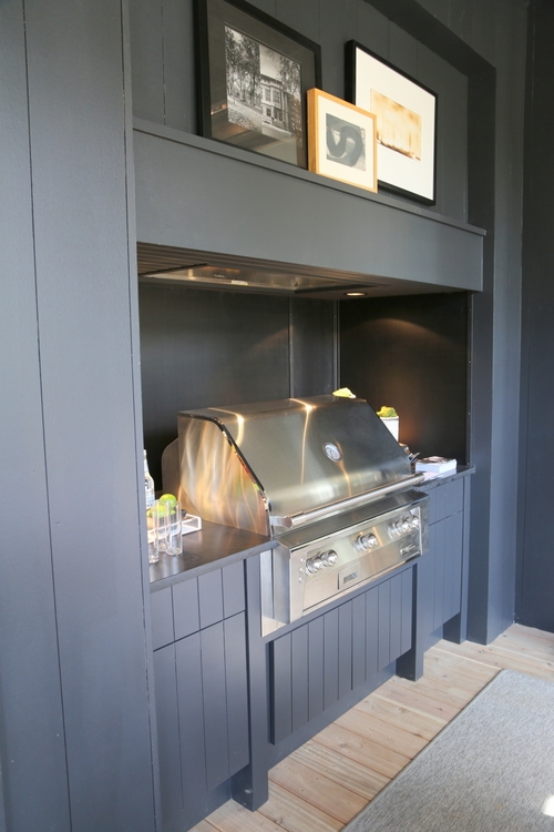
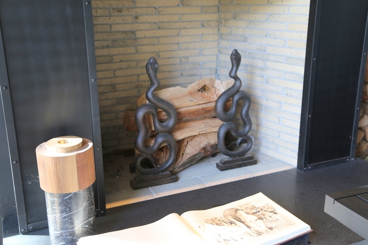
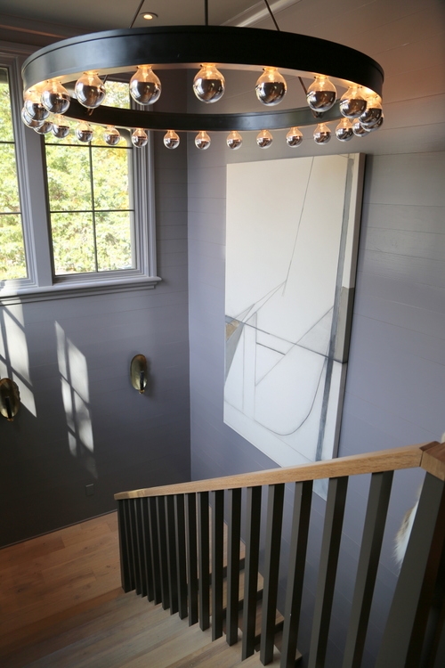
Black wall color is a current design trend, as is black iron lighting:
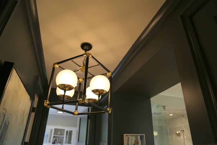 Sandler Interiors
Fur and animal-themed textiles and decor are hot:
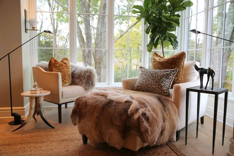 Lila Pryor Franks
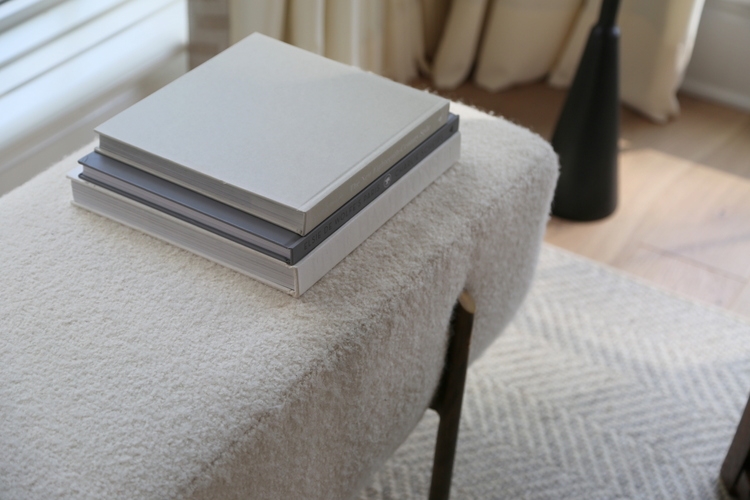
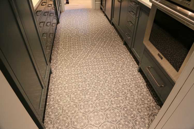
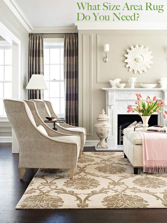
Rugs are trending for bathrooms, kitchens, and other unexpected area of the home.
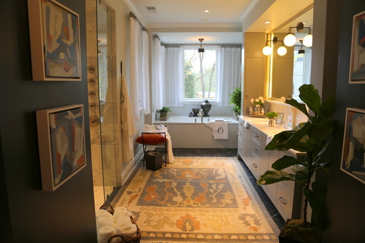 Sandler Interiors
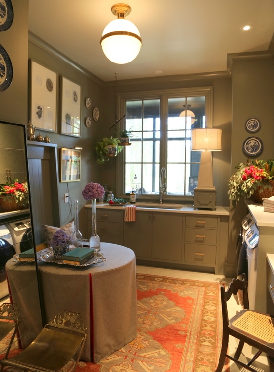 Corey Morris
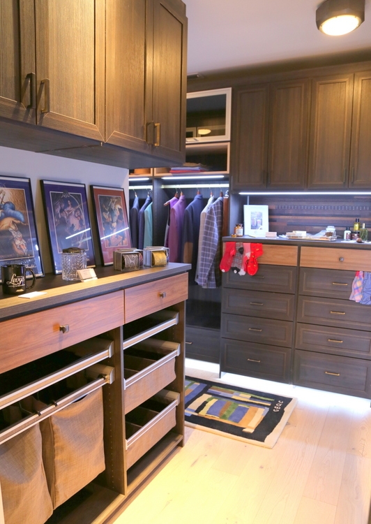
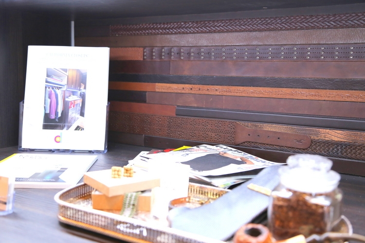
Check out the “backsplash” made of belts:
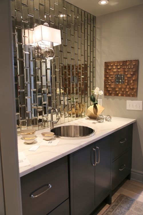
Mirrored subway tile brightens a bar area:
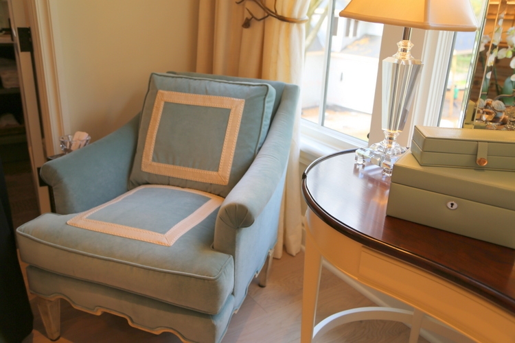
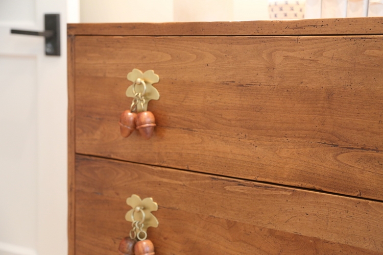
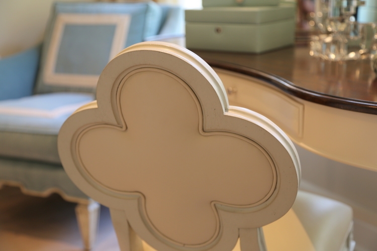
Lots of interesting design details in upholstery and furniture hardware:
 Joanne Haynes
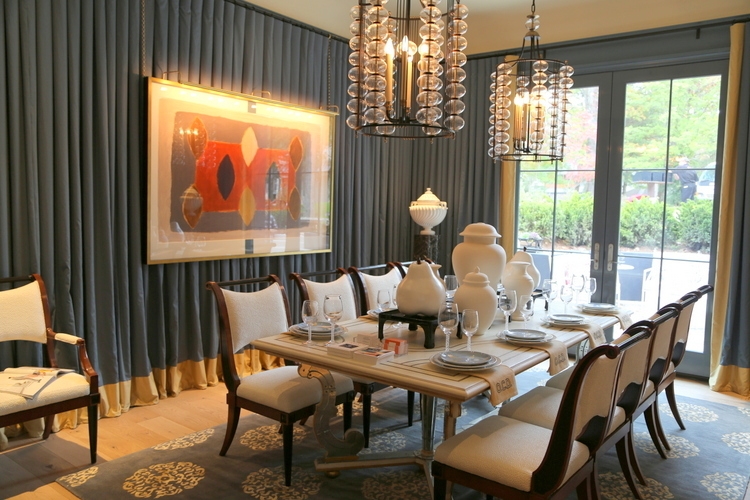
Walls draped in fabric add texture and drama in Jonathan Savage’s dining room.
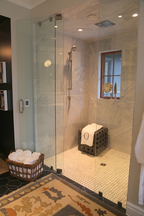
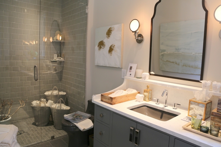
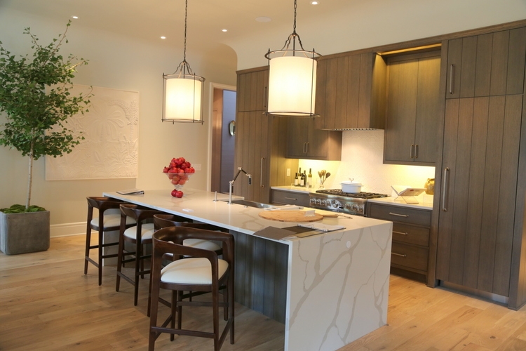
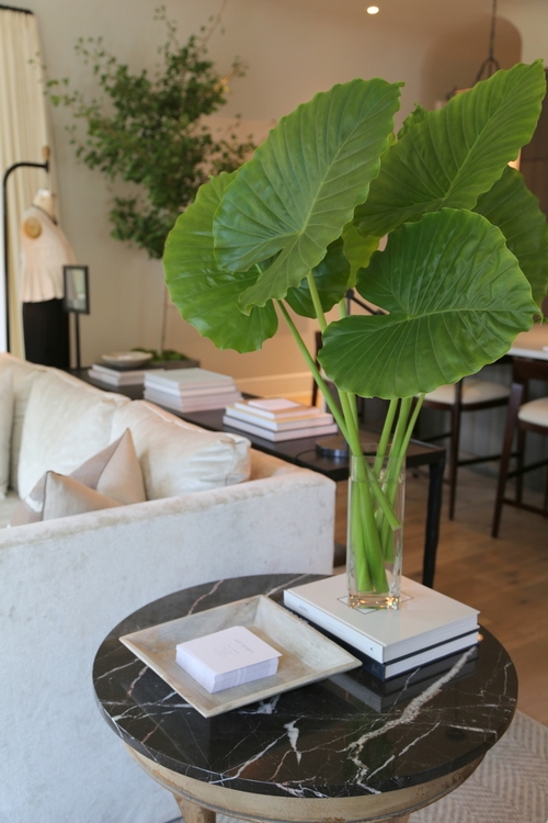
Quartz and marble are the solid surfaces of choice.
 Tanely Blake
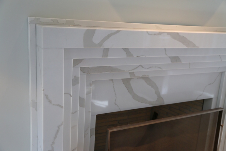
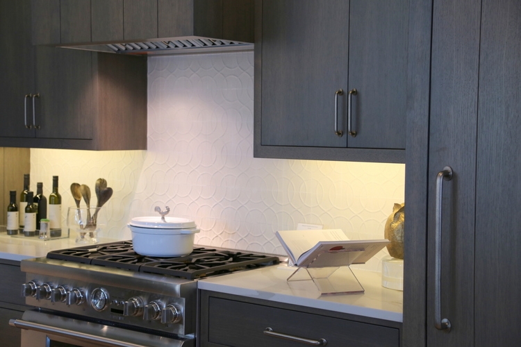
Notice the lack of grout lines – grout lines that match the tile make it appear like a solid sheet of material:
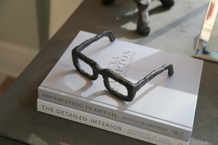
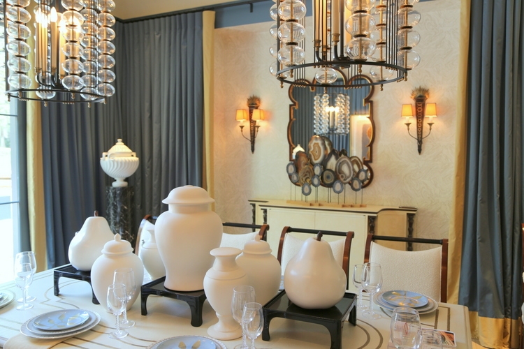
Try this: paint mismatched ginger jars or pottery the same color and create a collection to use as a centerpiece.
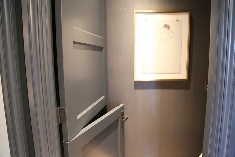
Well, I never! It’s a dutch door in the water closet – very cheeky!
To win a pair of tickets to the O’More Designer Showhouse, leave a comment about your favorite design trend from my highlights on both the blog and The Decorologist Facebook page. You must comment BOTH places to win – good luck!


Love the black wall trend and black iron lighting !! I wasn’t fond of the blush pink trend, but I think o may be coming around!!
Sometimes they have to wear you down . . . 😉
I love the outdoor space and the kitchen backsplash tile.
YES!
Hi Kristie, What a great video! I enjoyed hearing you speak as well as all the great photos! The designer showcase is spectacular. My favs are the blush pink ottoman in the lady’s closet, the gorgeous marble, especially the black, and the encaustic tiles…love! Also love the kitchen island and the mid-tones in the paint. I didn’t care for all the fabric in the dining room as it would drive me crazy keeping those “walls” dust-free. I do like those bubble chandeliers, though! Finally, love the powder room sink and others with a high backsplash, instead of mirrors going all the way to the sink. Thanks for sharing this beautiful tour!
Thanks, Laura! Lots of favorites, right? 😉 I get what you are saying about the fabric walls . . .
Loving the rugs in unusual rooms.
yes!
I really like that styled laundry room, so elegant!
It’s fabulous, right? I might actually enjoy doing the laundry in a space like this!
The tile with no grout lines is very interesting! I also liked the pottery painted the same color!!
Thanks for your input, Robin!
I really enjoyed the video, great idea! I’ve pinned several of the ideas, the subway mirror tiles for a bar area, the acorn pulls – so unique! Thank you for sharing
Of course, Anne! Thank you!
what a GREAT post!!!!
Ah, thank you, dear Elizabeth!
Kristie,
I loved the more masculine rooms and detail throughout the video. I really liked the library, screened porch and the men’s belt backsplash. I would have never thought to do something like that but it really works in “his closet area”. I’m getting ready to redo a vintage dresser that belonged to my aunt so the idea of the hanging drawer pulls is one I might use on that. I really enjoyed your video and enjoying reading your blogs. Thanks so much for sharing.
Especially loved the no grout tile backsplash and the “to-die-for” closet!
I always love a black wall, but found that belt “backsplash” to be a really interesting and unique touch. The library and outdoor space were the most eye catching for me, loved all the natural light balanced by the dark paint. Thanks for sharing the video and photos!
So many great ideas in this showhouse. Thanks for sharing them. That belt backsplash – so creative and perfect for a closet. Who wouldn’t love an “indoor” grill…if it was vented properly I guess. Not sure how that would work.
Thank you for sharing Kristie. I love the new color trends. The designers did a wonderful job of making each room to the next flow great together. Love it!
Kristie–I loved your video presentation! My two favorites are the kitchen back splash tile –so clean & classic AND the bathroom counter top with its integrated back splash. I like how the back splash gives a personality to the bathroom and makes the room seem more special –perfect for a small guest bathroom.
Thanks so much, Lorrie!