Hello, friends! Paint color can change your home in a number of ways, some of which you may not have even been aware of. You can use color and color placement to manipulate space inside and outside of your home. I’ll share some examples from a recent new build by Kole Custom Homebuilders where I was hired to choose paint colors.

1. Highlight Architectural Elements with Paint Color
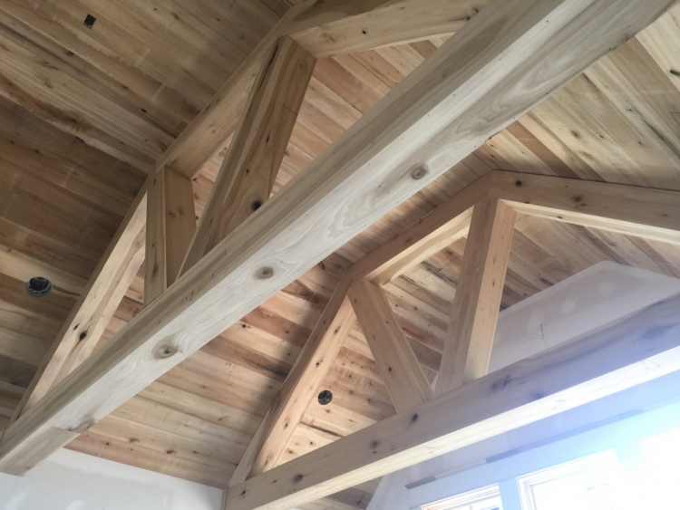
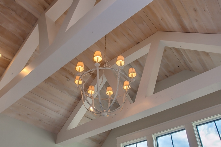
You can definitely use paint color to highlight or draw attention to any special architectural features in your home. The vaulted living room looked like this when I met the builder at the new build:
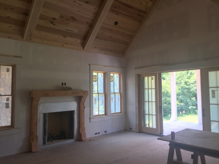 before
The reclaimed hardwood to be laid on the floors would have a lot of color variations, so color decisions for this room were about how to simply and elegantly define the architectural features without making it a contest of which one gets the most attention.
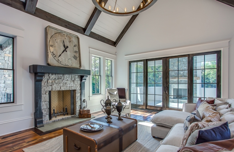
I specified a soft black color was used for the windows and mantel in paint form, while the same color was used for the beams and french doors in a stain form so that the grain can be seen. Keep in mind that any color in stain (more translucent) will read lighter than in paint (more opaque). The difference between the two create a less stark contrast with the white walls and other trim and provides a bit more depth and dimension than if it were all painted.
 paint and stain colors by The Decorologist
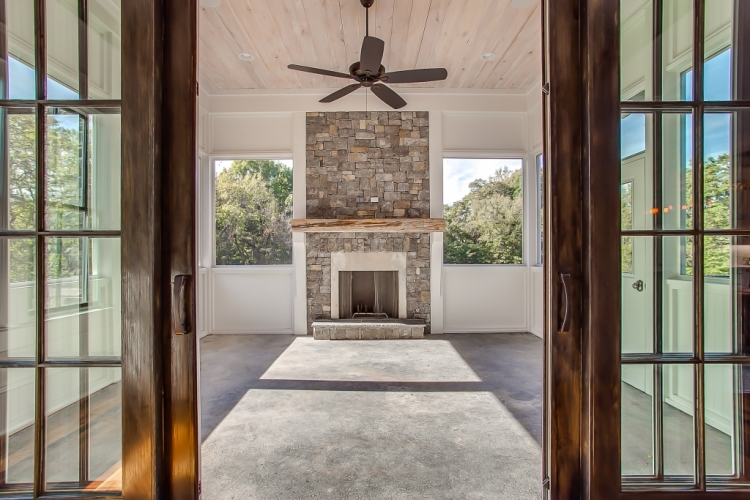
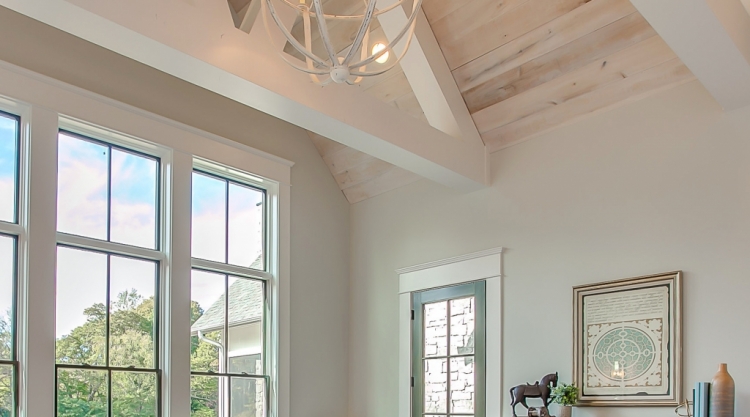
After using the darker stains inside, we opted to use a natural stain on the screened porch’s mantel and ceiling.
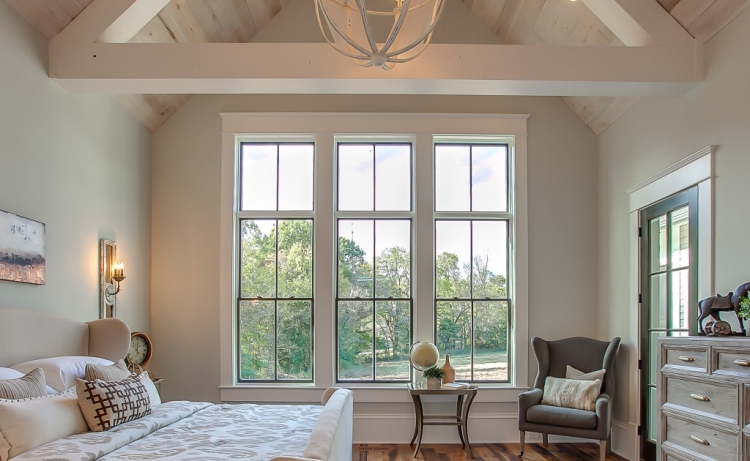
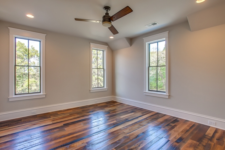
The master bedroom featured a pine-planked vaulted ceiling with very interesting ceiling beams. The question was: how many colors should be used here? Think of all the elements involved: ceiling, drywall, beams, trim, windows. That’s five elements that need to be painted and/or painted.
 before
We wanted the ceiling architecture to be the focal point of the room, but this could easily become too distracting if done the wrong way. I decided to have the ceiling itself treated with a natural stain, emphasize the geometry of the beams with the contrast of white paint, and paint the walls a light soothing color that would keep the room anchored. Here’s the result:
The trim is the same white as the beams, and the windows and door to the porch are soft black. While the architecture of the ceiling is a beautiful focal point, it doesn’t wrestle your attention away from the view beyond.
2. Balance Focal Points with Paint Color
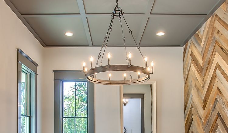
When I first visited this new home under construction, a dramatic focal point wall had already been installed in the front room, as well as a grid of ceiling molding. We could have painted out the entire room (walls, trim, and ceiling) out in the same color, but I wanted to try to balance out this heavy focal point wall in an interesting way.

I decided on a light gray for the walls and a dark, warm brown-gray for the entire ceiling and trim in the entire room. A large desk will be centered on the accent wall, facing toward the front window reception-style.
 paint specification by The Decorologist
3. Simplify Busy Finishes with Paint Color
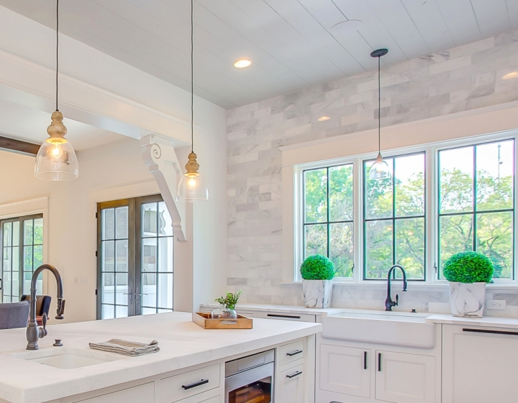
Below is what the kitchen looked like when I arrived to consult on paint color. The corbel is one of a pair of reclaimed architectural pieces which they initially planned on keeping the color what it was – a soft black. But did we really want the corbels to stand out from the rest of the trim? Marble subway tile was going to be installed on most of the walls in the kitchen, so we needed a paint color plan for the kitchen that didn’t compete with the finishes.
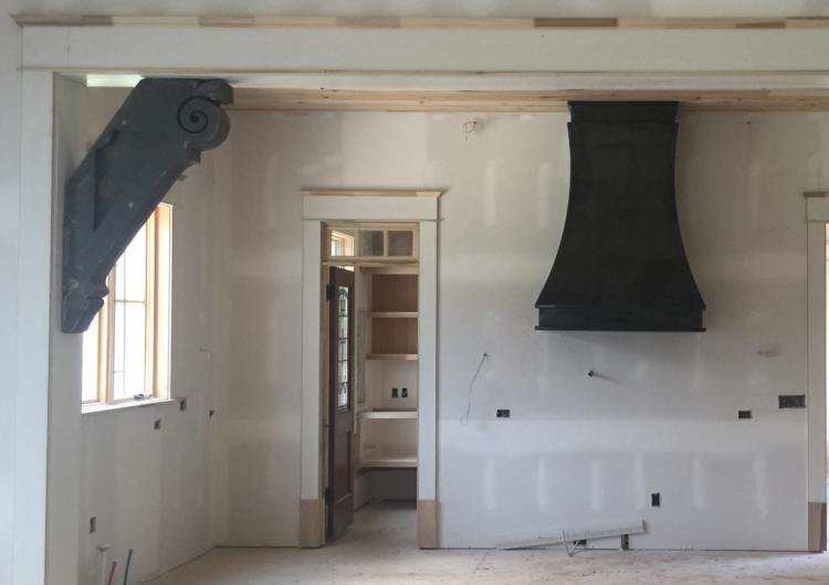
Obviously, the after shot is from a different angle (sorry). I recommended they paint the corbels, trim, and walls the same white, while adding a light gray on the planked ceiling to warm things up in the mostly white space. The black from the range hood is repeated in the window mullions and kitchen hardware, but repeating it on the corbels would have drawn too much attention to something that should appear more integral to the trim.
The tile selections for this large master bathroom were already chosen, so my job here was to choose the best paint colors so as to enhance and not detract from the tile. This is the tile I working off of:
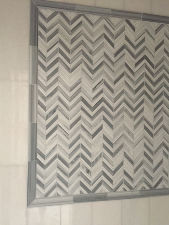
I chose a wall color that blended with the undertones of the tile, so as not to distract from the drama of the finishes. Here is the bathroom complete with paint:
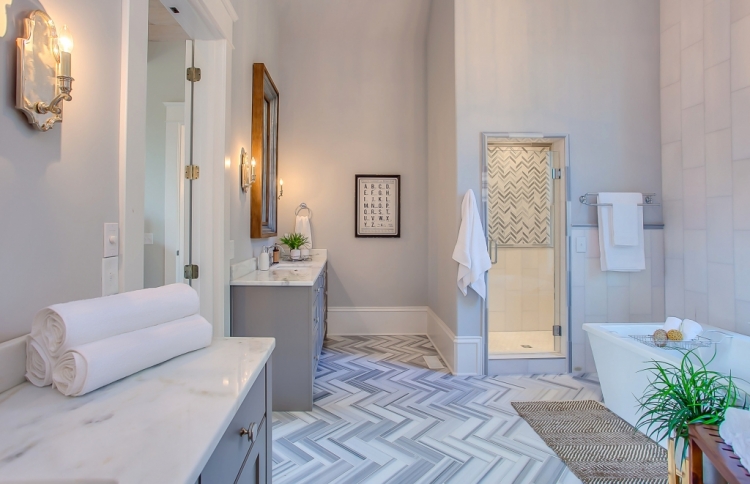
Although I prefer for the master bedroom and bath to be the same wall color, that wasn’t possible because of the elements that had already chosen for those rooms. You have to know how to work with what you’ve got!
4. Tie Your Finishes Together with Paint Colors
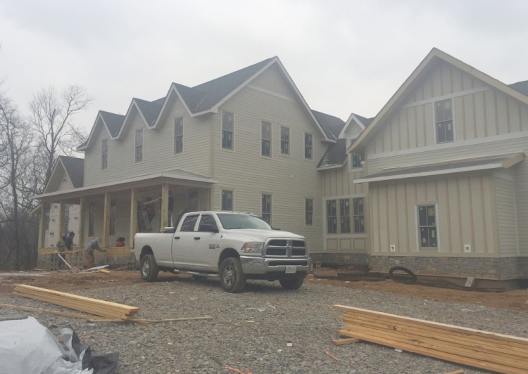
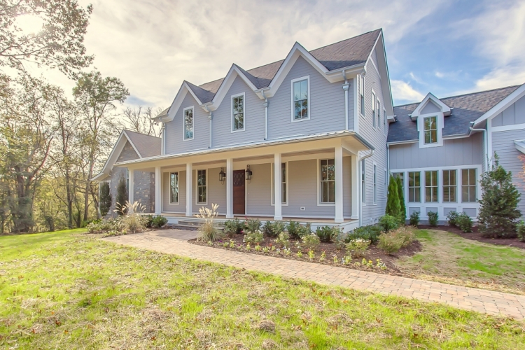
Here’s the exterior of the house during the build. The stone foundation and gray roof dictated my options for exterior color selection.
I chose a medium gray that blended well with the stone and roofing material. This was the perfect opportunity for aluminum gutters, too:
 paint colors by The Decorologist
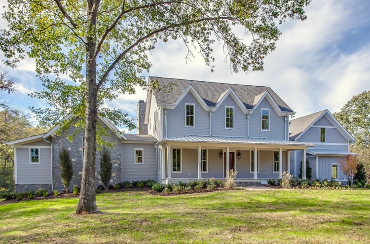
From this vantage point, you can see the stone accented area on the left side of the farmhouse. If I had specified beige or white for the siding, that stone accent area would have stuck out like sore thumb. Stone exterior features should blend and complement, not dominate, the exterior of a home.
 paint colors by The Decorologist
The builder found this amazing antique newel post that he incorporated into this new home.
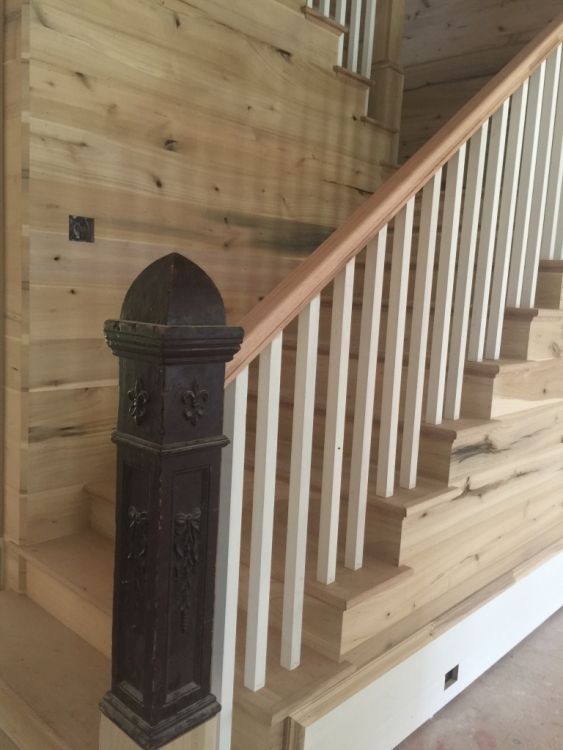
In order to integrate it with the new staircase, we needed paint to pull the old and new together in a cohesive way. I specified soft black paint in gloss for the newel post, handrail, and stair treads. The stair treads were actually a different wood than the reclaimed barn wood on the rest of the floors, so they would have appeared mismatched if they had been stained. Painting them soft black with porch/deck paint helps them tie in seamlessly.
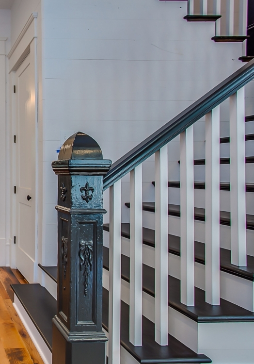
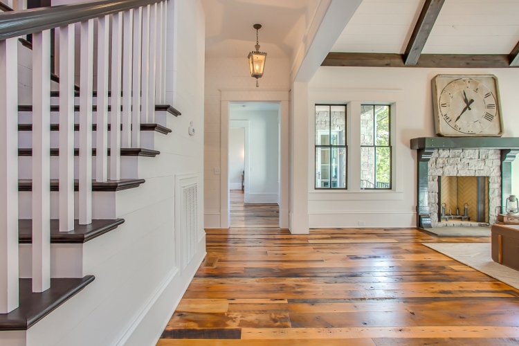
The staircase ties in nicely with the adjoining living room I showed you earlier, as it’s the same black as the windows and fireplace mantel.
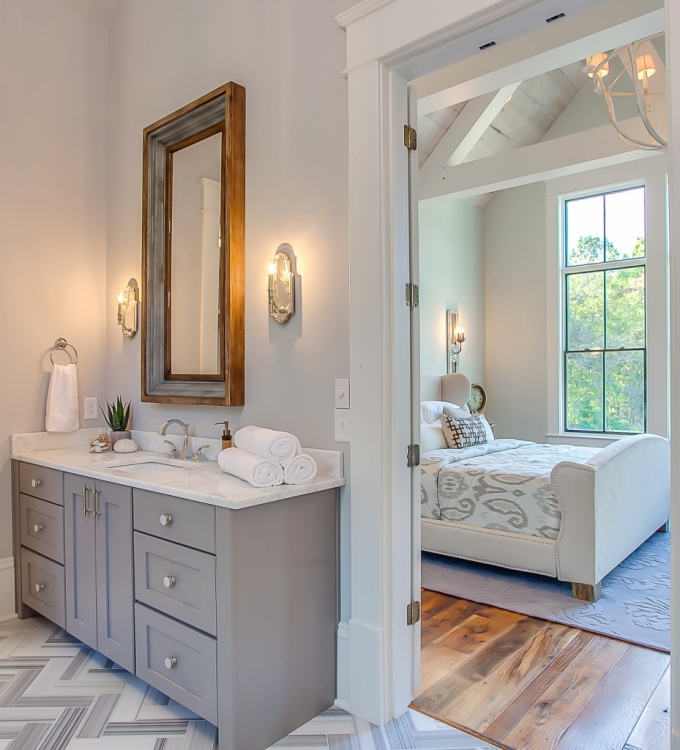
5. Connect Spaces with Paint Color
Although this wasn’t possible for the master bedroom/bath of this home, I usually tie together ensuite bedrooms/bathrooms with paint color. Here is an example in the home where I was able to keep the wall colors the same, working from the bathroom finishes first:
 Benjamin Moore Seattle Mist
Tile and countertops are always the bossiest elements in the room, so it was important to choose a paint color that worked with those first. That color was a natural for its adjoining bedroom space. Because there is no crown molding, I wrapped Seattle Mist on both the walls and ceiling:
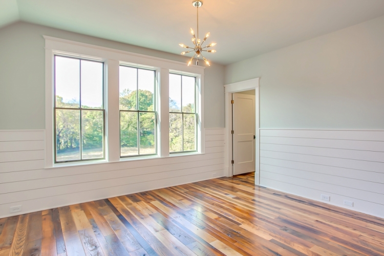
This space will be the children’s playroom in the upstairs of the home. The shiplap wainscotting was painted Sherwin-Williams Snowbound SW7004 like the trim, while the gray-blue wall color extends from the wall onto the ceiling and creates a skylike effect.
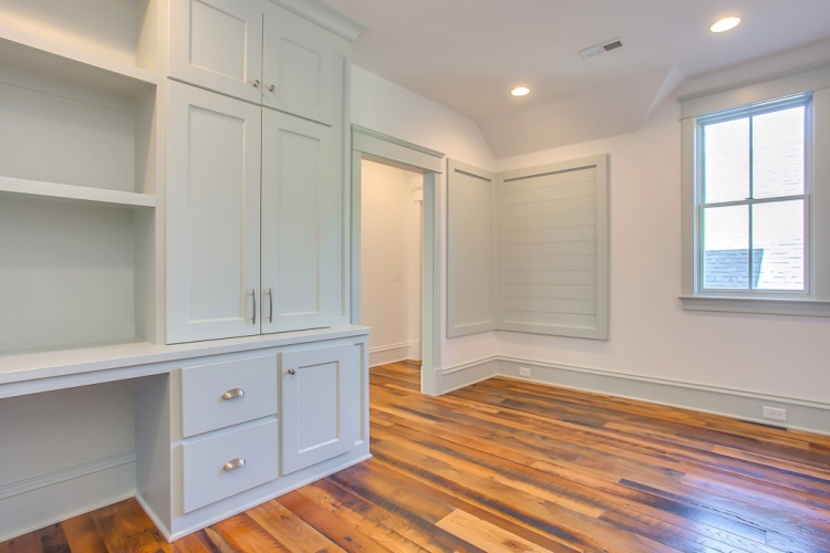
Across the hall will be the children’s art room with cabinets for art supplies, a built-in desk for doing homework, and a corner pin-up board for showcasing art and messages. The wall color from the playroom is used here on the trim and cabinetry, while the trim color from the playroom is used here on the walls and ceiling. Flipping the color placement from another nearby space is a great way to use paint to tie spaces together in an interesting way.
I hope these suggestions were helpful and made you think more about how paint color can alter more than, well, just color.
If you want to learn how to specify the perfect paint colors and create amazing interior paint color palettes for any home, find out about my professional training in the Psychological Color Expert™ certification course.
If you’d like to know the other paint colors from this home, follow me on Instagram and Pinterest, where I will be sharing those over the next week!


simply stunning!
Thank you, Elizabeth 🙂
This is just beautiful. They’re lucky to have your expertise! That staircase is an inspiration. I’ve wanted to paint mine for years. Need to get on that!
Thank you, and go for it!
It’s mind boggling to me Kristie that you could figure out how to tie together all of the paint & stain colors so beautifully while emphasizing all of the gorgeous features of the home. What you do isn’t easy, and I so admire your talent. Well done!!!
Thank you so much, Valerie. It’s definitely more work than it may seem to clients when you are going in. There are so many things to consider and address – even though much of this home is pretty “neutral,” this paint color plan ended up requiring 13 different colors. I’ve worked on a bunch of homes with this builder, and he gets it! He and his team are a joy to work with!
What a gorgeous home! The paint choices made such a huge difference.
Thank you, Stacey! I appreciate your complement 🙂
Such an amazing job, Kristie. There were so many elements going on there. It could have been a bit of a mess, with so many focal elements, You corralled them and and made them shine as a whole. The builder was smart to know he needed your help to fully realize his hopes for his house!
Thanks so much, Amy! This builder is so awesome and creative with the elements he uses. I must say I was a little worried when I learned about the reclaimed barnwood for the floors that ended up being really warm and earthy compared to the tile and other selections. Creating a friendly balance with paint colors was really important in this house, and we are all glad it worked out so lovely!
How I wish I had you for even one hour at my house…I just can’t see what to do, and when you point it out it is so obvious and so beautiful!! Do you do online consultations?
Thanks, Kerry! I actually have done hundreds of online color consults, but I’m not currently not taking on additional online or local clients. I’m booked out through spring, and just can’t schedule any further out right now. 🙁
I work as a personal finance trainer and have been sending some ladies who want to start businesses to your course. Maybe they will bring back all of your good training and I will put them to work on my house for practice. Nice for me!!
Thank you, Kerry! I’ll try to train them well for you 😉
Beautiful job Kristie – as always!
Your eye for color application is incredible.
Thank you for sharing so we can consider them for our own situations.
Any chance you can let us know the colors used on walls and ceiling in the room with the wood chevron wall?
Alysa,
Thank you! Follow me on Pinterest and Instagram – I will be sharing them there soon!
https://www.pinterest.com/thedecorologist/
https://www.instagram.com/thedecorologist/
Hello, I have scoured your instagram feed and am still looking for this gorgeous gray on the bedroom walls, care to share? Thank you <3
Home improvement is one of the important part which can include kitchen and bathroom remodeling. For home renovation flooring part is important, along that kitchen counter-tops, cabinets are important. Apart from that color part is one of the important features which can give increase the beauty of the home. In your blog the way you mentioned the five surprising points to paint color which can enhance homes features are really helpful.
Kristie, this post is so helpful! Maybe this is the place to mention that I’d love for you to do a post on paint colors that draw the eye outdoors. This use of color is one I always notice when done well.
This is my fave post I’ve seen so far! So many beautiful color combinations!
Thank you so much, Allison! It was a great house to choose a color palette for – so fun.