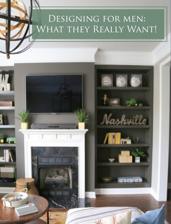
Have you ever wondered if designing for men (single men) is different than designing for women or couples? If you thought I wasn’t in touch with the masculine side of design, today you’ll see if I was able to bring it for a single professional’s townhouse. I’m here to tell you, there are 5 things that are important to men when it comes to interior design.
1) Comfort
I bet this one isn’t a surprise. Men prefer function over form, practically every time. Those oversized, puffy sofas and recliners are their natural default.
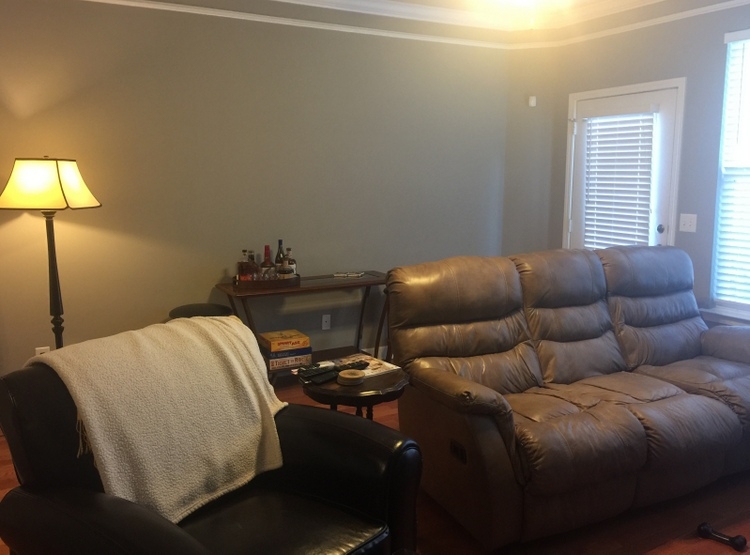 before
But there are other options that are plenty comfortable and look great, too. In order convince the man of this, he’s going to have to do some sofa surfing at a local retailer to be sure it’s comfy enough. But he may need some guidance!
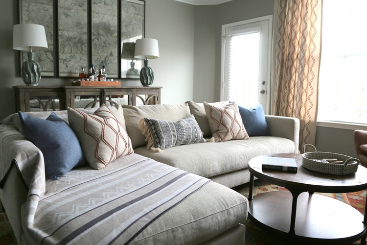 after (find similar table here)
Here are a couple of things I could recommend:
1) Look for sofa options with deep seating. Men usually have longer limbs than the ladies, so a deep sofa seat is going to feel the most comfortable to them.
2) Skip the puffy arms and add those horizontal inches to length of the actual sofa seating. An 84″ long sofa with 10″ wide arms has only 64″ of buttspace, while an 84″ long sofa with 4″ wide arms has 76.” Hey, that’s another butt’s worth of seating!
3) Provide something to put their feet up on. You don’t need a recliner to get comfy – a sectional, sofa with chaise, or a great table with a non-precious top will provide room for the fella to stretch out his legs while watching the big game (find out here the reason we chose this round one).
2) A Dose of Black
Did you know that in a recent study of color preferences, black is in men’s top 3 favorite choices? If a woman thinks every room needs a touch of black, the guys think every room needs a heavy dose! My client wasn’t interested in changing his dark paint colors, so we had to go with the flow. The bookcases aren’t black, but they are not too far from it. To counteract the darkness, we removed a few dark pieces in his bookcases and replaced them with more colorful or lighter items to create contrast.
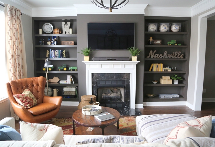 design by The Decorologist
I wanted to use most of my client’s own items because they were important to him. But bringing in some greens and yellows really helped things stand out compared to the before of this area:
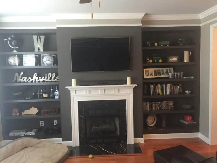 before
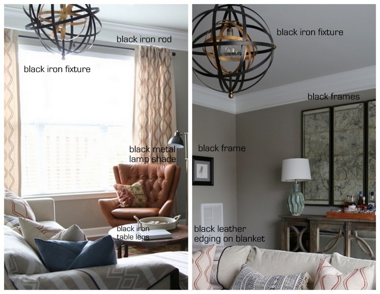
When designing for men, you can also add black in iron finishes of light fixtures, picture frames, and tabletop accessories.
3) Leather
Another big surprise, right? Men sure do love their leather. My client loved the ease of his previous leather seating, so we initially shopped for only leather sofas.
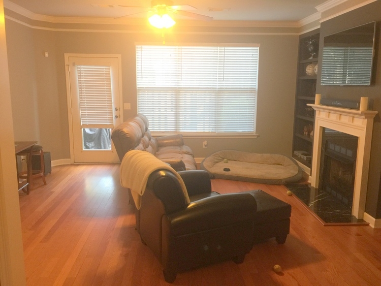 before
I did steer him towards a lovely cognac shade to add color and interest, which he liked very much. But when he saw the price difference of the leather and performance fabric version of the sofa, he changed course and opted for the fabric.
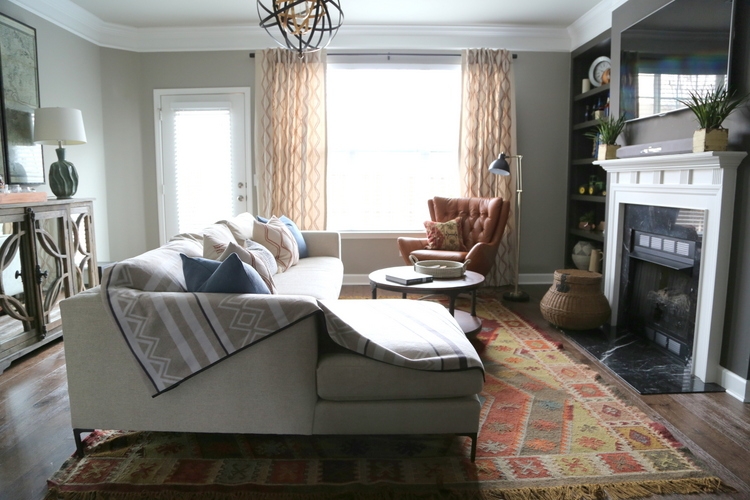 design by Kristie Barnett, The Decorologist
Since it’s a performance fabric, it’s easy to maintain and clean. I would advise you NEVER to choose an upholstery fabric for bachelors that isn’t easily cleanable.
Although he didn’t end up with a leather sofa, I made sure to find my client a fabulous cognac leather chair with a masculine mid-century look. It’s one of my favorite things in the room!
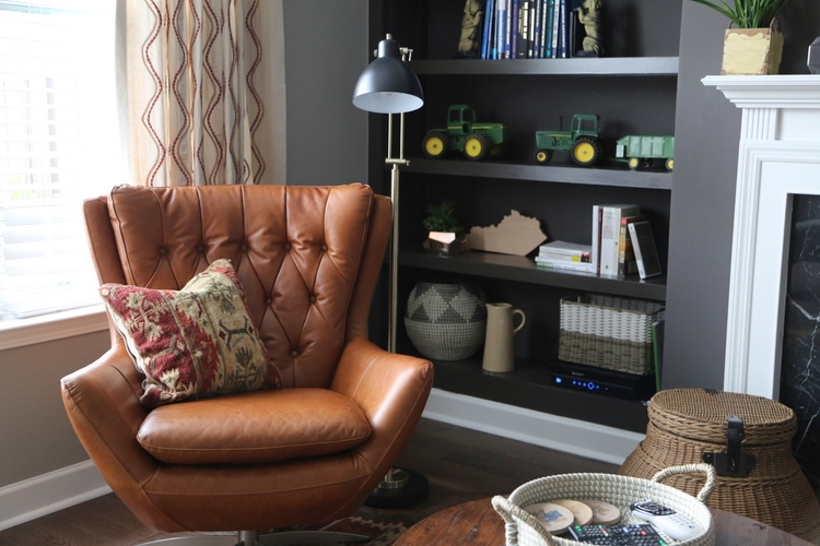
4) Texture
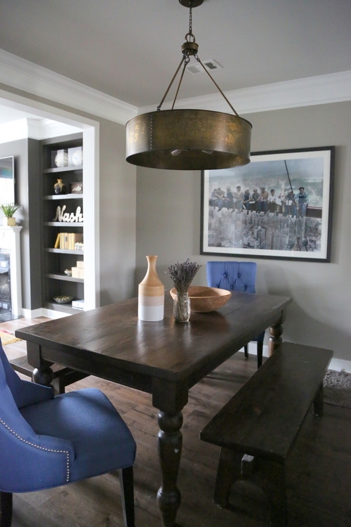
Although they may be able to articulate that they want this, I find that when designing for men they are always drawn to texture. They are big about the touching, and they tend to prefer rougher, grittier textures. We incorporated a lot of texture in this room to give it depth and warmth, such as the drapes and pillows with the corded embroidery, the recycled yarn kilim area rug, the rough-hewn coffee table top, and the hammered copper dining room fixture.
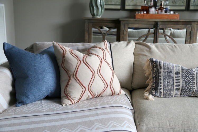
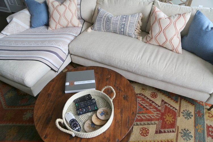 similar rug here
5) Masculine Art
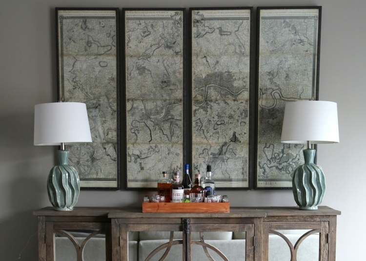
While my male client didn’t exactly know what kind of art he wanted for his townhome, he was pretty sure what he DIDN’T want. Nothing feminine, nothing botanical, nothing abstract or “weird.” When he told me he preferred black and white, I died a little inside . . . but the client gets what the client wants, so I searched for something sophisticated and interesting in black and white. When I found these large panels of a vintage map of London, I hoped he would be interested.
Guess what? London is one of his favorite destinations, so he loved this option for the living room.
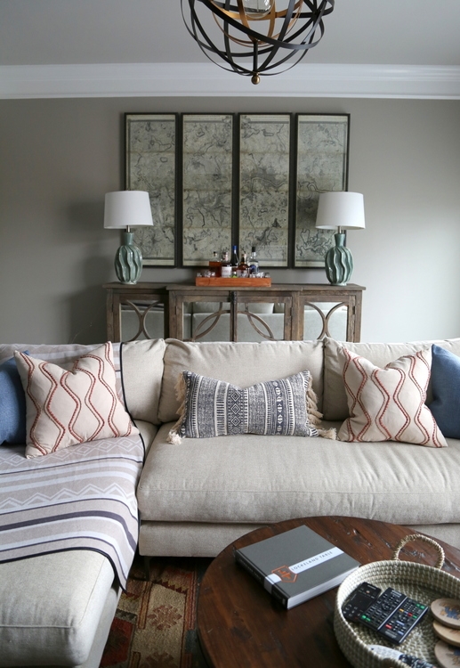
Since we did black and white here, I was hoping for some color in his monotone dining room. I soon received an email from him, telling me how he was drawn to the iconic b/w photograph of construction workers eating lunch atop a beam amongst the skyscrapers of New York. My hopes for color were almost dashed, until I found this oversized poster in a colorized version that would be perfect with the upholstered end chairs already in his dining room. I ordered the inexpensive poster and had it framed for a few hundred dollars, and we love how it turned out!
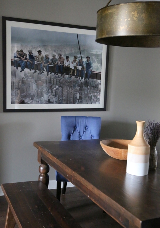 Charles C. Ebbets’ workers lunching on a beam
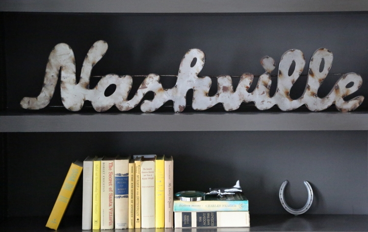
Of course, anything rugged or rusted can make for a masculine art piece, like this metal Nashville sign that my owner already had:
So, what did I leave out? What do you know about designing for men that we should know?
If you’d like to become a certified expert in choosing interior paint color and paint color palettes, find out all about my online training program here!
Note: this post contains some affiliate links in order to help you find similar items in my design.







That is one incredible transformation! Before, the space was nondescript- with the only word coming to mind being puffy. Now… it is warm, inviting, and masculine- without looking like a boy’s club. Absolutely LOVE this before/ after!!
Thanks so much, Elizabeth! This was a fun one 😉
Wow — what a great update! Love the changes. I wasn’t able to click on the link to view the similar rug option, could you repost it, or send it my way?? Thanks!!
Thanks, Jackie! I fixed the link – thank you for letting me know it wasn’t working 🙂
The room feels much cozier and more comfortable. Very inspiring design and color scheme. Thanks for sharing!
Thank you, Amy!
The most I know about decorating for men comes from having a husband and three boys, and it’s this: every man is different.
Comfort? Yes. Function over aesthetic value? Mostly. Black? Depends, but a little bit never hurts. Those basics still apply, but everything else is up in the air.
My husband’s color choices always surprise me, but I know he likes low-contrast palettes (no bright white trim against dark walls, for example). My sons all have different taste and only one seems to like everything I come up with decorating-wise…I hope this isn’t a phase he’ll outgrow, it’s nice to have someone agree with me on these things. 😉
Thank you for your perspective, Molly. As a mom of 3 boys, you certainly have a house full of guys to design around! Do you get a lot of push back from your guys? Do they want a lot of input in how you decorate your home, or do you find they don’t like change?
My sons are less likely to push back than my husband is. He likes things familiar, so too many changes at once can bother him, and some things he will just never go for. I always ask for their input, but they don’t always give it. One son never seems to know what he wants or likes until I make a change and he doesn’t like it. There is never a dull decorating moment at my house. 🙂
This is great! I’m going to forward it to a young man I am working with (I helped raise him & now he’s all grown up!). We chose Grey Owl for his main neutral, but I have to work with his Forest Green puffy sectional. Love the copper top coffee table.
Gray Owl is a great neutral for men – I didn’t get any choice in the paint color here, but it worked out great in the end. I definitely made furnishing choices based on the gray walls and dark bookcases, so that the room would be masculine without being so dark (which it was previously). Good luck with that project, Beth! 😉
Great job Kristie!!
Thank you, Aimey!
Great job Kristie!! I was glad you talked him out of keeping the recliner. I see a lot of large recliners when staging. They are so unattractive and take of a lot of space.
Yeah, that’s always an obstacle to overcome with the guys. However, there are some very attractive recliner options (Ballard Designs) now, but the floorplan here really didn’t allow for a sofa AND a chair/recliner to face the television. The chaise of the sofa is now the “recliner,” plus the leather chair that doesn’t face the tv actually swivels which is a win-win!
We have a very similar sectional that I love and my husband hates. I wish I was exaggerating. So, my question is, even if you go with deep seating, should you also be considering the back height? I’m more than happy to look at different options, but I am drawn to the same style sofas and don’t want to end up right where we are.
Courtney,
Back height is also important – was it too low for your hubby? Some of the mid-century styles look great (and appeal to guys), but can be too short for their liking. The best you can do is test, test, test – but not on your own. Both of you need to test-drive sofas together, at the same time, in order to come to the happiest compromise on this expensive of a purchase. This sofa is from Pottery Barn, by the way 😉
Beautiful job! I see my husband’s and son’s preferences. The only thing I would add is a small table at the end of the couch. My husband would have turned a trash can upside down and placed it there to plop his beer or coffee mug. He wouldn’t be interested in leaning forward to use the coffee table. To this day, your post about “The truth about men and decorating” featuring the pic of Frasier Crane’s father’s recliner is my all time favorite.
Thank you, Ronnie! And the input about the side table is well-taken! Actually, there’s a whiskey barrel inspired side table I am sending this client as a suggestion for either beside the sofa or leather chair.
Don’t leave out a space for the game consoles and controllers. You can buy extra long cables for the controllers so they don’t need to sit two feet from the television set. Much as I hate to admit it, designing around video games is extremely important for men ages 20-40.
Wow Jean, that’s not something I would have thought of! Thanks for sharing that!
Excellent all around. Love the art!
Thanks, Sharon!
What a transformation! Love all of it – super stylish and masculine at the same time. I have yet to work with a single man, but have heard so very many of them in the couples I work with repeat the same things over and over. Leather, recliner, bigger TV, don’t paint the wood, don’t paint the brick, etc. : ) Beautiful job!
Thanks so much, Ashley! There are some commonalities with the fellas, no doubt! 😉
My mother was a designer and she used to say that the husband’s were the most resistant at he beginning but the most ecstatic at the end– they fell in love with their houses once they were finished… Even if they didn’t quite understand the what’s and why’s of what my mother was doing. They loved to have guests to show off their fabulous homes. BTW, this is a great looking masculine space. The charcoal color comes off as so chic and helps the TV blend in. Men are right when they demand comfort but wrong when they don’t want to paint the wood…most especially when it’s knotty pine!
My mother was a designer and she used to say that the husband’s were the most resistant at he beginning but the most ecstatic at the end– they fell in love with their houses once they were finished… Even if they didn’t quite understand the what’s and why’s of what my mother was doing. They loved to have guests to show off their fabulous redone homes. BTW, this is a great looking masculine space. The charcoal color comes off as so chic and helps the TV blend in. Men are right when they demand comfort but wrong when they don’t want to paint the wood…most especially when it’s knotty pine!
Would love to know the paint colors even though you didn’t pick them!