Although it’s a simple and small space, this dining room is a fresh and inviting place to share an intimate meal.
Simple and Elegant Dining Room
This was not always the case! This homeowner was looking for an interior decorator to give her a new perspective on this dining space, without breaking the bank. Rather than a makeover, this room really needed a make-under. This room was like a woman who wears make-up in such a way that all you notice is the make-up. Below, a make-under highlighted and enhanced this woman’s natural beauty:
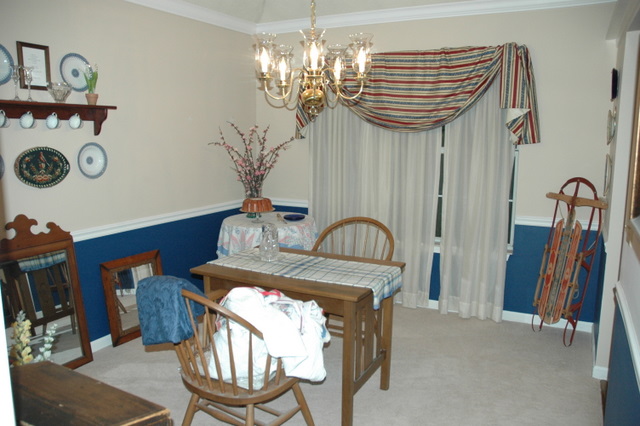
The overdone make-up in this room includes the high-contrast colors, the brassy light fixture, and the showy window treatment.
Dining Room Before Design Intervention
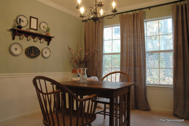
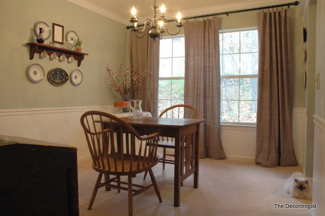
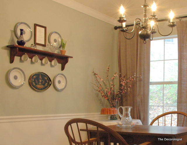
By choosing a fresh, light color for the wall (vs. the dated pinky-beige) and painting out the area below the chair rail in trim color (white), the room appears less choppy and more elegant. By choosing simple panels that hang above and outside the windows, we revealed (rather than concealed) the beautiful view and natural light. Both of these changes put the focus on the inherent beauty of the architecture of the room (moulding and windows).
Dining Room After The Decorologist
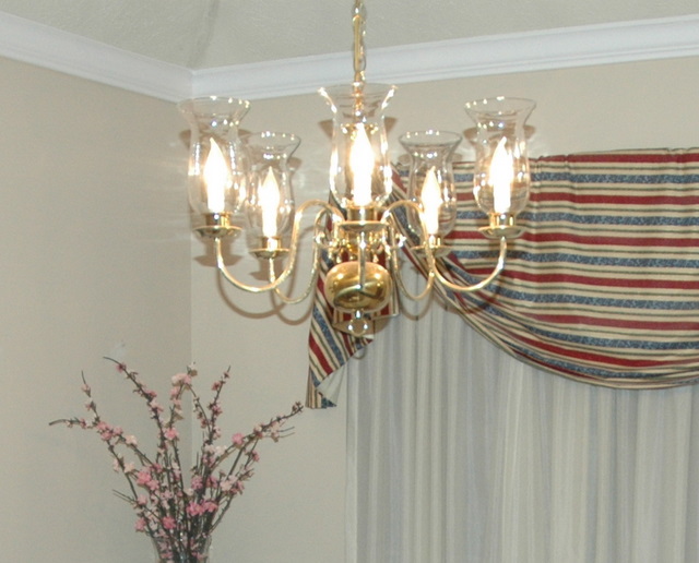
The brassy light fixture got a make-under, as well. We didn’t replace it – it’s the same light fixture, only better. Here is the rather dated brass light fixture before:
Brassy Light Fixture
I had my clients take down the brass fixture, remove the glass hurricanes, and simply spray paint it before rehanging it. Just a can of metal primer and a can of metal finish spray paint in iron or oil-rubbed bronze – less than $10 for a whole new light fixture!
Updated Light Fixture
The showy window treatments, high-contrast color scheme, and brassy light fixture were distracting – now you notice the architecture of the room, the lovely view, and the special collection of dishes my client has collected. Next time you think your room needs a make-over, perhaps you should consider a make-under instead!








Looks beautiful!
Great post~nice and simple wins every time!
Ah, a make under…indeed this is a great choice. And this room proves that you don’t have to spend a fortune for a great update to a room. Love the update to the chandy!
thank you, holly! i was happy with how it turned out 🙂
Brilliant ideas to make this room less…in order to make it more. Nothing extravagant or pricey, just simple things to show off a room to its best advantage. The lighting idea was the best way to retain what you have and improve it’s look!
PERFECT! Love the make-under! I am a huge fan of the spray paint idea! Genius.
What a great message to put out there, Kristie! A make-under is so often overlooked… and I love the way you brought the DIY in with the chandelier. It’s amazing what a can of spray paint can do! And I also really like that you had the hurricanes removed. Perfect.
here’s an email sent by Dee:
“Thanks for the “less is more” tip with an excellent visual example.
Also, I appreciate the suggestions regarding the light fixture.
We have been contemplating that project for some time but didn’t know anyone who had actually done it or how to do it. I assume you can find the metal primer and the bronze paint spray at Home Depot or Lowes?
Our light fixtures are considerably larger than the one featured. We have one in the dining room and one in the foyer, which will require an electrician to take down. But, I think it will be worth it to get rid of the dated brass look.”
Dee,
Yes – just metal primer and spray paint from any big box store will work. Even if you have to hire an electrician, it’s less expensive than a new light fixture – let us know how it turns out!
this was sent to me via email:
“Very nice job, less is more when it’s done tastefully. You are a rock star (without all the bling)!”
-Kathy
I like it Kristie! Great job… XoXo
Wow, it actually looks like you added an extra window to the room. It looks so much better!
Wow, this is one of those projects where I can hardly believe it’s the same room! The changes are so simple, but so wisely made. Another great job!
Warmly, Michelle
FABULOUS JOB!!!!!!!!