Last year, I hired Allison to help manage my growing business and to keep me from losing my mind. I had become overwhelmed with the amount of email I had to swim through every day, and with the scheduling and invoicing that were sucking the joy out of my life.
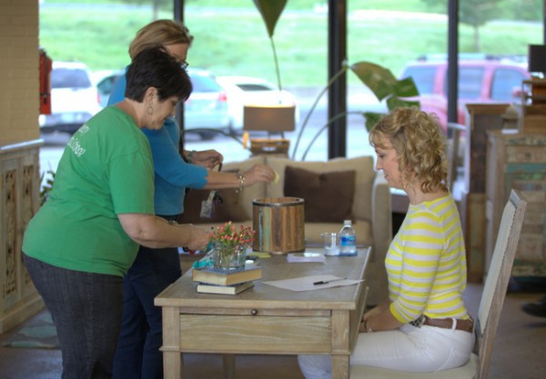
Allison welcoming attendees at my Furniture Arranging Workshop at Merridian
Allison has lived in her current home with her family for about a decade. When she told me she wanted a change in her family’s home, I knew that new paint colors could help her gain a fresh outlook on her space. Here are a few “befores” of the living area that opens into the kitchen:
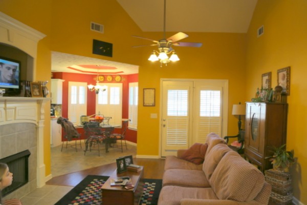 gold and red color scheme before – oh look, there’s Peeta!
We spent a day analyzing the architecture, deciding what could be changed or replaced within her budget, choosing a new and cohesive paint palette, and picking out a few new pieces of furniture.
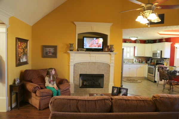
pink undertones in the fireplace tile, yellow undertones in the kitchen floor
Every home has its challenges, and Allison’s included the following:
1) heavily textured ceilings – You shouldn’t paint those, or should you?
2) odd angles – How might you downplay those?
3) melamine cabinets – Can you alter those in any way?
4) fireplace tile that clash with the nearby kitchen floor tile – Do you have to rip out one or the other?
Oh, and did I mention? There’s a pesky little thing we like to call a budget. Sure, anybody can rip out fireplace tile, flooring, cabinetry, etc. and just replace them with upgrades – provided they have a limitless budget!
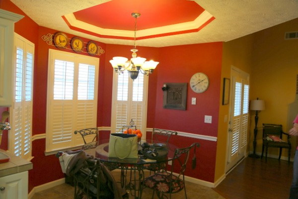
kitchen before
Well, I certainly have a plan as to how to address these challenges, and Allison and I will share them here as we go along. Today, I can show you how we reconciled the fireplace tile issue. Here’s the fireplace before:
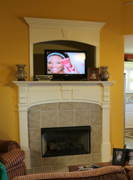
see ya later, bossy tile!
The tile is still there, of course, it has just been painted out like the rest of the fireplace and no longer clashes with the nearby kitchen floor. And I suppose you see a peek at the new wall color, too, in this picture Allison snapped with her phone:
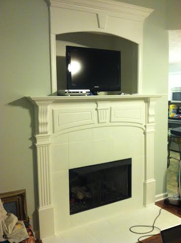
fireplace after
Stay tuned as Allison moves forward with our plans. The new color palette includes a backdrop of gray-blue with yellow and red accents, so that she can still use some of her accessories. While the former color scheme and placement made the space appear smaller and accentuated the odd angles, the new one will visually expand the space and de-emphasize the odd angles. Here are a few of the furniture pieces I chose for Allison’s “new” living room:
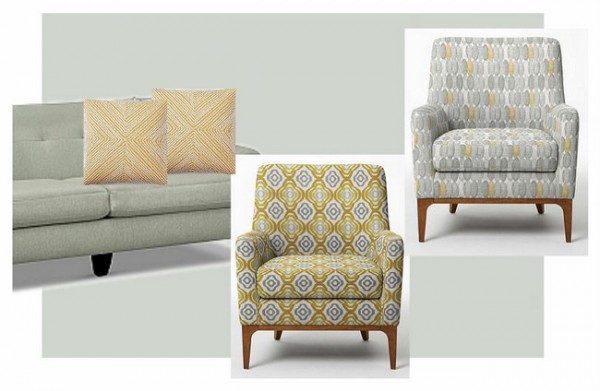
living room mood board
I think a pair of either of these chairs will bring in a bit of yellow for her, but in a more current way than the former gold walls did. Which one do you like best?










The fireplace looks outstanding now! Never would’ve thought of painting it. Great job. I would pick the chair on the far right (I agree with Beth though that it depends on the feeling she’s trying to achieve.)
The one on the top right would make me happier because the pattern is less bold, but I’m more of a traditional girl. What matters most is what Allison likes, and maybe also her rug pattern, if any.
It looks like maybe Allison has the same problem in her living room that I do: a narrower room with the fireplace on the long wall. I can’t wait to see what you do with it!
Judy
I prefer the top one because its more subtle and you can always bring that yellow in with fabulous pillows. What an interesting project. Can’t wait to see what else you will be doing. The fireplace looks stunning!
The forward one is more “fun,” while the other is more subtle, so it really depends on the feeling she is seeking to achieve!
Agree on the color change and painting the tiles. For a minimal cost I would remove niche a co the fireplace and just hang TV on wall. Just too much going on there.
I like the more subtle coloured one at the back, but whichever you use I am sure will be stunning!
I wish I lived on your side of the pond so I could utilise your services. The current R to $ exchange rate even makes your E-design service too expensive.
Be that as it may I get heaps of tips and advice from your blog!!
I am glad you found each other! I am sure you both will compliment each other perfectly.
The one in the foreground — great pattern, and a nice subtle yellow-gold.
Hi there: I agree with Lindy. I would definitely remove the niche above the fireplace. It just looks like a big hole and I think if it was flat it would be more attractive. Although both fabrics are beautiful on the chairs my favourite is the yellow and blue or purple chair. I can hardly wait to see the rest of the renovations. Good luck.
I just posted today about wanting to paint my fireplace tile. Looks so much better in Allison’s home with it all fresh and white! Love the more gray chair but it might not pop against her newly painted walls as much as the more yellow chair. Although the grayer chair is more neutral so can go with more? They are both lovely so I am sure whatever she picks will look great in there!
Your post today is great, Ange! Love all the photos showing what you could choose to do 🙂
It is just amazing the power of paint! I have a similar situation with marble around my fireplace that has a hint of pinky beige to it. My kitchen is open to it and I want to change the countertop and go with something in the grey family but can’t afford to change the fireplace tile. Should I pant it grey or white? I have all white molding and bookshelves on each side of the fireplace so it may need some color? What kind of paint did you use? Can’t wait to see the end results!
Barbara,
If you use a gray (which could be great), make sure it ties in with other gray in the space. You don’t want it to be the only gray thing in the room – but if you do a gray countertop, you could tie it into that.
Thanks everyone for your thoughts. It has been such a fun experience and I can’t wait to see how it all turns out. Still have a lot to do but so far it is all coming together exactly how I hoped. But that is not surprising since I am doing exactly what Kristie suggested. She is the best as I’m sure you all agree! Can’t wait until we can reveal the whole house!!!
While I was reading, I thought to myself, “It’s too bad you can’t just paint those tiles in the fireplace,” … little did I know that you can indeed paint those tiles!! What kind of paint do you use?
It looks fabulous!!! Great job!
Karen,
I will be sharing in an upcoming post exactly what to use if someone wants to paint their own tile. And you might be surprised what else we decide to paint!
Looks great. You are both fortunate to have found one another. Love the wall color and can’t wait to see what else you do.
Looks great!! Can’t wait to see the rest of it!
Oh darn it ! You are going to hold us in suspense to see the finished rooms….I can barely stand the anticipation 😉 I know it will be beautiful and Allison will certainly love the new soothing colors. So glad you have found the help you need Kristie, so that you will be able to do all that you do and still find time for your family. Hugs to you Kristie and Allison !
Thank you so much, Mary! I promise we’ll show you all of it in detail 🙂
UUU..i’m so excited about this. I love makeover projects, cannot wait for the final result.
Kristie & Allison,
This difference is amazing… so fresh! It gives you a whole new outlook in a space you’ve been living in for a long time. Really fabulous inspiration. And I second the “glad you found each other comment,” ; looks like this partnership will bring good for both of you (…and all of us by extension).
The middle chair is GORGEOUS.