When people hire me to do a paint color consultation for their home, they are typically looking for very different colors than what they currently have. Occasionally, I encounter a space with fixed elements that demand a certain color, but the room is painted a wrong version of that color.
Some people (including me) are more sensitive to subtle color differences than most – so I’m not sure how many of you will pick up on the difference here. But here we go. Here is the email I got from my client last week:
“It has been so long that you probably don’t even remember me – maybe the long drive out here, though. Your suggestion of painting my den (a different version of green) changed how I felt about my house. I felt paralyzed at first because of the ugly tile and the green tiled fireplace. Now, I LOVE IT!!!! . . . I did have to compromise on the puffy couch for my husband but I got the patterned chairs that I really wanted . . . This email was sent to brag on you and how much you have inspired me in your visit and your blog. Thanks again. -D”
Actually, the previous paint color wasn’t bad at all. But it didn’t create the effect the client wanted in the room. The sage and hunter green colors looked like they had been done in the early 1990s, but removing the dated floor and fireplace tiles was not an affordable option. The main issue here was that the homeowner really disliked the whole vibe of this space because the color wasn’t “just right.”
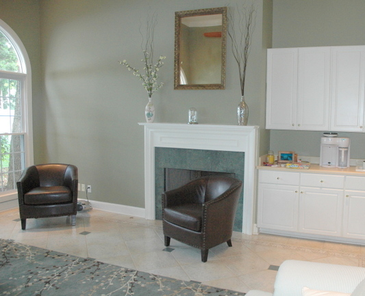
green living room before
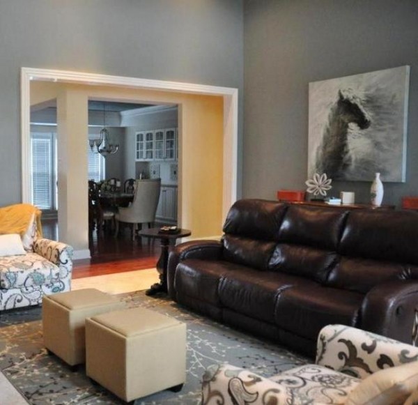
So I found what I believed would be a better option. I must tell you, I don’t think my client was into it to begin with. But as you read above, she went with my recommendation and then she got it. Ok, now really pay attention to the way the new wall color makes the fireplace surround read. So much better, right? This darker gray with both green and blue undertones looks much more sophisticated and makes that surround and the tile floor look amazing. And the new curtains and chairs tie in beautifully.
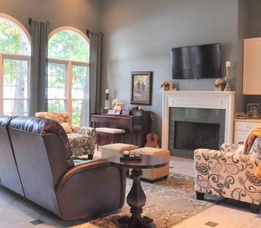
better green paint color
This is a “before” from the other side of the room:
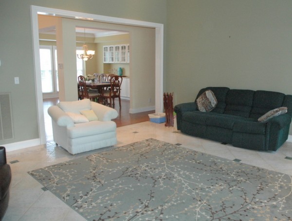
living room before
Let’s take a look at the room with the updated wall color:
living room after
Can you tell what a difference a subtle change in color, even when it’s in the same color family, can make? I really think that many paint color mistakes are just a bit “off,” which can make all the difference in the look and feel of the whole space.
If you want to learn how to choose the right paint colors for your home, check out my Color Workshop Video here.


I agree whole-heartedly with this notion. I painted our bathroom orange. I usually go with my gut, but I actually spent too much time pondering the different color versions and ended up with the wrong color and sheen. I’m living with it, but I really want to repaint the orange another version of orange. I don’t have the heart to tell my husband, as I am sure he will not understand, or ‘see’ the difference. Thanks for the reminder that my gut just may be correct this time. 😀
Christine,
Thank you for your comment – I was concerned when I wrote this post that many people wouldn’t get it. I realize that many people can’t tell the difference and think it’s a waste of time to make such a small change. And maybe for those people, it doesn’t matter. But I have worked with so many people that really are VERY SENSITIVE to colors and to their visual surroundings in general. To those people, it makes a world of difference. Good luck on your bathroom!
I didn’t mind the before color but the after is much much nicer and more sophisticated. The difference is not so subtle in my opinion; the new color seems much grayer and darker. Very nice room!
Thank you for this post! I fall into the VERY SENSITIVE category and had no idea that everyone wasn’t the same. For me, the before and after pictures evoke a completely different feel, love the color change you made.
It’s all in the little details. It’s amazing how a slight change can make such a HUGE difference. It can be green but has to be the right green and with millions to choose from, how do clients know how to pick “the one”. Good thing they have you!
Thank you for this post, now I know I’m not alone. I just repainted my dining room a slightly grayer color than it was before. It looks amazing and it really compliments our 1930s mahogany buffet. But I have to say that I just went and did it. My husband didn’t understand and claimed that he wouldn’t have even known I had painted if I wasn’t still painting when he came home. But, over the last couple of weeks he’s come around and says that it is more sophisticated, although he’s still not sure it was worth the effort. But, since it bugged me and I’m the painter around here, I have to say that it makes me so happy and was totally worth it.
How did you choose this color? Do you know these colors very well by name? Or did you hold the paint chip up to a particular element in the chairs, or in the tiles? The grey color you chose looks fantastic. Thanks!
Suzy,
Drawing from my training and experience with paint colors, I listen to what my client describes they want the space to look and feel, then choose a range of color options that I believe may work with the existing elements in the room. In this case, we needed to look at the fireplace tile, floor tile, and rug. The chairs weren’t yet purchased when we chose the paint color. We test multiple colors with large samples until we find the one that’s *just right*
I like it so much that I want to know the name of that color! I think that even if someone can’t “tell the
difference”, their sub-conscious probably can.
I completely “get” it. To me, the required change in the undertones and the depth of the paint color was very obvious and makes all the difference here. :). It’s beautiful and harmonious now. I must be super-sensitive to colors as well, just never thought of it quite that way. I just thought of it as picky! lol. I’ve had people joke about my obsession with getting the color just so, but I know what I see and I have learned to trust it. The proof that the obsession is worth it? People often comment on how the rooms in my home just feel “right”, and they often seek out my opinion when choosing color, which is easy and fun for me. But following your blog is truly enjoyable for me because I get to go beyond the kinda obvious (for me) methods of choosing the right color and take it to the next level; which is learning more about where and why to put color in certain places. So thanks for being willing to write about things you’re not sure whether we will get or not – it gives us the opportunity to be stretched and learn something new. 🙂
Thank you so much, Lex. That is really encouraging to me. I had my daughter read the post last night before it went live to see what she thought. She said, “Mom, there is really not much difference. I don’t think you should use this.” Of course, she’s only 13, but I really hesitated posting this. It really is amazing how many of us are really affected by color (some of us more obsessively than others). I have one client who hates green. She perceives even the smallest drop of green in any color – she’s like the princess and the pea, but with color!
Hehehe – princess and the pea, great analogy.
I see a big difference Kristie! Much warmer and inviting than the previous paint color. Great job as always!
This must be what has happened to me! I just took all the popcorn off my house and am now painting the rooms. I painted my den SW wool skein and now tonight it looks mint green in the night light. I don’t know what to do now? It looks beige in the daylight, I am tired!
How do I contact you, could I send you a picture and you help me make a color choice? How much do you charge?
Thanks for your interest! For more information, contact my assistant at [email protected].
I can’t believe how much better the fireplace looks with the new paint color. Amazing.
I know exactly what you mean. I just wish i could choose colours as you do. I loved some of the photos on your blog so much that I chose soft yellow and blue for our house but somehow it just doesn’t quite work. The blue is off by a smidgen and makes my dining room look like a nursery.
Choosing between 50 shades of green can be overwhelming for some people. Great example of how making a subtle change can be as powerful as a more dramatic one.
I see it! I see it! It has taken me a long time to train my eye but I see it and I notice it all the time now when going into different homes. One of the biggest personal lessons for me was our kitchen in our previous home. It was ORANGE and I mean orange and that orange matched the floors (horribly!) we had beautiful new cabinets and stainless appliances but the orange on the walls was not doing anything for the space. We updated to BM Wythe Blue and the difference was incredible. It was so complimentary to the floor, the cabinets, and the lighting that the kitchen received. The slightest difference in this room here is equally incredible and shows what a tweak can do.
Would you mind sharing the new color? It’s gorgeous!