I’ve been specifying paint colors for about fifteen years, and I’ve found there are a few specific colors that are the most difficult paint colors to choose. Why would some colors be easier/harder than others? The answer is complicated, but the truth is that four stand out from the rest.

YELLOW
Yellow is notoriously difficult to “get right,” which is probably why many people dislike it as a wall color option. It was quite popular a few decades ago, but with
SO MANY YELLOWS GONE WRONG,
the general populace seems to have rejected yellows as of late. I rarely have a client who requests a yellow hue, but I use it in my own home to lovely effect. I have heard many men say they believe yellow to be a feminine color, but I’m not quite sure where that line of thinking comes from! Yellow is the one color that can add the impression of light to a dark room, which is why I like to use it in basements with minimal natural lighting.
Testing on large (12″X12″) Small Wall® paint sample boards is absolutely imperative for testing difficult paint colors.
Yellows can go neon, lemon, or even muddy if you choose the wrong one for a given space. Since light greatly affects the perception of color, you need to be able to move a large sample of it around the room to different walls. Small Wall® provides accurate color representation of paint colors as they will appear on a primed wall because it is a closed-cell, non-porous surface (unlike poster board or foam core). Just purchase small samples of the paint colors you want to test and paint up two good coats on the sample boards.

Yellow can be the RIGHT paint color for your space, but only if you choose the correct one with proper testing. Strong yellows are a great contrast next to red or orange wood stains, and warm, buttery yellows can be a great choice in historic color palettes.
 my dining room – wall color is Benjamin Moore Philadelphia Cream
PINK
Blush pink has been trending for a few years now, but it is one of the most difficult paint colors to get right. It always goes pinker than you expect (or intend) if you judging from a paint fan deck or small paper samples.
Trust me on this – choose a pink that is LESS pink than you want it to be, because it will go pinker once it’s painted on the entire wall. To avoid bubble gum or Pepto-Bismol pink, choose one that leans slightly more orange rather than violet.
The best blushes and pinks are those that are tones, meaning gray has been added to the hue. This protects against your room looking like a 6-year-old child chose the wall color. I know that many don’t agree with me, but you aren’t doing your kid a favor by letting them pick their own paint colors. They don’t know what they don’t know, and what they don’t know is that the saturated hue they think looks pretty in a fan deck is going to induce headaches for anyone spending more than three minutes in their room!
You’re actually being a good parent if you give them a better version of the color they think they want. I’m telling you, MUTE THAT PINK WAY DOWN.
 room design and art by Gina Julian, color design by The Decorologist
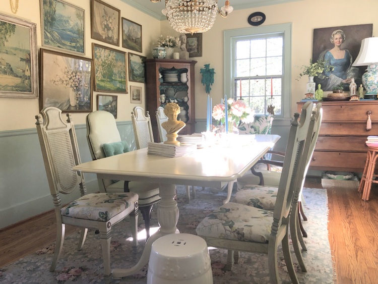
If you look in the Sherwin-Williams fan deck at the wall color in the above photo, you will be
SHOCKED
to see that it is Malted Milk SW 6057. This color looks muddy and nearly beige on a small sample compared to other versions of pink, but transforms when applied on the walls of this room in the House for Hope Showhouse:
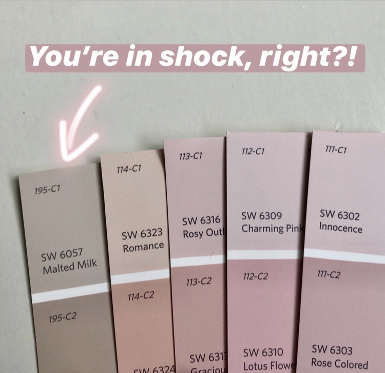
I took the photo above in natural daylight, in front of a window. If this isn’t proof that color is relative, I don’t know what is. THIS is why pink is so difficult to choose! I know you are having a hard time believing me at this point, but look in a Sherwin-Williams fan deck and see for yourself. More examples of where I’ve specified Malted Milk here and here.
RED
Let’s be honest about red. No one has asked me to help them choose an interior red for years now. And I don’t think I’ll be specifying any for a while to come. But I definitely pick a lot of red door colors. A good red exterior door is a classic that never goes out of style. When choosing a red, pay careful attention to the undertone. It could be violet or orange. Most people I encounter want a good barn red shade, which means black has been added.
By the way, don’t be fooled by the name of the paint color.
Just because it’s called “barn red,” doesn’t mean it’s going to actually be a barn red. Don’t rely on the name a person in Sherwin-Williams’ marketing department chose – test it on large Small Wall® sample boards.
 London front door photographed by The Decorologist
WHITE
White is notoriously one of the most difficult paint colors to choose on both interiors and exteriors. Why? Well, white can harbor a number of different undertones and it is extremely affected by lighting and surrounding colors.
The other issue for white is that changing its finish can change its appearance a good deal.
So that white in semi-gloss finish on the trim? It may look more yellow on the wall in an eggshell finish. That being said, I’ve learned which specific whites typically work best for most situations. This has enabled me to narrow down the choices a great deal.
 The Decorologist
Don’t let this post scare you! Even the most difficult paint colors shouldn’t be shied away from if they’re your heart’s desire. While it is an extra step in the paint-choosing process, it is well worth the time and effort to paint up larger samples on Small Wall® so that you choose the RIGHT version of your favorite color. They are available in packages of two at your local Sherwin-Williams store.
If you want to become an expert in all things paint colors, find out more about our ONLINE paint color certification course! Included in the course is my NEW Perfect Paint Palette™, complete with instructions and painted 12×12 Small Wall® sample boards of the core Sherwin-Williams paint colors in my system:
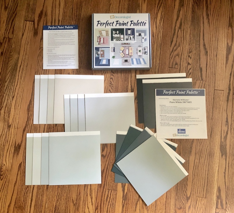 Perfect Paint Palette™ for the Psychological Color Expert™ training course
I will teach you EVERYTHING you need to know so that you never make another mistake in paint colors again – I promise! Find out more here:

Disclosure: I am proud to be the Brand Ambassador for SmallWall®, and they compensate me by providing me the best paint sample boards on the market. Lucky me!


Great post! So much helpful information!!
Glad you liked, Jenny! Happy New Year!
Do you have a favorite white? I find that the undertones of white turn yellow or even blue on the wall.
There is no one white that works in all situations, unfortunately. But this post might help! https://thedecorologist.com/best-white-paint-color/
I’ve found yellows to be difficult, specifically finding a nice soft butter yellow. It’s difficult to find one that doesn’t end up looking too pale. Tried to avoid that once and went darker only to end up with a mustard color that I didn’t care for (my mom loved it though, and it was her house, so it worked out okay).
Try Benjamin Moore golden lab .
Thank you, Helen.
I’m shocked about that pink!
I know, right???
We just had our house painted Malted Milk today without realizing….HOA came asking why we changed colors…this turned out way too pinkish than paper.
I’m sure it did! I’m so sorry. If you could share a photo or two with me, that could really help other people who may make that mistake. Please send photos to [email protected]
omg i love you lol, i want to paint my livingroom in a pale pink and it was really driving me crazy about all the colours options x_x thank you, greetings from argentina!