Happy Monday, dear readers! Have I got a fun room makeover for you . . .
Kristie Barnett
Suppose you lived in a home that looked about the same as it had for the last 50 or more years? Same paint color (or lack thereof), same finishes, same old groove.
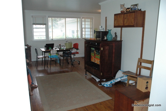
Before Makeover
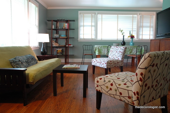
This mid-century ranch needed to find a new groove. It was kinda like a Sleeping Beauty, just waiting for The Decorologist to pucker up and . . . well, you get my drift. Anyway, for very little money this space finally looks (and feels) like it belongs to the current homeowners.
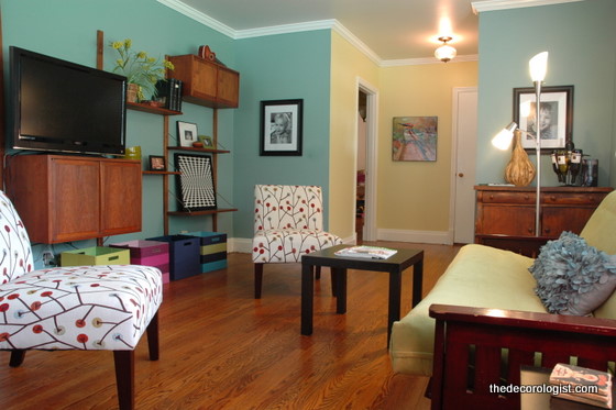
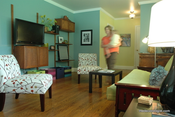
Living Room After
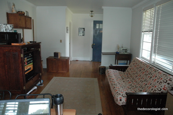
You see, one of the current homeowners (the husband) actually grew up in this home. And after all those years, he had a hard time seeing it any other way. His wife and young kiddos are living here now, but they didn’t yet feel like it was THEIR OWN. This home felt like a hodge-podge of his father’s old things and the apartment furnishings from the couple’s single days.
Living Room Before
The wife decided it was time to add some color, try something different. And she knew that “admitting you need help is the first step . . . ”
Kristie Barnett
We did a lot of shifting around furniture and brainstorming about better storage solutions. You can live with what you need without sacrificing beauty. And you can live with what you love without sacrificing function.
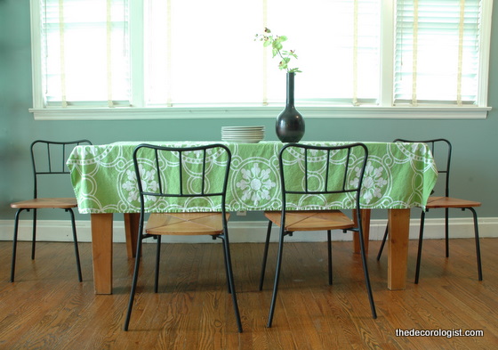
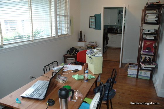
Dining Area Before
We moved out the smaller, shorter table in favor of this larger one that was just sitting under the carport collecting spiderwebs.
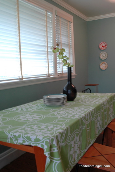 Kristie Barnett
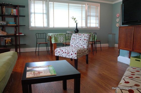
Now, THIS is a groove you can dance to . . .
Kristie Barnett
This room is finally living up to it’s potential as a fun, contemporary living space for a lively young family. We incorporated some bargain finds into the decor – the futon slipcover and LACK side tables are from IKEA (check out my post devoted to those awesome little tables by clicking here).
Kristie Barnett
The slipper chairs are from Target.com.
Target’s Avington Slipper Chair
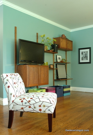
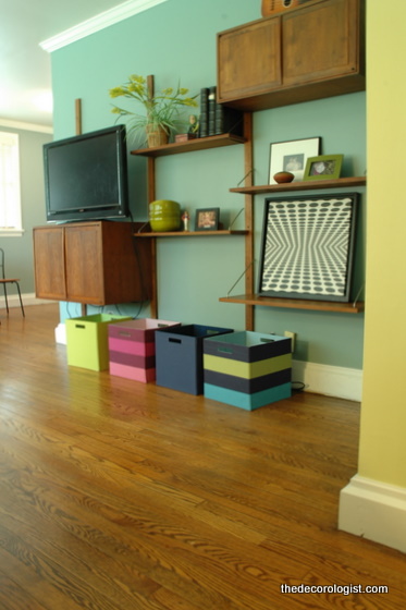
This awesome shelving system was made by the father that previously lived in the home. The couple had been using a few pieces of it along with a large tv cabinet. We moved out the bulky cabinet and reassembled the mid-century marvel, creating a better home for their tv and a great area for display and storage.
Kristie Barnett
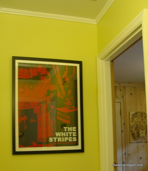
Now the home is as cool as the family who lives there. How do I know they’re cool? Well . . .
I’d say their White Stripes obsession is a dead give-away.
Contact [email protected] for a make-over of your least favorite room. I can help you change its groove!








Love the changes and color! Such inexpensive ways to make such a big impact! Brilliant again.
GREAT POST!
Beautiful job! Great transformation! I’m sure the homeowners are ecstatic. What is the blueish/green paint color you used?
patsy, that’s bm’s del mar blue
patsy, it’s del mar blue 🙂
Viva la White Stripes…and great decorating, of course!
wonderful changes, Kristie!
Love it! Gotta get me some Del Mar Blue! Great job again, KB.
thank you, dear – the question is, which room???
totally amazing transformation! Before it was so drab and depressing and afterwards it is just so bright and inviting! NICE JOB!
thank you, ashley! it needed a shot of color, didn’t it?
Love the Tiffany blue paint!
another great make over!
Holy cow! This doesn’t even look like the same house. You’ve got talent oozing out of your ears, Girl!
Warmly, MIchelle
awww, thanks michelle! you are too kind 🙂
What a fab transformation Kristie! And you were definitely working with the deadly emotional attachment enemy on this one. Hurray for you – what a difference. I bet the wife’s smile is as bright as the white on The White Stripes print! Awesome 🙂
Great makeover….from bits to best! I particularly like the slipper chairs, the midcentury modules on the wall and the green tablecloth..and the way you pulled it all together. Very cool!
“bits to best” – love that, carol! sounds so aussie!!!
Lovey transformation! Love the TV unit and the dinning chairs!
Wow you did another amazing job! Thank you fro sharing this room! I love the kitchen table and those chairs are awesome.
thank you so much, jacqueline!
KB, once again, you just knocked it out of the park! I have been in this home many times, the homeowners are some of our dearest friends, and I *honestly* did not recognize it from the photos! Can you believe that??? Just goes to show you the power of the transformation! Amazing job.
I love how you didn’t make them buy a bunch of expensive new furniture but reworked their existing stuff. I also love that it has an even more mid-century vibe than before.
i ALWAYS try to work with what’s already there and figure out what the client really cares about – no one really wants a home that looks/feels like somebody else!
Hi 🙂
Just a newbie to your blog; am LOVING all your work! You did such a great job on this room. Lots of inspiration here!
Lusi x
thank you, lusi! happy to meet cha 🙂
Kristie, you did a beautiful job, not only with the colors, but also with the staging. Nice!
Gorgeous Kristie! You’re a marvel! Love that shade of blue-green on the walls. Wish Target in Australia sold great chairs like those slipper chairs too!
What a transformation!! That’s truly a testament to the power of color!! From dreary to cheery my favorite phrase.
thank you, dearheart!
It has a nice, young look to it now. It would be difficult to imagine the home you grew up in completely changing. Good thing the Decorologist was making house calls.
The place looks wonderful! Were the ceiling painted grey? If so, what exact paint color did you use?
I would also like to know the paint color used for the short hallway leading into the living room area from outside. I am decorating a similar space and am thinking to use the same colors. Thank you!
Yes, I’m wondering the same thing Tricia was wondering…love that green in the hallway! What an inviting and fun space! I wish you did house calls in Wisconsin!
Beautiful ideas – thank you for posting.
I am building a new construction home. It is an East Coastal “theme”, with vaulted ceilings…. very tall walls. I would like to have the ceiling, and about 1/3 way down one color, and the rest another color. I’m looking at grays / blues / green colors… but wanted to get your opinion. Any color choices you can recommend.
I love the Sherwin Williams coastal like… but so many choices.
Thank you.
Darlene