My client loved her newer home, but she had a very traditional aesthetic. The contemporary tile in her bathroom was a challenge – she tried to make it feel more traditional by painting the walls a traditional color. Unfortunately, applying a unrelated color on the walls of this room did little to take it in the direction she really wanted. The photo below doesn’t truly reflect the disconnect we were seeing in the room – it was driving the homeowner crazy.
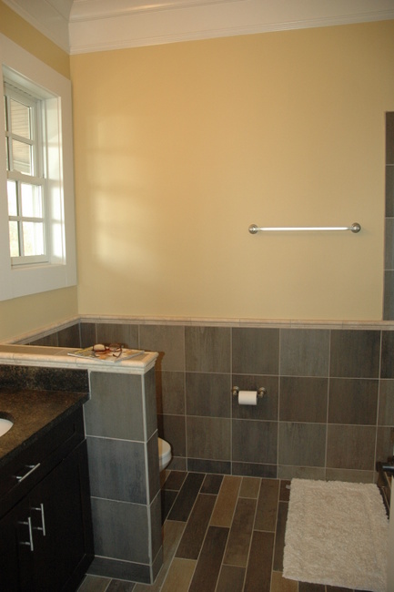
Contemporary Bathroom Before
I knew it was crucial to choose a wall color that tied in with the tile, or else the room would never sing. You shouldn’t try to fight bossy tile – it’s just too strong! Instead of fighting it, we chose a neutral wall color that coordinated with the tile. My client wouldn’t have normally chosen a gray, but this was the right color for the tile and it was obvious when we sampled it in context. Then we added traditional accessories like a quad of framed botanicals, a lovely roman shade, and a small oriental rug (rather than a shaggy bathmat!). New nickel drawer pulls in a slightly-less contemporary feel helps soften the space as well.
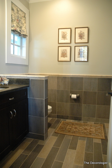
Now there is better flow from the traditional bedroom into the bathroom, in spite of the contemporary tile. I guess I’m a lover, not a fighter!
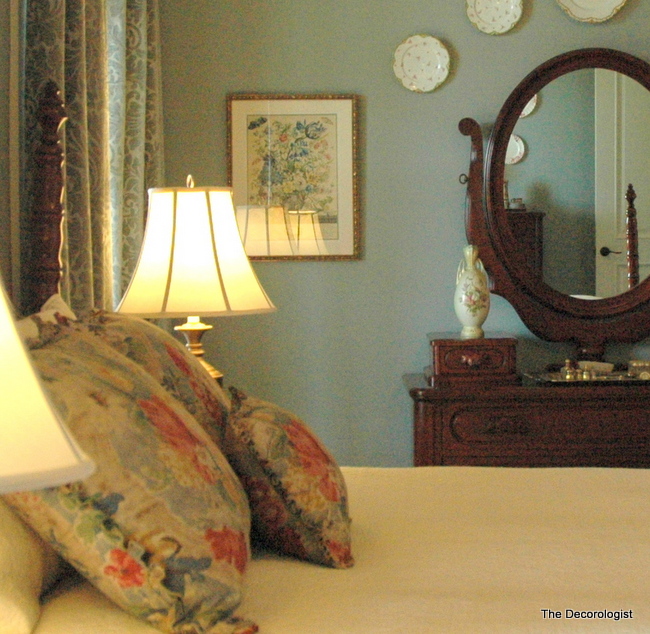
Adjoining Bedroom
Have you ever been bossed around by your bathroom or kitchen tile? Who won the fight?








Kristi,
Love that grayish color in the bath! What color is that and the blue in the bedroom?
Joy,
Thanks! The wall color in the bathroom is Revere Pewter. It’s a grayed tan, and was a good “bridge” between the more modern tile and the more traditional hardwood and dark furnishings in the adjoining bedroom.
Love the roman shades. Where can I go to have something like this?
Evelyn,
The roman shades are custom-made – I love how they tuck into the window frame, rather than laying over the top of the frame.
What a difference! The grey really did soften things – looks great!
Fantastic post, Kristi! Your before-and-after shots do such a great job of showing that your wall color has to come from the undertones of the existing finishes or it will feel “off”, as it does in the “before”. Even more important when there’s a lot going on in those finishes…..
Mmmmm…lovely transformation. As always, and this I have learned from you, wall color is so vital to achieve harmony in a room. I love the way in which you worked with the existing tile, while remaining true to the home owner’s taste. The pieces you chose as accessories are lovely. Getting rid of the traditional bathmat and replacing it with a small “real” rug makes such an impact. I do believe in rooms flowing in a home and you have achieved it beautifully. I’m remain a big fan of your work. Btw, did “The Tennessean” think your makeover of the brick house and its porch was outstanding? Bye for now..
Thank you for your comment, Susanne. The “front porch makeover” was 1.5 pages in The Tennessean on Saturday! It’s not on their website unfortunately, or I’d put up a link. Thanks for asking 🙂
Oh my goodness — now THAT is lovely! 🙂 Great job!
What a wonderful difference this makes! You told that tile who is boss!
I love your transformation. I’m having a similar issue but trying to tie in (with color) a wall area with a dark granite underneath. Your post has made me look at this area in a different way. And I’m thinking that the Revere Pewter is an interesting option. Thanks, Kristie!
love the gray…what a great improvement. So many people reject gray out of hand but look how beautiful it looks. It’s true what you said..it’s all about the context.
Kristie I love the bathroom and bedroom! They turned great!! I love the color in the bedroom. Is that that a blue color or grey?
I know it looks a bit blue in the photo, but the color is Revere Pewter which is a grayed tan. There is definitely blue in the tile, though.
very nice and the ‘after’ color is obviously better.
Kristie, this is a PERFECT example of color in context!! Everyone thinks it’s about their “favorite” color.
It’s so NOT.
Color is such a wonderful and mysterious gift from God, and each IN CONTEXT of other colors is a valid player.
It’s amazing– the tie in with the bedroom also.
I Love your work too!
Thank you so much, Paula! It’s always a fine balance for me to choose the “right” color for the context and still give the homeowner the “feel” they are hoping to achieve. I’m lucky to have such wonderful, trusting clients – most of the time, they get that I am trying to do both and are open to my direction away from what they might have chosen on their own!
I need a clarification, is the paint color in the bedroom Revere Pewter also? Very nice.
No, it’s a gray-blue color.