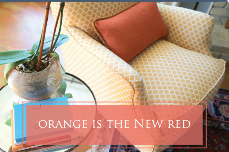
When working with my clients, pretty early on I ask the question: are you a red kinda girl, an orange/coral kinda girl, or a pink kinda girl? Many women have a strong attraction to one of those three, to the exclusion of the others. If you are not really gifted with color and design, it is pretty difficult to mix two of these three with good effect! Most of us just pick a lane. If you are a red kinda girl, you tend to stick with red for accents throughout your home. The same is true if your choice is orange or pink.
This client’s bedroom didn’t seem right for her. At all. She had already made some big design changes in other parts of her home, and it seemed obvious to me she was changing lanes from red and heading towards orange/coral. The first thing that needed to change in this room was this brick fireplace and the very heavy dark cherry surround and mantel. It’s a walk-out basement, and these elements were doing nothing to lighten up the room.
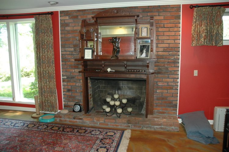
fireplace before
Red is not often a good wall color to pair with a red brick fireplace, and you can see how much more vivid the red wall color was compared to the brick and to the orange-stained concrete floor.
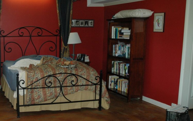 red bedroom before
Believe it or not, I knew that even with that difficult flooring material, this room could look amazing with the right changes. Some of the choices I helped her make included wall color, reworking the fireplace, specifying new chairs, arranging furniture, and hanging art. We decided on a medium blue as a backdrop for the orange and for the new bedding she chose. The shift from red to orange helped integrate the flooring into the color scheme. Wanna see the fireplace transformation first? It’s pretty dramatic – it even made it into my book! Here’s the before:
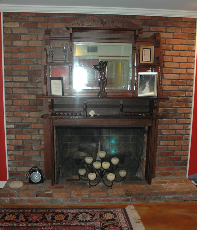
before – dark and dreary
and here’s the much-improved after:
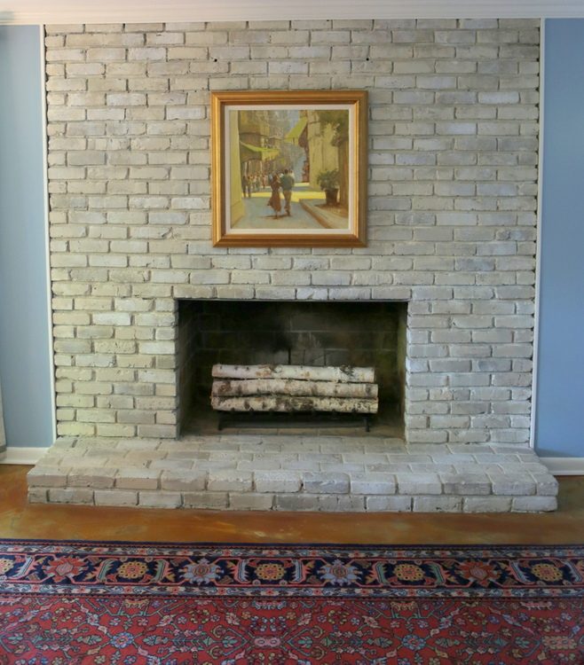
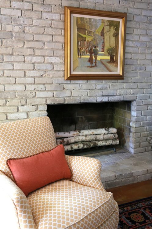
fresh and light faux-finished fireplace by artist Heather Thompson
We loved the lines of these chairs from Ballard Designs so much that we had them custom-covered in this beautiful golden fabric that works well with the new color scheme. Did you know you can do that? Ballard will cover their upholstered furniture in your own fabric, if you like!
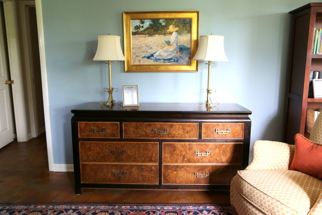
This Asian-inspired dresser is from a local store that carries unique vintage pieces, and the blue in the background really sets it off.
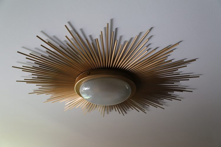
This sunburst light fixture is absolutely perfect for the new space, and hubby won’t bump his head while passing beneath it.
In regard to the artwork for the room, my client sent me photos and dimensions of the pieces she was considering and I gave her the thumbs up or the thumbs down. Here’s the before of this side of the room:
before
My client had purchased new bedding, side dressers, and a pair of fabulous lamps, but I helped her find the mirrors that hang behind the lamps and make final decisions about the art choices. She invited me back to hang the art and style the room. These orange panels really finished off the space, and are a beautiful sight to behold when she wakes up in the morning:
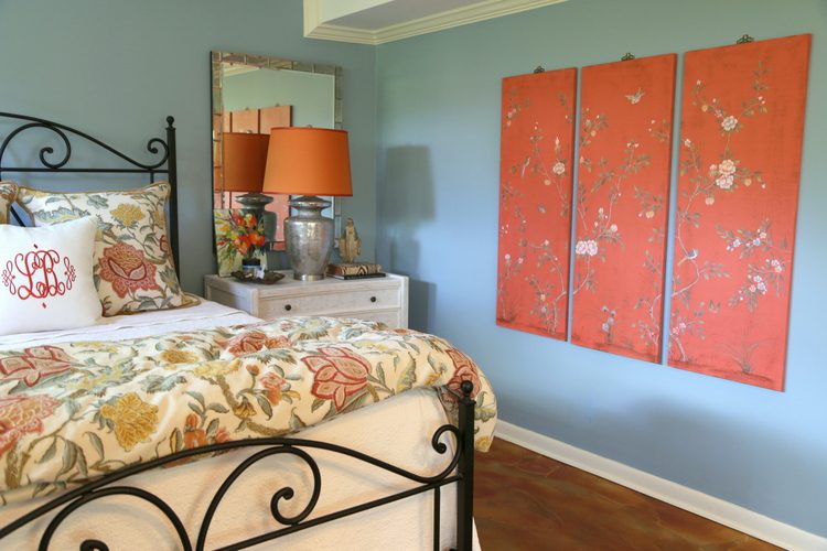
Even the orange-stained concrete floors look as though they were part of the scheme from the beginning!
Would you change from red to orange accents – or are you a red girl all the way?


Rooms with orange or rust colors make me feel angry and depressed, so I’d never use orange or rust, ever. I might use red with a more blue undertone in the dining room or den, but not in the bedroom.
Wow, that’s really interesting, Pam. How colors can make us FEEL. I totally get that.
Wow, the fireplace looks fabulous now! I love how the blue backdrop is so pretty with everything else and how the orange floor ties in with the furnishings now. My favorite accent are the mirrors behind the lamps. Such a great idea!
I’m a red and pink girl. I just love them both. Orange is something I typically pass over. I have to admit though, that I love the look of corals with blues, aquas, greens and creams. Just gorgeous! If I had a beach home it would be fun to decorate it in those colors. My own home is in garden hues with just about every color, except orange!
Donna,
I have almost every color in my house, too, Donna, except orange and red. I am a pink girl, myself – both dark raspberry and light pink. I actually love coral, too, but it’s hard to incorporate with the pinks. I also think a beach house in blues, greens, and coral would be divine. And yellow.
So pretty, Kristy! I am curious about the wood fireplace. Did you find an architectural salvage place to send it to? It looks like it wants to find a new home. Maybe at my house.
Teri,
I will check to see what they did with it, but I’m thinking it’s gone-gone :/
I figured it was gone. It was more of a rhetorical question. I could have had a great time with that lovely wood, though.
Actually, I got an email from my client and she will be contacting you shortly!!!
I’ve used red as a foreground accent color in the past, and used to steer clear of all things orange, but the combination that makes me feel happy now is pink and coral together. Maybe it’s the ice cream truck memories of childhood? Somehow they are like the colors of a happy song to me….and feminine and playful at the same time! Your writing and designs are a joy Kristie!
Are you kidding me!!!!! I cannot believe the improvement. Job well done on both your parts!
Every room in our cottage was done in seventies orange. I’ve just gotten rid of it– there’s no way anything more than an orange flower or two is getting back in…
Love the painted fireplace 🙂
What a beautiful transformation! I love the blue and coral/orange together. I love the way the burled(?) wood on the Asian-inspired bureau really plays off of the swirly colors on the concrete floor.
The painted bricks on the fireplace look so much nicer than the typical painted bricks–I am very curious about what exactly was done to get such a lovely effect. On my monitor it looks like each brick is a slightly different color. Was it more of a “white- wash versus paint?” Could you do a how-to blog post about it, pretty please? (I have been contemplating whether or not I should paint my brick fireplace–which has actually very pretty terra-cotta colored brick (and I am a coral/orange/terra-cotta kind of girl these days, though I used to be more of a burgundy and then old-barn red kind of girl!) However, it is very dark in a dark room and when I see transformations such as these I really get the urge to lighten it up!
I’d also love to know who makes the lovely comforter–it is gorgeous!
Thanks.
Phyllis,
I wish I could “how-to” that fireplace, but it’s more about the artistry of the faux painter who did it! She does many fireplace makeovers for me – I typically give her three paint colors I want her to use depending on the setting (sometimes it’s more grays, sometimes more beiges) and she layers the colors to make it look quite natural and not so “painted brick.”
There is also a product called Brick-A-New – I’ve met the inventor. but have yet to try. You might look into that. 🙂 http://www.brick-anew.com/
Thanks, Kristie. I checked out the link for the brick-anew. For some reason, their colors don’t look quite as pretty as the ones you chose for this fireplace redo- though maybe it is just that their photography isn’t doing it justice-. Your painter really is an artist!
Well, I do choose custom colors (usually three) to work in the specific rooms that they are for. Every fireplace is a bit different, based on the wall color and other finishes in the room it’s in. But that product looks like a good option if you don’t go the custom-painted route!
Phyllis,
The duvet cover is from Pottery Barn. The pattern is Cynthia Palampore. They only have draperies in that pattern now, but you can find the bedding on eBay.
It looks amazing! Orange is definitely growing on me, but I still like red best. I’ve never been a fan of pink, but it is not completely absent from my home. Looking around my living room, I see a little of all three. I would call my style colorful / eclectic / schoolhouse, and red, orange, and even a little pink can easily co-exist in that world. 🙂
The room is really nice now! I esp. like the chair with the golden fabric and the new fireplace… the photo with the cat is so cute!!!Ten years ago I decorated a lot with red ( a dark red, burgundy) in the old flat and we really liked it! When we moved to our house, we got rid of all things red (there were window panels and carpets on the stairs that we left in the flat, and the red rug was just plain old and worn) and now we have a lot of blue colors in our house, esp. many of our wallpapers, and dark blue paint in the living room. I love that, and while I use some yellow accents during the summer, in the fall I love the orange/blue combo! I cannot say I don’t like the red anymore – when I look at the old photos, I think we did a really good job back then. I have never liked pink though, I think it is such a cold color …
So much better and updated. I am definitely a pink girl- I love raspberry!
Me, too!!!
There are very few colors I wouldn’t use. Orange and red are fine with me. I’d use them more but I have two boys with autism who have sensory issues and I’ve been told to steer clear of red and of very bright colors in general as they could be overstimulating.
That’s interesting, Molly. I guess that could be an issue for people with sensory issues. I certainly feel uncomfortable in some of the bright neon colors I sometimes see children’s rooms painted out in. My youngest daughter has always said that certain greens give her a headache!
You really breathed life into this space! I love the wall color change to more soothing, relaxing blue complimented by the wash on the fireplace. Wonderful with bedding accents! Isn’t it wonderful how much color can change things?!
Thank you so much, Rosa!
I love orange, and always have, but I tend to get annoyed with peaches or muted tuscans that aren’t orange enough for me. Since I also like my rooms to be relaxed and sophisticated (who doesn’t?) I’ve learned the hard way to provide lots and lots of white or light neutral, with a bit of orange here and there, so my orange can zing and have lots of quiet visual room around it to for a place to be itself. It’s still hard for me to figure out. I really enjoy the way you handle orange in your work, Kristie.
I love to sneak my orange in, in things that most people will not think of as orange at first glance: the midtone wood doors and baseboards of my house–is wood, not orange, a bowl of peaches or oranges on the dining room table–is fruit, not orange, the mostly-white quilt my sister made–is an heirloom, and, yes, I suppose a third of the colored squares are some shade of orange. Hmm.
So many ways to “sneak in” color, right? I like that you use lots of whites and light neutrals with your orange – light gray is so pretty with it. I’ve seen rooms done with too much black – which automatically makes me think “halloween.” Thank you for your input, Johnna!
I love all colors and have used every shade of red in decorating. So, I guess that makes me a red girl. However, in the new house I’ve made a real effort to use more on-trend colors and not stay stuck in my style and color choices of the past 5-10 years. The fabrics for my newly installed drapery panels are a linen blend floral and the primary color is coral, which I’m loving. I really like the idea of adding a coral accent to a green, blue, and neutral color palette, which I may do in the master bedroom.
Gorgeous! I have a dark kitchen that only gets indirect light. I really like orange and think it paired with the light blue is very pretty. Do wou think the white, blue, orange colors are good to a darker kitchen?