One of the perks of getting a press pass to a Designer Show House is getting the full paint schedule for the whole shebang. As a paint color consultant, I always love seeing what paint colors other designers use and the effects that are achieved with their choices. Let’s start with one of my favorite rooms in the house, why don’t we? The master bath:
 Design by K Evers Interiors
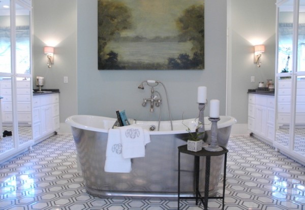
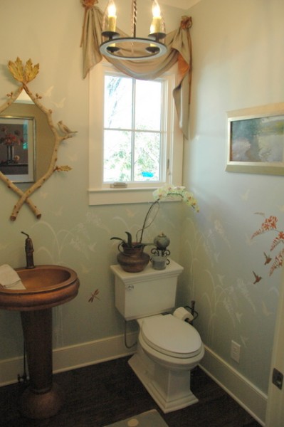
The soaking tub, the floor tile, the mirrors – oh so glamorous! I love this bathroom, and I love the color used in the space: Sherwin-Williams SW 6191 Contented. The water closet (aka, the potty room) is a luxe dark wallpaper, but reads an inky black in the photo. Man, I love this bathroom!
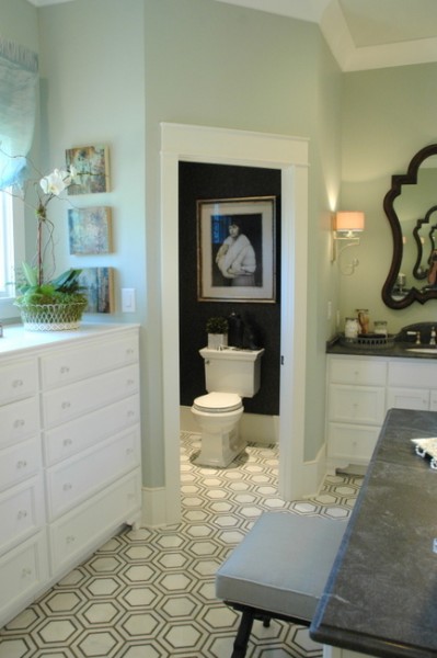
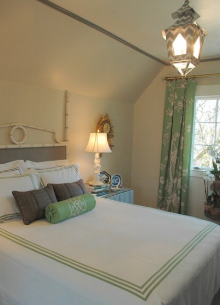
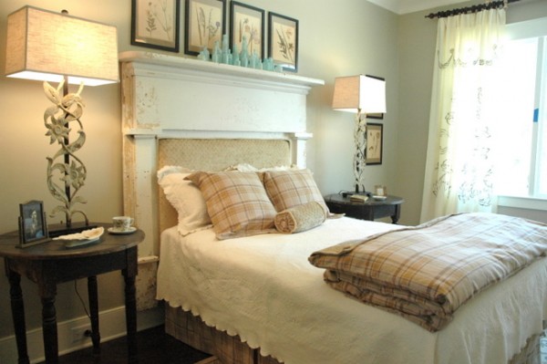
The black ties in well with the dark fixtures, the mirror frame, the floor tile, and the countertops. You can see a hint of the ceiling color in the photo above: Sherwin-Williams 6189 Opaline. The adjoining master bedroom is fresh and peaceful with the walls painted Sherwin-Williams SW 6190 Filmy Green.
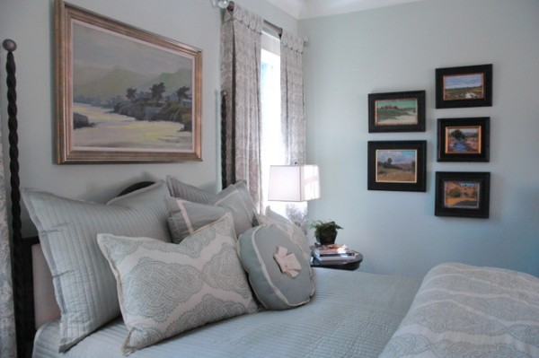
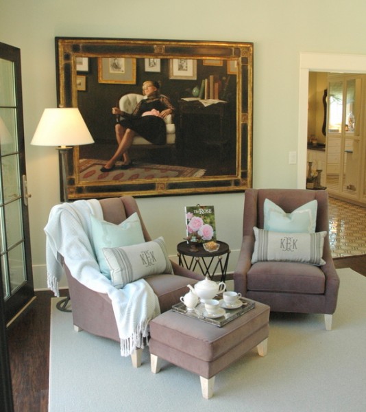
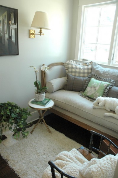
Although the bedding and window treatments create a peaceful tone-on-tone effect in the space, the dusky purple undertones in the sitting area look surprisingly pleasant against the Filmy Green, as well.
Design by K Evers Interiors
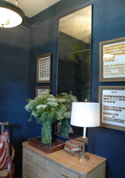
The small entry to the Show House features dark blue upholstered walls, while the trim is painted in Benjamin Moore’s Amazon Green 2136-30.
Designed by R Higgins Interiors
The upstairs powder room has a fun mural painted over a base of Benjamin Moore Gray Cashmere 2138-60.
Designed by Starbuck Designers
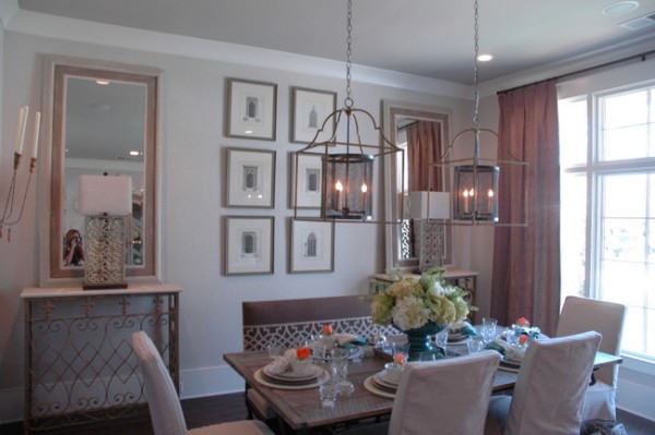
The dining room walls were covered in a wallpaper, although it is difficult to see that in the photographs. The ceiling is painted out in Benjamin Moore Shale 861, which I have used in clients’ homes on both the walls and once on kitchen cabinets. It’s a beautiful color, but you have to watch out for the pink undertones in this one.
Crysta Parish, Lead Designer – Dana Goodman Interiors
One of the guest rooms was painted out in Benjamin Moore’s Edgecomb Gray HC-173, which is a popular color with designers lately. It works well with the strong green and the Chelsea Gray accent in this space. Edgecomb Gray typically reads as an off-white, which may surprise you if you’ve seen it featured in design magazines and on Pinterest.
Designed by J. Haynes Interiors
This neutral is really more beigy than gray, and has both pink and yellow undertones, and I find that it can be a good solution in a bathroom with certain ceramic tiles. But again, it reads like an off-white in a light-filled room like the one in the Show House.
Benjamin Moore Edgecomb Gray HC-173
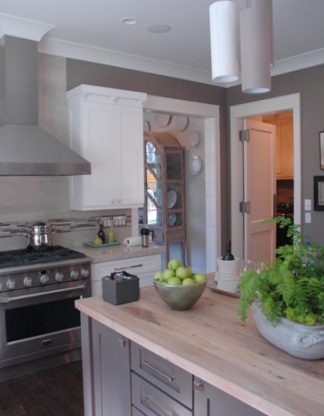
The kitchen walls are painted in Sherwin Williams Warm Stone 7032, which is a warm contrast behind the white cabinetry. This color is a nice grayed brown.
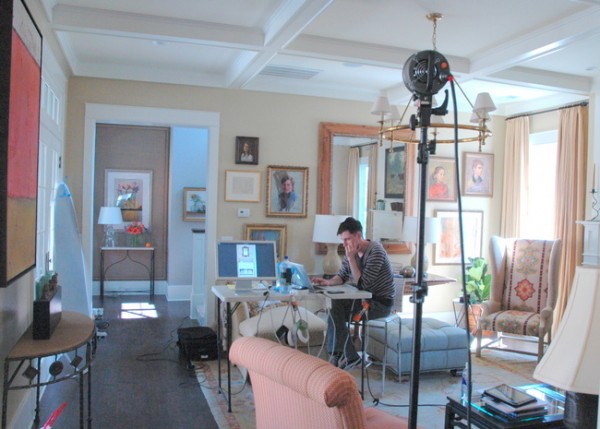
Both gray-based and tan-based neutrals were used as paint colors in the Show House. Let’s take a look at some of the tan-based colors now. The living room is painted Benjamin Moore Sandy Brown 1046, which has a peachy-yellow undertone. Since I photographed the house prior to its public opening, the best shot I could get was while Traditional Home photographers were on site, so forgive all the equipment in the room:
Design by Mark Simmons Interiors
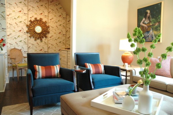
In the upstairs family room, the designer chose the wall color based on her inspiration for the room – the bird wallpaper. The warm beige that serves as a backdrop for this space is Benjamin Moore’s Bar Harbor Beige 1032.
Designer Kim Zimmer
This guest bedroom by Scarlett Scales was painted Sherwin Williams Balanced Beige 7037 to act as a neutral backdrop to the vintage vibe of the space.
Designed by Scarlett Scales
Now it’s your turn! Which colors do you like best in the Show House? As you should know by now, color is relative and is highly affected by lighting conditions and surrounding colors. As a paint color consultant or a homeowner, have you used any of these colors? How did they turn out in your space?


Paint is so hard! Thanks for this as I’m in the midst of painting some rooms right now!
Great – I hope it helps, Liza!
Thanks! I was there Saturday. I was able to thumb thru some of the resource sheets and get some of the colors. I would have sworn the entryway was black!
I really liked the bedroom with the repurposed mantle headboard. I want those lamps with the ironwork! I really liked the upstairs family room that was more transitional style across from the little sitting area and powder room that seemed more traditional.
The masterbath was just crazy! I bet 1/3 of the budget for the house is in there! 🙂 The kitchen almost looked too pristine for cooking!
I need the landscape designers to come to my house. They really made a lot that isn’t very wide really nice. I don’t think off white sofa’s on a porch at my house would last an hour. My two houndogs would roll in the mud and then take a snooze!
Thanks for the pictures and the info. I pretty much obeyed the “no photography” sign except in the laundry room.
Thanks for your thoughts on the Show House, Cindy! They hadn’t yet put out the white sofa when I was there, and the landscapers were working like crazy trying to get it ready by opening date. I wish I had time this week to go back and see it again.
Great post, Kristie… pinned most of them. Always great to see how light affects these colors on walls!
I love them all but I think the WARM STONE in the kitchen is my favorite!! I really like the subtle grey/brown of it and know it would work perfectly in my space. Thanks again for sharing and giving us so many details!!
This was a fantastic post, thank you. I still don’t understand why greens are popular in bathrooms, though…. it wreaks havoc on skin tones. Would love to see a post about how to use pale pinks, taupe, greys and other colors in a bathroom environment.
Kristy, the first two pictures of the master bath appear to me to have 3 different colors in it. The first picture appears to have a more blue color immediately behind the tub, with a softer gray-ish green on the walls which are on the left and right of the tub in the photo. On the second picture, the green there appears far more yellow based. Is it just the lighting in the room,or the way the picture was taken (or both) that makes them all look so different? Is it really just one color? And if so, which picture would you say most accurately depicts the true color?
Thanks!
I was totally going to ask the same thing!!! Thanks for sharing with your TCE’ers
Lex,
It really is just one color! Green tend to be more metameristic than other colors, that is, it changes more in relation to lighting conditions and surrounding colors. This color is a blue-green, so it looks bluer in some light and on some walls and greener in different light at different times of the day. That’s the beauty of it, if you ask me! Just so you know, I took the photos without the flash, so as not to best chapter the “true” look of the paint colors.
And of course, the kind of light bulbs used and even the shades of the fixtures are going to influence the perception of color.
Thanks for the reply Kristie! 🙂
Where is this Show House? Who sponsors it? I must have missed this information along the line. Thanks. I like the colors in the kitchen very much.
Cherie,
The Show House is in downton Franklin, TN. Go to http:omoreshowhouse.com for more info!
I think I love th master bath best! Beautiful! Is it me, or do you think there are a lot of beiges used? I am surprised- I would think grays or blue grays would be the favorite color used. Beige. Hmm…… What do you think?
Yup, Kelly. I’d say about half and half (beiges vs. grays). I’m sure you know what I think 😉
Just wanted to comment that I recently built a home and used Sherwin Williams Contented as my primary color in my house. It is gorgeous in all rooms. I love how at certain times it looks like it has light blue tones, other times more grey, and then in normal lighting has soft green tones. I’ve never lived in a home that gives off such great energy. I do have vaulted ceilings and an open floor plan, but I always feel positive and energized. And I believe it is this paint color that does that.
Thank you for sharing that, Jeff. It’s wonderful to feel so “contented” (pun intended) with the color that surrounds you every day!
The master bath WINS in my book. It is clearly the star of the show. Subdued plus enough pizzaz to ignite your senses morning and evening when bathrooms are used most. I would use this color for sure in a room with plenty of light. Thank you, Kristie for all the great photos!
Was glad to see the edgecomb gray but wondered what you thought of the partner color on the same swatch HC172 revere pewter. Does it also read off white like this?
I really like the color on the walls in the kitchen. I would love to know what color was used on the kitchen island cabinetry. Thanks!
Thanks Kristie! That was fun. I’m loving that bathroom floor and the blue entryway. I think the balaced beige would look great in a room I’m working on. I can’t tell from the pic, but does it look dark in a bedroom?
I love the pillows on the two chairs in the upstairs family room! Any idea where they came from? Or if they were custom made, what the fabric is? I have a room I want to do in those colors and that fabric would be perfect…