Painting your exterior is a scary and daunting task. Visualizing options that would work for a given house is beyond the imagination of most people – it’s just not easy! A recent Nashville client hated the exterior of her stucco home and needed help from a Color Consultant (that’s me, by the way). When I arrived to give her advice, the stucco had already been removed.
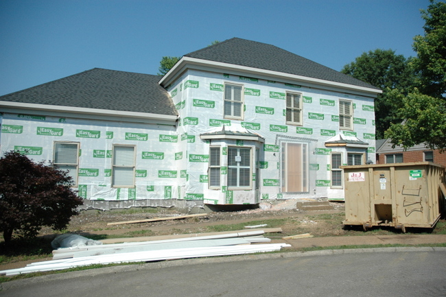
This was the brick veneer she had chosen to give her home the facelift she wanted.
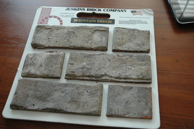
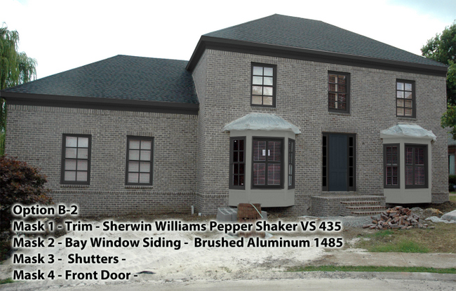
I loved the brick immediately! So now her questions: Light trim or dark trim? Color or neutral? Which neutral? Shutters or no shutters? Paint the door or stain it? Once we established what would work well with her existing roof and her new brick veneer, I had the graphic designer on my team mock up some options to help my client visualize her best options going forward. Here are a few we both liked – this one is dark trim, light bay window siding, and dark muted blue on the front door.
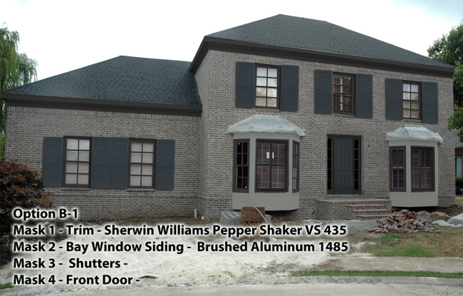
This next one is the same scheme as the one above, but with the addition of shutters.
Here is one we worked up that utilized lighter trim rather than dark, and a wood stain on the door rather than paint.
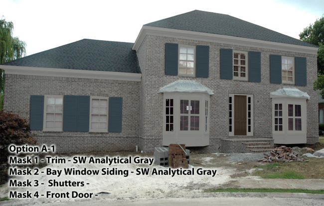
We actually mocked up a few other options, but these were our favorites. Isn’t it interesting the way the placement of color affects the overall style and feel of the home? The last one feels the most traditional, while the first one feels more sophisticated and a bit European. Oh, and you should know that the shutters on all virtual three mock-ups are the same color. The shutters appear lighter in the last mock-up because of the dark trim. That’s something that’s hard to predict unless you “see” it for yourself! Can you see how much easier it would be to make decisions on exterior paint if you could visualize the possible results? Contact The Decorologist if you need help making the tough decisions regarding interior or exterior color!







Super post! This really shows in a tangible way, the huge benefits of utilizing your services! What a difference, not to mention to money savings, to see the finished product before the paint goes up! I like number 3 with cooper over the bays! 🙂
Thanks, Leif! I forgot to mention that copper is going in over the bays, and we also had to decide whether to leave them natural to patina naturally or speed up the patina process. I voted for speeding it up!
I would never have guessed they are the same color shutters! WOW!!! We’re struggling now because we have green shutters, garage doors and trim. It was nice for a while but I’m SO tired of it. I want black shutter and cream/white trim but my husband doesn’t know what color to paint the garage doors. I think black would be fine. (They are LARGE doors and face the front of the house). Oh…we have a really nice “brick” colored brick with some tan, salmon and brown tones.
Patti,
Most of the time I recommend painting garage doors in such a way that they do not stand out from the house – unless they are beautifully crafted carriage doors, you really don’t want to draw attention to them. However, there has to be some tie-in to the rest of the house. It’ll look random and draw more attention to something if it’s the only thing painted that color. That’s good for a front door, but not for garage doors.
That is an amazing tool to be able to demonstrate to your clients what their options will be and give them “real” choices. What program do you use Kristie?
Someday I want to paint my brick. I am definitely calling you in for a consult before I do. 🙂
Yay – I can’t wait!
Kristie, when I first saw the brick sample, I would have said dark trim, but the lighter trim opens up the windows beautifully. Image #3 is good with 2 exceptions–I realize this is a mockup–but the shutters are too wide. Technically they should be just as wide as !/2 the window. (You knew that, I’m sure 🙂
Also, the painted trim around the front door looks wrong. In my opinion the entire door & sidelights should be stained same as door. For what it’s worth….
WOW, though—what a wonderful tool–or wonderful SKILL your team member has!!! I’m IMPRESSED!!!
Paula.
Thank you for your ideas, Paula! The mock-up shutters were a bit wide – you are right. The deal with the door – the trim around the door is a different wood from the door, so it won’t stain out the same color as the door.
I would then maybe paint the front door a rich color and the sidelites the same….
I agree, your graphic designer has some mad Photoshop skillz! What a useful opportunity to visualize the house this way.
PS: I would ask the person applying the brick to exactly match the grout to the paint color.
This is great Kristie! Exterior colors are so hard for homeowners and you are actually giving them an actual ‘picture’ of what different colors will look like. Wonderful service!
I can’t decide! I like them both.
Great job Kristine! Nice presentation and clear view of what the house will look like using different color options and ideas. There’s no doubt that you have a good skill. Keep it up! BTW I choose Option A-1 🙂
What a beautiful house !