I work with multiple clients every week helping them establish color palettes for their home. Some people may think that paint color consultants/specialists have a few pre-established color palettes that they pull out, any of which will work in a given home.
Color Palette by The Decorologist
That may be true for some in this field, but it's certainly not the way I operate. Determining what is NOT changing in a client's home is very important, as that influences what options are available going forward. Part of my job is knowing what colors and color combinations are current, or on-trend, but that's not to say that those colors will truly work in any setting. I am always dealing with pre-existing finishes and furnishings that must be part of the overall equation in order to make the space feel right.
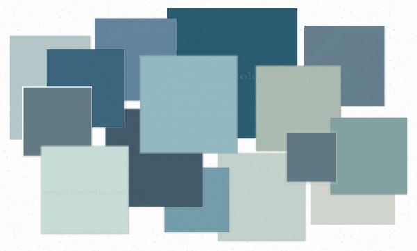
Just SOME of the blues I've used in design projects this year
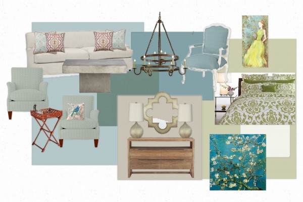
Let's say a client loves blue and wants that incorporated in the color palette. I can usually make that happen, but different clients may need different blues based on what's already a part of their existing space. Knowing WHICH blue will work in a given space is the puzzle I solve during my color consultations. Below is a color palette that I worked on with a client yesterday – I started working with her over two years ago, when we established a couple of the colors you see below (the two blues) in a couple of her rooms. She told me yesterday that she had read a recent article I wrote for The Tennessean about looking at the "big picture" and decorating in the right order, so now she wanted to build on those colors to finish out her home in a complete color palette with good flow.
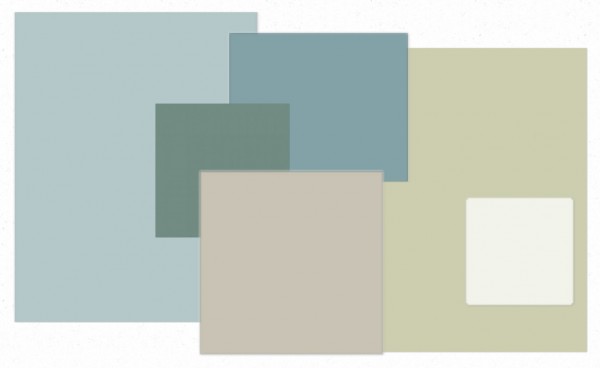
Client Color Palette
The color scheme you see above is roughly layed out in relation to the flow of the rooms in her home. The neutral you see will be in the entrance to her home, the light blue is in her living room/dining room (from two years ago), the darker blue is in her kitchen (from two years ago), the lighter green will be in her bedroom/bath with the off-white going on several furniture pieces, and the dark green will be in her hall bathroom. This color palette works with her existing furnishings and finishes, which is my #1 priority.
This image that I posted at the beginning of this article is an Inspiration Board I put together last night using her color palette, but which different furnishings just for fun. This might be the direction I would go in if we were starting from scratch, which we aren't. Regardless of whether you are using what you have or starting from scratch, the development of a cohesive, on-trend color palette requires a vision for the "big picture" or the finished look of a space.
If you want to know more about my services, take a look here. Make sure you sign up for free design and color ideas through your email!


The two pictures look the same to me. Am I missing something?
You mean the first and last images? Yes, they are the same, I just didn’t want you to have scroll back up to the top again when I referred back to it.
I love those colors, but what's really caught my eye is the picture with the girl in the bright green dress! I would love to find that!
Ann,
It’s from Layla Grace – isn’t it pretty?
I was also loving that girl. Thanks for the source.
Yes, very pretty! I have always loved that Van Gogh too. Thanks for the source!
Hi Kristie!! Absolutely love this color palette – all of my favorite colors!! Can you share what paint colors these are? I'm especially interested in the lighter green and blue. Thank you! Happy New Year!!
Although I often share paint color names when appropriate, I really can’t share a specific palette like this my client paid for. I hope you understand!
of course!
Kristie-I love that you just whipped up that inspiration board last night. It's really pretty. I've noticed that you typically use a lot of blues and greens in your designs. I was never into blue until I saw how it looks in your rooms. Now I've got a blue-gray in my hallway and am loving it everytime I come into my home.
Lisa,
Blues and greens are so liveable and make everything seem fresh and current (right now, anyway). I can hardly imagine doing a whole-house color palette without some kind of green or blue!
Great article, Kristie! I remember the days when all of the designers chose Plantation Beige & Tobacco Road, ugh! But change is hard and we still make those colors for clients. When I am doing multiple-color consultations in a neighborhood, or for relatives of past clients, I always make a point to not choose any of the same colors for my plans, unless absolutely necessary. I want the client to feel their plan is unique and special to their home, trust is key.
Thanks for all you do!
Rebecca
Kristie–
I love your board (as always). I am in the process of redecorating a master bedroom and that mirror that you use would be just perfect in the space. Could you tell me where that piece is from? Thanks!!
LOVE IT ;-). The inspiration Board is beautful !
What is the name of the turquoise blue color in the bottom right of your inspiration board above? From my iPhone I could not enlarge it to tell whether it's paint or wallpaper. I really like the combo with the white flowers.
Kristie, I've learned so much from you and this is just another extension of that. And I must admit, I feel so much better after reading this post because my thought process when going into a client's home is "okay, what is staying?" and determining what items in that room (including floors, rugs, etc) are staying the way they are and then going from there. Color really does require practice and I do believe that the eye slowly learns (very slowly) undertone and what is "off" – now I need to stop rambling. But I love the focus of your blog and always enjoy reading your posts.