Benjamin Moore announced their 2015 Color of the Year, Guilford Green HC-116. It’s a perfectly nice color, and it certainly has it’s place – but not as Color of the Year. Let me tell you why not.
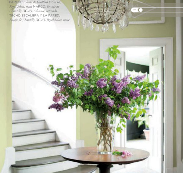
When I think about a paint color that’s dubbed “Color of the Year,” I assume it would be:
The “it” color.
The color that’s about to burst onto the scene.
The most on-trend color of 2015.
The hottest color to paint the walls in your house.
Am I off-base here? Is it acceptable for the so-called “Color of the Year” to be a perfectly nice, but not a particularly on-trend, color? Let me explain. As a Paint Color Specialist who develops interior and exterior paint color palettes for homes every day, I tend to sort any given color family into types. So let’s talk greens, since that is the color family Guilford Green is in.
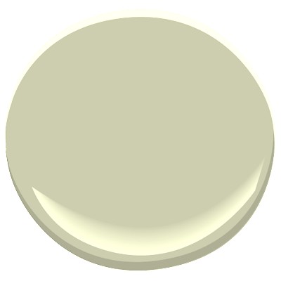
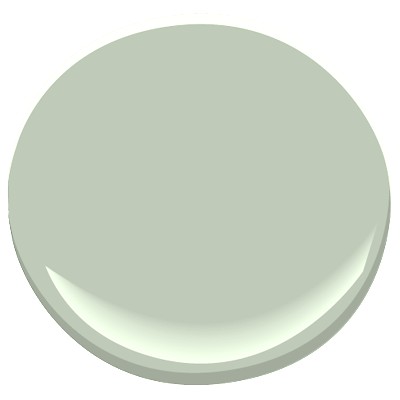
Benjamin Moore Guilford Green HC-116
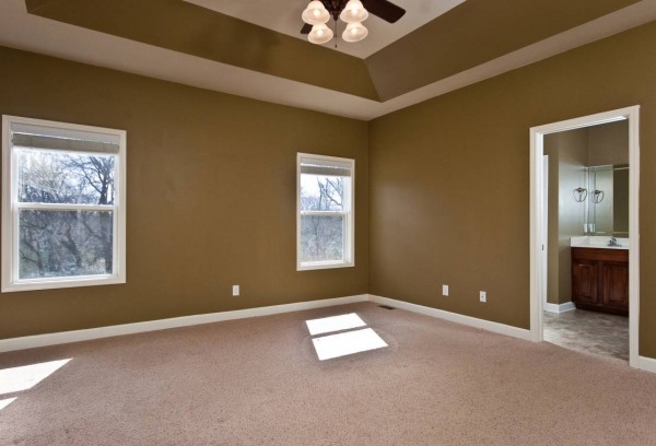
There are greens that I consider muddy greens. They are brown-greens and they take on more of an olive or army tone. I use them on occasions when called for, but they are NOT trending greens. In fact, we are still worn out with muddy greens that were all over creation in the 1990s (and I’m not going to specific name any of the dated muddy greens that are running through my head right now, because I don’t want to hurt anyone’s feelings). Yes, olive is hot in the fashion world (I just bought a pair of olive skinny jeans), but I don’t see it making a strong showing in the land of decor any time soon. Because then about half of us could pull own old olive sofa out of the basement rec room and be right on trend, right? I don’t think so.
source
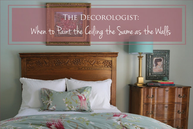
Then there are greens that I consider muted greens (rather than muddy). They are gray-greens, which are definitely trending and will consider to trend over the next several years. They include colors like Paris Rain 1501, Heather Gray 2139-40, and Intrigue 1580. They look fabulous with many of the trending blues (light and dark), yellows, and pair with red without resulting in a Christmas color scheme.
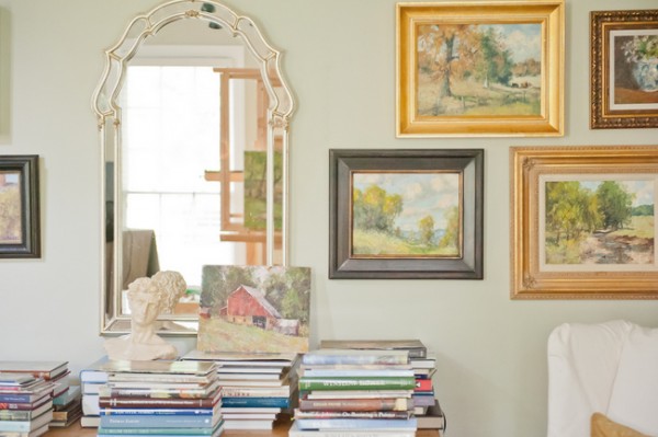
gray-green walls by The Decorologist
There are greens that skew towards yellow, like Guilford Green HC-116, Georgian Green HC-115, and Sweet Daphne 529. Georgian Green is a classic, and I used it a few months ago in a living room makeover. I actually have some Sweet Daphne on both my front and back porches as accent colors on chairs. Yellow-greens have been trending over the last 5-10 years and are nothing new. While you could certainly paint your living room Georgian Green to great effect, the paler Guilford Green will look a bit like a 5-year-old girl’s bedroom (which is honestly the only room where I’ve used it).
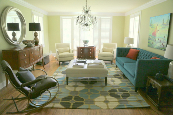
Benjamin Moore Georgian Green HC-115
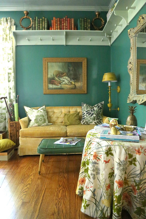
Finally, there are greens that skew towards blue (rather than yellow). These include the lighter versions that might be described as a bit minty, like Antique Jade 465 or Prescott Green HC-140.. And also the darker versions that are a bit teal and jewel-y, including Mountain Laurel AC-20 and Waterbury Green HC-136. As I’ve been watching the trends, these lighter blue-greens are the kinds of green that are cutting edge: fresh and clean, and the perfect backdrop for practically any blues and the darker emerald and teals. They also play well with pinks, coral/oranges, and reds.
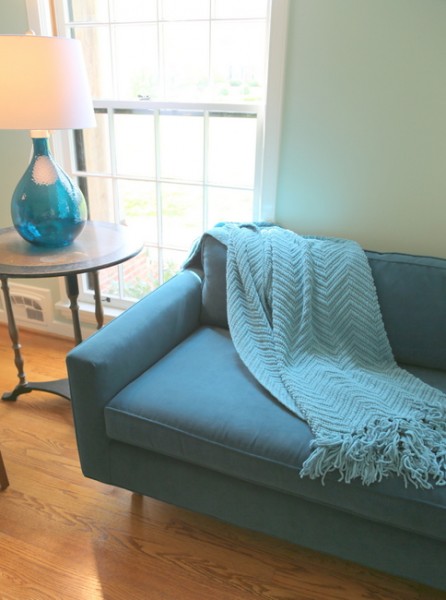
Benjamin Moore Antique Jade by The Decorologist
So what exactly am I trying to say? In terms of color forecasting, I do not see a strong trend of yellow-greens and muddy greens rising on the horizon. I’m not saying you won’t see them or don’t see them, but I certainly wouldn’t name one of those type of greens as the 2015 Color of the Year. Instead, I’d look towards a green on the gray side and with a hit of blue. Something a bit jade-y and a teeny-tiny bit minty. Like Antique Jade 465 or Prescott Green HC-140.
Maybe I’m splitting hairs. But that’s what I do. Splitting paint color hairs is my job – it’s my passion! But, of course, Benjamin Moore isn’t asking for my opinion. Not yet, anyway.
If paint color fascinates you like it does me, there is SO MUCH TO LEARN about how to use it in your home and the homes of your clients. Let me rock your world with color in my new ONLINE color course – and be sure to check out all the 5-star reviews!!!








So agree! I am in a rental house in which the decorator chose a similar Ralph Lauren color 9 years ago!! Good news for my landlord–he doesn’t have to choose a new on-trend color yet!
I remember when I first saw Wythe Blue on your blog back in 2012 (?) when we first bought our house. I fell in love with the color and didn’t get to put it on the walls until earlier this year. I was worried about how it would read in my dining room, but with the beadboard and chunky molding, it looks perfect. I love it so much.We were trying to make the room look as it would’ve when the house was built in 1919 and the color is the perfect combination of historical influence while still being on trend. I wholeheartedly agree with your opinions on the green. I don’t particularly think their choice lines up with what is on trend currently.
Wythe Blue is such an amazing color, both historic and on-trend! I’m glad it worked out so well for your house 🙂
There in lies the problem…they didn’t ask their Benjamin Moore color specialist!! 🙂
Since green is not amongst my favorites, it’s not likely that I would have chosen any of them as “the color of the year” (if anyone were asking me to choose 🙂 ), but some of them do go well with purple, which is one of my favorites, so it’s not beyond the realm of possibility that I might use some shade of green in a room at some point. But, Benjamin Moore didn’t ask my opinion either, so I guess they’ll just have to make their own choices and I’ll make mine :). By the way, your “read the article” button seems to be malfunctioning. Clicking on the title gets you there, but the button at the bottom of the original post does not.
Janet,
Yes – purples do look fantastic with greens, no doubt a great combo! It appears that the “read the article” button only works when you click on the first part of it (read), which bums me out, but I don’t know how to fix it. Try clicking on the left side of the button and let me know if that doesn’t work.
I agree with you! I love green any shade of it. But I don’t find Guilford Green to exciting or special.
Great post. Guilford Green was one of the colors I chose when we painted a couple of years ago. Sometimes I like it and sometimes not so much. Fortunately, it’s only in the upstairs hallway. Thanks for sharing some alternative color selections. I really appreciate your blog.
And thank you for your comments, Sara!
I’m a green person myself–most all shades. I like your color better too. They should have asked you. 🙂
You are SO right on, Kristie! What were they thinking… or not thinking. What a “dud” for such a lofty position of power and excitement in the design world. I certainly hope designers don’t take this color seriously and ruin many otherwise beautiful homes in 2015.
I agree with you Kristie! I love green. In fact I had a green dining room for 8 years and incorporate green all throughout my home, however, like you said, I don’t see it green as being the “color of the year”.
I HATE, loathe….. that green color. It’s on my walls in my bedroom when we moved in here and I hate it!!! Getting ready to paint over it, and I can’t wait to get rid of it.
Nope, definitely not color of the year in my book either.
Ok, so do you hate ALL greens? Or just certain kinds of green???
I recently acquired a top grade leather couch in an emerald green color from Craigslist. My intention was to paint it a more subtle brown hue, but am getting used to it and am re-decorating around it. I have put up strong blue single fabric panels at each window edge and am making changes with the accessories etc. and painting some a royal blue. So, an emerald green couch may not be everyone’s cup of tea but it is working for me; I hope green will be the color of the year.
Kate!!! Emerald Green was Pantone (the industry color giant) 2014 Color of the Year, so you are spot-on and completely on-trend!!!! Please don’t paint it brown, you’ve got a statement piece right there. Lucky girl 🙂
Good call,Kristie-I painted a bedroom & family room Guilford Green 5 years ago and it was lovely, but I am over it-I think this color will be as popular as that Pantones wild orchid color- Not!-I love that blue Breath of Fresh Air that they had last year as the color of the year-I painted my master bedroom with it and still love it-I wish they would unveil a whole new color that no one has ever seen before as the color of the year to add some excitement-This seems rather lazy, picking a color that they have been using for years! They should hire you to pick the color for 2016-I will write and recommend it to BM!!
Wow! Thank you so much for the comment! I really appreciate it hugely. Thank you from a major fan. Kate
Very good post, Kristie. Well thought out and explained.
Ok, I did not write the part about “Your comment is awaiting moderation”. I thought this was a very good post that was thought out and explained.
You are SO right. I think a blue color for sure and love your choice!
I had the same thought, but couldn’t put it so eloquently. I don’t mind this green on the circle – it looks silvery. But when I saw it in a picture of a room, I said, “Ew…..”
Thanks for the affirmation – I wasn’t sure if I was going to be the only one thinking this could have been a better choice!
Just thinking….when I go to Florida, i never seem to tire of the clean colors there. Maybe “clean” isn’t JUST a trend, but a basic desire appealing to our senses because we “like” to be clean. (Most people do). Therefore, a yellow-y green color, of course would become tiring much sooner that a clean green with or without blue, right? I certainly NEVER tire of our Carolina Blue sky!!!
Am curious Kristie, what would YOU have picked!?!!! I too, am a little surprised they picked Guilford Green, it could always be worse!
If you read the post, you will know my pick!
Kristie,
I agree with you 100%. I really look forward to finding out what the “Color of the Year” is going to be, and I am soooooooo disappointed in this one. I too love greens, but NOT this Guilford Green shade. Possibly it was a typo???? Hehehe
There’s always 2016,
Paige Brasche
Bluffton, SC
Hi Kristie!
First, I read your blog for a while, is wonderful.
Interesting post, I like how confident you express your opinion.
I also felt a little surprised to see the color of the year 2015, I think it’s a little bit difficult color, but it looks beautiful with white and light-colored accessories.
By observing your blog I can see how nicely you combine colors. Very nice. I come from Europe and I must say that the majority of Europeans have some aversion to the color ;-). Or in other words: have a different perspective on these matters. But well … in the end is a different continent.
Hugs!
Hi Charlotte,
Thank you for your comment – it’s interesting to hear how different areas of the world have differing tastes and feelings about color! I agree that Guilford Green would look best with lots of white to balance it.
It’s so funny you posted about this. I’ve been in the process of painting my home and at one point considered green for my LR and DR, but decided against it. I actually bought a sample of Guilford Green and painted a paint board to see how it would look… every time I looked at it (different lights, different walls) I hated it. It looked so muddy and dreary. So I finally chose a blue with a hint of green (I’ll tell you which one when I finish redecorating and have pics). I find it very difficult to find good greens. I painted a home near the beach Georgian Green. At times it looks a little too yellow, but for the most part I like it… it works with my turquoise and royal blue accents. No Guilford Green for me!
Ooh, can’t wait to hear what color you chose!
Hi Kristie, May I ask your opinion on the Benjamin Moore color Gray Horse? Do you think it is muddy? Is this the type of gray green color trending now? I do love all your color selections in this post. I have to agree with you on the Guilford Green. Don’t know what it is about it, but it looks upsetting.
Linda,
I LOVE Gray Horse! Definitely a medium gray-green. Muted, but not muddy (muddy to me is brown-ish). Beautiful, sophisticated color – especially in a light-filled room.
Thanks so much Kristie. My master Bedroom is light filled. I was hoping it would work. I think it would look good with my black furniture. I will send you a photo when it’s finished.
I’d love to see it, Linda – please send a photo!
I have read 2 of your blogs, and you make me want to write one, because of your unique and confident perspective. Your agreeing to disagree with the color of the year is refreshing:)
I’m totally with you, and said the same thing when asked. I’ve been specifying that colour for years! Definitely NOT a new colour! Maria
Kristie! How are you? Great I hope! I was checking your Sherwin Williams Coral Reef color of the year post and clicked the link to check the greens you were using. The Georgian Green living room is lovely and soothing. I am wondering about the art used over the sofa? I’d love to know more about it. What can you tell me about it? I’d love a better look at it. Is it an original or a print? Where can I see it better?
Hi Pamela,
See this post for information about the artist and close ups of two of her pieces. You can click on her name – it should take you to her website. https://thedecorologist.com/should-your-art-match-your-sofa/
Dear Kristie,
So glad I found your blog on Guilford green. It is a new year and I want to paint the LR. It is painted Mount Vernon Green fromP&L. The foyer has grasscloth in a gold tone which I put up last year…I love it but don’t love the LR anymore. I have alot of white molding and bookcases at one end of the LR so I can do color. I have been leaning toward Palladian Blue, Aganthus green, etc. The issue is I sit in my Kitchen and see past a light blue, like palladian blue / taupe danville tan damask wallpaper over danville tan trimmed DR to and through the foyer of grasscloth and see the green and it needs to go. I have been thinking in terms of blue but just not sure. Maybe these teal blue greens may work. I want to incorporate some red and yellow in the LR too. I like color but don’t want a circus and am trying to do a slick traditional. So over stuff. Kids are gone and I want a clean look. Maybe Wyethe blue? Oh by the way I live in Cleveland Oh. in a traditional center hall brick 1941 colonial.
Hi Lorene,
I love Wyethe Blue and Stratton Blue, for especially for period homes – great blues with enough green to keep them warm and up-to-date (vs. powder, “Colonial” blues). If those blues are too “clean” for you, a nice muted version might be Gray Wisp. Good luck – your home sounds lovely!
Kristi, thank you for responding. I will put those colors on the wall. You must not think the Stratton or Wyethe blues are too strong against the gold toned grasscloth. Then again the room has alot of white trim and the white bookcases to balance the color. Interesting that you chose those colors because they do flow nicely from the kitchen past the lighter blue in the DR. I am still trying to decide if I should paint the trim in the DR a soft white versus the Danville tan that is already there. Living in the North and the house facing the North can be a problem with light. The DR was papered in a very strong fruit pattern with the Danville Tan in very earthy colors and I needed light but did not want to redo everything so I changed the paper. May I send pics at some point? The kitchen is all off white cabinetry with a pretty brown on the walls. Again very little wall. I think color is the hardest thing.
Again, if those colors seem too bright/clean, try something more grayed down like Gray Wisp. If you need further help, check out my services/fees for online color consultations in the menu bar.
I will and thank you again. I have spent the whole morning reading your site and so informative. Thanks again.
Lorene
Hi, I absolutely love your articles & love your tastes as they reflect mine to a T. Now, I have a question that isn’t easy to answer but I’m reprinting my whole home. I’m so done with the very dark colours & now want a zen like feel to a now-adult only home. I’m looking for the perfect beige(tan, etc) which has to have grey undertones in it for the bedrooms & a darker grey-based greenish for hallways. As for one wall, in the living room, I’d love an avocado colour. It’s our downsized home so 3 colours are enough. I’m a minimalist, no knickknacks & accent my home with natural elements. I’m terrified to go from extreme dark (which I love) to light colours but it’s time. I don’t have all the natural light I used to have in my bigger home. Any suggestions?
Thank you. I agree with your take on Guilford green. A few years ago I went with Prescott green in my family room and a good friend chose Guiford Green for her living room. At the time I wish I had chosen the same. I still like both colors as well as Palladian blue in my guest room – all from the same BM color strip. But while I found them on trend then I can’t imagine BM calling any of these colors on trend today.
Redecorating an empty bedroom upstairs. Flooring consists of 5″ dark wood as I’m adding a space for my yoga practice. Purchased a sample of “Antique Jade” and slathered on walls in different areas to see how it looks in light/shadows. The Benjiman Moore rep recommended the Guilford Green (but used a very similar shade in my daughter’s bathroom years ago). Just came across your article, and so glad I did! Antique Jade is a soothing shade. On my way to pick up more.
Cheryl,
Thank you for sharing! Please let me know how it turns out – send a photo if you can!
Thanks for the tip on Paris Rain. Think I’m going with Gray Mirage, very similar but a hair lighter. Your whole take on greens–muted, not muddy; mint, not olive–seems so right that I wonder what Ben Moore can have been thinking.
Thank you, Jon! I like to think I know a little something about color trends. I believe you sent my assistant an email about the wall color of the room with the art? Guess what, it’s Gray Mirage. But I think you may have guessed that!
I love antique jade! Unfortunately, it’s coming off as just a tad too blue in my basement. Any suggestions for adjusting the color or another color that’s close to antique jade but won’t veer too blue?
Absolutely! Prescott Green is a greener version that I love!
Thanks! I’ll give it a try tomorrow. Fingers crossed.
I really enjoyed reading your blog about paint color first. A couple of years ago, I painted my kitchen BM dillweed. I have been thinking about painting my dining room a blue gray, possibly wedgewood gray, harlequin or manor blue. Both rooms open to the family room which is a mushroom color. Will I be making a mistake to go to blues in the dining room? Am I really pushing it going with the same blue color in the sunroom which adjoins the family room?
What do you think about silver sage? I’m trying to choose a color for my kitchen and living room. Small space, totally open concept. My cabinets are close to a pickle wood color.
Susan,
If your cabinets are pickled wood, they have a pink undertone. So I would avoid wall color with green in it, or it will enhance the pink undertone of the cabinets. Take a look at Edgecomb Gray – it will make your cabinets appear more neutral. I hope that helps and thanks for reading!
Thanks for posting this! I just purchased my first home and I’m trying to pick a green for my kitchen. The first one I chose (which I’ll now be painting over) is too neon/pastel looking and reminds me of a color you’d see in a nursery although it looked okay in the sample. I am feeling so discouraged. I want a green that pairs well with the white cabinets and black granite countertops (picture of my kitchen attached). I like that green feels freah and clean – when done right. I want to incorporate fresh plants in the kitchen to bring the room to life as well. Any suggestions?!
Hi we are in Colorado and looking for a green color exterior with white trim.
we look at so many sage colors. would like something muted and not too dark
HELP!!!! I need to paint my 1987 kitchen. Much of it has been updated, but not all to my liking. Purchased in the fall, and we don’t have the budget to take out the awful beigy taupey orangey tile and backsplash right now. (We had to do the basement from scratch and a ton of exterior updates.) Anywhooo… I want to do a green in the kitchen. There isn’t a ton of open wall space due to the gargantuan amount of ugly backsplash (which is exactly the same as the floor tile but smaller). The kitchen backs to the woods – we get more light in fall/winter and much less in spring/summer. Overall, it is a dark kitchen and it makes me crazy. I need to brighten it with paint. Guilford Green was on my short list, but I’m having second thoughts. Help please!!!
Jennifer, are your cabinets white or wood stained?
Thanks for responding Kristie.
They are wood stained. On the darker side. You can see them in the photo I attached.
Hi Jennifer: I need some advice on the color to paint my living room, dininroom and kitchen. I would appreciate your help. My living room and dining room are Apple gold and the kitchen is a peach color. I want a fresh light feel. I was thinking of painting the walls in all three rooms Georgian Green. What do you suggest. Thanks
Kristie, I just found this thread. I wonder what color green you would recommend for an office with a big eastern exposure (7th floor). I was thinking of Georgian Green. Thanks for any ideas.
Totally agree! I actually sampled that color and didn’t like it. I painted my fm room waterbury …but now I’m tired of it ..I feel it’s outdated …ant ideas on another color ?? I’m going crazy trying different Colors ….as you can see I just need to chose lol.
I painted my dining room a similar Rslph Lauren color in 2006….it’s the room that everyone is photographed in at parties, and it does a number on people’s skin tones. I’ve been looking for cooler greens, but had trouble finding something in BM I liked….right now my favorite is F&B Teresa’s Green. I will check out your suggestions. Thanks!
Great, insightful post. What would you say about Soft Fern and Grecian Green – would you consider those trendy gray-greens, or yellowish greens?
Guilford Green most certainly deserved color of the year for me. I painted my whole condo in 2015 using it. It is the most spectacular & versatile green. When you first walk into my condo the color doesn’t really look green. It is just this amazing neutral color. The more you look you say… oh yeah, that is green. Guilford Green is also a chameleon… it plays well with browns but also with grays. Just 2 weeks ago I got a new office & decided to paint it Guilford Green. I cheated & had them mix it as another brand because i didn’t have time to get by a Benjamin Moore store. The mixer at Home Depot even commented… wow this is a really spectacular green. So as you can see I am quite attached to my Guilford Green & I wholeheartedly disagree that you could have picked a better color of the year. Guildford Green is amazing & it totally deserved to reign in 2015 :o)
Any ideas on what colors to use with vintage pewter oak Pergo? I’d like to use some cool greens and an accent color.
I am using man on the walls which is beautiful IN my dining room I have a turquoise painted stressed credenza want to paint THE arches antique Jade will this look good or what do you suggest
Trying to do this today please help
The walls are man on the moon
Can you tell me what the color is in the photo with the mirror and frames? Thank you!
Maybe I’m a five year old girl deep down inside, but Guildford Green was our favorite color out of all of the rooms we painted in our home 4 years ago. It’s such a relaxing and soothing color that I’m using it again in our living room in our new home. Just searching for sites with decorating inspiration that used the color and came across your blog so thought I’d add my opinion. Link below is a pic in our old home where I used the color. 🙂
I know it’s an older paint color but I got the BM Antique Jade today for a large guest bath. The cabinetry is beautiful but dark and the counter is marble with a lot of brown tones.. Before I even read this post I was thinking of some purples but leaning toward coral and /or teal accessories..hope it works because a decorator I am not! I will have my color wheel!
Good luck with your bathroom, Nan!
Hi Kristie! My landlord has my place painted a dupe of “Behr Beach Grass S280-2.”
See: https://www.behr.com/consumer/ColorDetailView/S280-2
I really loathe the color because it looks so pink in person! If I paint over it, I have to paint back to the same color whenever I move out, and that’d be too much $$ for me to spend on a place I don’t own, so I’m just going to do an accent wall in order at least give myself one wall I like. Are there any greens you recommend that would help neutralize the pink? Or would all greens bring out the pink? If greens aren’t a good idea, what Benjamin Moore or Sherwin Williams color would you recommend? Thank you so much!!
I am looking for a brighter green for a sunny stairwell with plants. My bedroom is Edgecomb gray. The rest of the house, except for bathrooms is white dove. Standing in my bedroom, I look out the door into the stairwell . I want to paint one wall Shades of Spring. What do you think?
Guilford green is great as a secondary color in a room with dark turquoise or teal or even medium shades like fort pierce green.
I have antique jade on my house in Hawaii and it’s never looked the least bit minty. It’s such a beautiful blue-green.
I have a frosted blueberry wall on my dining room wall. My living room which is open, is all white, but the white is dingy looking and I am thinking about painting it “tunsgate green” any thoughts?
It’s so interesting reading a post that’s almost a decade old considering olive green has been absolutely trending everywhere in the home decor world for the past few years with no signs of stopping soon, from deep to light to mid-tones, so the forecast was off! It will be interesting to see when my own comment becomes dated and your forecast is correct once again. That’s why it’s a wise idea to use trends as merely suggestions that highlight new things, and to importantly pick from those “trends” (ie suggestions) what appeals to your long term aesthetic style and leave the rest, because many folks who balked at olive green 8 years ago are probably using it now and will continue using it until it’s unfashionable again when they rush to change to the next thing. Interestingly wouldn’t consider Guilford Green olive – i personally love olive greens (and sagey grey and black and blue greens), but I detest grassy/celery/army yellow greens,- I consider it more of a grassy green than an olive green.
Hi Kristie, I’ve just returned from my local BM store with tester pots of Prescott Green and Antique Jade. Thanks for the tips! I’d also love to know what the colour on your post is just prior to your discussion about yellower greens. It’s labelled gray green by the decorologist. The pic is of a wall of framed art. Love to consider testing it as well. Thank you!