Pantone has announced the 2014 top spring fashion colors for women, so let’s take a look and I’ll tell you how I think this will affect interior decor:
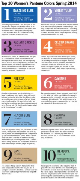
I know these are hard to read – check out more info here.
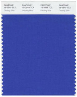
There’s always a trickle-down effect from fashion to decor, so many of these colors will show up in decor fabrics and accessory colors in the coming year. But it’s likely you’ll see more toned-down versions of them. Dazzling Blue is a royal to cobalt blue, but it’s a bit more “electric” than the ones I am currently using frequently as an alternative neutral to black or gray.
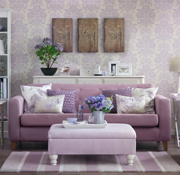
With two purples high on the list, we’ll see both blue-lavenders and red-lavenders continue to show up in both fashion and interiors over the next couple of years.
And Hemlock? It’s a stunner, and I’m happy to keep injecting blue-greens into the homes I work in. I must say, I’m also glad to see Cayenne in the top 10, as I’m ready for a rosy alternative to orange. But Freesia, Placid and Sand? As a Paint Color Consultant, you won’t likely see me specifying those colors for interiors anytime soon. Just a bit too gold, a bit too colonial, and a bit too fleshy.
Which are your favorites?
If you want to choose perfectly perfect paint colors for your interior, get my Color Workshop Video today!






I love 3, 6, 8, and 10. I find the others too bright for my taste, but I am sure they are lovely in small doses and and as accents.
Like many others, I have recently begun to make my major surfaces and furnishings more neutral in my home. But I am doing it specifically so that I can thoroughly indulge my often-changing color crushes without breaking the bank. I love many of the colors above, and find that I enjoy them most in small doses that take center stage against my neutral backdrop. They make me smile. My favorite from above has to be Radiant Orchid, paired with antique brass, cream and warm gray. Yum!
Nice pairing, Lex! Thanks for sharing 🙂
Spring 2014? Wow already! I have seen a lot of lavender and orchid lately. A lot of the same colors with new names.
Exactly my thoughts, Kelly. Same colors with new names. Dazzling Blue? A slightly tweaked Monaco Blue. Hemlock? Strikingly similar to Grayed Jade. And that awful Placid Blue? Dusk Blue.
Not at all surprised by the Dazzling Blue–it’s both so classic and so hot at the moment.
Interesting how they like to tell us what we’ll like 😉 Actually since these are colors that’ll be used in fabrics and other wearable fashion, the look of them will likely be altered depending on how it lays in the pattern, design, etc. As for these colors for decorating….hmmmm….. I’m thinking a gray/purple combo might suit me just fine 🙂
I’ve been using all of these expect #5 because it’s too bright and #9 because it’s too much like beige. I think they will translate well into home interiors. Purple, in all ranges from rich purple to lavender are crazy hot right now.