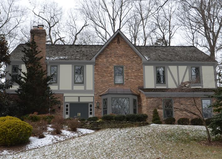
I’m always preaching about paint color placement, because I believe that can be as important as the colors you choose. I’m going to show you some variations of color placement on a recent online exterior paint consultation where Graphics Girl (that’s what I call my graphics designer because she is a superhero!) helped us visualize the best Tudor paint colors and placement for this home’s exterior.
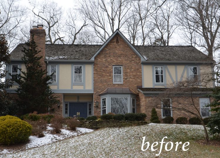
Below is the before version of this lovely tudor revival style home. Tudor and tudor revival architecture is often marked by the use of half timbering, stucco, diamond-paned windows, tall chimneys, and pitched roofs. This home was built in the early 1980s, but it harkens back to the medieval architecture in England during the Tudor period (1485-1603).
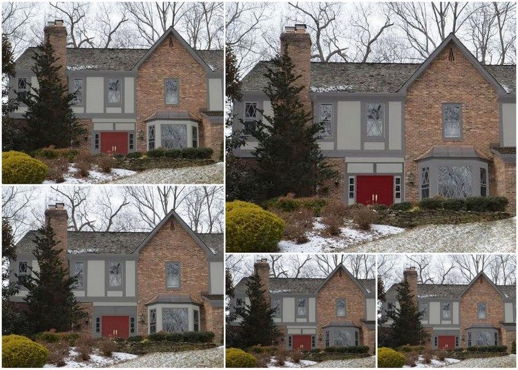
My client contacted me to help her choose new paint colors on the home she and her husband recently purchased in the D.C. area. Not only is the paint color palette a question, but also issues like: should the bay window area be painted out body color or trim color? Should the trim be light or dark? How much contrast between trim and body would be best? Here is a collage of how I had Graphics Girl mock up various paint color placement options on the bay window and the area around the front door, which I thought could be improved from the original color placement. Look closely:
tudor revival paint color placement options
I think the one at top right looks best, and the paint placement on those sidelights brightens up the entry area. Most people just repeat the previous paint color placement when repainting their home’s exterior, because it is just so hard to envision different color placement. That’s why virtual mock-ups can be helpful. Let’s face it – no one wants to screw up on a decision as expensive as painting an exterior. Plus, you’re going to be looking at it every day for the next 20 years!
tudor revival paint color mock up
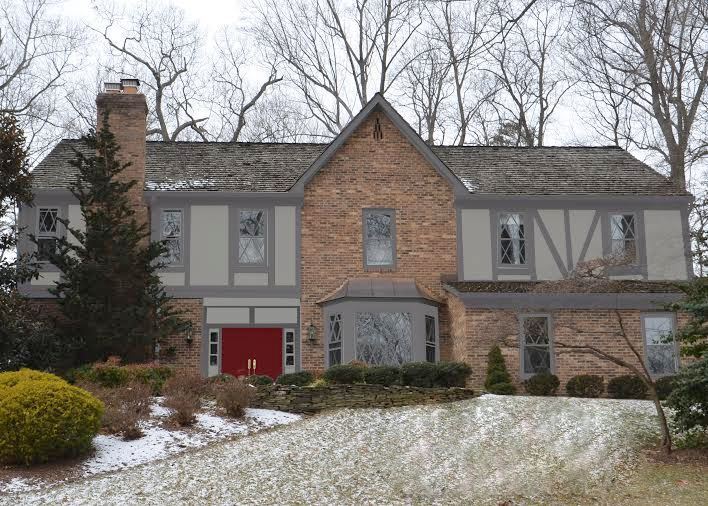
The mock-up above is actually my favorite option for paint colors and paint color placement on this home. Although she was thinking she wanted less contrast between the body and trim, I wanted my client to see how a sharper contrast might look, including accenting the diamond-paned windows a dark, rich color. I specified Benjamin Moore’s Lafayette Green HC-135 as the eyeliner on the “eyes” of this house, and the effect is a beautiful way to bring attention to the architectural detail of the diamond-paned windows. What do you think?
Here’s another tudor style home I chose colors for in Nashville. If you need help with your exterior paint colors, find out how I can help here.
AND, don’t forget to sign up for my Expert Psychological Stager™ course if you’d like to earn your home staging certification or up your game as a design professional! The next course is May 7-9, 2015 and I’m running an Early Bird Special for the next few weeks, so reserve your spot today!


I too love the darker colour trim for the windows! Many of the heritage homes in my neck of the woods have black trimmed windows with a contrasting wider window trim in a lighter colour so a common look here. Great idea for visualizing the exterior colour placement.
Thank you, Jo! I love a little eyeliner on my windows (and my eyes) 😉
You had me worried there for a minute when I saw the first photo…I like the same color scheme as you do. Nice job, as always.
Excellent, excellent, excellent post my friend! This after is suburb:)
I like the last image with the darker sash colors and the dark door. I think shutters would complement this house too. The window above the bay looks proportionately small and shutters would help balance it.
Lisa,
I agree – I am going to mock up some shutters for that window on the brick for them. Good call.
I like the top left photo with the lighter colors on the bay window, but not a fan of the red doors in that photo. I think the darker gray doors in the last photo look great! So, lighter bay window and dark gray doors. Hope this helps!
I agree that the dark green really brings out the windows and will probably look even better in real life than in the rendering, which unfortunately flattens out the building.
Darker colors on the window sash was common before white vinyl windows came along, and nearly universal before around 1900 or so, except perhaps on brick buildings. The dark sash with lighter casing remained common until WWII or so. I like it so much better than white sashes, especially when paired with dark casings, which to me makes the windows look flat and stuck on.
Unfortunately those of us with vinyl windows don’t have much of a choice. Then I think it is best to pick a light to medium color to minimize the contrast between the sash and the casing, especially on a historic or traditional style home.
Thank you for that input, Kathy – that history is really interesting. Vinyl windows are the bane of my existence! This client is having the diamond-paned mullions replaced, but they will be wood and can be painted (thankfully!).
I like it! It “feels” right. It’s strong, stable, period appropriate and PRETTY. Isn’t it wonderful when the homeowner drives up and feels a rush of, “oh I like this, what an improvement.” Nice work.
Thank you so much, Audrey!
I definitely agree that the red door is not quite right, and I agree that more contrast between the stucco and trim is better. I actually think even more contrast might be even better (I really wanted to say “more better”). 🙂 My grandfather built several tudor style houses in the 60’s and 70’s, and they always had the white/cream stucco with dark brown trim, so that’s what I think of when I think “tudor.” That specific combo is probably a tad dated now, though. 🙂 Your final mock-up looks nice and updated, without losing the tudor “roots.”
Just for fun, here’s one of the tudors my grandfather built. My grandparents lived in this house before I was born. He built a house for my parents down the street, and then built another tudor-ish house a little farther down the street. 🙂 Both of those houses have been redone, and look nothing like they did when I was growing up, but this first one he built still looks just like it did back then. If you’ve never taken a Google Street View tour of your childhood neighborhood, I highly recommend it. It’s like riding my bike through memories. 🙂
Wow, I love that!!! My grandfather and great-grandfather built many houses in Nashville – mainly stone Tudor Revivals, but quite small ones. I love driving by them on occasion. Thanks for sharing that 🙂
Is that the color for the door, too?
Yes, Dianne – for the windows and door, too!
Having these mock-ups is a lifesaver for exteriors especially, but I still struggle with color placement sometimes. I actually like having some of the lighter tone on the bay window as well. It feels so heavy all in the trim color.
What about also putting shutters on the two windows to the right of the bay window to help balance out the front door??
Beautiful job! For what it is worth, I too like the green window frames as feel they enhance the wonderful diamond panes but don’t distract from them. -Brenda-
P.S: When viewing the mock-up, at first I felt there was something about the design over the front door that didn’t appeal to me but after scrolling up to the first photo realized the area was a semi porch. Lesson learned …. ☺
painting makes beautiful house.
Such nice choices for the upper story! I like your suggested door color much better, but here in the DC area, red doors are very popular.
Painting a Tudor style home is not an easy task. I love this style for its enchanting appeal. But, it captivates attention only if it is painted well. You have done a fantastic work. The sharper contrast with the accenting diamond-paned windows is a perfect blend!
Hi! My home is a 1940’s tudor, It is painted light gray, with a creamy yellow trim and black window trim. The door is now this horrible pink, ( this is the way I bought it)! It is a rounded wood door with a horrific old aluminum storm door on it (that was made to fit it). I do not want to remove the aluminum door as there is no overhang to protect the wooden door. I thought about painting the aluminum door black, but am confused about the wooden door. Please Help!!!
What color did you use for the stucco? I’ve been racking my brain to find this color..