Seems like people are more interested in paint colors than ever before, so I thought I’d share the Sherwin-Williams paint colors used on both the interior and exterior of the Southern Living Showcase House that I toured in The Grove earlier this week.

The facade of this home is particularly welcoming and even cozy, because it’s structured like a u-shaped courtyard. The light-colored shutters and beadboard porch ceiling lend southern charm.
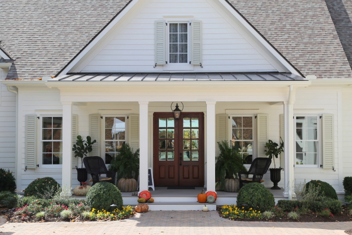
The shutters are painted in Sherwin-Williams Ancient Marble. The porch ceilings are all Sherwin-Williams Rainwashed.
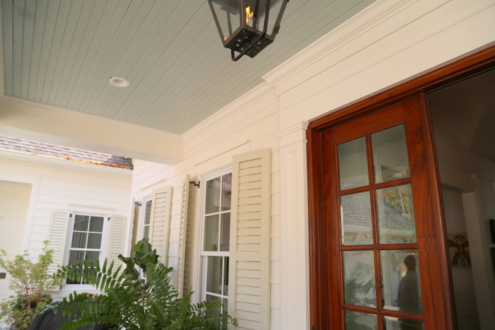
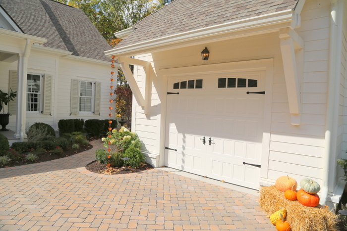
The exterior siding and trim is painted Sherwin-Williams Dover White. Notice the copper rain chains on the side of the garage.
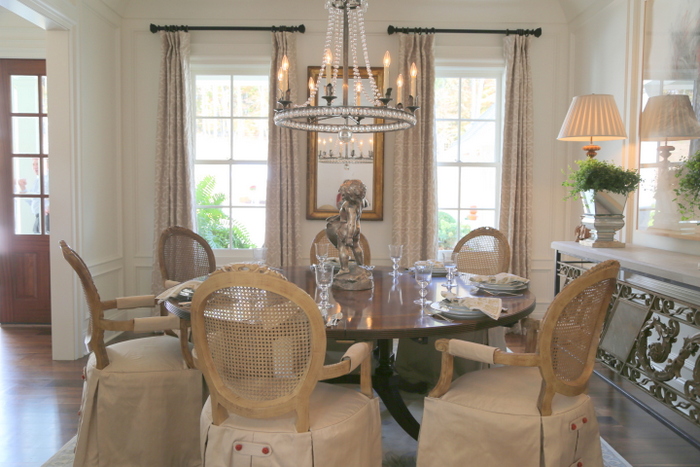
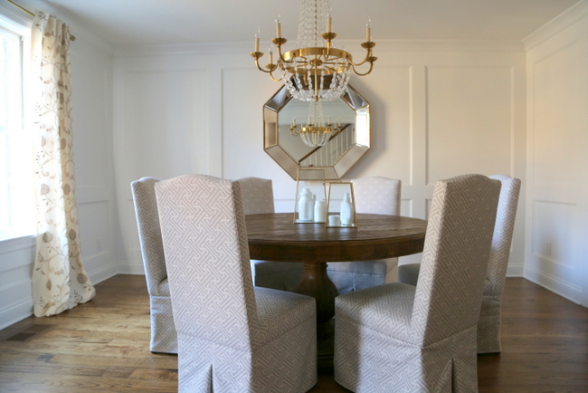
The vast majority of the interior is painted in Sherwin-Williams 2016 Color of the Year, Alabaster. While there is no doubt that whites and off-whites are trending for interiors, you have to be willing to add lots of fine furnishings and decor to make it feel finished. If you have one ugly or particularly colored piece, it will stand out like a sore thumb against a white backdrop.
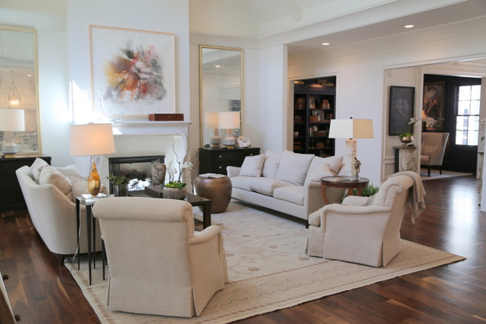
Sherwin-Williams Alabaster has a slightly yellow undertone. If you like this white paint color, be careful not to get it mixed up with Benjamin Moore Alabaster, which has a pink undertone.
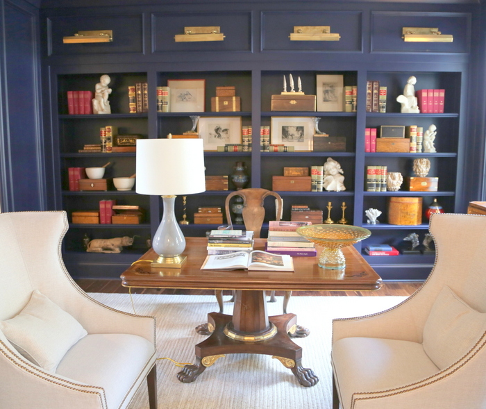
All the bedrooms are painted the same white as well, so I won’t bother showing you those here. The library is the boldest room in the house, painted in Sherwin-Williams Old Navy. Be careful with this color, it definitely leans a bit towards purple:
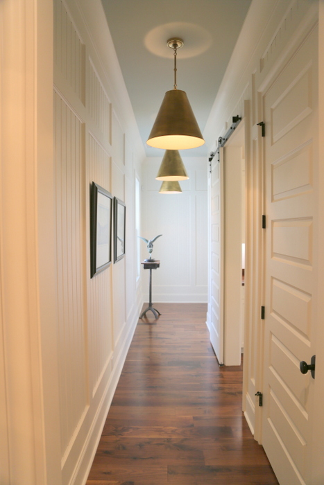
There are a few instances of blue painted ceilings on the interior of the house, including this back hallway.
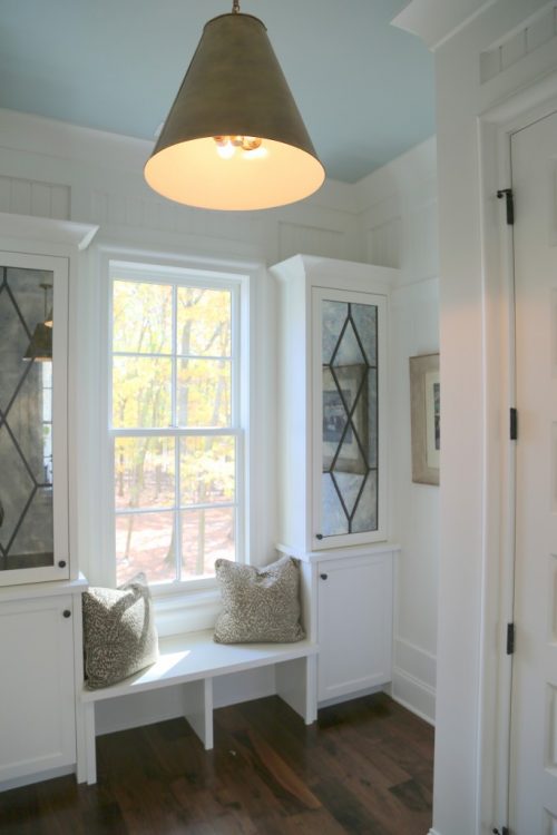
ceiling is Sherwin-Williams Rainwashed
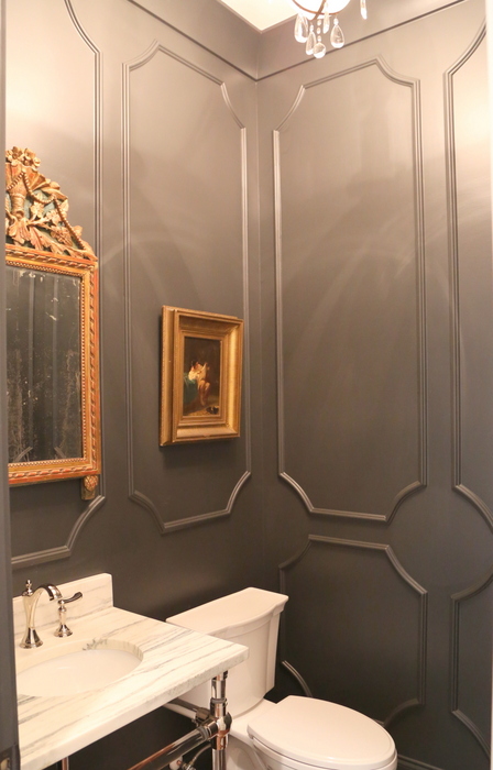
This dramatic powder room on the main floor is Sherwin-Williams Iron Ore. And check out the wall moulding here:
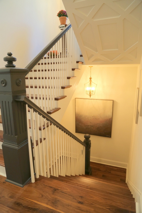
Sherwin-Williams Iron Ore is also the color of the handrails and newel posts on the stairs.
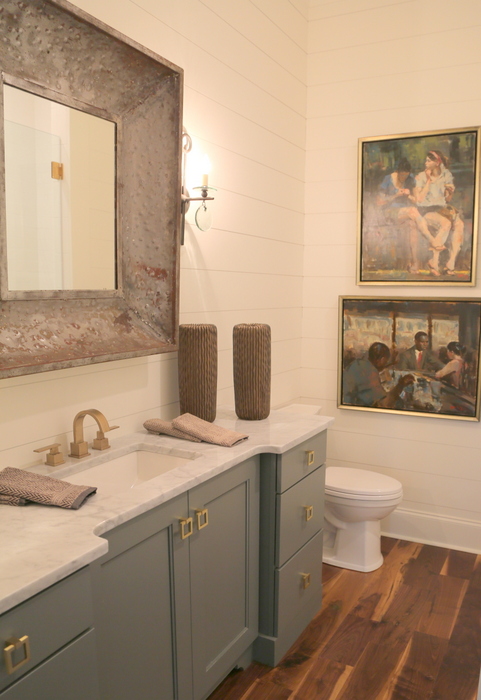
While most of the bathroom cabinets are painted white, this one in the guest bedroom is a lovely gray blue. I love the effect of the gold drawer pulls against this color. This is a prefinished color option from the manufacturer of the cabinet, so it’s not a Sherwin-Williams color. It’s similar to Benjamin Moore Intrigue.
To see more of this house, check out my previous post.
On a related note, I was invited to develop the color palette for Carbine & Associates’ soon-to-be-built House for Hope in Franklin, TN. I have to tell you: it’s been a real struggle to get the designers on board with my paint colors. Most of them want to do white walls, white trim, and white ceilings. Do you prefer a mostly-white color palette in a home? Or do prefer a tasteful but varied palette?







Varied, please! I grew up with whites, started married life with whites. Bummed to see it all come back again.
Please pass on to the designers that most female homeowners prefer a tasteful but varied palette. This is according to my nonscientific poll :).
CJ, women make 90% of the purchasing choices in this country and definitely have the majority of influence when buying a home. So I think your “nonscientific” poll is right on the mark 🙂
I like the look of all the white, at first. But you are spot on about the fine furnishings that must accompany that look. The majority of us cannot pull off that much white because we can’t fill an entire house with new furniture that will allow it to look “finished”. If I painted most of my house white right now, my family would ask me was I priming in preparation to paint!? Lol!
Yes! All white walls with not the greatest furnishings can make you feel like your living in your first apartment, right?
Kristie, I absolutely prefer tasteful colors carefully placed a relationship to one another. We bought a 150+ year old home with additions from the 60s and 70s. This was a new challenge for us–trying to integrate the old and new aspects of the home with respect and taste (if you know what I mean). The best thing we ever did was buying your video “just the right paint colors”. We made a list of colors you recommended that we felt would work, bought sample jars of them, and I painted several posterboard samples of each color. Following your suggestion, we placed the colors in different parts of the rooms and watch how they changed during the day and evening. We are able to tie the many elements of the home together because of your great teaching–I am so glad we spent the time to watch your video (several times). We always get compliments on the colors we have applied, but our success was because we went into the project educated! We recommend your videos to our friends. Really appreciate your furniture placement video also!
Susanne,
Thank you so much for the glowing review on my paint color and furniture arranging videos! I love to hear when people have successfully applied the colors in their homes. I am so happy to hear that you love your new colors, and you know I have such a love for old homes – which makes it all the nicer to hear! I’d love to see some photos if you could send me a few of your favorite rooms – [email protected]
Thanks again for your encouraging comment!
My vote is for a “tasteful but varied palette”. In a model home, I’m looking for inspiration and “ahhh” moments–a bit like runway fashion! If designers cannot handle color, who can 😉
I have to admit that I like white. Maybe not stark white, but various shades of white and off white, even very light muslins or linen beiges may still be ok. Or the absolute lightest versions of a colors are nice too, the ones that read almost white.
I’m not at all into a colored walls right now.
I go and see a lot of open houses and I dislike each house that has walls of any color. They just seem so old, dark and un-fresh. I do agree that the furnishing in an all white house need to be tops, not necessarily a lot of stuff, but what is there needs to be on-point and it helps to have some architectural interest. I also notice that they take longer to sell than houses painted in light whites.
Another color that I love to wear, but do not like in interiors in most houses I see it in, is a clear-clean grey. Unfortunately, unless decorated in all white items, or very very carefully edited items, and the right floors and true white mill-work and cool hardscape items, the clear grey never seems to look right and can especially seem like someone is following a trend to update an older house. But I do agree that we are probably all kind of sick of seeing endless white rooms on the web. This is really too bad though, because it is my choice of color and I hope there isn’t a backlash of too much white that it becomes un-cool or “tainted”! Great post Kristie!
Sorry, that came out wrong I think…I meant to write that houses with colored walls seem to take longer to sell than white or light interiors. At least in the Seattle area. It may be regional.
Chris, thank you for sharing your thoughts! You are correct that dark walls are not best for staging/selling a home. I find that a muted but varied palette is key – if the whole house is one color, buyers don’t remember the rooms as well, so the right balance of the right light colors is important. This can be hard to get right for stagers and sellers, which is why I created The Psychological Staging Paint Color Toolkit.
Tastefully varied palette, all the way! I have to be honest, I was a rather disappointed with this showhouse. I love neutrals layered with lots of textures, but this was just so safely tasteful and lacking in character to me. I feel like anyone could live there and anyone could have designed it.
I very much appreciate knowing the paint colors, though. And I really did like the exterior choices in particular. I thought the tonal shutters an interesting choice.
Tastefully varied, please! I went specifically looking for paint color inspiration and was sorely disappointed. I can’t wait to see your palette for the House for Hope and get my inspiration there!
I love color. But then you did that beautiful house in April and I LOVED the way it turned out. The white was warmed up with browns and felt warm instead of sterile. I feel like white only works if you really know what you’re doing.
I love the blue ceilings. When I was a child my mom always painted the porch ceiling a pretty sky blue! If you’re going to go white, it seems like a nice way to introduce some color.
Yes, Cathy – I like that they used the blue on a ceiling down a narrow hallway. It kinda pulls you through the space, and keeps it interesting 🙂
The problem with white walls, trim and ceiling is that it really only works in homes with a lot or architectural interest and great hardwood floors. For what I think of as “subdivision” homes, i.e. the typical homes that most people live in, an all white palette doesn’t work at all. But a tastefully varied color palette can add interest to an architecturally uninteresting home, and help provide a cohesive look, even if the furnishings aren’t the greatest.
Great observation, Tracie! I concur 🙂
I love the look of white in magazine photos, but discovered that I couldn’t live with it when I rehabilitated an old house top to bottom and had the contractor paint all the walls white. It lasted about a week before I started repainting everything.
The white reminds me of sheetrock every time. I’m still crazy for S/W’s Functional Gray. Overall, I feel more psychologically welcomed with some color on the walls. That is, some color one doesn’t have to concentrate on to see there really IS a shade of color. Maybe that’s wanting visual gratification…or maybe I’m way off. Anyway, not crazy about white walls. Can remember when my mother called those colors “oyster” and “eggshell.”
Judy,
There is definitely a psychological impact of color – for good or for bad!
Just finished painting the kitchen cabinets. Uppers Alabaster and lowers Cornwall Slate, what a chore but what an amazing difference! Chose the S/W Alabaster on a whim and love it! Did get a little carried away , painted the ceiling (flat), kitchen and dining room chandeliers with the satin finish like the cabinets because it picks up the light and reflects it so beautifully. Still waiting to paint the red fireplace brick Alabaster (flat) in the dining room next spring. Walls are S/W Aloof Gray (cashmere finish) which is an amazing color that changes gray-blue-green with each passing hour, so calming and peaceful. My husband says Sherman Williams is my new boyfriend and King Gustav approves of my choices 🙂 i have found that true creators pass their knowledge along like illumination in a dark room. Betcha you never thought you would be likened to a light bulb! Thank you for your amazing teaching and sharing, they’re gifts
Not all white! It looks nice in magazines , but I cannot imagine the up-keep of white furniture, white rugs, white walls with a family! Looks much too cold to me.
Sorry I am posting late. Stick to your guns, the world needs more color! I agree with the above, white works in a designer home, but if you have anything “off,” you can’t disguise it or give it charm without some other tricks. Also, a lot of different “stuff” against white can look messy/cluttered and it just doesn’t work for homes the way it works on Pinterest. Please…stick to your guns!
Quickly…what do you think of the Iron Ore? I love it! I did tricorn black in my small bathroom and love it, but I kind of wish I had done Iron Ore. Oh well. And on Rainwashed…what is the undertone of this color? Is it blue with gray? Green with gray? And do you like it’s one down color Quietude for bedrooms? Just love paint talk!
I love Iron Ore, Tanya. I’m using it for all the interior doors and staircase railings in an upcoming project. Rainwashed reads quite blue, but it does lean green (vs. purple). Quietude is a very nice bedroom color – I’ve seen it used in many designer showhouses over the last couple of years.
The exterior Dover White color is beautiful. It looks very white, yet warm, as opposed to a “blue-white” you see on a lot of houses. Very nice!
White is nice, but I dont have the money to always buy newer updated furniture. The beach house my husband and I remodeled, painted and staged, sold in three weeks in Newport Beach CA with a muted palette. We had no trouble decorating around the walls painted in a muted “greige”. You can’t live in home that is all white without worrying that something will get something dirty.
I love your choice of interior paint colorful Alabaster… did you use the same color for trim and cabinets?
Thank you, you do beautiful work!
I love the paint colors but like the metal and roof colors that go with it as well. Do you by chance have those colors?
Roof colors meaning shingle colors!
Yes, I am also interested in the roof colors. (The brand and color of the shingles as well as the metal above the porch). Wr are reroofing and this is the look I am creating.
I’m sorry, Lisa, but I don’t have that information! Good luck in your search!
What color stain did you use for entry door?
I would love to know the stain on the entry door as well! 🙂
What color are the shutters?
What is the blue on the ceiling? It’s beautiful.
Searching for a good shingle and metal roof combination. Can you tell me what color the shingles and roof are of the 2016 Southern Living Home is? I know it was a while ago!
Love the living room chairs…. please pass along to me brand and name of the chair. Thank you in advance
Can you share what color the roof is on this home?