Every new year I’m asked about TRENDS – and today I’m going to focus on sharing the 2022 paint color trends. Here are the top five things you need to know about trending color:
It’s Easy Being Green Afterall
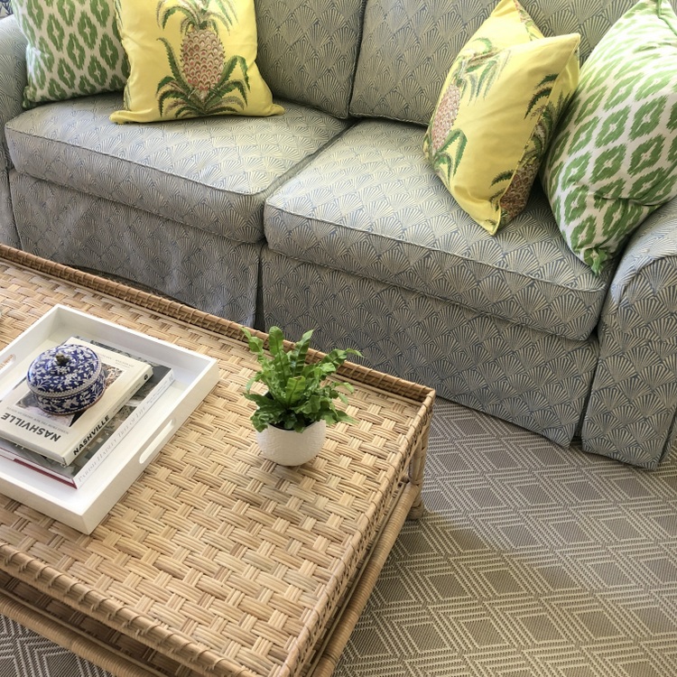
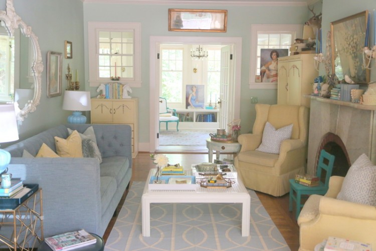
I’m sure Kermit would argue with me on this point, but it really is easy being green in 2022. For the first time EVER, most of the major paint companies went with a green as their 2022 Color of the Year (you can read all about that here). Grayed and earthy greens are growing like weeds (you get it?) in popularity, and dark greens have been dominating as an accent color for a couple of years now. Pairing those together is a natural!
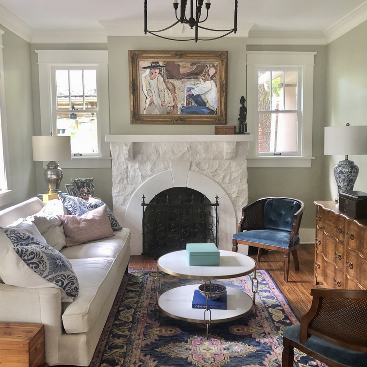 gray green, The Decorologist (befores and afters of this project here)
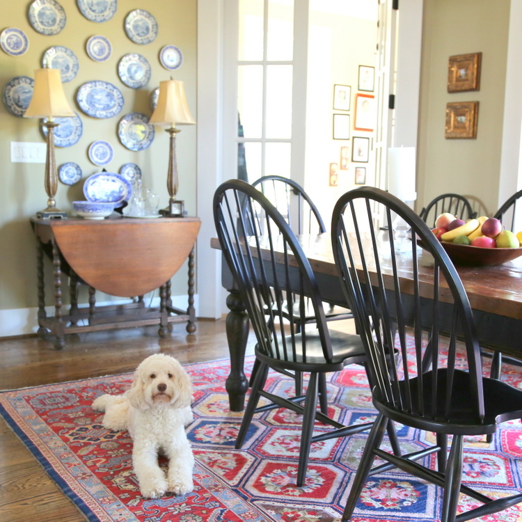 earthy green, The Decorologist
Beige is BACK, Only Lighter
The color gray reigned in the prior decade, and white has had it’s day in the sunshine over the last five years. What’s next for neutrals? Beige, but not your standard “builder beige” of the past. These beiges are lighter and more nuanced, falling between off-white and what most of those think of as beige. If you currently have a beige room that now seems a bit dark to you, you might try a lighter version of it to brighten up your space, like I recently did in a client’s home:
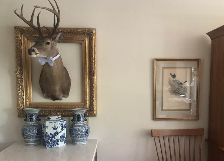 the “new” light beige, The Decorologist
Light Colors Sell Houses
In 2022, white and off-white continue to be the top colors for interiors and exteriors when selling a home. The 2022 FIXR Paint & Color Trends report confirms that. But that doesn’t mean everyone should repaint their house white before putting it on the market. Contrary to popular belief, white is not the answer for many homes. It totally depends on the finishes and furnishings.
According to FIXR, designers report that homeowners are now choosing warm neutrals more than white and black color palettes when repainting the homes they are living in. Good colors for selling homes include off-whites, light beiges, and light grays, depending on what other elements are in the home (tile, flooring, countertops, etc.)
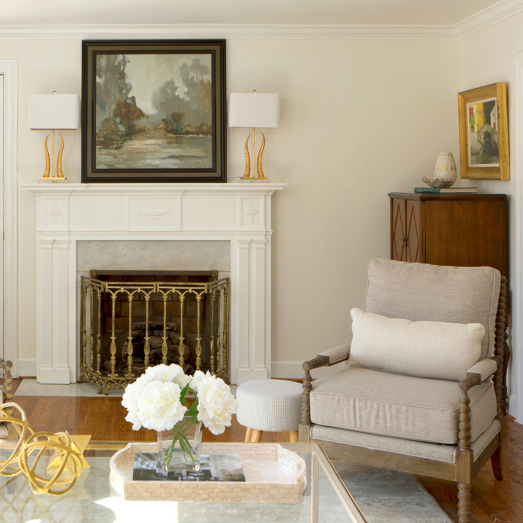 off white, The Decorologist
Wallpaper is Wonderful
Ok, wallpaper isn’t a color, but it it has officially re-entered the mainstream in a big way. And it’s a great way to introduce new color into a space. FIXR’s report found that the powder room is the most popular place to include wallpaper, with dining rooms and ceilings being the next spots to consider.
The wallpaper patterns that will be most popular in 2022 include nature-inspired, Chinoiserie, geometric, murals, and Art Deco. I’ve been consulting on a master suite project over the last year where we chose an Art Deco wallpaper in greens for the bathroom:
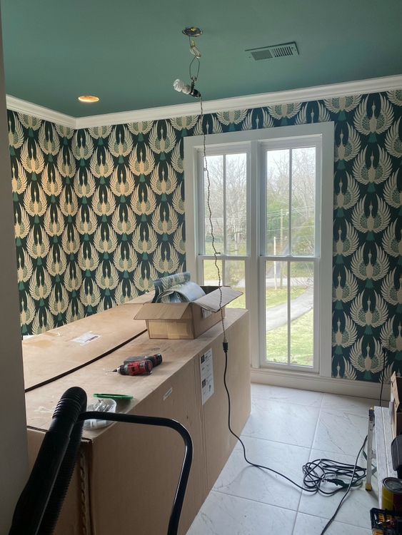 bathroom progress shot
Your Favorite Color Never Gets Old
Here’s my final say on the matter of 2022 Paint Color Trends: using YOUR favorite color is always the right way to go. Trends wax and wane over time, and in some ways we will always be chasing them. But creating a color palette that includes your personal favorite color will make you smile every time you walk in the room. No matter what the trends say.
There are so many ways to add color to your home, including fabrics, paint, wallpaper, rugs, art and pillows. According to the results of the FIXR report, these will be the most popular ways to incorporate new colors in your home this year:
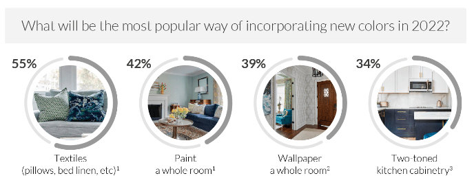
Each year, FIXR.com reaches out to industry influencers and top interior design experts to find out their take on the latest paint and color trends. 64 experts were asked to contribute their opinions (including me!) and it’s a very thorough report that you should really check out here.

Pin this image for future reference:
Thanks so much for reading my blog, which I’ve been putting out since 2009. It seems like the world has changed a lot since then, but I have found that the passion for color and design never changes! If you share this passion, I invite you to consider training with me and becoming a Psychological Color Expert™. You can find out more about the certification course that lays out my complete system for choosing the right paint colors for your home or conducting professional paint color consultations that wow your clients here.




Kristie, what did you think of the Panone color of the year??? That blue?
You mean Very Peri? I think it was waayyyy off base. Not good at all.
Oh good! I thought a big “NO”. Love your greens. And green is not my favorite color, but much softer and prettier and go well with soft and pretty blues too.
That’s the good thing about greens – they go with practically every other color since it is so natured-based. I’m glad you agree with me on that overly dark and saturated periwinkle that Pantone chose. 😉
Art Deco, eh? Looks like the ’20s are back. Interesting to see wallpaper making a splash again. I like that one in the bathroom shot. Is that a duck, or goose, in the print? Either way, it’s really cool.
Thanks, Molly! That wallpaper features cranes, from a view underneath if they were flying in the air above.
Very punny and good post 😁I love your advice at the end. In a world where we feel that nothing is enough or on trend. It’s nice to find what you really like and go for it.
I do love beige though. More than gray.
Thank you, Veronica. The reason I never changed the main color in my previous home in the 20 years we lived there is because it was a color I loved and still love. Not at all on trend, but I learned how to incorporate all the colors that looked great with it.
I love your blogs, keep them coming! Always something fresh to take away!
Thank you for the encouragement, Patti! It means a lot to me. 🙂
The crane wallpaper in the bathroom you’re doing is beautiful! (I’m in Florida and I see these graceful birds often in our neighborhoods). Having a large window in the bathroom would stump me, and I’m looking forward to seeing how you deal with this privacy issue. Love your blog.
I love love the beige color you did here! Can you share the name?