Do you have a lot of mixed wood tones in your furnishings? Would you be surprised if I told you that was actually a GOOD thing? Using all the same wood tone can give you a flat, monotonous look in a room, while mixing a few varieties can provide depth and interest.
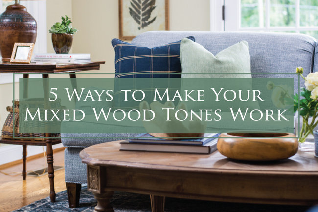
Let me start out my saying that there is no exact formula for mixing wood tones. However, I have some helpful tips for mixing them successfully:
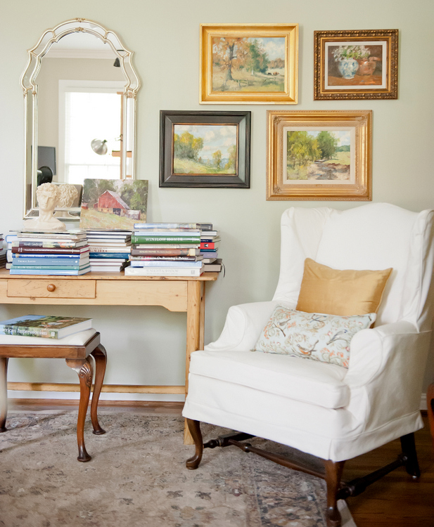
Choose your main wood tone
One of the wood tones in your room should be repeated a couple of times, if possible. While they don’t have to be the same wood species, they should have the same undertone of color (orange, red, or yellow, for example).
 The Decorologist
Add a mix of lighter or darker wood tones
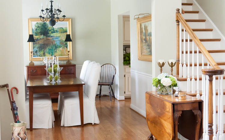
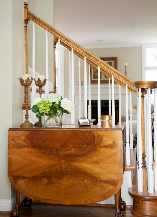
When you mix wood tones in a room, contrast is key. Dark and light wood tones create interest. Pair a light wood floor with darker wood furnishings, or a dark wood floor with lighter wood furnishings. In my client’s home below, the darker dining table and antique chest contrast beautifully with the lighter wood stain on the floor and stair bannister, while the burled drop leaf table marry both dark and light tones nicely.
 The Decorologist, Melanie G Photography
Integrate a few painted or metal pieces
If you have a lot of traditional or antique wood pieces in a room, adding furnishings and decor that have metal or painted finishes can really brighten and update the look. The round metal coffee table, mirror frames, and drapery hardware add a bit of contemporary glamour that balances the more traditional furnishings in my hip, young client’s living room:
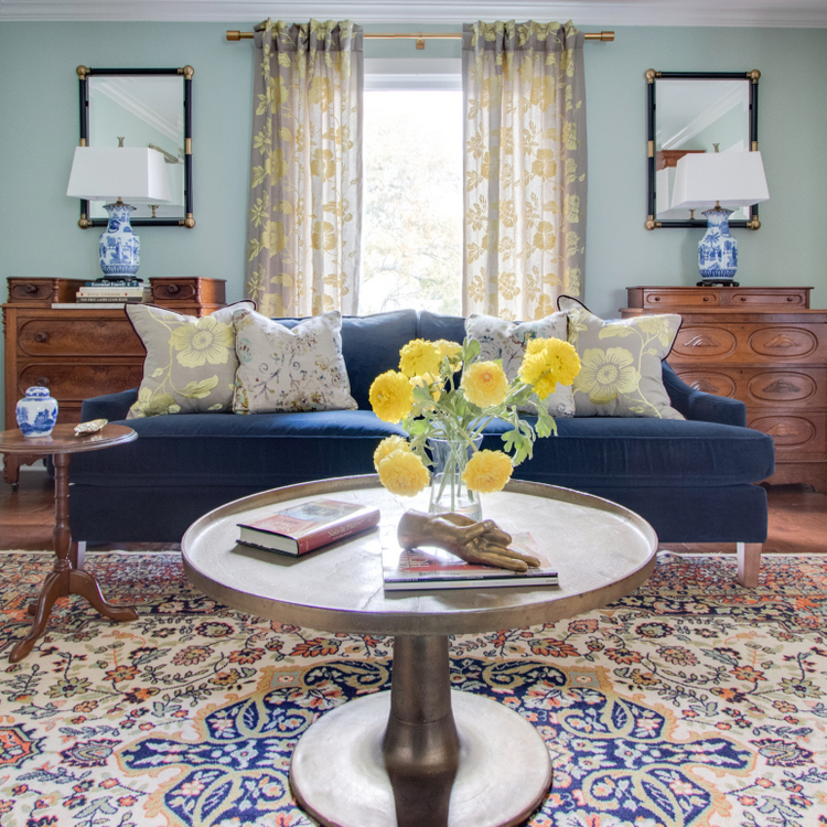 The Decorologist
And touches of black – whether metal or paint – really help!
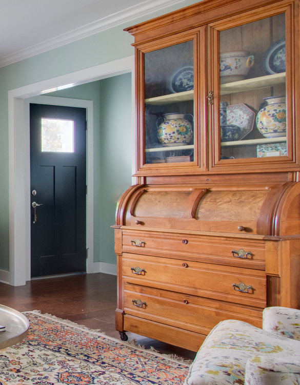 The Decorologist
Add a rug to add contrast
While a large rug is always great for grounding a space and anchoring a furniture grouping, it also provides a break between multiple wood tones. This is particularly helpful when your furniture and floor wood tones are either both light or both dark. In the living room below, the dark side table has great contrast with the lighter floor, but the coffee table wouldn’t have married as well if placed directly on the wood floor. The rug really provides the proper contrast needed for the table’s light wash stain.
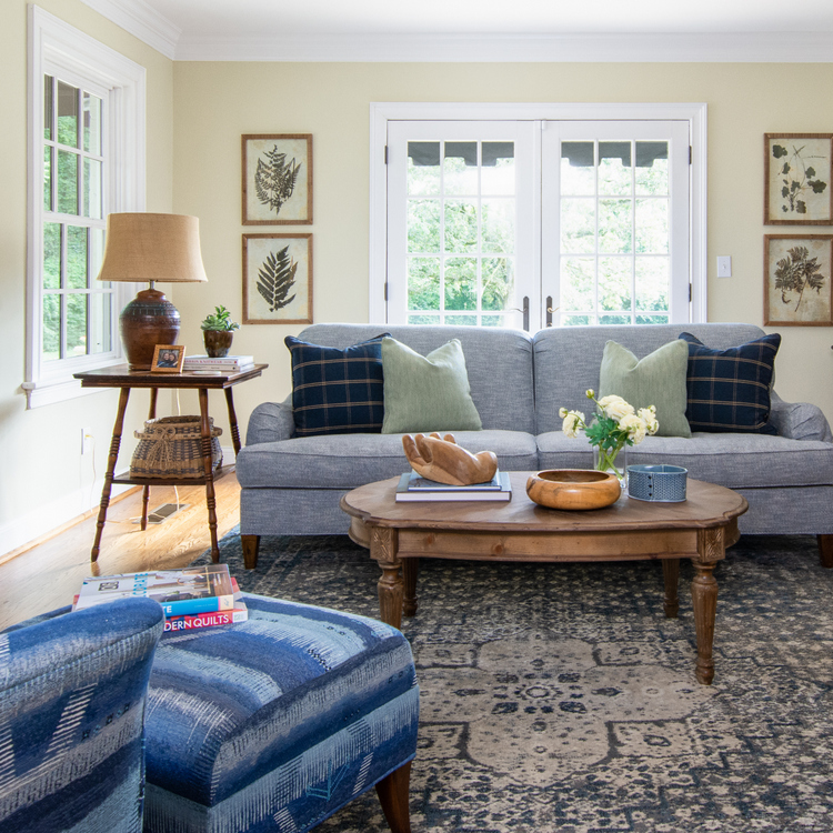 The Decorologist
 The Decorologist
Check out how these three different wood tones look perfectly fine up close together when planted on a rug (this would NOT have been the case without a rug in this scenario):
 The Decorologist, Melanie G Photography
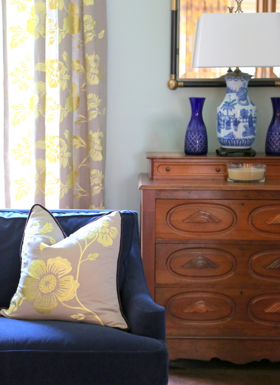
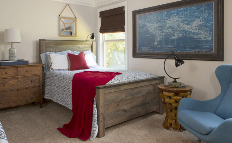
Use a repeated accent color to tie mixed wood tones together
A great trick to unite a bunch of mixed woods is to repeat an accent color across the room to create connections that have nothing to do with the wood tones. In the bedroom below, repeating the same blue in the space really ties the multitude of mixed wood tones together!
 The Decorologist
I hope this gives you the confidence to mix wood tones in your home, rather than being fearful of making mismatching mistakes! Using these pointers will make your mixed wood tones seem like all part of the plan.
If you like the design and color advice I offer in these blogposts, you should know that I offer deeper dives in my video workshops and especially in my professional-level training. These are all available online and on demand, whenever you’d like to learn! I cover topics like styling accessories, arranging furniture, choosing paint color, as well as certified training to become a professional Home Stager or Paint Color Consultant.


Thank you for this post! We are currently in the process of choosing engineered hardwoods for our main level, including bedrooms. Part of my dilemma was seeing all the different wood tones. We will be putting down a large area rug and this has given me much more confidence about the 3-4 different tones. Thanks again.
I’m glad this helped you, Shelby! A large rug will definitely pull disparate wood tones together.
Thanks for these tips. I swear you know exactly what info I need when I need it. We are finishing off our open concept living room and kitchen and we have some different woods I was worried about tying in together. This was such a big help. Thanks
I’m so glad, Roxanne! Maybe you are sending me signals somehow, haha! 🙂
Kristie,
Love these tips–especially the last one which I would not have thought as “working” with mixed woods but it truly does! Can I share this on my Order in the House Staging facebook page?
Thank you, Linda, and OF COURSE I’d love it if you would share this post. 🙂
Thank you for your thoughts on how to deal with mixing wood tones! I have a Victorian home with wood everywhere. Although I love it, I don’t love the wood’s orange undertones. I don’t want to cover it up, but I wonder what paint colors to use to downplay it?
Ellen,
Don’t dismiss a few good rugs, but I would suggest blue and green paint colors. They always work best with orange floors, even if they are very muted versions of blue or green.
This is not quite the question in discussion but not sure what place to ask this question : But, I want to paint some old antique furniture gold. I don’t want the spray gold paint . I would like to know of a brand of gold paint you can put on with a brush on antique vintage wood furniture . The water based gold paint I bought did not work at all. Thank you, Barbara Renfrow
Have you tried Rub ‘N Buff gold or silver paint? I have applied it with both a soft brush and a soft cloth. It’s available at craft stores, Hobby Lobby, and Amazon and looks beautiful!
good article, interesting ideas I had not thought of, I use black alot to stop the oak oak oak every where, the older homes in my town are full of oak, the contrast of black really helps, like your idea for metal and painted pieces, always learning is what the world is about, thanks for your blog…
CarolAnne,
Thank you so much for commenting! I find it a bit hard to talk clients with tons of wood to add black. They think it is already dark, and they fear black will make things darker. Little bits here and there really do help break up the wood tones. 🙂
PineTree Lane is the best online furniture shop in Dubai. Get the perfect furniture for your home starting from amazing sofas, chairs, tables, cabinets and kitchen furniture. Whether you want a modern and contemporary piece of furniture or a classic and ancient one, we have it all for you.
Love this article, so helpful. I inherited some antique furniture and am trying to incorporate with my lighter, reclaimed wood tones. I’m not sure what tone or finish framing I should use for artwork and photos? Our dominant wood tone is the reclaimed wood, with some walnut and maple pieces added in. I also have some painted old white (Annie Sloan) furniture. Finishes are polished nickel, stainless steel appliances, brass handles on furniture and a gold on our grandfather clock. Lots going on so I’m trying to tie it all together! Any tips are much appreciated!
Hi Sarah,
I would suggest you frame your artwork with a finish that is currently lesser-used in the space. That will make the lesser-used finish seem more intentional and not just out of place. If there are too many wood or hardware finishes mixed in a given room/space of your home, you may want to shift a few to other areas so that things don’t get too chaotic!
Thank you, Kristie! Any feedback on how to combine styles is much appreciated. I have both farmhouse and Sheraton style going on. As far as metal finish verses wood, do you feel that one brings a more cohesive look than the other? Also, is there a particular style frame that is neutral and would work well with with both styles?