I was invited to join some of the biggest bloggers from the South to tour and photograph HGTV’s latest Smart Home 2014 located right here in Nashville. The “Smart” in Smart Home refers to all the latest in high-tech innovations giving the homeowner better control over energy use, security, interior climate, and lighting, but I found so many “smart” design ideas there, as well! Here’s the top 7 smart design ideas that I wanted to share with you today:
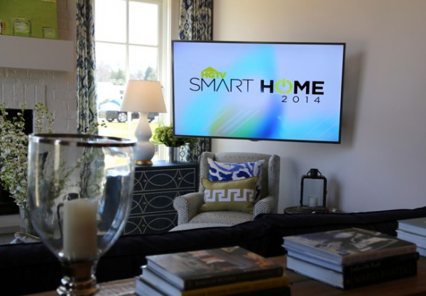
Duncanwood Reserve, Nashville
1. Installing sconces is a great way to shed light and get a custom look in your home. They warm things up and provides character that plug-in lamps can’t.
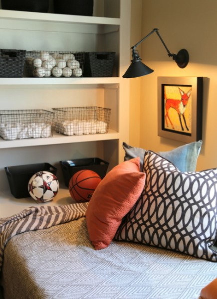
HGTV Smart Home, Nashville – boy’s room
The HGTV Smart Home had sconces everywhere – hallways, stairwell, reading nooks, bathrooms, bedsides, etc. Sconces are the only light sources that give you light at eye level – ceiling lights are well above and table lamps are below eye level much of the time you are in a space.
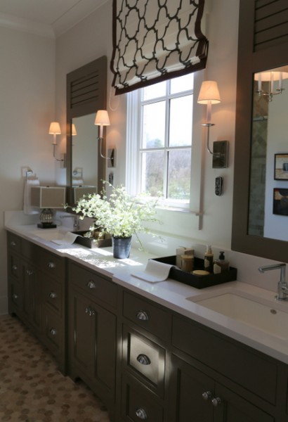
HGTV Smart Home master bathroom
2. Nailhead trim is a great way to add a bit of bling to your furniture, especially if it forms an interesting pattern like on this fabulous bureau. Designers Linda Woodrum and Kelly Grokulsky chose all the furnishings – yes, I said ALL – in one long, marathon day from Bassett Furniture.
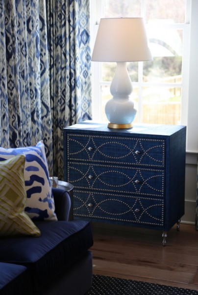
HGTV Smart Home living room
3. You’ve probably seen pairs of cube tables and ottomans used in place of the typical coffee table, right? Sometimes three is even better than two – take a look at these great wood cube tables in the home’s rec room. They can be pushed together like a rectangular coffee table, or pulled apart to meet the need of whomever is sitting nearest.
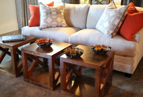 Wood cube tables from Bassett
4. Subway tile is still awesome, but it doesn’t always have to be white to be a classic. One of the bathrooms in the HGTV Smart Home was tiled in a gorgeous navy blue subway tile:
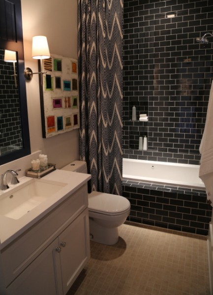
dark blue subway tile
And another featured a soft black subway tile as the bathtub and shower surround. It was surprisingly sophisticated:
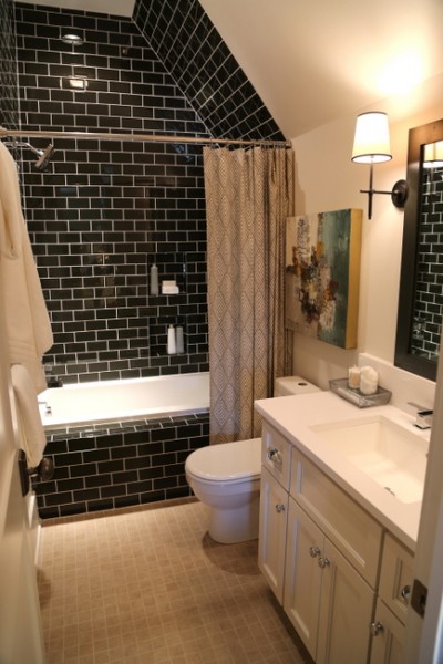
black subway tile
5. Creative wood moldings add texture and architectural gravitas to any space. This compact upstairs children’s den is just big enough for watching movies, playing video games, and reading books, but look at the punch the paneled walls and planked ceilings give it! I really think this was my FAVORITE room in the house. You’ll notice it’s all painted out – not exposed wood. Painting it doesn’t make it any less “wood,” y’all.
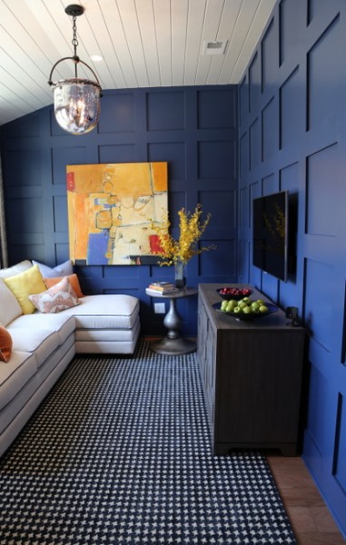
painted paneling and planked ceiling
Here’s another example of a wall treatment that includes applied wood. This is Jack Thomasson, HGTV house planner, with me in front of a fabulous accent wall that combines wood and painted stripes to make a statement in a boy’s room.

Kristie Barnett and Jack Thomasson
Here, we’ll move out the way so you can see what this wall really looks like. It really has great texture and dimension.
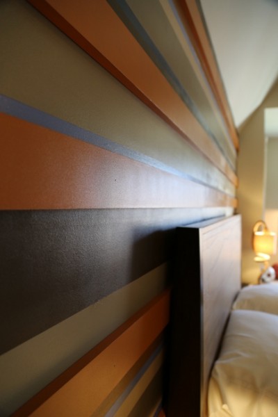
planked wall in HGTV Smart Home
6. Ever thought of installing a backsplash in the kitchen that might be found on a bathroom floor? Maybe you haven’t, but I think you’ll have to admit that this kitchen design proves that it can be absolutely stunning.
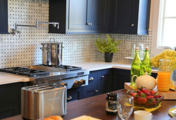
HGTV Smart Home kitchen
7. Bound and serged wall-to-wall carpeting can be an cost-friendly alternative to area rugs, and you can have them made whatever size best fits your room. Designer Kelly Grokulsky told me that she and Linda Woodrum chose all the flooring for the home in one day from Shaw Floors.
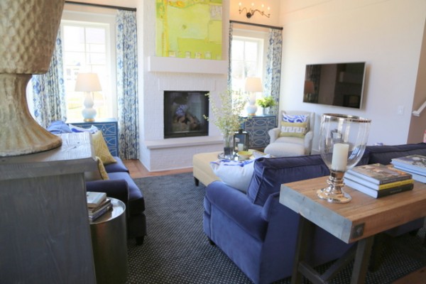
bound rug from Shaw Floors
I have lots more photos and information to share about this house, but there’s only so much I can squeeze into one post! It’s NOT going to open to the public, so stay tuned for upcoming posts featuring this beautiful home. I want to thank Forest Home Media for inviting this band of bloggers for such a special tour of the home.

HGTV Smart Home 2014 Exclusive Blogger Tour
Forest Home Media represents Carbine & Associates, the Nashville-based builders of the HGTV Smart Home 2014. They also provided us with swag bags of goodies from HGTV:
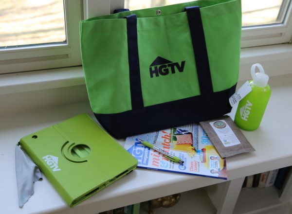
Did you know that you could actually WIN this home? The HGTV Smart Home 2014 Giveway opens for entries April 15 and runs through June 9. Visit HGTV.com/smart to learn more about this home and the various prizes you can enter to win, including decor items from inside the home.

Nancy McNulty and Dana Tucker of Forest Home Media
What is your favorite smart design idea from the HGTV Smart Home?







Pretty home and even prettier ladies! Thanks for the sneak peek AND the ideas!
I like how Jack’s shirt matches the wall!
Haha, that is a great shirt 🙂
Ooh-la-la. Some really interesting and gorgeous design choices. My faves are the navy blue subway tile, the walls in the boy’s room, the blue cabinets and the blue living room. I guess I’m on a blue kick right now. Thanks for sharing, Kristie!
Beth,
I am also loving those darker blues . . .
The tile in the kichen!! Takes my breath away. Love!!
Thanks for the Forest Home Media shout out! Great blog and I love that upstairs Indigo Batik kids’ den too. Small space made big w/ those extra building touches!
Wow! What a home! The sconces are such a great idea! Thanks for sharing! I also like the idea of the large room size-rugs with the bound and serged carpet–that opens so many options up to a home owner. I wouldn’t have thought of that on my own. Lots of wonderful photos and comments. I am eager to see what else you will be introducing us to in this house. Thanks for the time you take to share with all of us. I have been getting a great education since I started reading your blog!!
Thank you so much, Susanne! There were so many good ideas there 🙂
Susanne, stay tuned to an upcoming blogpost on the paint colors in this house!
Kristie, thanks so much for coming to the Blogger Day and for the great post!! I’m glad my photo of you and Jack came out. Of course, you can’t take a bad photo. Thanks!!!
Ooohhh it is so hard to choose… So many “smart” design ideas. I like them all, but if I have to choose, it would be the navy blue subway tile. I was surprised to see that it really looks classic. Thank you for the inspiration Kristie.
I loved both of the dark tiled bathrooms, too, Livia. That dark blue was just gorgeous and very liveable.
The cube tables. They’re exactly what I need for my living room. So much easier to move around when cleaning or working out than a big, heavy coffee table.
I’m loving the blues too, not navy so much in a room but those softer blues
are wonderful. Also love the eclectic style mixes in so many of the rooms/areas.
Please could you tell me where the lighting fixtures came from .I know some are from Ethan Allen but not all. Looking forward to hearing from you!
In the 2014 ghtv smart house where did all the ceiling light fixtures come from? Some are from Ethan Allen but I can’t find the others. Please help! I’d like to redo all the light fixtures in my house. Thank-you.
Hi Kathy
did you ever find out where the lighting came from? I ask because my mom after 45yrs is re doing her dining room and fell in love with the black iron chandelier and for a surprise I’m looking for it. I have looked for 3 days with no luck.