When designing interior spaces, I typically choose paint color first. If you work in the field of design, you may have been taught to do the exact opposite. I know, I know. That’s what they teach in design school. You start with art or fabric or rug, then choose a wall color from one of those – you simply have to match it. Color me crazy, but what affects you most when you enter a space? It’s what you see the most of, right? So if you choose the background color in that piece of chair fabric or a color in 15% of your area rug for your wall color, it may match but that doesn’t mean you (or your clients) are going to LOVE it.
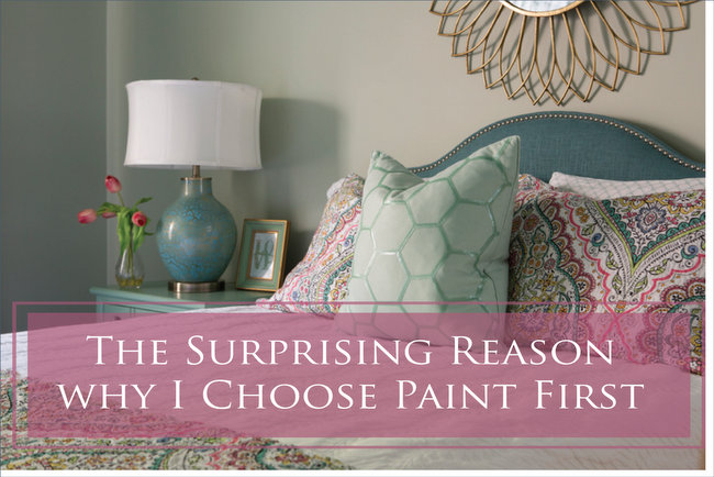
Last year I designed four children’s bedrooms in one client’s home. Although the youngest of the family was still in a crib, the idea was to create a room that would be colorful but sophisticated enough to take her from little girl to adult. Designing “evergreen” children’s rooms is something I really love to do. It’s an approach that enables you to stretch your dollars by making design decisions that last throughout childhood – so you don’t have to buy new every few years when your kids tire of Barbies or Pokemon or whatever “theme” of the season they are into.
Of course, we should start with the “before.” There really wasn’t much to work with. Just a full-sized mattress and a crib. My client wanted happy color for her baby girl’s room, but something not too babyish or predictable.
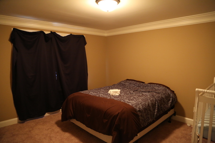
before
Pretty dreary room to begin with. Because the bedding and some decorative items can change out over time, we started by establishing the paint color scheme first. “WHAT???” you say. “You choose paint color first?”
Yes. Yes, I do, when I have the opportunity to do so.
Do you know why?
Paint color has more impact than any other design element because it’s always in your field of vision. If the paint color isn’t pleasing, the room design is a bust.
And that’s why you should choose paint color first. It’s more important that you love the color that you see all around you on the walls than it is to first choose a fabric that you only see when you view the space from a certain angle. Of course, if you already have the *perfect* bedding or rug or whatever that you want to launch the design off of, you can start with that. But keep in mind that the wall color will likely have more impact on how you feel about the room than anything in it.
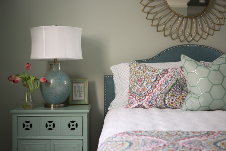
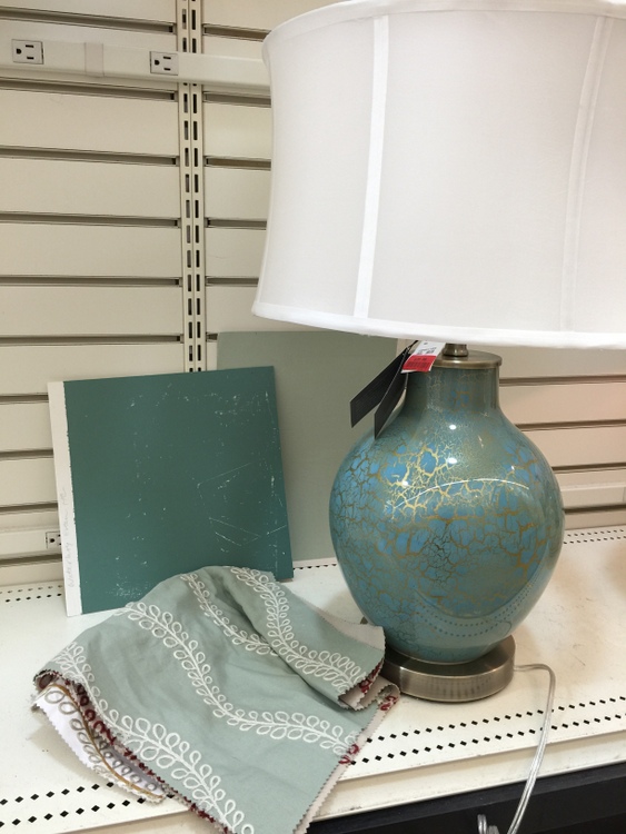
We started with the paint colors for this bedroom design. Benjamin Moore Prescott Green HC-140 for the walls and Waterbury Green HC-136 for the ceiling. Then I took my Small Wall color sample boards and went shopping for the room. I chose fabric for the curtains and the perfect lamp for the bedside – could the colors of the lamp base be any better???
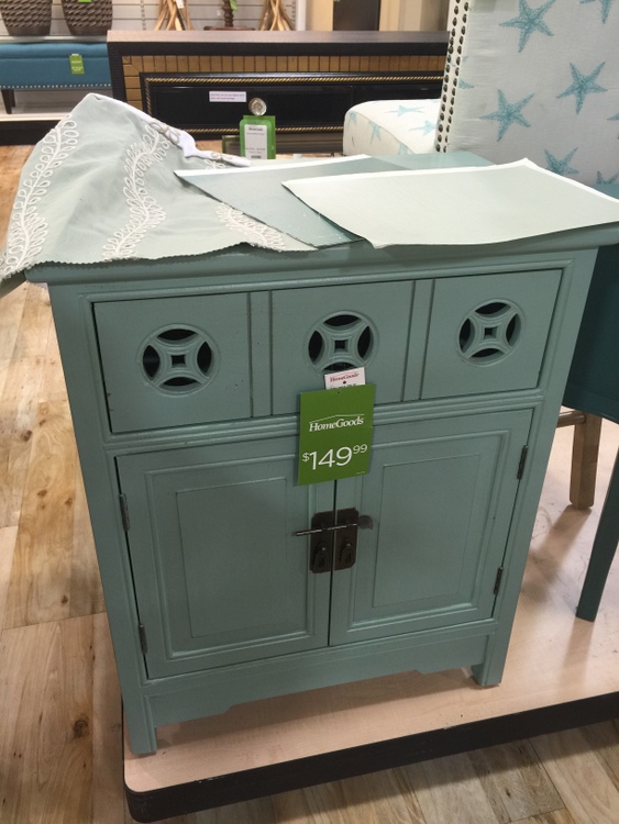
When you understand what colors are on-trend, it’s not terribly difficult to find decor that works great with the paint colors you’ve chosen. Here’s the absolute bargain I found on an interesting side table from HomeGoods:
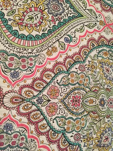
The bedding we chose works for a girl of any age and is such a great pattern.
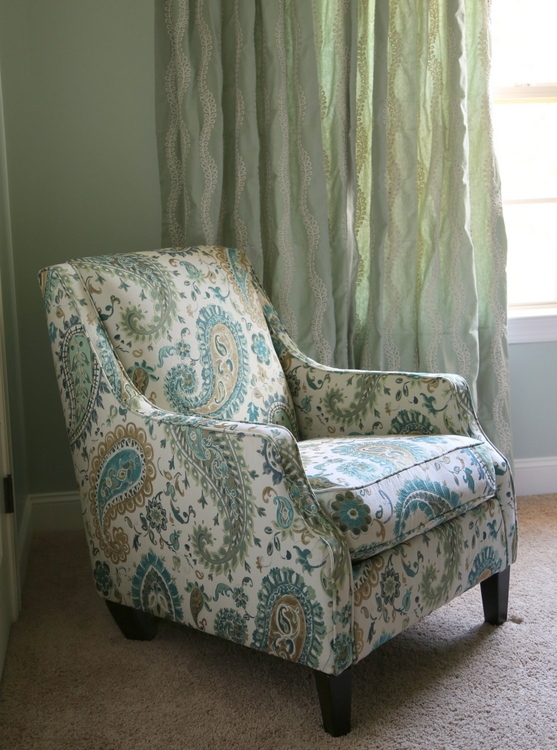
Every bedroom needs a comfy chair, and my client wanted a nice place to read stories to her young daughter.
I knew that the lighting for this bedroom needed to be special, so we scoured Ebay for a vintage tole chandelier. This one was originally 1970s green and gold. I had my client paint the flowers and ribbon detail in a pink that pulled from the bedding fabric.
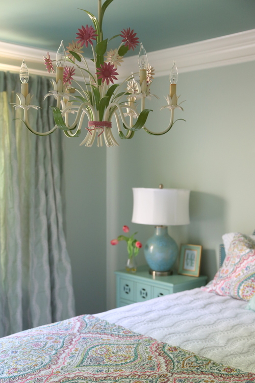
Ok, let’s pull this all together now! Take a look again at the “before:”

Pretty depressing, right?
Never fear, here’s the final and happy AFTER:
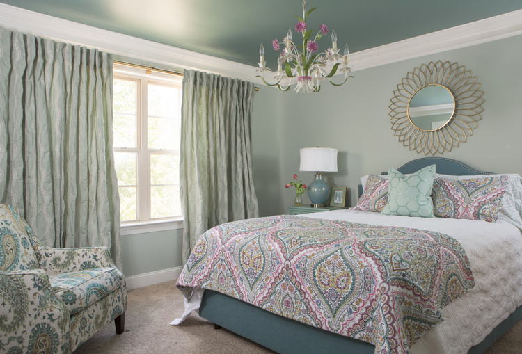
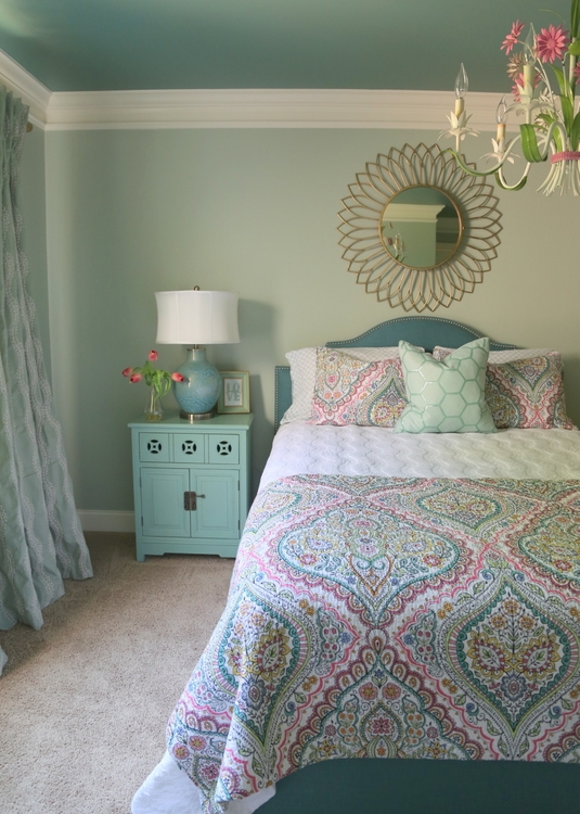
I don’t know about you, but I think this is a beautiful bedroom for a girl of any age. In fact, I’d love a room like this for myself!
I encourage you to choose paint color first. It may be easier to choose an “inspiration piece” like fabric or art first and pull a paint color out of it, but I’d rather my client be happy looking at all angles of their space (which they will be if they LOVE the paint color). I’m happy to hear your thoughts or rebuttals in the comments below!








What a transformation! It would also make a beautiful guest room!
The chair would update my living room nicely to bring a fresh look to my existing wheat toned sofa. Prescott Green has been on my list of colours to consider when I start my room redo. I have seen it used successfully by you in previous posts. I so enjoy your posts Kristie, thank you for sharing.
Thank you so much for commenting, Trudy! I’ve had Prescott Green in my living room for 16 years now, and I still love it. It’s very similar to an old Martha Stewart color called Windowbox, which an artist friend had painted his whole interior in the 1990s. I copied it for my bedroom in my former home, and have been using it ever since in one way or another!
The wall and ceiling colors are beautiful! I would have never thought to paint the ceiling darker, but with a sheen. Your right about the color of the walls, it’s a great idea.
Thank you, Pamela! I love these two colors together – I’ve also used this combo in a dining room, which turned out so pretty. 🙂
Absolutely beautiful!
Thanks so much, Joanne!
Very insightful!
Most designers do start with fabric or art first, but I see why your method works. The room turned out affordable & beautiful:)
Thanks, Natalie! I suppose the difference is in what you decide to be your “inspiration” for a space. When starting from scratch, I tend to use a great paint color as my inspiration.
I AGREE 1,000%. Thank you for explaining – and showing – so clearly!
Thanks, Kate! Sometimes I think I’m the only one!!! 😉
I have always chosen the wall color first as inspiration because I love playing with colors and feel the walls are the most impactful. I’m glad to hear your validation!!
Jody,
Yes! I like how you phrased it: “the walls are the most impactful.” So very true!
I chose paint first for my living room and it’s the one room in my home that I love the most. I followed the rules in the other rooms and I am so disappointed with the result. Thank you for sharing this because now I know what I need to do moving forward.
Beautiful design on the girl’s bedroom!
Hi Anne,
I really thought I’d be getting more push-back about this approach, so it’s good to hear a homeowner express their personal experience with this. You “followed the rules” and probably had a great color match, but that doesn’t mean you’ll love the result! Thank you for sharing!
I like this idea. No wonder I’m never “thrilled” with my paint. I should start there! I did LOVE my master bedroom in our former home and I think I did chose paint first when we lived there. It appears (online anyway) to be very similar to what you chose. It was an old color by Martha Stewart for Sherwin Williams called Milk Pail. I was happy every time I walked into that room. Need to revisit that one!
There used to be a line of paint that Martha Stewart did for KMart that had some beautiful color options – too bad they have apparently disappeared. I think I remember Milk Pail!
I am so glad to see you say this, Kristie!
I had thought the same( especially for staging) about the paint color first, but kept reading opinions to the contrary. I guess this is also a life lesson in trusting your God given instincts! Your rooms are always so very soothing, Kristie! We all need THAT these days…. Beautiful work, lovely finds. Green is like an eternal color, always classic.
Thanks for putting this out there today, Kristie!
Hi, Paula! Thanks so much! You are correct that most have a differing opinion about room design. While I’m always mindful of existing elements in the room that need to be considered when choosing paint color, I’m always going to pick wall color before new furnishings and decor. I let the paint color guide the color choices in my decor, not some bossy swatch of fabric.
My favorite of your finds is the little side table! Color, drawer cut outs, everything!
Gorgeous room. I would not have thought to paint it that color! Or the ceiling either! But it works so beautifully together. I live the hanging lamp! A perfect touch!
Thanks so much, Arell!
Interesting perspective. Unfortunately none of your photos appear on my iPad since you upgraded your blog. Very frustrating, because I enjoy your work, and miss seeing it!
Sylvia,
I’m sorry to hear that – not sure of why you wouldn’t be seeing images. If you are able to see them on a laptop computer or your phone, the issue may be needing to update your iPad software? Let me know it you can or cannot see them elsewhere, and I’ll let my tech guys know!!!
The problem seems to be on my end, since the images were present on my phone.
Thank goodness…what a gorgeous, well pulled together room! Simply loved everything about it!! Another job so well done!
Now to figure out what’s wrong with my iPad…
I am also not able to see the images on my iPad. I have tried several things but nothing seems to work
Have you tried viewing it on your phone or laptop computer? Check that first – if you can see the images there, you may have an issue with the ipad. Maybe you need to install updates?
I chose paint colors first for most of the rooms in my home and the design came together beautifully from there! I was able to find the perfect fabrics and accessories to coordinate. I don’t get why that is said to be such a ‘no-no.’ I love choosing paint colors and have always been happy with my selections.
I’m pinning this gorgeous room for my future bedroom! Stunning.
Yay!!! I’m glad it gives you some inspiration for you new bedroom, Beth!
The room is just lovely! Love the wall color. Can you comment on whether you feel the same when the wall will be painted a neutral rather than a color? And how you narrow down from the many variations available once you chosen a direction? Thanks!
Amy, if you’re wanting to do a neutral wall color, you need to be thinking about what other elements will be in the room – is it a bedroom, living, dining, kitchen? Are there finishes like carpet, stone, tile to consider? Then you need to pick a lane – beige, gray, or white/off-white? Your finishes and fabrics will need to coordinate with whichever neutral lane you choose. I wish I could be more specific, but there are many variables to consider. You’d definitely want to eliminate any undertones you don’t want to show up, like a peach or pink beige, for example.
Thank you. Your reply is always very thoughtful and helpful!
You’re welcome, Amy!
What about a new house. I am going crazy trying to figure out cabinet colors and quartz. Plus the island color. It’s difficult to choose a paint color when the walls haven’t been dry walled yet??
Judy,
For new builds, it depends on whether or not you have your heart set on something in particular. If it’s a certain quartz or cabinet colors, then your paint colors will be dependent on those choices and that’s your starting point. If you instead have some ideas for paint colors that give you the look you are going for, you can choose that first then make your hard surface choices based on that paint color/colors.
I have almost always followed the rule to pick paint last, but in the new home we are building now (a first for us), I found that I really needed to pick a paint color before picking carpets. It just made it so much easier to find the right carpet. However, I had already picked hard floorings at that point (hardwood and tile), and I based it on the furniture we already owned. I do imagine that picking the finishes available in stores (especially home goods), you will end up with a bit of a trendy palette, though. Unless you’re picking very traditionally styled pieces, of course. I guess it works if you’re starting for scratch, but the average homeowner isn’t buying a whole house or even a room of furniture. So I guess what I’m saying is that you are the exception to the rule that works, but experts are the ones that know how to break the rules!
What a lovely room! Fantastic!
Can I ask where the bedding came from? I love it
Mary, the bedding was from HomeGoods! I love to mix sets together to make it custom-looking.
Gorgeous room, Kristie! I love the side table and the mirror. Perfect for any age!
Thanks so much, Colleen!
For 15 years I lived in a house with three knotty pine rooms. (No, I couldn’t have painted them. Don’t ask. ) That dictated how I decorated the rooms. I took some of those decorative items with me when I moved into a new house. I like the wall colors of our new home, but am finding I don’t like the decorative items anymore that I brought with me. I’m now choosing items I really like that fit with a wall color I really like. I’m happy with my physical environment and what I put in it. Before I was picking items to make the best of a mediocre situation. If you don’t like your wall color, it won’t improve by matching decorative items.
Thank you for sharing your experience, Kris! Like you said, “If you don’t like your wall color, it won’t improve by matching decorative items.”
I liked the colors you used, simply beautiful. I liked your idea, now I am going to follow you. All the pictures are very pretty.
What a fabulous, artful transformation. The chandelier is absolutely delightful and gives the room personality. Well done!!!
I guess I’ll be the lone dissenter, although I understand where you’re coming from. We built our last home custom, and I made all wall paint decisions based on the overall palette I wanted to use (coastal blues and browns). I did not have any fabrics or rugs picked out at that point. I was also not working in the world of decor at the time, so my knowledge of what was available to me was limited, as was my budget. I was always happy with the paint colors but I was never happy with the rooms overall because I never found just the right fabrics, etc. that worked within the limitations of the non-neutral rooms. Our new house is a 1916 four square with lots of dark wood trim and original hardwood floors. All the wood is gorgeous, but it’s a lot trickier to work with than rooms with white trim. I have some wall colors, or rather color families, I’ve been pondering that I think will work well with the wood trim. But … I have been stuck for several months because I could not decide on the fabrics and wallpapers that will work best for our first floor, which would then inform the exact paint colors. As a fabric professional (I make and sell designer pillow covers), I know how many options are out there, but even with all that knowledge, it can still be tricky to find the perfect combo that brings me joy, works with the house, and is approved by the husband. If I had chosen the paint colors first, I would have felt trapped by those because I’m very picky about fabric and wallpaper patterns. I have finally found the fabrics and wallpaper that will bring me joy in my space, so I am now working on picking paint colors to coordinate. I’m not concerned about matching exact colors — just picking coordinating colors. I am drawn to cool, clear colors, but those usually aren’t best for walls. Instead, I’ll choose some slightly more muted tones for the walls but my fabrics and wallpaper will still have my cool, clear colors. Fingers crossed it will all work out!
dear kristie, you say choose the color you love first for the wall, but in the next paragraph you say “When you understand what colors are on-trend, it’s not terribly difficult to find decor that works great with the paint colors you’ve chosen..”
so if i choose the paint color that not on-trend how i could find decor that works great?
The room is lovely, but I think a daybed with a popup trundle would have been a more practical choice for a young child. Then it could accomodate guests in various configurations and not take up so much floorspace when the little girl is older and needs room for toys and whatnot.
I can also see a young child jumping on the bed or having a pillow fight and crashing into the chandelier–no matter how many times you say not to do it, they can’t resist trying it at least once.
Glad to see that dusky teals are coming back. I have been wanting to use this color in my vintage Mamie Eisenhower pink kitchen for years (the woodwork was originally painted that sort of color), but the colors readily available were never quite right. All of a sudden I can find accessories and such in just the right color. Been thinking of painting the ceiling that sort of color but a bit worried that it will look dark.
Kathy,
Yes, a daybed with trundle would have been good, as well! But keeping the existing bed/mattress saved us $$$ . . .
I bet your kitchen is so fun! Would love you to post a photo!!!
I’ve always chose my paint color first and never had a problem. I found all the right fabrics, rugs, furniture, accessories… and it was fun! All the colors wound up blending beautifully within each space and from room to room. Bucks the trend but very good advice.
As an interior designer, I couldn’t agree more with the insight shared here! Paint color truly sets the tone for a room and influences every other design element. It’s often the backdrop for all your décor and can dramatically affect how the space feels. Choosing the right paint color first ensures that you have a cohesive foundation to build upon, which makes selecting fabrics, furniture, and accessories much easier.
Starting with Benjamin Moore’s Prescott Green and Waterbury Green, for instance, provides a beautiful, harmonious canvas that can guide the rest of your design choices. As someone who has experienced the transformative power of color in many projects, I can attest to how pivotal this step is in creating a space that feels both intentional and inviting. It’s not just about color—it’s about creating a mood and a sense of cohesion throughout your home.
Great advice for anyone looking to refresh their space!