Bathrooms and kitchens are the spaces in our homes that most show their age. Creating a classic bathroom design that will be both lasting and “modern” can be a challenge. Design trends are fickle beasts, and choosing the right finishes can leave you overwhelmed by all the possible options. This recent bathroom remodel in my client’s hundred-year-old home is an example of how to accomplish a look that will stand the test of time, yet isn’t cookie-cutter at all!
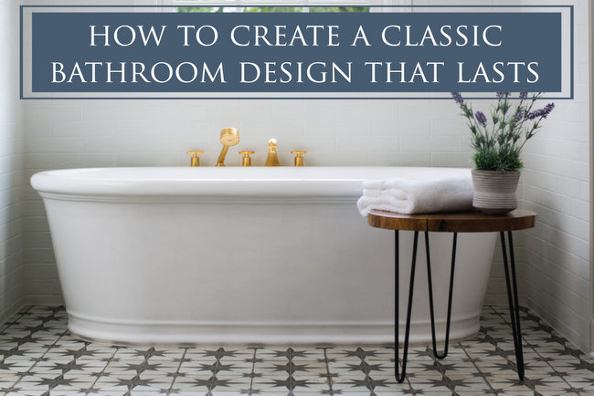
1. Start with function, follow with form.
There’s a lot of important work that must be done in the bathroom, you know? Bathing, brushing, grooming, primping, and other unmentionable actions must be successfully accomplished in a relatively small space. Start with your needs, then consider your desires. A separate bath and shower aren’t necessary, but can be quite a luxury if you’ve never had one!
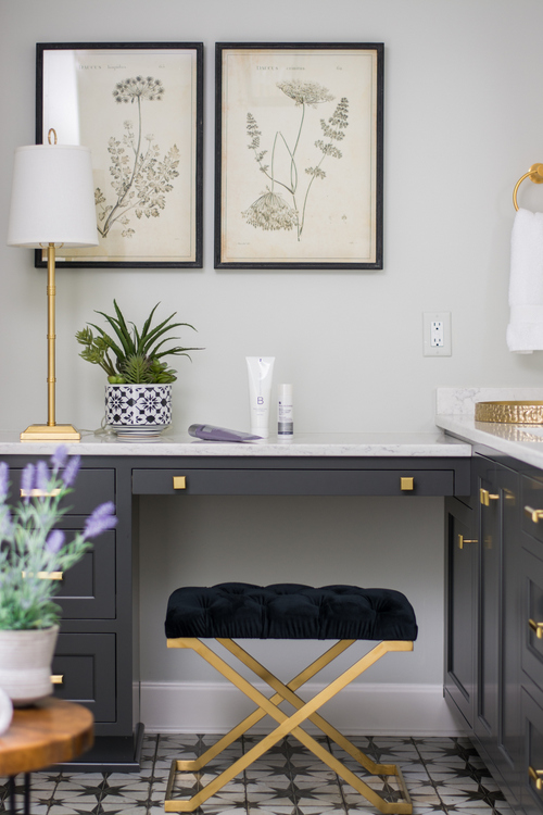
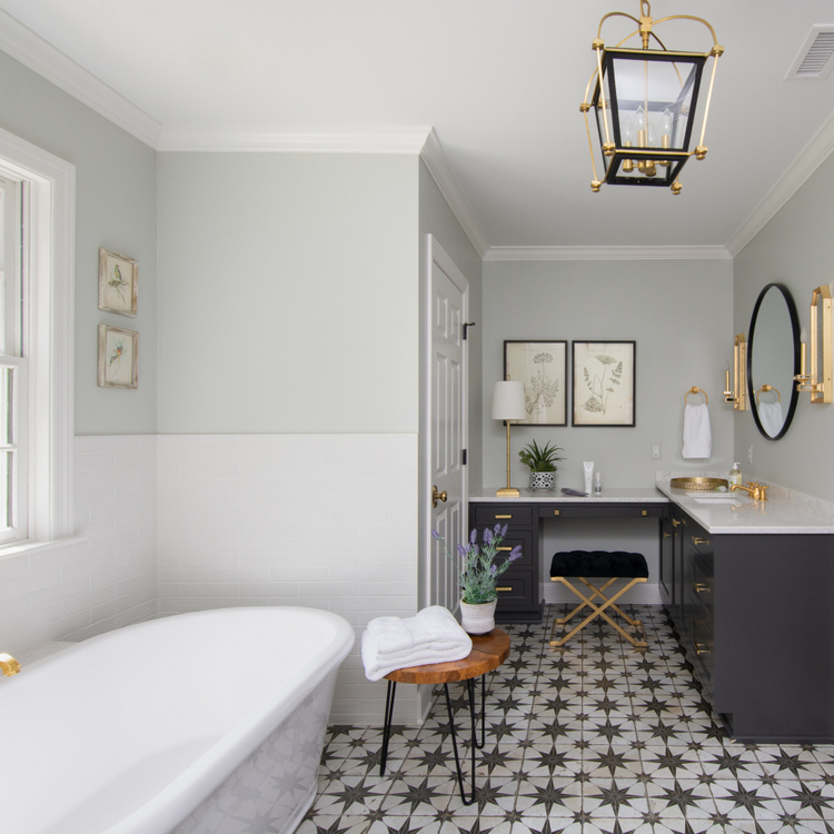
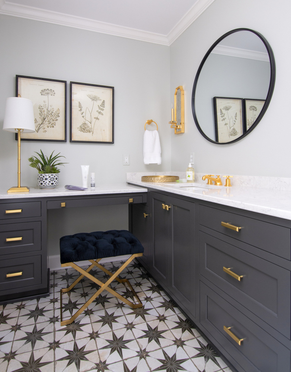
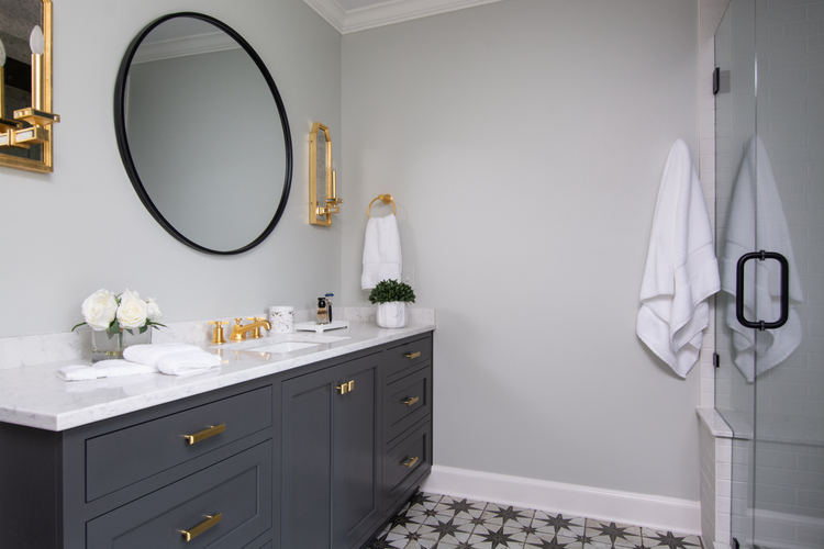
Do you need a place to sit down and apply makeup? Be sure to consider the counter height and space for a stool or chair beneath. The tall homeowners wanted higher countertops for brushing teeth and grooming hair, but we decided to drop down this make-up area to a comfortable height for seating (lighted make-up mirror not pictured).
2. Find one design element that you LOVE, then build the room around it.
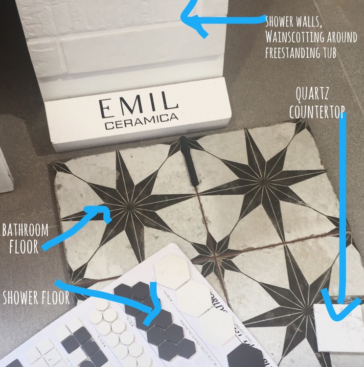
For this classic bathroom design, that element is the star-studded encaustic floor tile. It was chosen first, and everything else followed. It’s the lead actor in this show, while all the other elements have supporting roles.
3. Insure a classic bathroom design by choosing elements that are not simply “popular,” but are rooted in history.
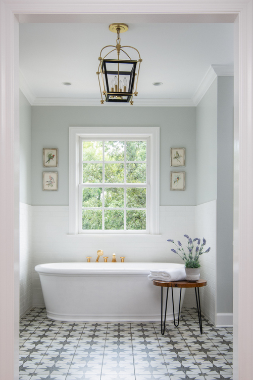
Just because some of what you see in this bathroom is currently popular or trending, that’s not the same as “trendy.” Marble-like quartz countertops; brass and iron metal finishes; encaustic, hex, subway, and brick tile are all rooted in bathroom history. Although there is an ebb and flow in their popularity throughout the decades, these kind of elements give a bathroom historical gravitas. Sure, it’s obviously a new bathroom. But there’s a nod to the past, such as the Art Deco-inspired encaustic floor tile and plumbing fixtures.
4. Pick finishes that visually tie in with one another to create a cohesive look.
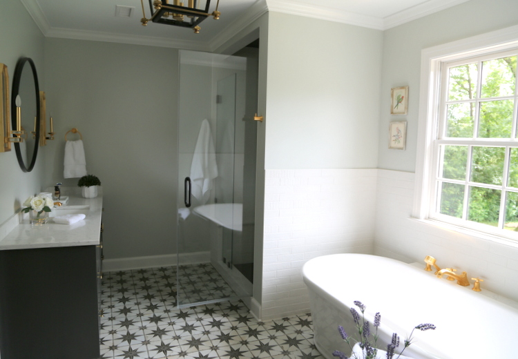
It’s so important for a classic bathroom design to pick elements that repeat similar shapes, colors, and motifs – but NOT EXACTLY. This isn’t like Garanimals or Rooms to Go, where you should pick “matching” sets.
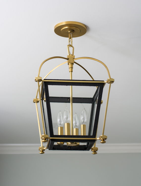
Rather than using the exact same metal finishes, I typically choose two for most bathroom and kitchen designs. With so much black in the design, we opted to pair it with brass/gold. I know some of you may have strong feelings about “not being ready for brass to come back,” but it truly is back in vogue. Every other bathroom in this home sports satin nickel or chrome, so we wanted the master bathroom to be set apart and SPECIAL. We fell hard for this gold and iron lantern fixture from Visual Comfort:
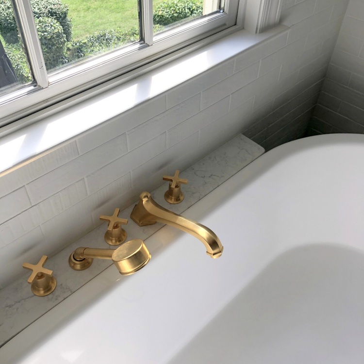
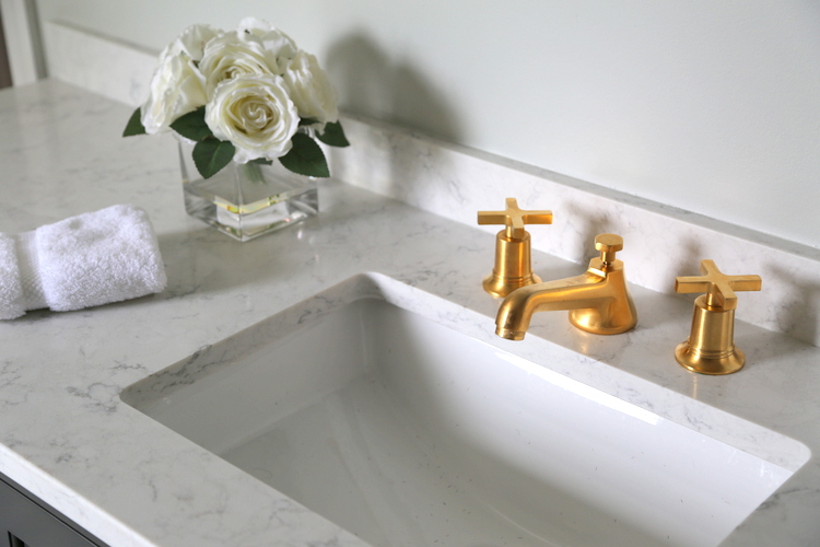
The sink, tub, and shower faucets followed suit:
While the sconces are also gold, we chose iron finishes for the round mirrors and shower door handle and hinges.
5. Choose what you love. Remember, it’s YOUR bathroom!
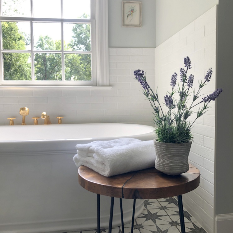
Who is it who’s spending hours every day in your bathroom? It’s YOU, not your neighbor or your friends – and certainly not your Facebook friends. You should choose what YOU love, rather than the latest trend in bathroom design.
Try bringing in some organic elements, like a potted plant, wooden stool, or favorite art to warm up your special space. Take a chance and juxtapose slick Art Deco shower fixtures with rough-textured painted brick like we did in this shower (just make sure it’s ceramic “brick” tile). The decorating police are NOT going to raid your house, so quit fretting so much about whether other people will like it! Unless of course you are planning on selling in the near future . . .
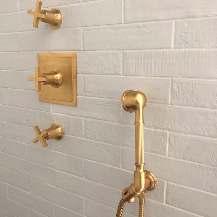 If loving these gold shower fixtures is wrong, I don’t wanna be right . . .
Really quickly, let me show you the “before” of this bathroom project:
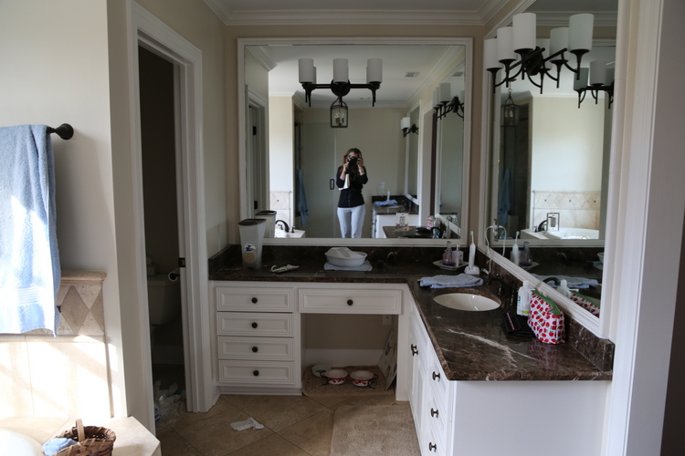




What a huge difference! It’s so beautiful! I wish that this was my bathroom.
Ah, thank you, Briana! I wish it were mine, too! 😉
Hi Kristie, There is SO much to love about this design! My favorite is the encaustic tile. To me (I have no design experience except for remodeling and decorating my own home) the tile is a nod to the classic black & white floors with a modern twist. Absolutely love the floor! I also like the mixed metals and the tip to design for oneself. I am so glad you like brass! I have some beautiful brass pieces that have stood the test of time over 33 years, and they seem to play nicely with some more modern touches. When I last did a major addition, I chose a Belle Epoque sink that I had fallen in love with at a Designer’s Showcase at Oheka Castle in NY. People thought I was nuts to spend so much on a sink that GASP did not have any cabinets! I personally think of cabinets as black holes and use a closet instead, with a beautiful wicker basket for towels under the sink. Anyway, I like your point about using what you love! Looking forward to another year of reading your wonderful blog!
Thank you so much for sharing your thoughts, Laura! I love your suggestion of bathroom closets vs. cabinets – that’s a great idea when the space allows, although I do love some drawers for organizing.
Hi Kristie, Yes, I can see the need for drawers! I am admittedly low maintenance, and don’t need a lot of storage right near the sink, but I know that is just me! I really love your design and would totally use encaustic tile when it’s time to remodel. Lovely!
Really pretty! May I ask what the wall color is?
Wow! You did a terrific job of remodeling this bathroom! Love the gold fixtures and the lantern especially!
Thank you, Rhonda! The gold adds so much sophistication and warms up all the black and white. 🙂
Great information as always!!
Thanks, Jenny!
Beautiful – I love the patterned tile with the simplicity of everything else, and the just-right touches of geometry with the glowing brass drawer pulls and the X of the seat. The flower pot is a marvel! It snaps everything into focus.
Are bathtubs popular except with families with children? We just bought a 100-year-old house and the main bathroom had been recently remodeled. There is no bathtub, just a large shower. I was concerned at first (but it wasn’t a deal breaker) and now I really like it since I don’t have to step over the wall of a tub to in. I can see it being very useful as my husband and I age and when my elderly mother visits. I am concerned that my future grandchildren won’t have any place to bathe. We had a claw foot bathtub in a previous home, but we rarely used it (and it was a pain to clean). Are houses without tubs a selling liability?
This is such an interesting question, Kate. Bathrooms without tubs are relatively modern. Many women (including myself) could not live without a tub to soak in on a regular basis. I’ve also had many clients whose husbands enjoy a hot soak for aching muscles. Although it is fine to have a bathroom or two in a home without a tub (shower only), it is a BIG mistake to get rid of all bathtubs. It is difficult to sell a house that doesn’t have a tub, as you are narrowing your buying audience significantly! I hope that answers your question – thank you for adding to the discussion. 🙂
I believe it is also against most building codes not to have at least one tub in the house. That is what our building inspector said when we were applying for our occupancy permit on a new build. He said that a house has to have a least one. It may also play in the resell of a home if it is found out. Check your local city, it may have changed.
Jacquie,
That is interesting! People are certainly tearing them out and reselling without them, but I do think it’s NOT wise for resell.
That floor tile is awesome — I’m inspired. Glad to see the enormous mirrors above the counters GONE! That’s the first thing I want to do to my own master bathroom when we remodel “some day.”
Really beautiful! What is the wall color, please?
Hello Kristie,
My favorite is the tile floor. May I ask who made it and what the pattern is called? I am thinking this would be perfect for a bathroom of ours! 🙂
“Insure a classic bathroom design by choosing elements that are not simply “popular,” but are rooted in history.” – perfect advice! And what a fantastic bathroom Kristie!
Lovely makeover here. The brass is gorgeous and that floor is so fun. Great job!
Thank you, Carla!
This remodel is so well done. I agree with your advice to work with an element you love as a starting point
This is absolutely beautiful, Kristi. My favorite element are the shower fixtures. I just love them.. .and then that Visual Comfort pendant…. what a WOW! Your clients must be thrilled!
Thank you, Leslie. At one point, my client was concerned that the look would be “too industrial.” The brass accents keep that from happening, adding warmth and a bit of the feminine.
Be still my heart…that VC lantern…!! Beautiful bathroom and lucky clients! What a fabulous classic look that is anything but boring!
Thanks, Janet! That lantern would be beautiful in so many settings, it’s definitely a classic beauty.
Great transformation and love that floor tile!
Thank you, Mary Ann – that tile is certainly the star of this bathroom!
I love how we, as designers, think about the function and not just the beauty.
You gotta have both, right?? Thanks for stopping by, Wendy!
Such a great post! I love that you distinguished between trendy and popular/trending. There are often great reasons why things are popular and it’s not about being trendy! Beautiful choices and finishes in this project!
Thank you so much, Donna! I’ve heard so many mention about encaustic tile being trendy, when what they don’t realize is that encaustic tile goes back for centuries like marble does.
What a gorgeous transformation! I really enjoyed your explanation for choosing classic elements. It truly is a beautiful space!
Thank you, Sheri!
I always enjoy reading and looking at your remodels. Love the mixture of metals. I was interested to see that your clients kept just a single sink in what I presume is the master bathroom. I’m in the process of remodeling a master bathroom that is not very big. It presently has two sinks, but not a lot of storage space. Would love to go with only one sink so I could build in some great new storage, but I feel for resale many years down the road, the idea of two sinks in a master bath will still be the “want.” Have fun with your new home, and remember to breathe!
Hi Diane,
It is master bathroom, but there are two separate countertops/cabinets/sink in this space! It may be tricky to tell the layout, but you walk into the middle of the bathroom facing the tub. If you turn left, there’s the shower and one sink/countertop/cabinet. If you turn right, there’s the other sink/countertop/cabinet and a door to the toilet.
Hello! LOVE this bathroom – it looks fantastic! I am considering using a very similar (if not exactly the same) tile in my own project… do you happen to recall the grout color used? Thanks so much!
Nice tips..as a suggestion you can go for Zurn’s Manual Faucets which give us the ability to control water flow and conserve it. You can Check out our commercial faucets with different designs, finishes and features that allow you to dress up and personalize your space. The bathroom faucets have multiple flow control and are designed to last and reduce maintenance time in your commercial installation.
What is the pale blue green paint you used
Hello. I see several people asked what is the paint color and I see you did not reply. Could you please share the color . I love your design in the bathroom!