There are many things to consider when putting together a lighting plan for a new home or remodel. A frequent mistake I see people make is choosing light fixtures without a well-conceived plan. If you simply pick out fixtures you like and distribute them throughout the home, you could be cruising for some expensive mistakes!
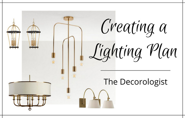
Establish the right style.
The style of the fixtures should be consistent with the a) style of the home and b) the style of the homeowner’s furnishings. Disparate lighting styles from room to room is a rookie move. Even if you decide you want to do modern lighting in a home with traditional architecture, one traditional light fixture will feel sorely out of place. Even if you know the style you are going for, you don’t want every fixture throughout to be the same. You need to mix the shapes and types of lighting to get a varied and interesting lighting plan. You wouldn’t choose all lantern lighting, or all chandeliers – instead, distribute variations of the lighting style throughout the spaces while staying consistent to the style you are aiming for.
Consider the scale.
I’ve seen clients choose beautiful fixtures that are simply too large or too small for the intended space, although typically the mistake is made in the direction of too small. The scale should be determined based on the room’s width/length, the ceiling height, and whether or not there will be furnishing beneath the fixture. In dining rooms and kitchens where lighting will be hung above tables and islands, fixtures can (and should) be larger than if they hung in a room with nothing beneath them. Rooms with vaulted ceilings require larger lighting fixtures so that they don’t feel lost in the vast expanse above.
Choose the finish of the fixtures wisely.
Many people default to choosing only one finish of lighting throughout, which can make for a boring, builder-grade result. Mixing finishes artfully (and skillfully) can give you a custom look that you won’t soon tire of. A recent client definitely wanted a classic, timeless look – and she favors nickel finishes. So I recommended a mix of polished nickel (which reads more high-end and sophisticated than brushed nickel) and iron finishes. Depending on the placement of the lighting, as well as the various sizes of fixtures, I usually do a mix of about 2/3 of the favorite finish, and 1/3 of the accent finish.
Count the cost.
I prefer to know the true overall budget for lighting before shopping for/with a client – it’s a waste of time and a big party-pooper to consider options that the client simply can’t afford. To a great extent, your budget limits your options. Once you determine the overall budget for the lighting plan, decide which lighting fixture is the most dominant, most seen by owners and/or guests, or most important. That could be the fixture that you may want to sink more of the budget into, while secondary fixtures can be less expensive to accommodate for that statement light of your dreams. Here’s my favorite tip for lowering costs in your lighting plan: choose fixtures without glass. Lantern fixtures without glass are less expensive than those that feature glass – plus, they are lower maintenance because you won’t have to clean the dusty glass on the regular!
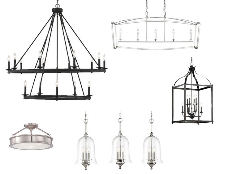
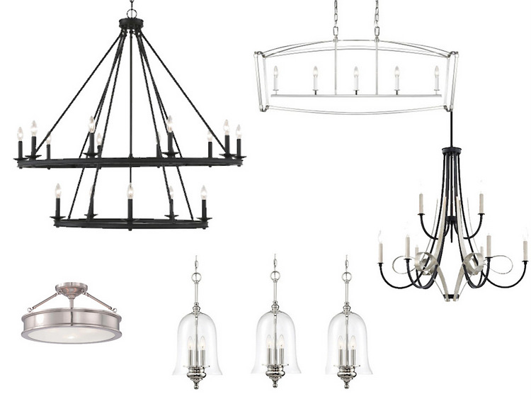
Now, I’d love to see what you think of the 4 lighting plan options I recently proposed to a client. Each option features fixtures that fall within the budget, are in proper scale for each room chosen, provide a variation in the style the client desires, and offer a mix of metals that are distributed appropriately based on the fixture chosen for the adjoining spaces. The largest, dominant, and most important light fixture is the iron chandelier for the vaulted gathering room (top left). The long nickel fixture is for above the kitchen island (adjacent to gathering room). The lower left fixture is for a small office to the left of the entry, the lower middle fixtures are for the central hallway/entry, and the lower right fixture is for the dining room.
Option A
Option B
Option C
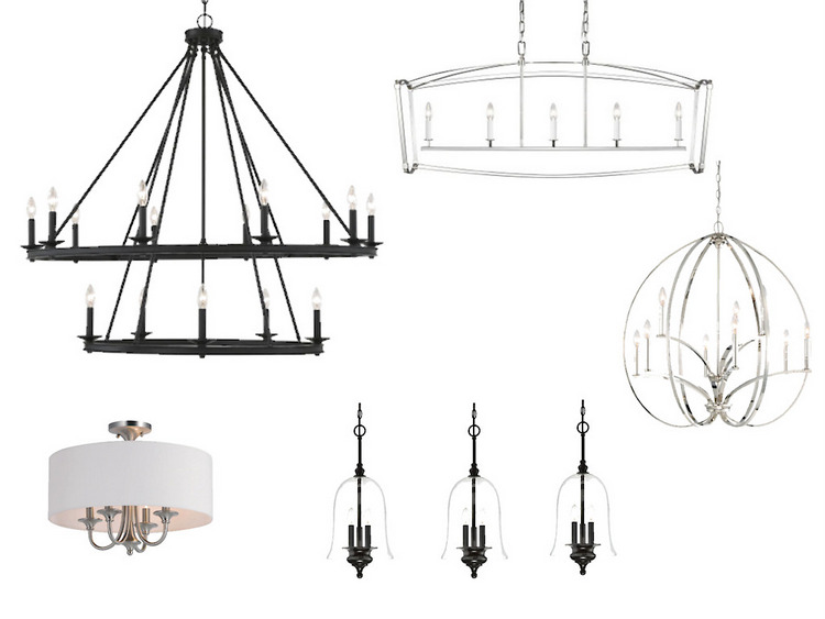
Option D
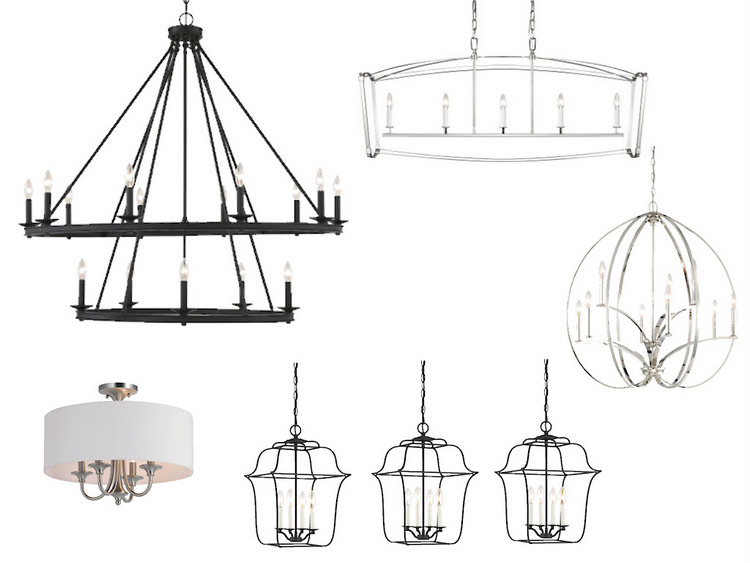
Ok, my talented readers! Which lighting plan combination is your favorite for a classic and sophisticated family home? Please share your thoughts in the comments below. i know someone is going to ask, but I’m not able to share specific dimensions or brands of the light fixtures you see here. If you need help with your own unique lighting plan, reach out to my office assistant ([email protected]) for details!
There’s so much more to learn – check out my video workshops and intensive certification courses here!







D is my fav!
Thanks for the input, Elizabeth! xo
I love option A!
Thanks for putting in your vote!
Hi Kristie, Another helpful lighting article! Option B is the most pleasing to my eye. I do like the dining room fixture in Options C and D, but it seems to be a bit small for a dining room, or maybe that size works with the client’s table. I’m interested in seeing what everyone else thinks, and for your reveal of the final result!
Thanks for sharing your thoughts – looking forward to seeing if there is a consensus . . .
Leaning toward D
Thanks for casting your vote, Nancy! 😉
Option D. PS. Great post 🙂
Thanks, Cindi!
To my eye, group A is most cohesive.
Great exercise!
Option A. It’s much cleaner lines for me, and has a cohesive look but yet combines unique fixtures. Option B the chandeliers feel too matchy. I don’t care for the shade on option C & D, the finish change on the pendants in C, or the pumpkin shaped dining room light in C & D.
Such good advice on spending the $$$ where it matters. I obsessed over this light fixture and spent less in other places so that I could get it for our family room. Still makes me happy every time I see it.
What a cool light fixture, Michelle! Love it.
D is my favorite.
Thanks for your vote, Janet!
I am torn between B and C…I love them both. This is why it is hard for me to decorate my house 🙂
It’s always more difficult to make decisions for your own home, isn’t it?? haha
I like D, but with the dining room fixture from B.
Sorry to change the rules. 🙂
That could work, as well, Kathy! Good eye! 😉
My vote is for A or B, but maybe D with B dining room chandelier. I think the round nickel one is too contemporary and trendy.
Kristie, I wish I had read this article prior to purchasing fixtures for our shophouse remodel. I definitely purchased fixtures to small for our 10′ and 12′ ceilings. I think Michelle W. and I must be more “left brained”. I like the clean (not busy/flowy) lines. Great article.
Bobbie Sue, that’s a common mistake – higher ceilings need larger fixtures!
A
I prefer B with the central hallway of C. Excellent article and an interesting mix of finishes.
Thanks for sharing your favorites – thank you, Patti!
D!
This article is perfect for me as we moved into a new home and I’m wanting to change all the lighting. So far I’ve only gotten around to picking outside lights. The rest is leaving me with too much anxiety-and sticker shock tbh. This helps a lot though, so see your choices and how they don’t all have the same metal or shape! Thanks so much.
Michelle, so glad the article was helpful! Best of luck on your lighting choices 🙂
I like option B. The two chandeliers complement each other and have a similar flow.
Hi Kristie, really good article. Option A gets my vote!
Thank you, Leelee! I appreciate your vote. 😉
Definitely D!!
Great – thanks for your input, Marsha! xo
“A”. Great post. It made me realize I have a hodgepodge of lighting and fans that has occurred over the years. I’ve updated paint, flooring, rugs and furniture but have failed miserably at looking up! I have work to do! 😂
Hope this article helped, rather than hurt! Haha, isn’t it always something else that needs to be done?? xo
D is my pick after several glances. I love the shade and mix of metals and shapes. If I was visiting a home with D – I would be ‘touring’ with excitement to see what is next around the next corner, in the next room.
Hi Kristie
I’m sooo late catching up on all my emails and left this one unread as I really wanted to read it when I had the chance to enjoy it.
I’m probably too late to put my opinion forward and would love to hear what the final choices were but, I liked your Option B but with the office fixture from C (&D )
Nice combinations in all your plans. Would love to see them in the house as I’m sure the whole plan ended up looking stunning!
I am in the process of renovating my kitchen. I started to look at lighting and I remembered this fabulous post! I think I know what I want, but the hubby and I seem to have very different ideas. I just email Daria to request a mediator, I mean consultation. 🙂
Yay!!! I’d love to be your “mediator.” 😉