One of my virtual clients (she’s a real person, but we worked together via the internet!) just sent me some photographs from the finished nursery I designed for her a while back. You may remember this post I wrote about the 2 bedrooms I designed for her long-distance through the magic of computers.
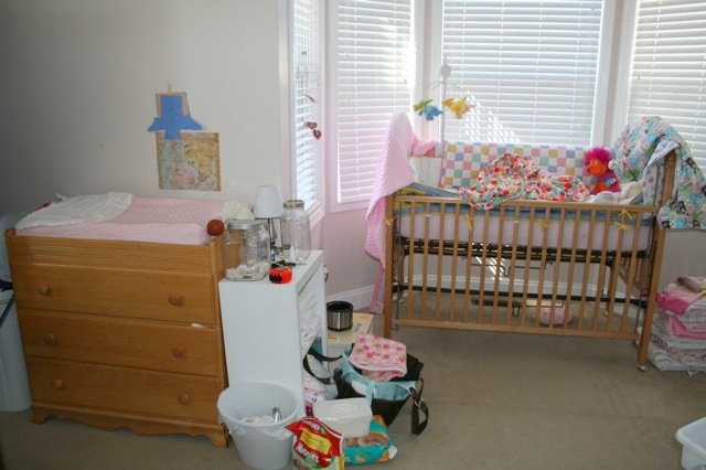
The before of her daughter’s nursery was a blank slate. And I do mean BLANK.
Nursery before The Decorologist
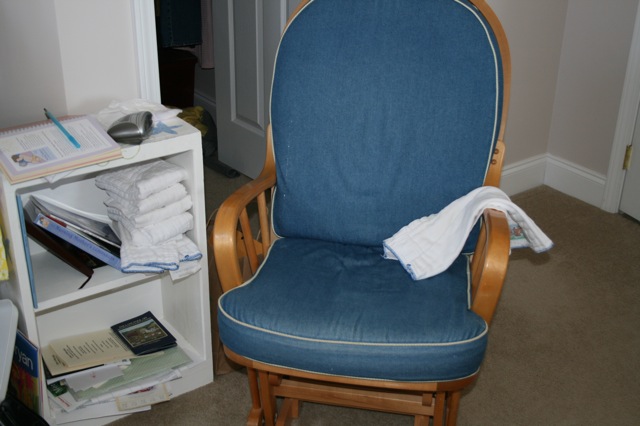
However, she did have several pieces of existing furniture and accessories that needed to be used, including some Beatrix Potter artwork and this very dated glider.
Dated but Well-Loved Glider
The baby was currently set up in her parent’s bedroom (the new nursery was previously an older son’s room) in this bay window area. My client needed to keep the crib and orangy wood changing table/dresser, so I’d have to work with those. Sometimes the biggest challenge is working with existing elements in a way that still gives you the look of a fresh, new room.
Baby Nook in Parent’s Bedroom
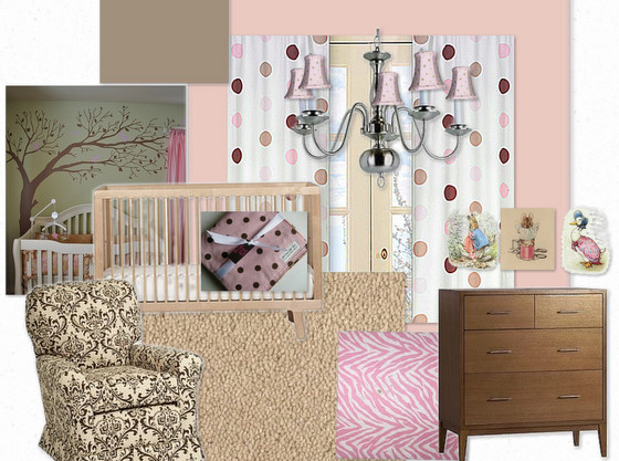
After spending some time discovering what style and feel my client wanted for this room, I created this Inspiration Board to represent the vision I cast for the nursery:
Nursery Inspiration Board by The Decorologist
We decided upon Benjamin Moore’s Rose Blush 037 for the walls, and Alexandria Beige HC-77 for the ceiling (as a Nashville color expert, I’ve found that Benjamin Moore colors are the BEST). This is a color scheme that will last well into the baby’s elementary years (even beyond). I chose a medium-pile frieze for the carpet so that the floor will be comfy and warm when the baby begins crawling about. My client was on a budget (and who isn’t?), so I chose a simple light fixture available at her local Lowe’s that could be spruced up with some cute chandelier shades. To give the feel of a new dresser/changing table that works with the new scheme, I suggested she paint the current one the same milk chocolate color as the ceiling. You’ll see I tried to incorporate a few different patterns in regards to fabrics, so it would feature polka-dots, but wouldn’t feel like a polka-dot themed room. The chair here is representative of an inspiration fabric to use in recovering the cushions of the existing glider.
Ready to check out some real afters?
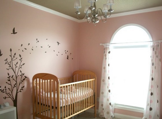
Nursery after The Decorologist
Isn’t it adorable? The glider looks brand-spanking new with these awesome new cushions! I knew she needed to keep her glider, but I suggested my client recover the cushions with a fabric similar to the one seen on the chair or the pink zebra fabric from the Inspiration Board. What a beautiful place to rock a little girl to sleep.
Nursery after The Decorologist
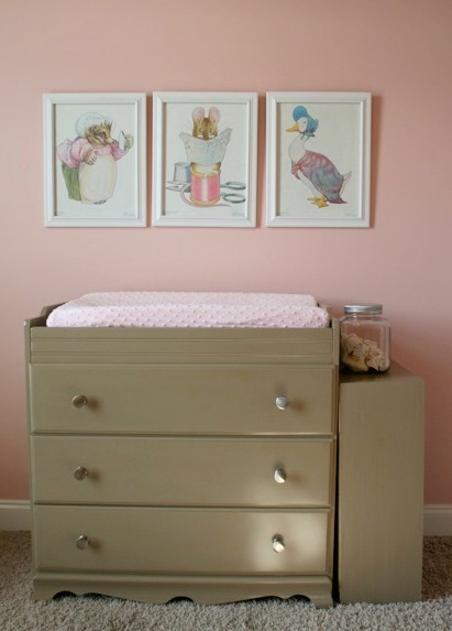
The milk chocolate ceiling really takes it up a notch, without any extra expense. And the idea of the tree decal extending over the crib makes such a great statement piece for the room without being too themey or babyish. Here’s the after of the painted changing table and the client’s existing artwork (you may want to scroll back up if you don’t recall the before):
Changing Table After
If you like what I did here, I’d appreciate it so much if you’d share this on FaceBook. If you need some long-distance help decorating a room in your home, contact The Decorologist to schedule your Virtual Design today!













You continue to amaze me!! You are so good at what you do!! Thanks for your continued inspiration and encouragement.
thank you, heather! you are an inspiration to me, too 🙂
The colors for this sweet baby’s room are brilliant! 🙂
thank you, lee – and thanks for posting to fb 🙂
LOVE! But what’s not to love. This is beautiful Kristie! Have a great weekend 🙂 Sheila
the color of the wall and ceiling is just fantastic. They are so dreaming feel. I love it. I wonder where she did the re-upholstering for the chair.
she lives out in the country, and she said she got some old guy to do it for $50! and the fabric was on sale, so she totally scored!
wow, that’s nit something you can come across everyday. Lucky her!
I mean not…
I don’t have a facebook account but will willingly share with anyone who needs some decorating done. It is amazing to have done this via the internet..the world’s your oyster!!
Oh Kristie this room is so sweet! I love the tree and the colors you choose. You are a true color expert! 🙂
it takes one to know one, right, kelly? 😉
So gorgeous, Kristie!!!
As the privileged one who gets to rock her baby girl to sleep in this room every night, I have to say that I LOVE THIS ROOM!!! It is so sweet and peaceful. I love every thing that Kristie suggested for this room, but I never would have thought of it on my own. This is where it was well worth the money to pay Kristie to make these choices for me, and in a sense do my shopping for me. There was no agonizing indecision over “theme” or colors. There were no mistakes that wasted my time or money. All I had to do was read Kristie’s thorough report, and then click on the links she sent me and click on “buy now.” 🙂 I would never have found the curtains (which perfectly matched baby blankets I already owned), glider fabric, or tree decal on my own. Kristie even found my local Benjamin Moore store for me. Paying Kristie for a couple of hours to plan this room saved me a LOT of time, effort, and money. And by the way the glider fabric came from fabric.com – a huge selection and really great prices. Just had to share! 🙂
Thank you so much for the glowing and generous recommendation, Amy! I’m so glad you are happy with the outcome!!!!! I’d love to come see it in person someday 🙂