By and large, The Decorologist’s Facebook Followers were NOT impressed with the choice. Listen, that color is actually great as an accent color found within fabrics and accessories. But it definitely not a color that translates well to wall color in most situations.
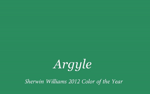
Argyle SW6747
As I tell my clients, not every pretty color in a paint fandeck was intended to be applied all over your interior walls. There are other applications for paint that aren’t interior wall color.
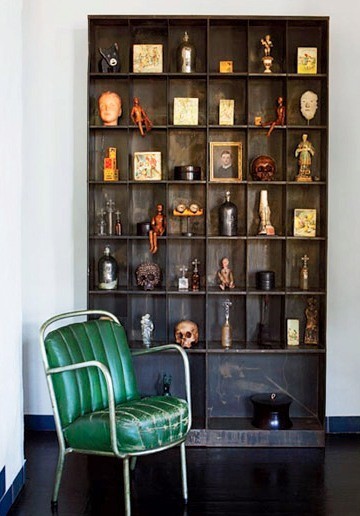
Obviously, everyone doesn’t realize that. Not even the Powers-That-Be at Sherwin-Williams (sorry, guys). When paint companies are choosing their “Color of the Year,“ they should keep in mind that most people think that means “Color of the Year for My Walls.” As a Nashville Color Consultant, I have never specified Argyle as a wall color because it’s too intense and clean to use as a wall color (unless you are talking a child’s room or playroom). Instead, I might use something a bit muddier and grayed down like this:

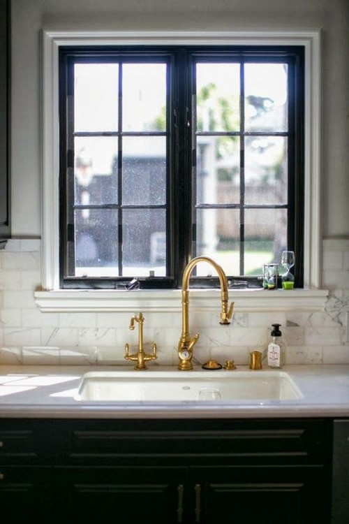
Believe me, it is plenty bright when it goes up but it doesn’t look screaming green like Argyle does. And I might even choose a color like the one below. Even though you might think the color below would read blue rather than green, I know from experience that it does not. So in a room with blue accents, this would be a great backdrop for that room and it would read GREEN. Color is relative. If you are looking at it next to either of the greens above, the color below looks blue – but it reads green when used in a room with blue fabrics and accessories.

Benjamin Moore’s Mountain Laurel
You don’t believe me, do you? Oh, ye of little faith. Try looking at it in relation to the color below:

Benjamin Moore’s Phillipsburg Blue
This is why a paint color you love in someone else’s home may look awful in your home. Color is relative! You have to look at colors in relation to the colors that will be around them in a given setting. And that’s why you need an Interior Decorator who specializes in color – someone who understands which colors are best for wall colors, how colors effect each other, and which colors read current and updated. I’ll be making an announcement next week about a class I’m offering in the Nashville area to help you make the right paint color decisions in your home. Stay tuned for details – class size will be extremely limited!


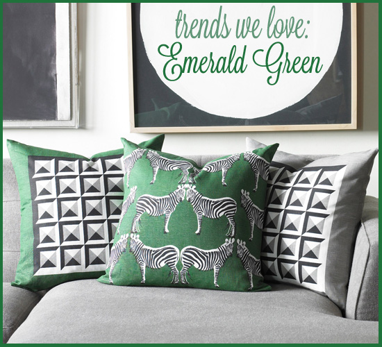






I like bright colors and I do not like this color! It is not the dark green of money and it is not the natural green of leaves and grass. It is off and cartoonish but not in a good way.
i agree, dina – it’s too clean, too intense for a wall color.
Ugh! I am tired of turquoise too but this is just wrong. That whole room doesn’t inspire confidence in the decorator’s ability.
Looks like the paint was picked to complement the art work, or is it vice versa?
Yes, Lynne – looks like it! I’ve seen that exact piece of art at Bed, Bath, & Beyond.
Excellent post, Kristie! I’m a green lover, but not this green… not on my walls! I think one of the comments above summed it up best… love the paint, hate the colour! Poor Sherwin Williams on this one 😐
Maybe you could do an online class for those of us who are far away.
I second this idea! I just saw your post about the class in June and would love to be able to go but I’m not anywhere near Tennessee!
Well, you guys are definitely giving me a lot to think about! Guess I better get a little more tech-savvy . . .
Hi Kristie. It’s so true that we look at the Color of the Year put out by the Paint Manufacturers and jump to the conclusion that they are meant strictly for walls. We forget how great they can look when incorporated into an accessory or “pop” color that can be changed at will and for a very reasonable amount of money. Wish I lived in Nashville to attend your class. That’s okay, we’ll be talking as soon as I am am able to become a client. I’m so looking forward to you helping me with my home.
I look forward to working with you, Susanne!
Kristie, Your analysis is, in my opinion, exactly right. I respect the balanced thinking that you always demonstrate (a gift!). Actually, the proverb that says: “With an abundance of counselors, there is success.”,
is so true here. Why don’t paint companies ask YOU and MARIA, who actually work with people in real homes every day, what you think??????
It’s the same with architects—-why don’t they ask homeowners how they actually LIVE????
(I hope some do!)
One of my very dear friends always used to tell me ‘don’t be afraid of color’ as he would walk around my white, cream and taupe colored home. (And I’m a Lilly lover…go figure!) While I don’t know that I could paint 4 walls (in the same room) Argyle, I could do curtains, pillows or accent colors in that shade easily!
PS: I hope your class is after June 10th—I signed up for Maria’s workshop (June 6-8) and I for sure, don’t want to miss yours—since I live close enough to drive and have friends I can stay with in Nashville!!!
Yay Paula! I’d love to meet you – the class is probably going to be June 26th in the evening. I should have lots more info to share next week!
I used Mountain Luarel years ago in a downstairs powder room and never get sick if it. Soothing and rich at the same time. Not a fan of the Argyle either.
I love Mountain Laurel and Charlotte Slate together!
I think accessories maybe… maybe not! Strange color. Maybe too primary bright??
“It’s the color of money” …I think that says it all. Wouldn’t most people want the exact opposite in their homes as your home should be a reflection of who you are from the inside out and not a materialistic statement? Who ever came up with the economy tie in at Sherwin Williams should be bumped out of marketing. People are leaning towards colors that reflect our reaffirmation of the focus on family, health, nature and sustainability. While green can certainly reflect all of these, it certainly isn’t the green most similar to “the color of money”.
I’m definitely not a fan of the “color of the year”. I love the greens you selected. We painted our dining room in Phillipsburg Blue. I love the color, but was a little concerned it would be too dark, but it really looks elegant as my dining room is pretty formal. I’m not sure what we will do as we are preparing our house for the market, but we will probably keep it to show how unique the house is. I hope that’s not a mistake.
Philipsburg Blue is a wonderful sophisticated color for a dining room, and I’m sure buyers will love it!