One thing I really love to do is to figure out the essence of a client’s style and make it happen for them in their space. It’s so much fun for me to help create different atmospheres that express who the homeowner is or who they hope to become. So I was happy to help this young Nashville recording artist design a contemporary bachelor pad that reflects his love of music and gives him a place to entertain friends.

photo by Melanie G. Photography
After conversing with his mother, a reader of The Decorologist in South Carolina, we scheduled a time to meet at the newly-purchased condo in arty Hillsboro Village of Nashville. I think I’ll save the “before” photos of the 650 square foot space until a bit later. I just can’t wait to show you around.
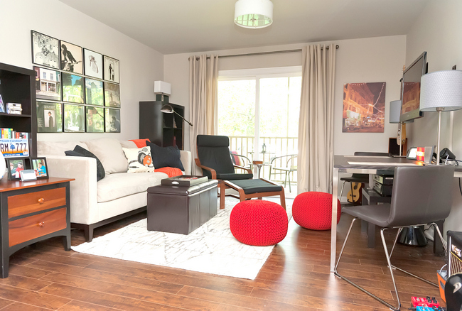
Design by Kristie Barnett, The Decorologist / Photo by Melanie G. Photography
The client’s needs included creating a main room that would be both multi-functional and stylish, where he could lounge, watch television, entertain, dine with friends, study, and work on the computer. All in the same room!
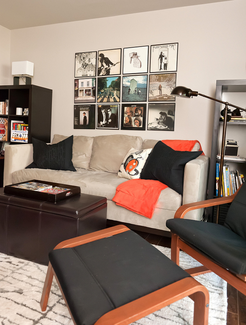
Photo by Melanie G. Photography
This called for some flexible space-planning solutions. During our first meeting, I came up with a floorplan and dimensions of what was needed to meet the needs of the client and the space. We agreed on this West Elm sofa and pair of Expedit bookcases from IKEA to flank it. On the opposite side of the room, we needed a table that could do triple-duty. It needed to provide space for dining, computer work, and for television components and lamps. This slender model worked great, and also has room beneath for extra seating in the form of these CB2 ottomans.
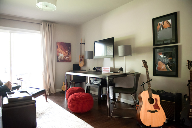
Photo by Melanie G. Photography
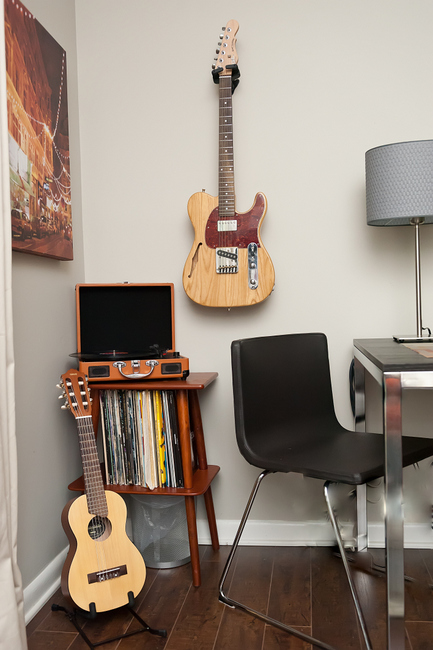
Accessories were easy – the client’s own musical instruments, speakers, and other musician stuff. It’s all easily accessible and looks really cool, to boot!
Melanie G. Photography
I loved hanging his collection of iconic albums in a smart grid above the sofa. It’s the perfect focal point for a musician’s home, don’t you agree?
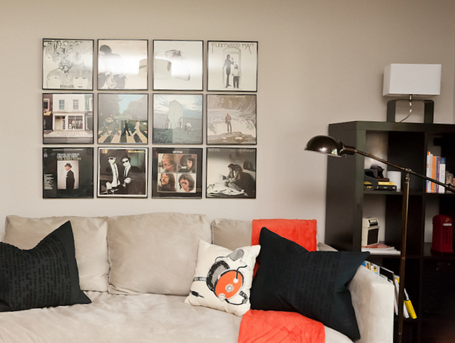
Record Album Art / Photo by Melanie G. Photography
I hung my client’s own framed CDs in his bedroom above the printer and one of his many guitars.
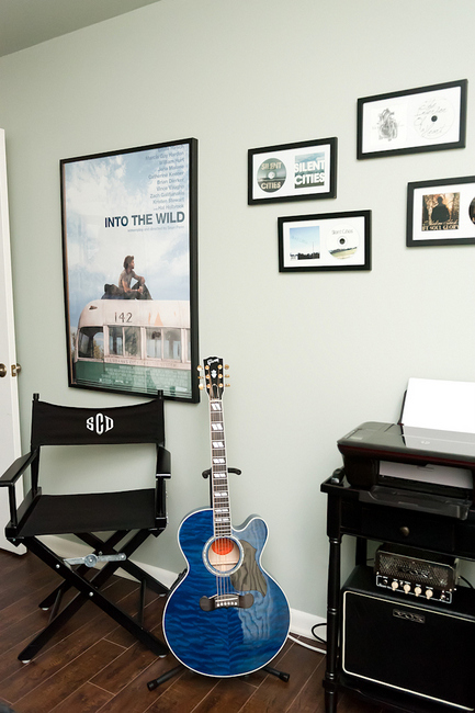
Melanie G. Photography
Maybe you should see some “befores” now. The walls were a dreary pinky-beige throughout, and the ceilings were popcorn-textured. And of course, the dreaded ceiling fan – ugh.
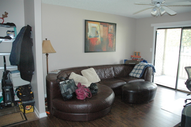
Living Room Before
We had the popcorn removed and wrapped the choices of paint colors on the wall and ceiling to make the small space feel larger. The color in this room is Benjamin Moore’s Revere Pewter. Following the transformation, complete with new lighting from Lowes and a new rug from West Elm:
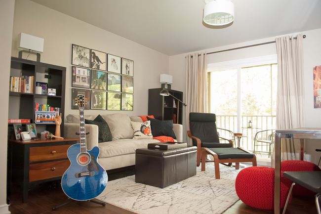
Design by Kristie Barnett / Photo by Melanie G. Photography
This was the previous condition of the bedroom:
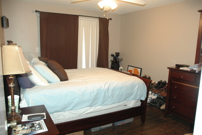
Bedroom Before
We made the bed the focal point, and lightened and brightened the whole room with a light gray-blue for walls and ceilings. His mother didn’t think he’d like the color I chose, but he loved it! Never met a man who didn’t like Benjamin Moore’s Gray Wisp.
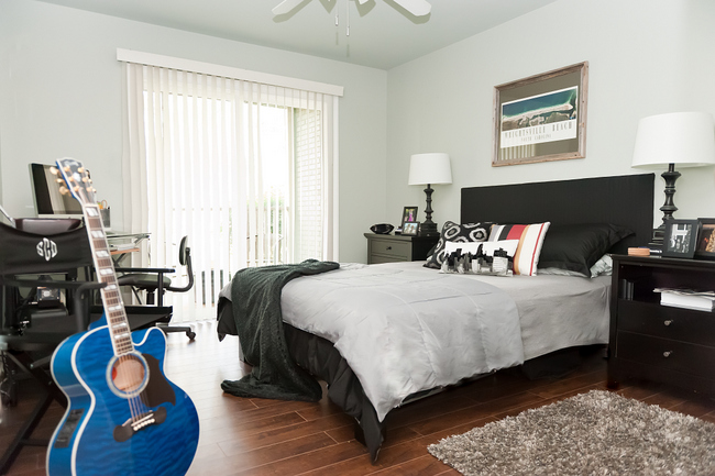
Bedroom Design by The Decorologist / Photo by Melanie G. Photography
Just a quick “before” of the bathroom:
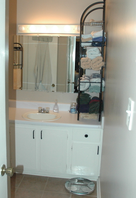
Bathroom Before
New paint, lighting, hardware, a framed mirror, and a base cabinet painted Benjamin Moore’s Kendall Charcoal made for a modern, masculine update.
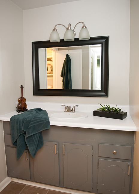
Bathroom After / Melanie G. Photography
The kitchen is super-small and the short cabinets didn’t help the storage situation. But new cabinetry wasn’t in the budget.
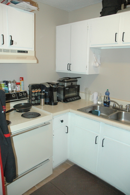
Kitchen Before
Fresh paint, white subway tile, new appliances, a granite-look laminate countertop, and new hardware took this basic kitchenette from sad to happy. Notice that we added crown moulding to the cabinets to make them look higher-end.
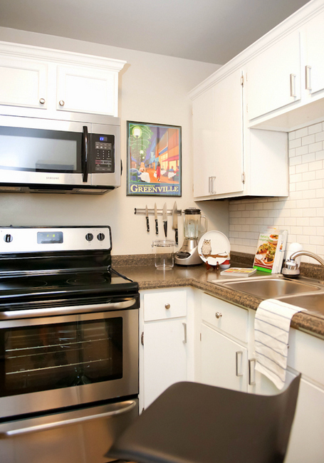
Kitchen After / Melanie G. Photography
We furnished this entire condo with great bargains from retailers like Lowe’s, West Elm, IKEA, CB2, and Target. Good style doesn’t have to be expensive, nor does it have to be the least bit feminine. This dude’s gotta save his money for guitars and amps and such.
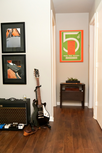
Photo by Melanie G. Photography
And for wooing the ladies who visit his cool condo, of course.
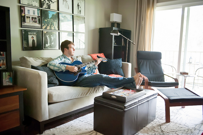
Recording Artist Sheldon Clark in his Nashville condo / Photo by Melanie G. Photography
What do you think of this contemporary style make-over? If you need help finding your own unique decorating style, contact The Decorologist for a design intervention!











Fantastic job, Kristie! Question: are the frames for the album covers a standard size? If so, where did you get them? My son would love to hang some of his dad’s “vintage” album covers in his dorm next year!
Michelle,
You can get them at Michaels, and probably JoAnn’s, as well! Yes, they are a standard size.
wow. just wow.
Great Job! What a transformation!
Beautiful, Kristie! What a great job you did and he sure looks comfy and happy!
This looks fantastic….love it! But I just have to know….why are ceiling fans “dreaded?” Are there times you think they can work in decor, or just never? We live in Kansas, and I think we would die without ceiling fans. What advice do you have for dealing with them?
Judy,
Good question – ceiling fans are certainly functional, but are rarely attractive. There just aren’t a lot of appealing options in ceiling fans, which is such a bummer for a decorator! We had 12 ceiling fans in our home when we bought it. 12! We took them all down immediately and replaced them with beautiful lighting. I’ve never once wished I had a ceiling fan – maybe it’s just something you get used to, one way or the other. They certainly aren’t necessary in EVERY room, right? Maybe your bedroom or a sunroom, but they shouldn’t be the default for the center of every ceiling. Just my humble opinion 🙂
Bravo! Encore!
I think that the kitchen was your “main act”! What a difference!
Lucky dude!,
Barbara
Sent in via email:
“Kristi…
Loved what you did in the condo, but I TOTALLY disagree about removing the ceiling fan. In Williamsburg, VA we would have died without our ceiling fans this summer. I hate light fixtures in fans (Yes, your customer’s fan was ugly.) but I love fans! They serve a real purpose. B.N.”
B.N., this small condo has air conditioning and low ceilings. We retained the fan in the bedroom, but it really wasn’t necessary in the living area.
Amazing! And your new photographer is making a BIG difference. Your work translates so much better now. Great job.
thank you, kelly! i can’t afford to use her for every project, but it sure does make a HUGE difference to have great photography. there’s only so much i can do when i do it myself.
What a wonderful transformation! I don’t know which room I like best. Living room came out great! Bedroom looks so much nicer! And the bathroom- simple changes for such a big impact! Love the album covers hanging on the wall. I framed them for a client and put up on thin shelves. They loved them! Great job as usual Kristie!
So cool! Beatles album covers for the win. When you compare this bachelor pad to pictures of your house, it’s amazing how versatile you are.
Kelley,
That’s why I love what I do! I get to dabble in other design styles, but come home to what I love, too 🙂
I love it..all of it! Unfortunatley, I too have must have a ceiling fan in the bedroom. No central air in house and I would melt without it. Right now, a necessary designer’s evil, and I certainly understand why. No popcorn ceilings..hooray. Another evil in my kitchen. Kristie you know hot cage the beasts in a home. There’s hope for this house…lol.
That BM Gray Wisp made me yawn so big I took a nap. Other than that I loved it. 🙂
It looks just awesome, Kristie, and perfect for a bachelor dude! I personally love Gray Wisp, and what a knock-out colour with his black pieces. My favorite transformation by far is the kitchen. You worked magic in there. Who would know it was a limited budget? The crown moulding – genius!
This looks completely fantastic! I love the living room the best, and I also really like how you updated the kitchen! 🙂
Hi Kristie, You really hit the right note on this one. (Pun intended.) I know both mother and son have got to be thrilled! And, I agree totally with you about ceiling fans in living rooms. Is that really the first thing you want someone to see in your room? To my clients who think they can’t live without: I always suggest using a wind tower fan. The newer models are very quiet, effective and unobstrusive.
I love it! did you remove the large glued on mirror in the bathroom? if so, was that difficult?
Dianne,
I’m Sheldon’s mom and helped with this renovation — the mirror was on a track, which most of those large mirrors are, so it came off easily after unscrewing those little clear clips. But my sources say that, even if it is not on a track, and you find that it is glued, you can go around the edges gently with a putty knife and it should come right off. And we LOVE how it all turned out – thanks, Kristie!!
got this in an email:
“This is an amazing transformation! Wow, Wow, Wow! I enjoy reading your posts very much. Such an eye for detail and the big picture. The personality of the young man shines through and everything is arranged for functionality and beauty.
Can hardly wait for your next project!
Evelyn”
I will immediately snatch your rss feed as I can not to find
your email subscription link or e-newsletter service.
Do you’ve any? Kindly allow me realize in order that I may just subscribe. Thanks.
Top right hand side of the page – it says “Subscribe to my emails”