What an exciting couple of weeks it’s been around here! We just finished up our September Expert Psychological Stager™ (EPS™) certification course here in Nashville, which was a fabulous experience on many levels (more about that on another day). AND, I’ve been preparing to birth my baby — well, it almost feels like that!
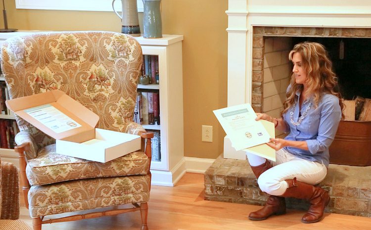
Introducing The Psychological Staging™ Paint Color Toolkit:
This is VERY exciting news for home stagers and real estate professionals, because nothing like this has ever existed before. When I began my career in home staging twelve years ago, there was no training provided for choosing the right paint colors for staging to sell. I learned by trial and error, and the errors were excruciating for both my clients and myself!
Realizing that the right paint colors can make the most positive visual difference in a home than any other staging trick there is, I began testing and learning everything I could about paint colors, color trends, and color placement. After years of creating custom interior and exterior paint color palettes for over a thousand homeowners, I have developed a system to help anyone choose the right paint colors and color placement when staging a house that will appeal to the widest possible audience.
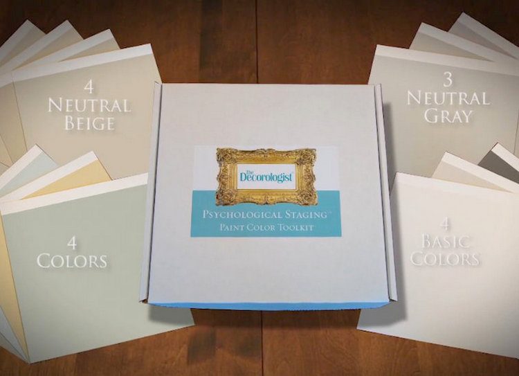
The kit includes 15 on-trend neutrals, colors, and my favorite “basics.” But that’s not the cool part. Not only do they work together in perfect harmony, they have simple but detailed instructions on the backs of each color board!
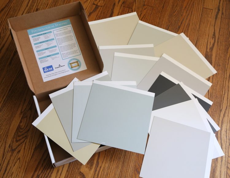
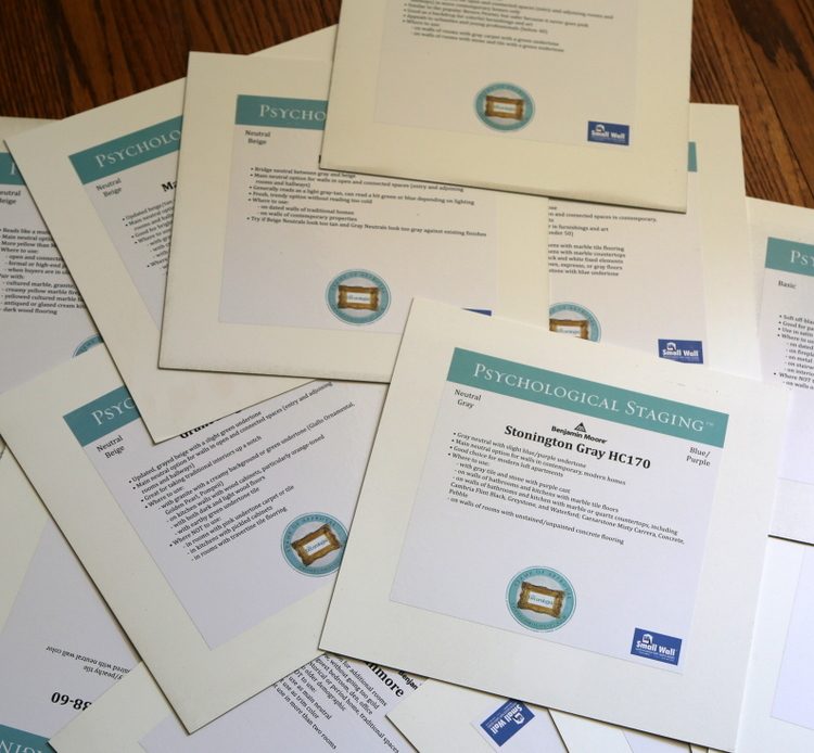
It’s a simple and direct system – which means you don’t have to have a Ph.D. in color to make the right choices when choosing paint colors to sell a property. You just follow the instructions, paying special attention to the section on each board that gives you rules for where to use it and where not to use it. For example, if there are orange-toned kitchen cabinets, I spell out which of neutrals and colors are the best options for the walls in that room.
It’s all there with you when you are on-site during a staging consultation or at your first visit to your seller’s home. Just follow the instructions for choosing the main neutral, then you’ll move easily into the other colors that are needed to fill out a complete color palette that will update the entire home. I even created a 10 minute video showing you step-by-step exactly how to use this product successfully. Choosing an on-trend, cohesive color palette that offers a bit of variation will help buyers remember every room, and with this kit you’ll be able to do that for an entire house in about 20 minutes flat!
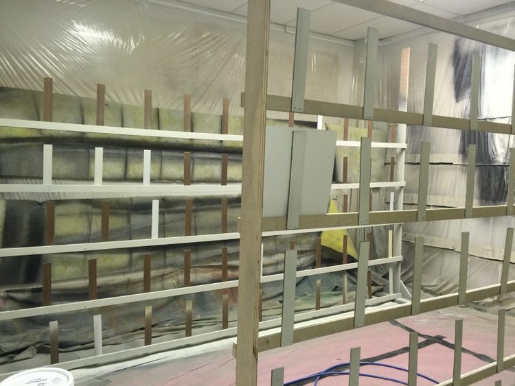
Sound easy? Well, let me tell you, developing this product and system was ANYTHING BUT! After being unable to find any local fulfillment company willing to hand-paint these boards to my specifications, Mr. Man and I had to figure out the best way to do this in bulk. Here’s a shot of the area in our warehouse where he built an ingenious paint booth:
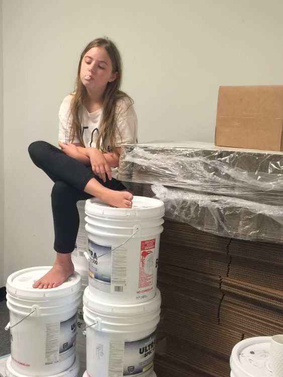
Even my kids spent many, many hours this summer sorting painted boards, applying stickers, and packing kits. I did pay them for it, but I can’t say they were terribly happy about it.
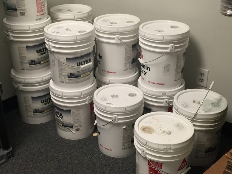
But Benjamin Moore was pretty happy to see me hauling out these 5-gallon buckets, I can tell you.
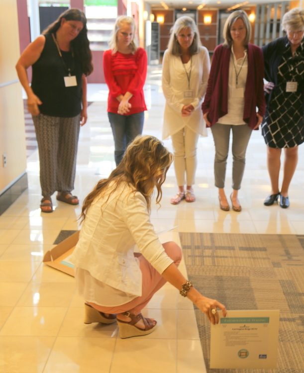
Here’s a photo of me demonstrating how to choose the right wall color for this flooring last week at the Expert Psychological Stager™ training course. Previous graduates of my course have purchased the prototype of the kit over the last year and have been so helpful in giving us feedback to help perfect the toolkit.
Here’s what some of them have said about their experience using the Psychological Staging™ Paint Color Toolkit:
![]()
The kit has truly been a lifesaver during consults where I have no idea what I’m walking into or when I get stuck trying to find that “perfect color” for a client.
– Morgan Thompson, Graced Interiors
![]() I love using my pre-made boards! Beautiful, practical colors and such a great visual aid for clients! – Becky Barton Porter, EPS™ home stager
I love using my pre-made boards! Beautiful, practical colors and such a great visual aid for clients! – Becky Barton Porter, EPS™ home stager
![]() Using the color boards helps me feel so much more confident about my color choices.
Using the color boards helps me feel so much more confident about my color choices.
– Samantha Ley, Canterbury Home Staging
![]() The staging color boards are one of the most useful items in my “tool bag.” They are lifesavers!
The staging color boards are one of the most useful items in my “tool bag.” They are lifesavers!
– Karen Brodrick Hattan, Home by Hattan
![]() Kristie’s top picks for staging colors has been priceless for my business It has made my life so much easier! Not only does it help with staging consults, but I also have used it for color consults for clients looking for a fresh, neutral look. I consider a very powerful personal weapon for your business!
Kristie’s top picks for staging colors has been priceless for my business It has made my life so much easier! Not only does it help with staging consults, but I also have used it for color consults for clients looking for a fresh, neutral look. I consider a very powerful personal weapon for your business!
– Linda Green, Reinventing Spaces by Linda
Because we are producing these kits in-house (so to speak), a limited number of Paint Color Toolkits are available until we are able to produce more. You can find much more about the product by visiting the landing page, and be sure to watch my promotional video by clicking on the image below:





Incredible tool that I use with every job! Congrats my friend!
Woo-hoo! You know that baby’s been in the womb for well over a year now – whew, that was a long pregancy! 😉
Great idea! This is just perfect. Like the affinity line but with fewer, easier, and “now” choices. I hope you will consider releasing the system without the paintboards, i.e. just a downloadable document, for those of us that collect paint decks:)
Melissa,
I have found the large boards painted with REAL paint to be invaluable – so much easier to “see” how the color will read in the room. I rarely use the small fandecks anymore, as it’s too difficult to test onsite. In the instructions and the step-by-step video that’s included, I show exactly how to test colors effectively to make the right choices in every space (with any finishes and lighting conditions).
I have red oak hardwood floors through out my home, orange in color not yellow, what wall color could I use, I have an open concept living area, would this paint system work for an individual, I prefer not to purchase if I am limited to only a few shades, from my living area the hall and the LL stairs can be seen, any wisdom would be great!
Woo-Hoo! GREAT product, I know this will be prove to be so useful!! Thank you for your vision and your work with these paint boards! (BTW, your hair looks awesome in the video!!) 😉
Haha!! Thanks, Karen – especially about the hair comment 😉
If I was in the decorating or staging business I’d buy those cards in a heartbeat! I wish I could afford them just for my own decorating use (sigh)– and I could afford to take all your training classes just for my own personal use, too! They sound fantastic. It almost makes me want to become a home stager just to take your classes and justify the expense of those paint cards!
Anyway- I just want to comment that I LOVE the chair in the 4th photo! Was that a client’s room? If so, I am curious as to what color you recommended to update the room and still coordinate with that gorgeous fabric? (Or do you think the wall color as shown is ok? On my monitor it looks like the “peanut butter” color that you once recommended another client change (from an older post).Thanks!
I love that chair, too, Phyllis! If I were staging that home to sell (which I’m not – it belongs to the videographer), I would choose Benjamin Moore Carrington Beige!
This is wonderful Kristie! Congratulations!
YOU ARE A GENIUS! Love this! Love you!
Thanks, LaJuana!!! Let’s get together soon!
Kristie, You should be so proud and pleased! What a great and helpful product. I wish you all the best with it.
Thank you so much, Jacquie. I hope it helps a lot of people, because color is a tricky business!
Great posting with useful information. Keep it to share you have of experience in the post.
How are your color boards different than Maria Killam’s?
Good question, Elaina. Maria’s boards are a large collection of mainly neutrals and off-whites of all undertones. It’s up to you to figure out which of these you will choose in a given space, which requires a lot of training and experience. Marias’s system of choosing color is based on which paint color matches your finishes.
My toolkit was developed specifically for the staging/real estate community and need to be able to make the right choices in a very limited amount of time with their client. They need to know the most updated, appealing colors to use and exactly when and where to use them. This where the unique detailed instructions for each color board comes in. When staging homes to sell, choosing colors simply because they match the finishes can provide a dated appearance and is a missed opportunity to present an updated, on-trend appearance even when some of the finishes aren’t as up-to-date. The limited colors in my kit are the ones I use to bring to life even dated finishes and homes throughout the country, and the specific instructions for each color show you where to use it and where not to. When you follow the instructions based on the dominant finishes in the home, my system guides you to only 2-3 neutrals to choose from for an open concept area, then on to colors in adjoining room to create important memory points for homebuyers. It’s quick and very effective – dozens of pro stagers have been using it over the last year as we’ve been perfecting the instructions for ease of use.
Thank you for your question, Elaina – I hope that helps!