Touring designer showcase homes can give you insight into what colors are being used in high-end new builds. Since I was fortunate enough to get an exclusive invitation to the HGTV Smart Home 2014 in Nashville last week, I thought I’d share all the paint colors used in this beautiful, high-tech home.
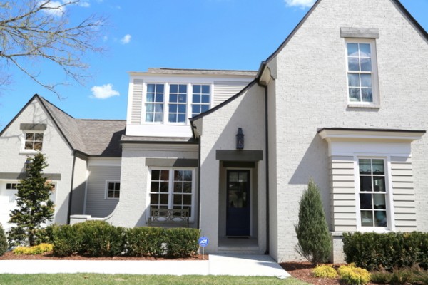
HGTV Smart Home 2014 in Duncanwood Reserve, Nashville
All of the paint colors are Sherwin-Williams, one of the sponsors of the build. The exterior body of the home is Amazing Gray SW 7044 in satin finish, the exterior trim/columns/trim are Shoji White SW 7042. The cedar timber lintels above the windows are Porpoise SW 7047.
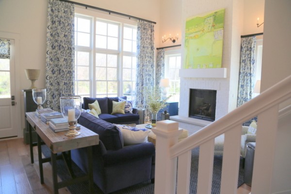
HGTV Smart Home living room
The main neutral throughout the interior of the home is Incredible White SW7028. It runs through the entry, hallways, living room, kitchen, and bathrooms throughout the house. The trim, fireplace brick, and paneled ceiling are painted out in the same color in a semi-gloss finish.
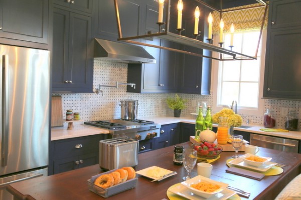
painted kitchen cabinets
The designers used Indigo Batik SW 7602 as a signature color throughout the home. It is a beautiful statement on the kitchen cabinetry and the front door, interior and exterior.
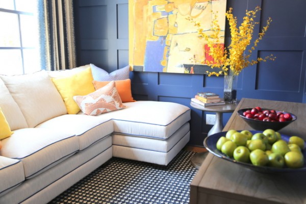
upstairs den
It’s also the first thing you see when you come upstairs, on the walls, gridwork, and trim of the upstairs den.
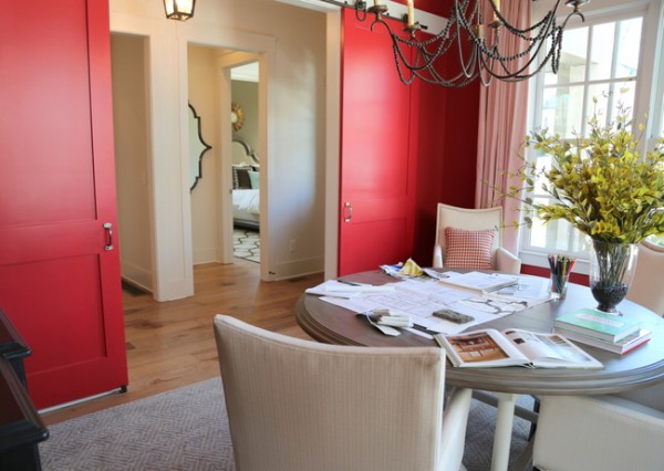
dining room
The dining room/meeting room features Antique Red SW 7587 on the walls and sliding barn doors. The trim is Incredible White SW 7028 and the ceiling is Collonade Gray SW 7641.
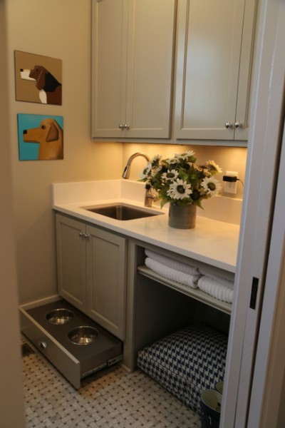
laundry room
The cabinetry in the laundry room is also Collonade Gray SW 7641. Notice how the flooring in the laundry room is the same as the backsplash in the adjoining kitchen. Now for the bedrooms:
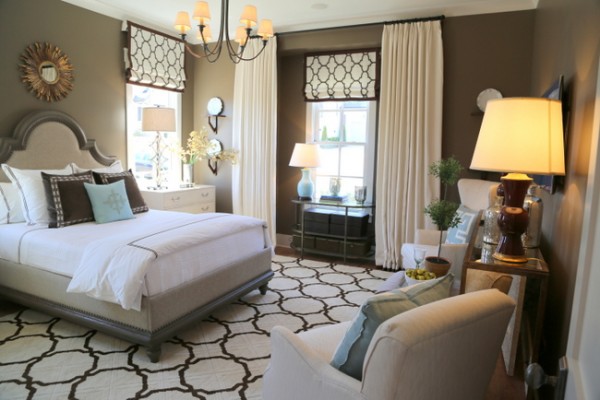 Foothills SW 7514
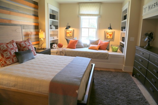 Sand Beach SW 7529
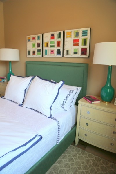 Latte SW6108
The HGTV Smart Home was built by John Montgomery of Carbine & Associates in Duncanwood Reserve, developed by Anchor Investments. The architect was Preston Shea, P. Shea/Design, and Jack Thomasson was the HGTV House Planner. Ryan Manners was the Landscape Creator, while Jason Moore was the Tech Specialist from MEC Technologies, Inc. Linda Woodrum of T.S. Hudson Interiors and Kelly Grokulsky were the interior designers.
So what paint color in the HGTV Smart Home is your favorite? Mine is Indigo Batik SW 7602.
Update August 2019: If you’d like to learn how to build gorgeous interior color palettes, find out about our Psychological Color Expert™ certification course here!








I too love the Indigo Batik throughout. It is warm and dramatic. I don’t care for the red in the dining room – I’d feel like I was sitting in a fire engine! The bedroom with Foothills on the walls is gorgeous and I also like the use of Collonade Gray on the cabinets.
Thanks for sharing, Kristie!
Thanks for sharing your thoughts, Beth. I haven’t done a red dining room in years, so I was surprised by that one. The Collonade Gray on the cabinets looked great 🙂
Definitely Collonade Gray for me. I like the use of the white, but I am contrast oriented consultant myself… I am a bit intrigued that red was used in the DR as well. I feel like I am still painting out those cranberry specs from decades past! Maybe this bright and true hue paired with blues or deep grays and white will bring reds back?
Do you have these colors available in a list form?
Thanks!
Love the Collonade Gray, too. I don’t have the paint colors in list form, Alison – sorry!
I love the cabinets in Indigo Batik SW 7602. It feels timeless, although it is a very contemporary color. Thank you for sharing Kristie.
I loved the dining room, the red is perfect.
Love, love, love the Indigo in the kitchen! Thanks for sharing the pics!
Glad to share, Chris!
I’m confused. I thought the sand and latte colors were relics from ten years ago. Are they still trendy?
Jess, I think the Sand works, but not the Latte.
The indigo batik is mine as well. I would love the antique red on our front door. I am so happy to have all this fantastic info. Thanks so much for sharing.
Yes Debbie,
The red would be great on a front door. Thanks for stopping by 🙂
Loved the Antique Red in the dining room. I have shades of gray throughout my home, and to be frank, the red just felt new again.
Thanks so much for sharing all of the colors!! I think that Porpoise is SW 7047
Kristie, I LOVE your combinations! I really want to use SW Aquaduct for the exterior doors and shutters on my beach house. What neutral grey do you think would look best for the main house color? I’m thinking SW Alabaster for the trim on railings and windows (decking is dark brown, pewter metal roofing). I’d love your opinion. Thanks!
Paula,
Aquaduct is such a clean bright color, I’m not sure I’d do a gray body color with it – maybe just a clean white like SW Alabaster. Unless you gray down the exterior door/shutters, then you could do a gray body effectively. Like Repose Gray on the body, Interesting Aqua on the shutters/door.
I love the colonnade gray for the cabinets, what do you think about Barcelona beige for the walls?
Love the house!
Were there any modifications to the exterior color? Or is it just straight SW 7044?