Have you ever had this problem? You have a piece of furniture or headboard or something in your home that needs “something” over it, but you have no idea what to hang on the wall above it?
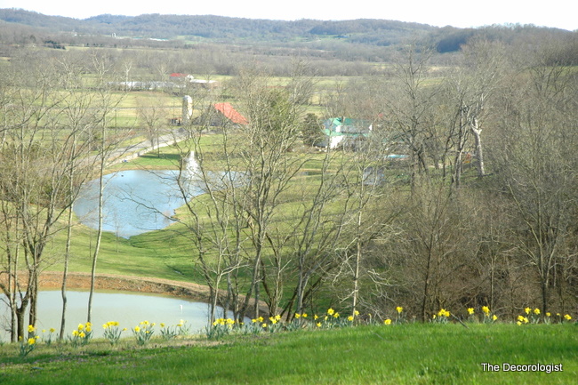
Beautiful View from the Front of My Client’s Home
This was the dilemma in my client’s home. Here is the dining room in it’s “before” state – it has lovely tall ceilings and a beautiful hutch to the right. The space above it looks a bit bare, but what to hang there????
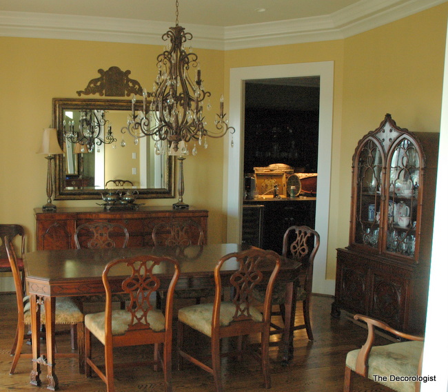
Dining Room Before The Decorologist
Following the lines of the furniture always works for me. Creating a vignette with much-loved china on the wall that mimics the lines of the furniture made for an interesting and unique solution for this design dilemma. Oh, and we changed the wall color so that the wood tones would have a richer backdrop (if you have lots of wood in one room, most of the time yellow is not the best choice to paint your walls).
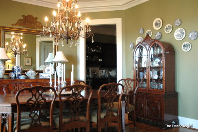
Dining Room After
Here’s another shot to show better show you the effect the plate grouping makes with this beautiful hutch.
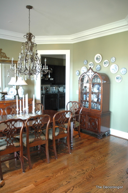
Blue and White Plate Grouping
Unusually-shaped furniture often call for unique accessorizing solutions. Have you ever had to accessorize around an oddly-shaped piece of furniture?




What color green did you use in the dining room?
very nice! If there is a big bowl of green plant on the table, in a bright colored, say yellow, or white container, I think it would be even better, and to give the room more life. I think every room needs a live thing 🙂
Hmmm. I think I liked it blank. Your client has beautiful furniture and that view is unbelieveable.
Beautiful color update! And fortunate that she had such a beautiful blue and white collection! Love blue and white porcelain.
Really good problem solving, Kristie!!
What a huge difference also after the color change. The furniture suddenly lost that cliche
effect. It dignified the room!!!!
As for the rest of her house , who needs artwork with a gorgeous–and I’ll bet ever changing— view
such as that….I’d like to frame that view and put it on MY wall!!
I wish I had your talent, that looks so much better! I would have ended up leaving it bare not knowing what to put there. At least I can ‘borrow’ your ideas, lol! Thanks for sharing!!
You are quite clever, Miss Kristie, I love what you did in the dining room, it was a beautiful room, but now it is beautiful and interesting! good job on picking great,new fresh color for the walls!
Wow, what a huge difference from 2 small changes!! The color made the furniture look totally different, and the plates really wake up that wall and now the hutch looks even more beautiful! I am always amazed what a difference paint can make!
I agree with so many above– the colour change in the room makes all the difference in the world. I have seen many rooms with lots of medium to dark wood painted yellow (maybe in an effort to lighten the look?) and it has never looked good to my eye– I now have an easy suggestion to make (politely and tactfully of course).
Love the blue & white w/green walls and the wood tones, Kristi. The pattern of the porcelain adds so much interest and life, the reflection, light, and sparkle from the crystal & mirror are subtle but make all the difference in the appearance of trhe room–I like it!
Sindy 🙂
A great look and adding the plates to frame the shape of the hutch looks really nice. What color did you end up painting the dining room? It looks great with the wood tones in the furniture.
Enjoyed reading your last few posts! Hope to visit again soon!
Ruthie
I would really love to know what color you painted this room! beautiful.
Love the green wall color; it really enhances the color of the wood. Plates on the wall is one of my favorite things. Teetering on the edge of going overboard, but I think I would like to see a pretty rug on that floor. Nice job!