I recently got the opportunity to interview interior designer Windsor Smith!!! Windsor is a wildly successful celebrity designer who is coming to the Antiques & Garden Show in Nashville this weekend.
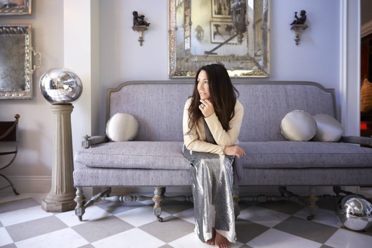
There’s a presentation on Friday morning featuring Windsor and her gal pal, Gwyneth Paltrow. Gwyneth met Windsor after she bought a house that Windsor built from the ground up which became a showhouse for Veranda magazine. Gwyneth hired Windsor to help her make her own home out of “the House of Windsor.”
Windsor (ok, Windsor’s people) sent me a copy of her beautiful book, Homefront: Design for Modern Living, which is full of images of her work and her musings about interior design.
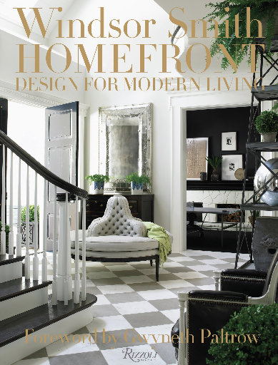
I was particularly interested in the chapter about the use of color (are you surprised?) in interior design. In the book, Windsor speaks about using five or less colors in your overall scheme in order to pull the entire house together. “I prefer to use hues at the warm end of the spectrum as accents. Pops of intense color bring a room to life, and they can be far more effective than an overall wash of pigment.”
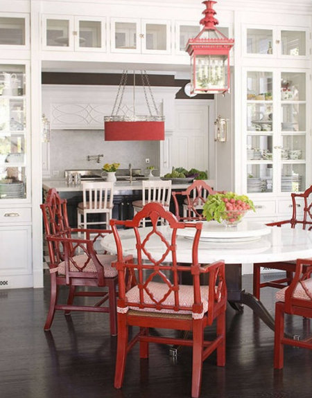
In my interview, I specifically asked Windsor which colors she prefers in her designs. She told me:
“I’m forever a slave to silvers and blues, stormy whites, dusky charcoals and navy blues…I’ll whip out a bright pink or lavender, even a rich saturated green on occasion, but I always lay these against a mercurial backdrop. And I adore black! She is the queen of all colors and to me, as important as white to a home. Come to think of it, I use both in equal doses! You’ll never find pale yellow in my work, or a celery green. Those were the colors of ALL our rugs growing up! I still can’t look at celery green today without feeling a little queasy…”
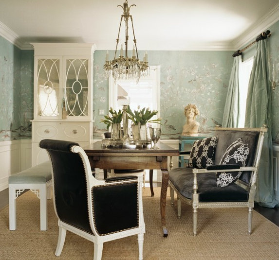
I didn’t ask her to explain what “stormy” whites look like, but I did ask her about her favorite design trends – and she wasn’t hearing of it! She instead answered:
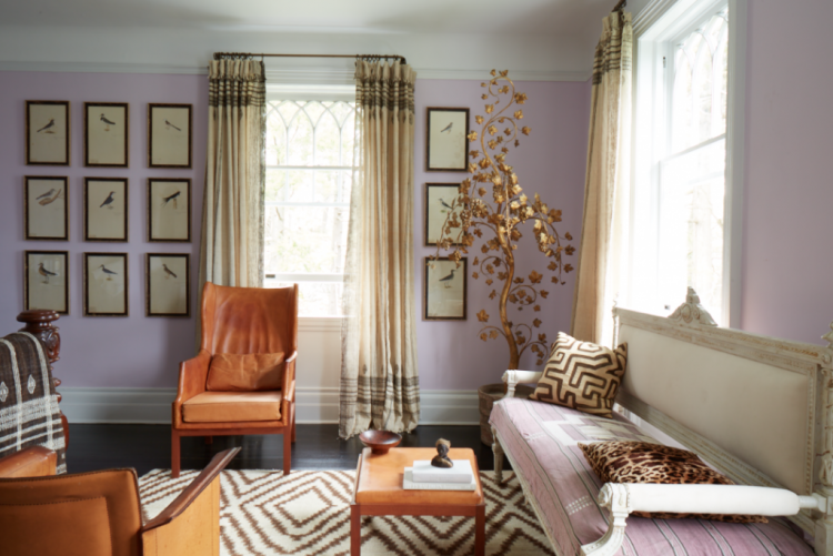
“I tend to shy away from trends, but I love creating new pairings . . . if I’m crushing on a new color, for instance, I like to move it around—pair it with other unlikely colors, and reimagine it in a variety of textures and applications. Whatever I’m fascinated with I try to put through a battery of tests, exploiting it in every exciting way I can think of.”She’s quite the wordsmith, but she sure wasn’t giving up any of her design secrets! But this might be an example of her pairing unlikely colors – lavender and orange:
When I asked Windsor to name one thing in a room that is most pivotal in her designs, she told me that the layout of the furnishings was more important to her than any one object or paint color. “I’m always exploring how to get more out of a room: more purpose, more opportunities for communication, and more true living into a space. I’d say a signature of my rooms are non-boiler plate furniture configurations. . . And I celebrate the nooks and crannies too often neglected by conventional floor plans.”
Windsor has created quite the design empire, so I was interested in how she balances family life and her career. Her answer: “Both of my sons Trinity and Oliver are in real estate – in our family you are required to get your real estate license following graduation if for nothing else as a fall back. And my husband is the sexiest developer alive. We all love working together and have a great understanding of what each of us is working on. In many instances we overlap, so suffice to say that when we are playing we are working and when we are working we’re also playing!”
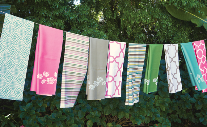
Kravet fabrics by Windsor Smith I was curious if someone like Windsor maintains a steadfast style in her own home, or if her preferences evolve over time. So I asked! This is what she told me:
I’ve had quite a trajectory— an arc if you will— having been in this business over 20 years now. I love things that are classic and of substance and quality. I began as an antiques dealer, then turned to designing interiors and, eventually, to building homes from the ground up with the responsibility for their architecture. Yet through every stage my own home has remained surprisingly consistent. So many pieces travel with me wherever we go as a family. I’m a big believer in buying only things that you love and/or that hold some kind of meaning. I never buy just to fit a space or to match the curtains. Part of what makes a home great, in my mind, is a balance of new and old, sentimental with of-the-moment, and the glossy new with treasures in a perfect state of demise. It feels real to me . . . if I fancy a new piece, even if it’s a swerve in a wildly new direction, it still somehow miraculously finds its place alongside long-loved pieces to coexist in harmony.
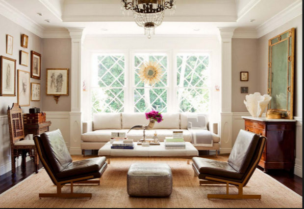
As I went through images of Windsor’s work, I noticed there were several shots of THIS ROOM with the fabulous diamond-paned windows. And it’s changed a lot over the years. Here’s what I think was an early version of this living room design:
Windsor Smith design
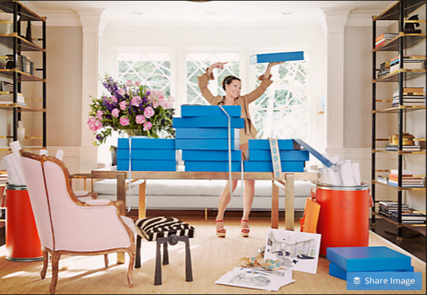
Then I stumbled upon this shot, where the room is set up as an office where she is featuring her Room in a Box a while back:
Windsor Smith
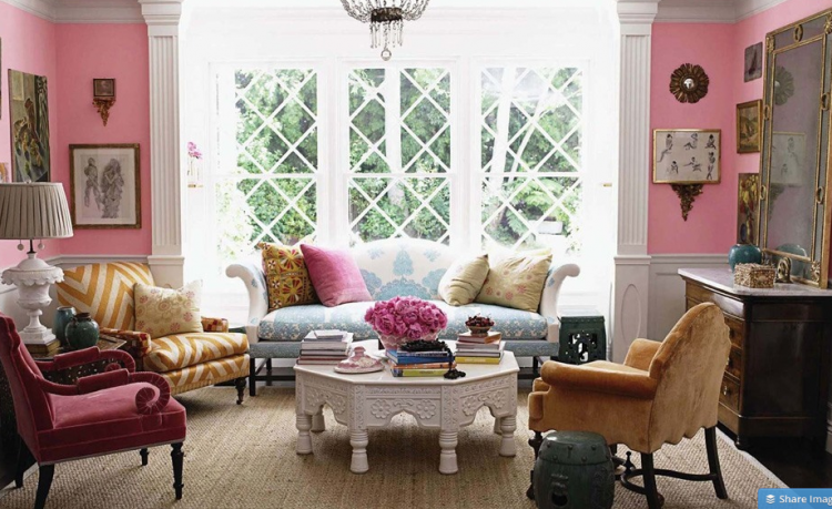
This is the latest rendition of the room (as far as I know!). Definitely an unexpected combination of colors:
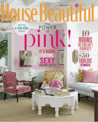
Windsor Smith This room appeared in House Beautiful a couple of years back, and even made the cover. Notice how different the wall color looks in the magazine and in the photo above. Yet another example of why you shouldn’t rely on magazines to give you accurate renditions of paint colors.
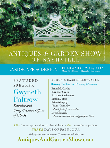
Come see Windsor Smith, Gwyneth Paltrow, Bunny Williams, and many other interior and landscape designers at the Antiques & Garden Show this Friday through Sunday, February 12-14, 2016. There will be over 150 fine antiques and horticultural dealers onsite at the Music City Center in downtown Nashville.
Find out about tickets and schedule at AntiquesAndGardenShow.com. If you can’t make it, never fear – I’m attending lectures by Windsor Smith, Gwyneth Paltrow, and Bunny Williams on Friday (I can’t wait)! You know I’ll share all the scoop I can get . . .
Don’t forget to sign up for our upcoming Expert Psychological Stager™ course May 3-5, 2016 here in beautiful Nashville! Click here to learn more. |

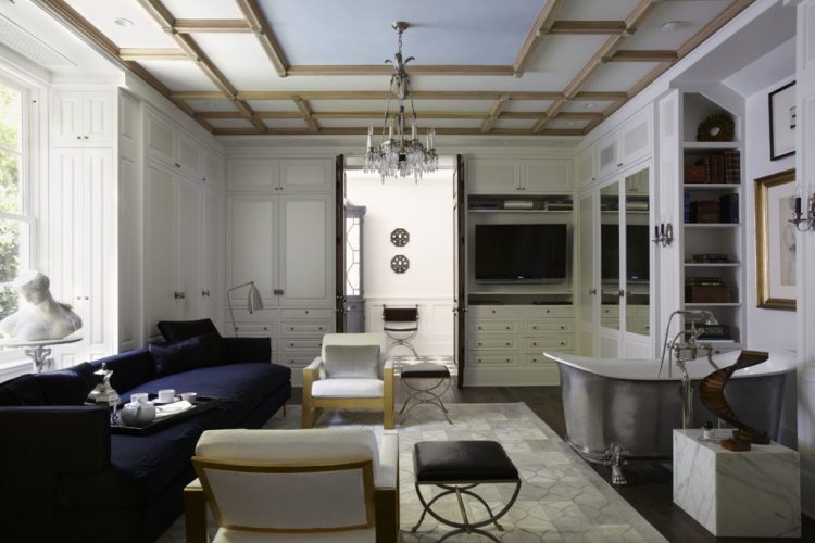 who wouldn’t like a place to entertain guests while tub-soaking, dah-ling?





Oh you lucky dawg! I adore Windsor Smith’s work! I usually do see her old living room in that bright bubble gum pink shade. And paired with gold? That takes guts! But it’s all so glorious as an entity. It certainly doesn’t hurt to have an architectural gem of a room too!
The show sounds like it’s going to be fabulous! Hope to hear more about it! xo ~ Laurel
Laurel,
Do you know if the living room is currently the pink? I’m not sure which image is the most current, but I was assuming the pink rendition.
Those fabrics are luscious! What beautiful work. Thank you for sharing.
Beautiful rooms. Love her fabric line also! Sounds like a great time- wish I lived closer!
Kelly, I’m really looking forward to it – it’s such a great show!!!
Great interview! Fun to hear her take on colour and using hues at the warm end of the spectrum as accents.
Windsor Smith and Bunny Williams – what a show that is going to be! Wish I lived much closer. Good interview Kristie, looking forward to reading your scoop.
Hi Kristie,
This is an interesting article but I must say I prefer your style! Your work is lovely and calming, as is the way you write. I found Windsor’s speech and styling to be a bit chaotic. If her intent is to disturb the space, she has succeeded, and I do understand that she probably finds joy in getting people off balance a little and challenging the norms. I’m sure her audience appreciates that, but at home I like a calming space with unexpected surprises that aren’t too jolting! One thing I did like is her use of silvers, blues, and grays as a backdrop. Just my thoughts…I am certainly no designer!