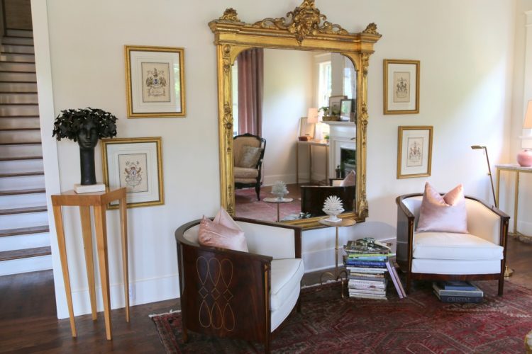
Touring designer showhouses is a great way to find inspiration for your own interior projects. It’s also the place to get a peek into the latest haute 2016 design trends that will invariably trickle down to the mainstream public. O’More College of Design is presenting their 3rd annual designer showhouse starting TODAY in historic downtown Franklin, TN, and it is definitely worth your time to tour this beauty over the next two weeks.
I was invited for an exclusive sneak peek yesterday, and I’m here to share with you the hautest (see what I did there?) trends in interior design. You’ll notice several of these trends combined in the images I’m about to share with you (all photography is mine).
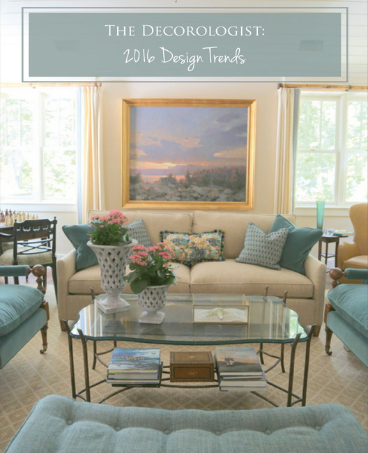
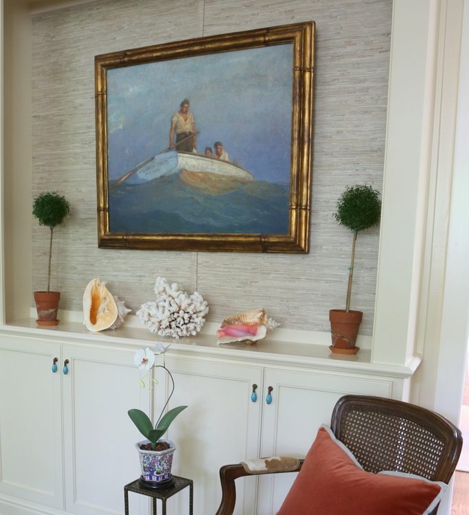
Rose Quartz
Why should little girls have all the fun? Pink is all grown up now and the O’More Showhouse features a glorious and sophisticated take on the 2016 Pantone Color of the Year, Rose Quartz.
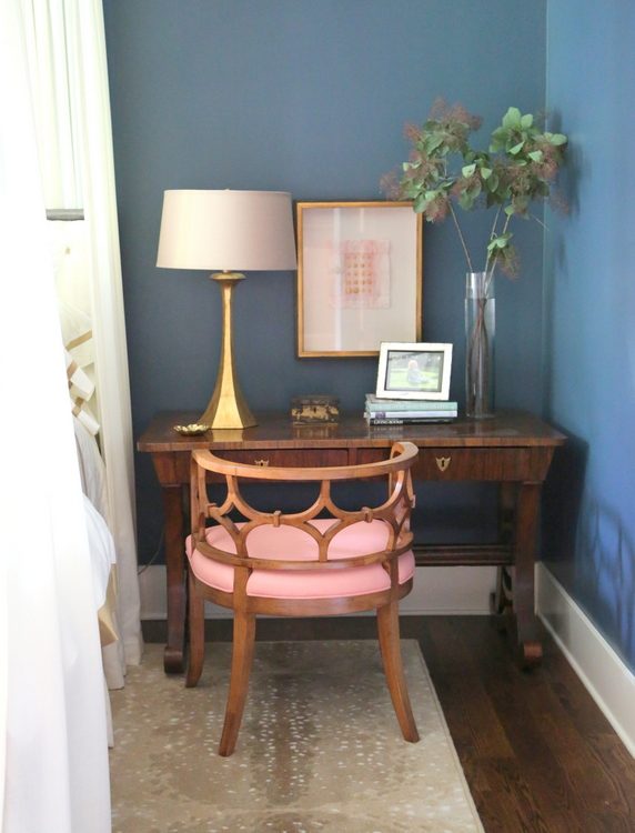
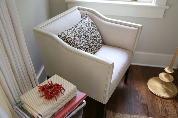
pink + gold + animal print by Mark Simmons Interiors
Mark Simmons Interiors
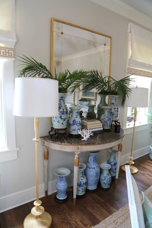
Chinoiserie
Chinoiserie is the European interpretation and imitation of Chinese and East Asian artistic traditions, and it’s definitely seeing a resurgence of popularity in interior design. Chinoiserie was popular throughout the 17th and 18th centuries and enjoyed a brief revival in the 1930s. Now we are seeing it as one of 2016 design trends, as well.
 Lila Pryor Frank Interiors
Lila Pryor Frank Interiors
J Haynes Interiors
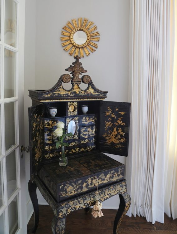
chinoiserie + gold
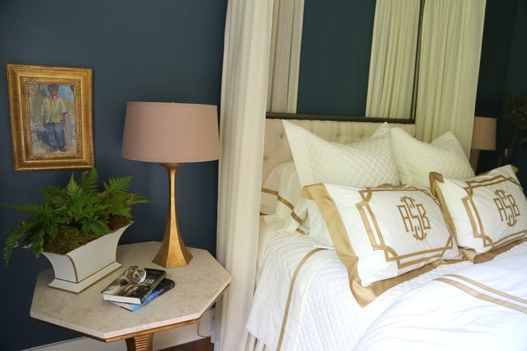
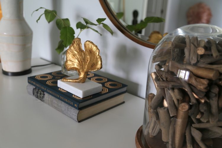
Gold Metals
Gold hardware and light fixtures continue to trend, and are particularly beautiful with the sophisticated pastels and range of blues featured in the 2016 O’More Showhouse.
gold + pink, Dana Goodman Interiors
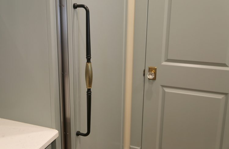
gold hardware in J. Jones Design’s kitchen
gold is definitely one of the big 2016 design trends
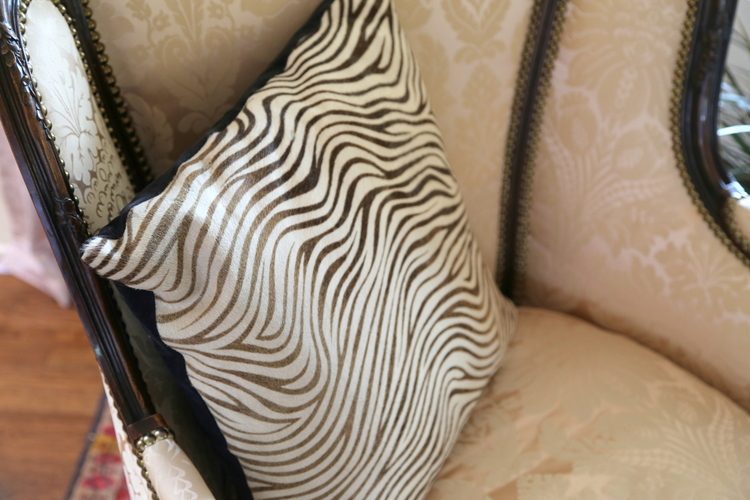
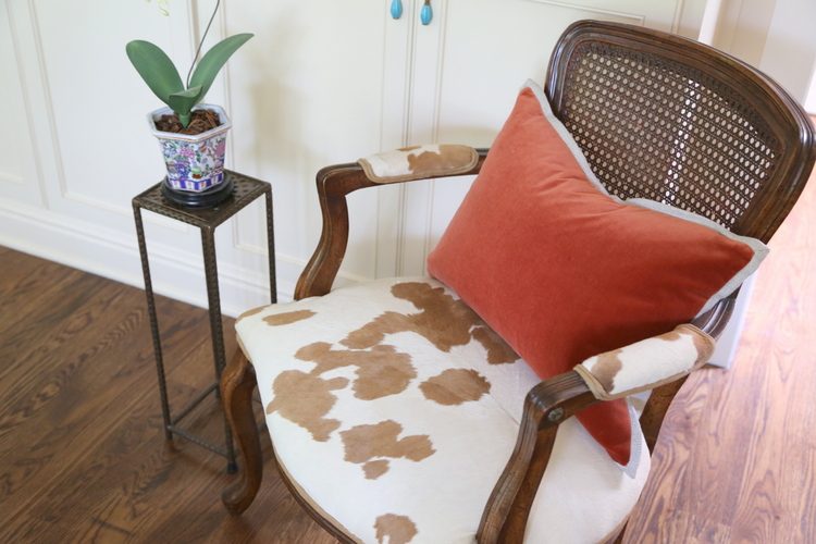
Animal Prints
Subtle touches of animal prints (another one of 2016 design trends) are throughout the showhouse rooms. I saw cheetah, zebra, cowhide, and deer, to name a few. Most were faux or animal print inspired pieces.

K7 Interior Design
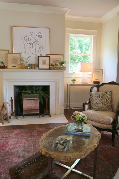
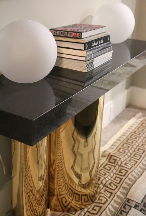
Au Naturale (Geodes, Bark, Nests, Oh My!)
You can never go wrong with nature, and the O’More Showhouse includes many natural elements as decorative detail throughout.
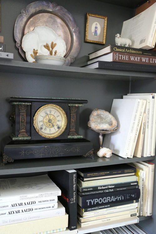

J&K Design Studio
I have a strong feeling that these side tables will be the most talked about element of the entire showhouse! Modern and rustic at the same time.
Savage Interiors
nature + gold + animal fur in J&K Design Studio’s bedroom
You can see this beautiful home for yourself and all the 2016 design trends if you live in the Greater Nashville area. The 2016 O’More Showhouse is open to the public May 12 – 27, 2016:


Kristie I’m wondering about the traditional/formal tone of this decor. It definitely seems more traditional than many show houses I’ve seen in the past few years. Is this a trend shift do you think? Or is that just the typical feel for the O’More house every year?
Thanks for sharing – it’s an absolutely beautiful house!
This home is in an historic, upscale area. It was built in 1919 – I think the traditional/formal tone is consistent with the history and architecture of the home, but there are some rooms that are less so. I just haven’t shown them all to you! I’d say the first O’More showhouse was similarly formal, but unfortunately I missed the second one and can’t speak to that one.
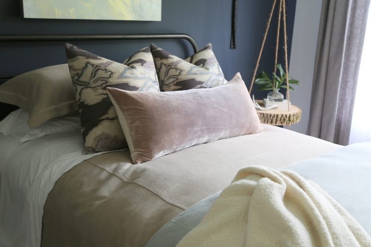
I love the use of pink in grownup room. Is there a pale gray that you could suggest for walls that wouldn’t read blue? A gray with pink undertones….I think I would love a gray room with a bit of pink sprinkled throughout.
Ben Moore Edgecomb Gray might be a good place to start, Jean!
According to the paint color handout for the show house, the dining room walls are Edgecomb Gray in case Jean wants to look at them. Of course I wanted to know what all of the colors were!
I started dragging our animal print stuff back out 2 years ago. We had an “Out of Africa” feel in our home in Florida
and, by golly, though we’re now in the mountains of NC….guess what? There’s more wild animals here than there ever were in Florida!! In winter it just feels cozy and in summer, not a bad vibe either!
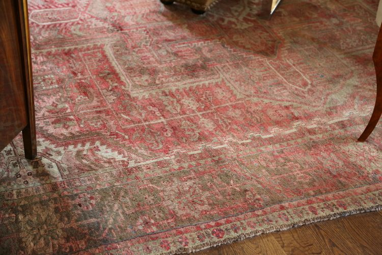
I’m drooling over that faded red oriental in the LR close -up photo! That’s a forever piece.
Happy for gold, although I like it burnished. The pinks are nice, but the combos of pinks and those depressing blues, I could live without. Love seeing pink with oranges or corals. Like the rose ceiling in the 1st LR pic also!
Ok, that’s my 2 cents! Wish I could come there & see it all. But….we always have a FABULOUS Cashiers Designer Show House , every summer. Come on over here Kristie and see that!!! Love, Paula
You know I love designer showhouses, and I’m sure the one in your town is fabulous! When is it, Paula?
PS: As to the “formal” feel of this show house….not sure if it is similar in the design school realm, but I know that in music, you must first master the classical forms….and later play off that into jazz, etc.
These rooms may well be an example for these students of the jumping off points in interior design.
Just a guess….
Thank you for this!
I was so happy to see animal prints in rooms with patterned rugs because I did this in my dining room just a couple of weeks ago 🙂
Good job – you are on the cutting edge, Joanne!
Joanne, your rug is stunning! I’ve been looking for one with similar colors and feel for a very long time and haven’t had any luck. Would you mind sharing your source? Thanks!
Some of the rooms seemed “tired” in color and design. Animal prints and gold in small doses can be awesome! Liked seeing them on this post. Fun!
This is the first time I don’t love the Showhouse. It seems dated to me. I understand it’s in a historic home, but it feels sad. I do love the print in gold frame on the fireplace and maybe in person, it’s different. But, in fairness my style is more modern, more eclectic.
Living in Florida, my style is less formal. I’m seeing an interest in animal prints such as the deer. Love it.
Thank you Kristie! I love reading your blog! I really liked the pink on the ceiling…did you mention what that color is? I hear it’s one of the most flattering colors, in terms of skin tones, for “humans” to be around. 🙂
I didn’t mention the color, but that’s because I’m working on a second blogpost this week about the showhouse, where I reveal all the specific colors! Thanks, Amy, and stayed tuned!!
Kitchen cabinets, walls and and trim paint colors are NOT Canadian “fandeck” choices, they are all
chosen from the current Benjamin Moore paint colorations. As professional designers we are cognizant
of current paint colors through our manufacturers, we are kept abreast by attending CEU courses and
other means. The Williamsburg Collection, by BM played a very strong role in many room choices, where
applicable with the designers vision. The actual number of paint color choices for a 5,600 sq.ft home is
completely within reason. Especially since light to dark colorations are so subtle. We are very glad
that the visiting public might enjoy, such a lovely transformation, and to see such a large number of
professional work, on display!
Jennifer Jones Allied ASID
2015 Past Chapter President ASID
Thank you for your comment and information, Jennifer. The kitchen you designed is lovely!
If the cabinetry and trim in your kitchen are Piedmont Gray CC-690, it is actually a color in the Benjamin Moore Canadian Collection, also known as The Designer Classics. That color is not in any of the collections/fandecks found in the states. Paint color specification (both interior and exterior) is my specialty.
I know you mentioned the Williamsburg Collection – which paint colors in the home were from that collection? I didn’t see that any were, although many were part of the Historic Collection – perhaps that what you meant.
These rooms are so lovely, however I do not see any of these as new trends?
Emily, they aren’t “new,” that’s true. But they are trending!