If you asked me to tell you what paint color mistakes to avoid, I could probably spit out at least 20 off the top of my head. I’m going to share three that I see all the time, and avoiding these will save you a lot of heartache and money.

Paint Color Mistake #1: Communicating the wrong color
This sounds like a really basic thing, but this is an extremely common problem! Paint names are not proprietary to a specific paint company, which means ANY paint company can use that same paint color name. Sometimes the name is exactly the same, as in the case of this color:
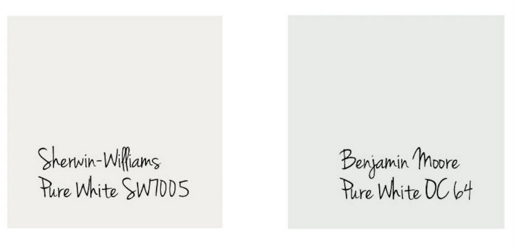
If you tell your painter you want the trim painted Pure White, make sure you specify WHICH Pure White you want. Sherwin-Williams Pure White is warmer with an ever-so-slight yellow undertone, while Benjamin Moore Pure White is cooler with a blue undertone.
Some color names are so similar that people confuse them with one another. Constantly. I cannot tell you how many times I’ve seen people confuse these three colors because of the similarity of their names:
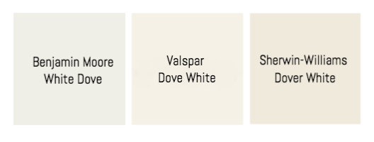
The whites above are obviously different whites with different undertones. Mix up one of these for all the trim in your home, and you will end up with a VERY different result. A recent client kept referring to the proposed paint color for her new build as “Dove White,” and I had to repeatedly correct her (it was actually White Dove). I explained that I really had to continue to correct her for fear that she would mistakenly relay the WRONG color to her painters.
 Benjamin Moore White Dove by The Decorologist
As basic as it may sound, it’s important to do this every time:
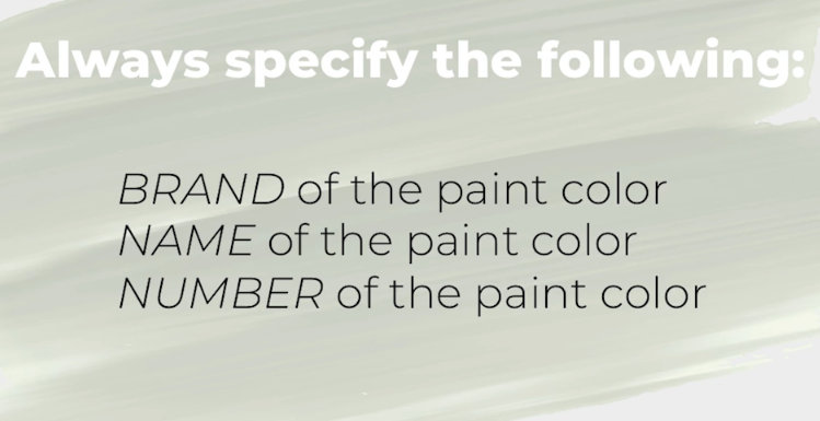
The brand and/or name can often be confused, but the number typically defines both the brand and name of the color. Always write out your color specifications for your painters (or your paint store) like this:
Benjamin Moore White Dove OC17
Sherwin-Williams Dover White SW6385
Valspar Dove White 7002-7
Paint Color Mistake #2: Being Deceived by the Name of the Color
Sometimes very pretty colors have very ugly names. And vice versa. I have watched many a client’s face fall when I make the mistake of naming a color before showing them a sample. Sometimes, they’ve even changed their minds based on the name of the color!
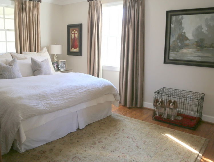 Benjamin Moore Edgecomb Gray by The Decorologist
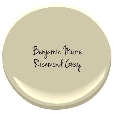
The color name means NEXT TO NOTHING. Here are some examples:
“Richmond Gray” matches no one’s definition of gray . . .
Suppose you want a paint color that makes you feel as though your bedroom is a seaside vacation getaway.
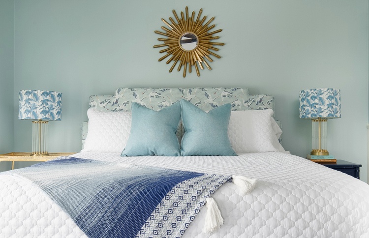 Sherwin-Williams Tradewind by The Decorologist
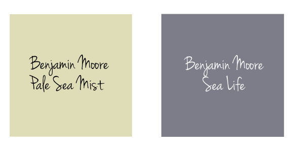
If names like “Sea Life” and “Pale Sea Mist” lead you to suppose that painting your walls that color will give you the coastal vibe you’ve been longing for, you might should think again.
Don’t make a paint color mistake based on the name of the color. And when choosing between two colors, don’t even consider the names!
Paint Color Mistake #3: Using Color Equivalents
This paint color mistake is one you may not be familiar with, so let me explain. Because paint colors and paint color names are not copyrighted or truly owned by any paint company, any color can be replicated or produced by another paint company. Some companies may argue that their colors cannot be replicated, but in most cases they certainly can. BUT, don’t let a paint store give you what they call their “color equivalents.” What does that mean? It means they want to give you the closest version they have in their own collection to the color you are requesting. Say you are purchasing paint from Sherwin-Williams, and you want Benjamin Moore Edgecomb Gray HC173. The clerk says “would you like me to give you our color equivalent to Edgecomb Gray?” Just say no!
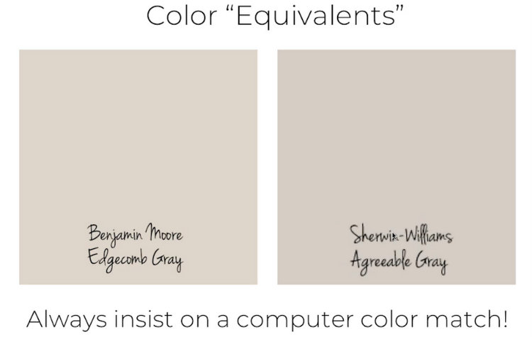
Color equivalents ARE NOT color matches. Say no to color equivalents, and always ask for the computer color match. It’s also a really good idea to check the color match against a fan deck or color sample before leaving the store with your paint to be sure they mixed it properly. Unfortunately, I’ve had both Benjamin Moore and Sherwin-Williams incorrectly mix THEIR OWN COLORS on several occasions.
And here’s a bonus for you:
Paint Color Mistake BONUS: Not Testing Paint Colors Properly
You really don’t know what you are getting if you are simply choosing a pretty color out of a paint fan deck, or even from a small printed chip. I explain why Small Wall sample boards can help you avoid major paint color mistakes in this article. And I explain the best way to test paint colors in detail here.
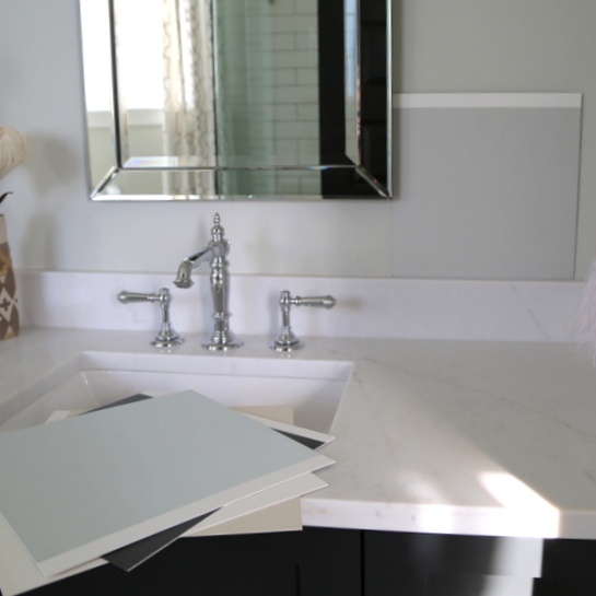 Small Wall painted sample boards
Mistakes happen, just made sure you aren’t the one making them! What’s the worst paint color mistake you’ve made?
Join me in September for my LIVE Psychological Color Expert™ course in Nashville and take your career in a colorful new direction!


Worst mistake I made was listening to two people (relatives) who assured me that the paint will always dry lighter than the color on the card so you should go with the next darkest color on the card instead. Instead of the soft peachy-pink I had in mind I ended up with a light-ish orange that was so not what I wanted!
Love this Kristie! I think this happened on a color Consultation I did for a realtor. I about fell when I saw the photos! I believe the painter worked for SW and I had specified a BM color, so he chose a “color equivalent “ the carpet on the room had violet undertones and he painted the room a gray that had blue-green undertones… boy, did the carpet look extra purple!
Now I know!
Great advice! I’ve painted many rooms in three different homes and never made a bad color mistake…probably because I obsessed over choosing the right one by hanging large samples on every wall and looking at them at various times of the day before I made my choices. Once in a while rooms came out lighter or darker than expected, but now I always check the LRV too!
This was a great article. You helped us so much choosing colors. I hate to admit that we often would be pulled in by intriguing names.
Yes, marketing is powerful stuff!
So true! A seamstress who was customizing window panels for my son’s room recommended “Mt Rainer Gray” (I think it’s SW, can’t remember) for his walls. . I was almost completely turned off by it because I DID NOT WANT gray. I wanted his room to be blue. Well guess what, it IS the loveliest shade of blue; his walls were painted and we love it.
Yes!!! That happens all the time with my clients – I mention the name of a color that has the word “gray” in the description, and they freak out. So often time the color is actually blue or even beige!
My daughter had painted her bedroom a beautiful color in the griege family. I liked it so much I put it on a wall in my open concept home and it read lavender!! I have dark cabinetry in my kitchen and I think it’s reflection made the color look “purple”. I ended up with 20 shade of greige on my walls until I found the one that read true throughout the day’s light – Sherwin Williams Anew Gray 7030 – and I’m very happy.
Oh no, Joanne! I’m glad you finally found the “right” color for your home. 🙂
So glad I read this!
I’m sometimes influenced by (or at least distracted by) paint color names. Finally began holding the paint chip so that my thumb covers the name. Not a full solution, but it helps me!
I wasn’t aware of color equivalents, thanks for the warning!
Great idea – just cover those names up until AFTER you’ve chosen the one you like best! 😉
Kristie, as much as I love your words of wisdom……my favorite part of this article were the adorable pups in the Edgecomb Gray photo! I think they really added that special something to the bedroom decor. 🙂
Sarah! I almost posted a close-up of those pups, so I’m glad you mentioned them. They are ADORABLE.
Another bit of advice… DON’T GET COLOR ADVICE FROM YOUR PAINTER! One would think with all the experience they have they’d know a lot about colors what looks good. I made that mistake once… I had several samples up on the wall looking for a light neutral greige and was leaning towards a couple, but I made the mistake of asking my painter what he thought and he chose a different one, so I went with it. It was much too gold and I was stuck living with it for years until I finally had it repainted.
Yes, Lorraine!!! Painters tend to default to what they see the most of, which often isn’t good. Crowdsourcing opinions in general can end up with a lame result.
This post made me laugh and reminded me of an incident that in retrospect makes me smile, but was absolutely not funny at the time. I was painting trim and needed more Benjamin Moore Simply White. My husband went to the Sherwin-Williams store and brought back Simple White. The paint had a distinct pink undertone and was a terrible mismatch!!!