Last week I shared the design trends I spotted at the 2016 O’More Showhouse, and today I’m going to reveal the designer Benjamin Moore paint colors found inside the lovely home!
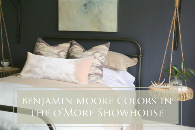 bedroom design by J&K Design Studio
Benjamin Moore Paint Colors in the 2016 O’More Showhouse
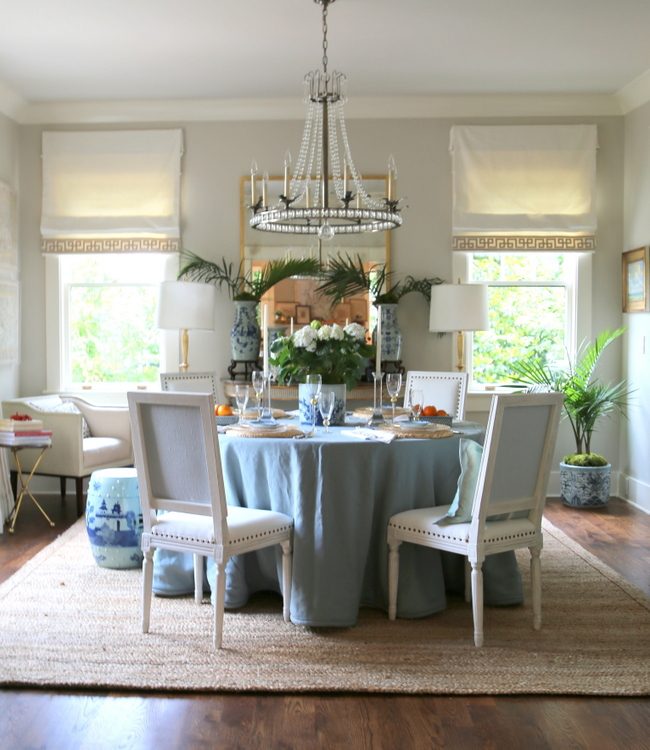
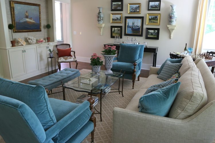
The dining and living room are open to each other in floorplan, so the paint colors needed to be harmonious. The dining room wall color is Benjamin Moore Edgecomb Gray HC-173, a designer favorite. Trim is Linen White OC-146.
The living room walls are Benjamin Moore Albescent OC-40, while the ceiling is Rose Dust 1010.
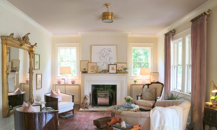 Benjamin Moore paint colors, design by Dana Goodman Interiors
Although Albescent looks slightly peachy in the fandeck, it reads creamy with a yellow undertone when paired with the violet-pink Rose Dust.
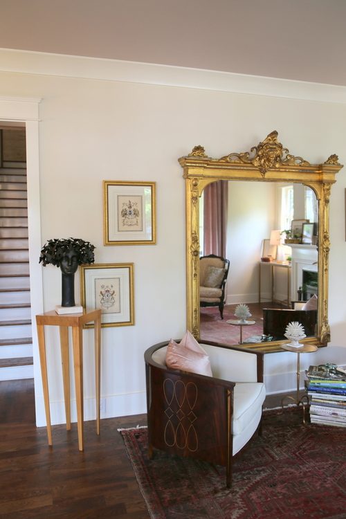 Dana Goodman Interiors
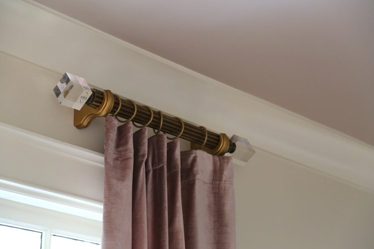
Pinks and violet paint colors should be chosen VERY carefully. They often “bloom” out brighter and bolder than you expect them to, which is why it’s important to choose one coordinates with fabrics in the room. I feel sure the designer of this room chose the ceiling color based on the draperies she chose first. See how beautifully they coordinate:
The walls of the showhouse kitchen is Natural Wicker OC-1, a warm off-white.
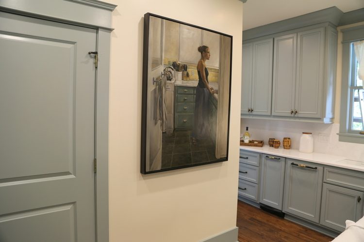 kitchen design by J Jones Design, Inc.
The cabinetry and trim is Benjamin Moore Piedmont Gray CC-690. If you’ve never heard of it, it’s because it isn’t part of the American fandecks. I believe it’s in the Canadian fandeck, which is somewhat different than the American one. The closest match I can find to it in our fandeck is Castle Walls 1573.
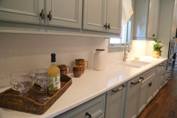 J. Jones Design, Inc.
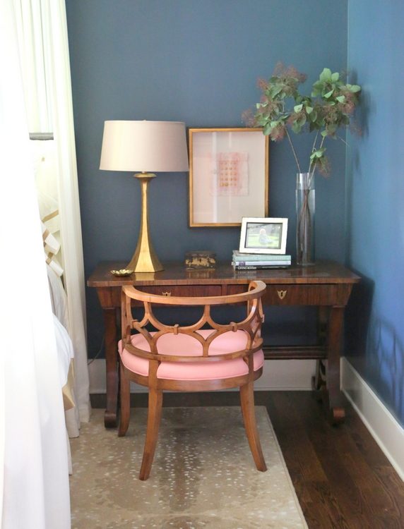
The master bedroom is dark and moody, painted in the very beautiful Newburg Green HC-158. I love how the gold and pink play off this color!
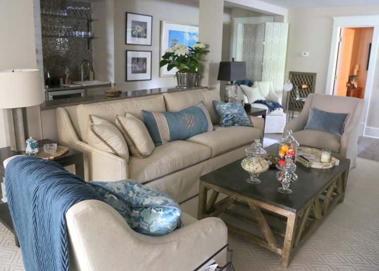
The family room by JoAnn Haynes is painted in Benjamin Moore paint colors: Malton 1073 on the walls, Linen White OC-146 on the trim and cabinetry.
This area is the stairwell to the basement, which leads down from the family room. It’s a fabulous little spot to curl up and read a good book. The walls here are Wickham Gray HC-171 and the bookcases are Ashwood Moss 1484.
The downstairs media room has Annapolis Gray on its walls, a close match to the upholstery in that space.
The basement level guest suite was difficult to photograph because there was very little natural light in the space. The wall color here is Winterwood 1486, which reads more silvery blue-green in a room filled with natural light.
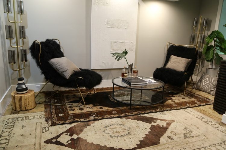 K7 Interior Designs
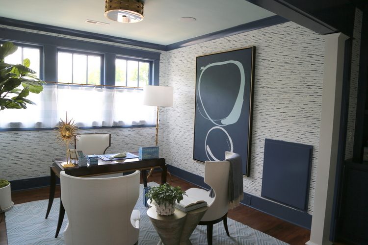
Moving upstairs, here’s a shot of the upper hallway that leads into an open office area. The wall color here is Benjamin Moore Hudson Bay 1680. It is also in the hallway on the main floor leading off the living room back towards the kitchen. Notice how they transitioned at the corner where the wallpaper begins in the office area.
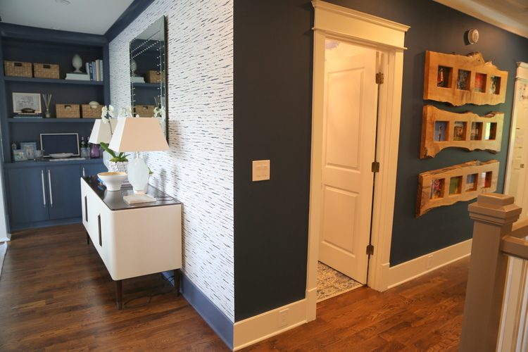
The Hudson Bay color continues in the office on the trim and bookcases.
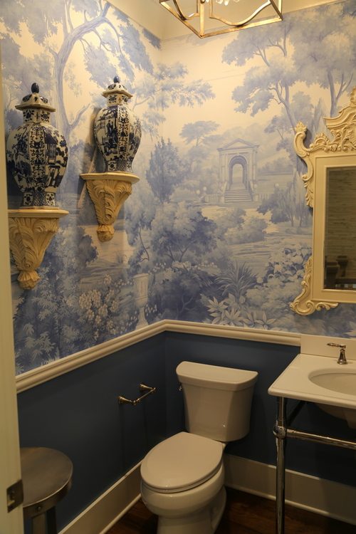
The hall bathroom adjacent to the office is painted below the chair rail in Twilight Blue 2067-30.
 The Enchanted Home
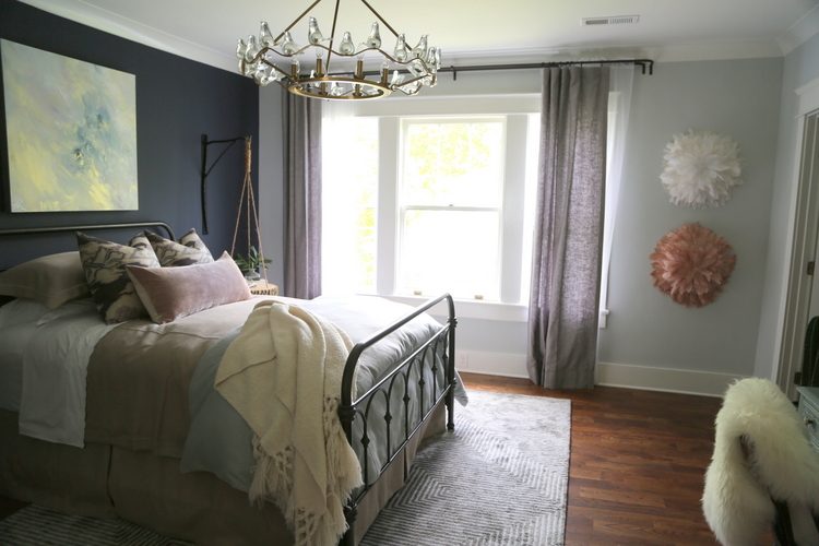
One of my favorite rooms was this bedroom painted in Benjamin Moore paint colors, Wickham Gray HC-171 and Hale Navy HC-154. The wall the bed is on is one of the few places I approve of an accent wall, and this one is lovely!
 J&K Design Studio
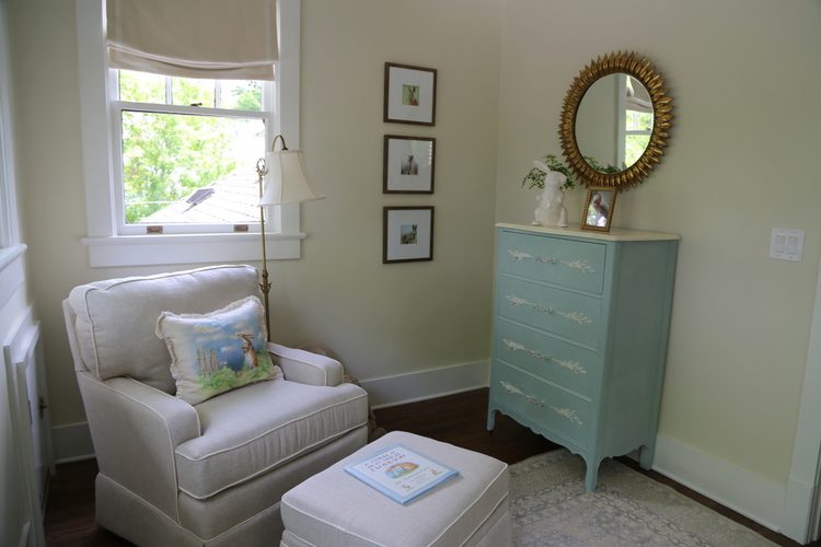
The nursery is a yellow undertone off-white, Benjamin Moore Monterey White HC-27.
 Franklin Preservation Associates
This house featured spaces by 22 different designers. As the Chair of the project, JoAnn Haynes established the general color palette for the designers, but you may notice that many of the rooms appear to be the same color. If you are trying to create a paint color palette for your own home, I have a word of advice for you:
If you use slight variations of the same color (such as the dark blues that are throughout this home), most people will not even know they are different colors as they tour through your home. Too many people use slight color variations in each room, thinking that is somehow more designed-looking. If you are using a dark blue in your home in multiple spaces, just use the SAME dark blue, but alter the placement of it in various rooms. Use it on the walls in one room, in the backs of bookcases in another, on the ceiling or maybe even the trim in yet another room. You’ll save money and your painters will thank you – can you imagine the possible mix-ups with three or four different colors that are so similar?
Do you have a passion for real estate and interior design? Find out more about my 3-day course in June when YOU could become a certified home staging pro!

 J
J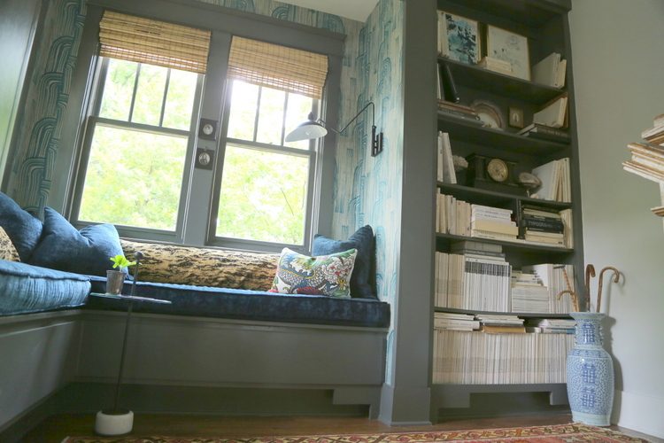







I’m glad you clarified the color scheme having more colors than necessary in a real home! I have a question about the color transition between the hall and office. I really like how the hallway paint color looks around the corner from the wallpaper, but where the trim color changes looks odd to me. If transitioning the trim color were ever necessary, I would think an inside corner would look better than an outside corner. Would you ever do this? Maybe it’s just a unique instance due to rooms being completed by different designers.
Judy,
Good question. No, I wouldn’t make this dramatic of a transition at a corner. I’m sure this had everything to do with the dueling designers in the two areas! Sometimes I have to transition at a corner, but I make sure it’s a subtle change in an area where you would barely notice!
Please what is the undertone for Edgecomb Gray HC-173? I love grays, but they always read blue in my house! Is this a taupe undertone? I think that is what I may need – something more pink-undertones?? Also, I love that this house has baseboards and trims of various colors (blue window trim and blue baseboard transitioning into white baseboard and white door area). Makes a house seem more interesting to me when all the trim, baseboards and doors are NOT white! Thanks for posting these photos!
Jean,
I find that Edgecomb Gray definitely has a pink undertone, so you would NEVER have to worry about it going blue! You must have tried grays with blue undertones, which are very popular. I have heard from color specialists that live up north or in Canada that Edgecomb Gray can go a bit green, but again, that hasn’t been my experience.
Thank you for all of the paint colors! The trim and cabinets in our house are also BM Linen White, so it is helpful to see so many colors that look nice with it. My favorites are Wickham Gray and Newburg Green. 🙂
Good, Jenny! I love Newburg Green, too – so dramatic!
So interesting that there is a different fandeck of colors for Benjamin Moore in Canada. Seems a little silly to me. I could see the paint color “names” being a little different, but to have different colors?
I like the vanity in the powder room. We saw a similar one in a showroom that we were interested in, but it was $10,000! Too expensive for us!
My favorite is also the navy and gray. The rooms are all pretty, not my colors maybe, but lovely. Love visiting Showhomes!
Love the beautiful oriental toile in the powder room!
Hello Jean,
Your use of the colors is super helpful. We are struggling identifying a color for a room in a 1920s home. We have 10′ ceilings that are coved, leaded glass windows, mahogany trim and a pale oak floor. The main issue is that this room tends to have poor levels of natural lighting, so I am finding that whites I am considering can go super gray and flat or the creamy whites get more yellow than expected. I have tried: navajo white, niveous, opaline, spanish white and a few others. We have gone ahead with priming the room to get rid of the existing olive branch green (also benjamin moore) before deciding. Do you have any suggestions based on the colors I listed or on others I may not have considered.
Super challenging!!
Thank you,
Tanya
I have Benjamin Moore Sherwood tan in my family room. I want an accent color on one wall. My attached kitchen is rain washed from Sherrington Williams. What do you think would be a good accent color for one wall. Thank you.
I am thinking of doing Piedmont Gray and White Wisp in the basement and have been having a hard time finding examples. I guess the name difference may explain it!
Can anyone tell me the exterior color of the siding? Appreciate it. I am looking for this exact color and also are the window frames the same color as well or slightly darker. Thx.