Black walls are trending, but would you dare to paint black bathroom walls? Well, I recently did, and the payoff was worth the risk! Let’s see if you agree.
We needed maximum results for minimal cost in this beach vacation rental project. Since bathroom is the only one on the main floor, it serves as the bathroom for an adjoining bedroom, as well as a powder room off the kitchen and living area. Here are some before photos:
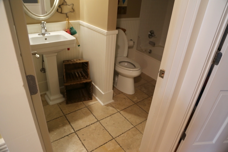 before
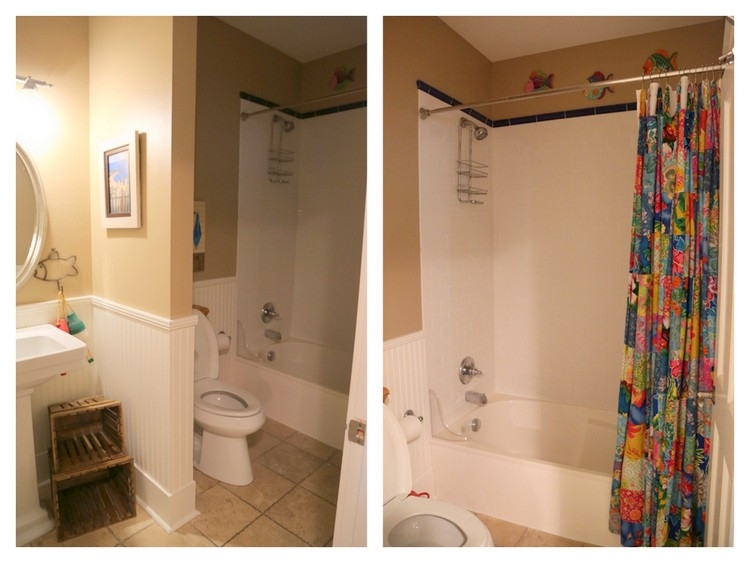
No need to tear out the white beadboard on the walls or subway tile in the shower. It might be helpful to understand where this bathroom ties in to the rest of the house. Here’s the adjoining space:
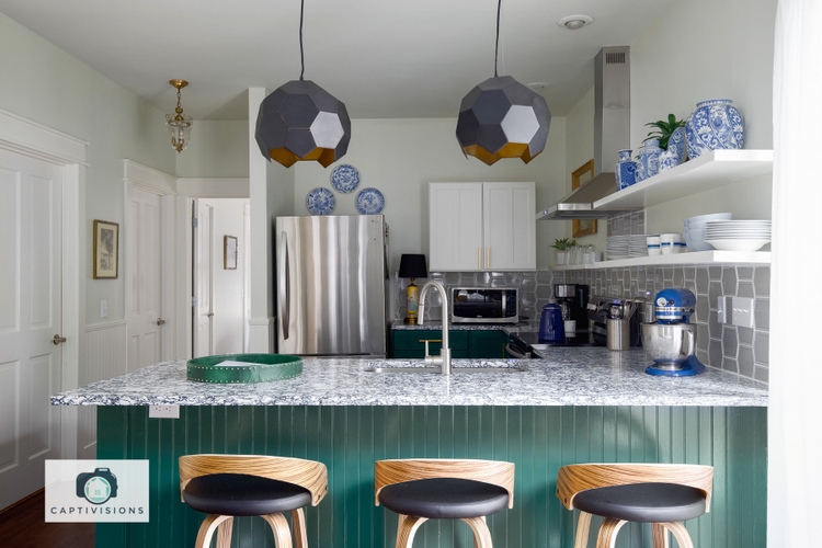 see the befores and afters of this kitchen here
The bathroom door is the closed one furthest away, right next to the door to the first floor bedroom. Since it has no windows, choosing black bathroom walls isn’t going to make it any darker when the lights are out, right? My plan for this bath was simple: update the flooring with ceramic encaustic tile, paint the walls above the beadboard black, and change out some decor.
You may have already seen the flooring I chose in a previous post or on my Instagram feed, but here it is:
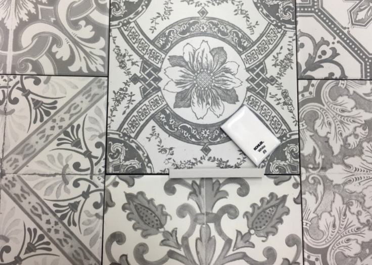
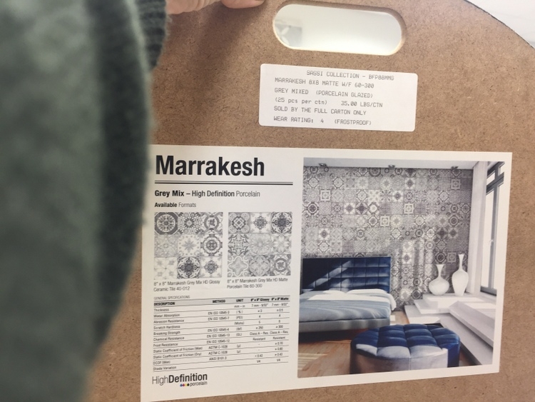
I love it soooo much. Less than $4.50 a square foot and there are lots of ways you could use it – for floors, backsplashes, walls:
The existing tile flooring had to be removed, which was an ugly thing to watch:
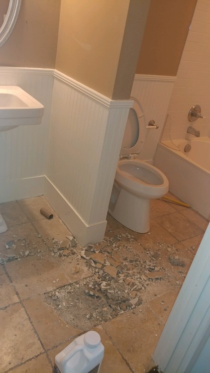 in process
But what a difference the new flooring made! We didn’t even have to repaint the existing trim or beadboard.
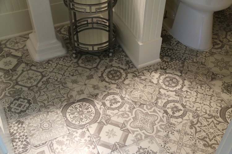
So here’s the previous listing photo of the bathroom (the walls were much darker and more brown than this appears):
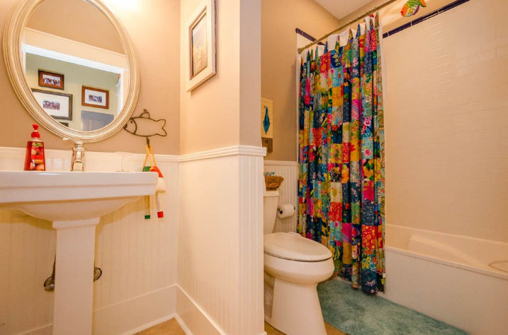 before
And here’s the new wall color, Sherwin-Williams Tricorn Black SW6258:
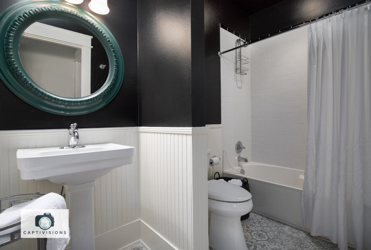
Here’s a shot I took from the bathtub:
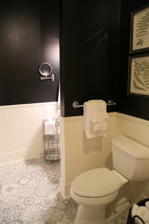
The art above the toilet repeats the green from the new bathroom mirror,
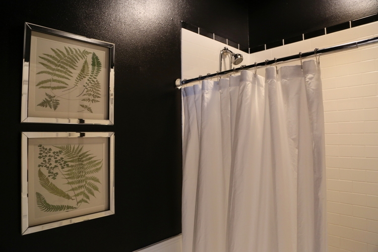
which is painted the same green as the base cabinets in the adjoining kitchen, Benjamin Moore Garden Cucumber 644:
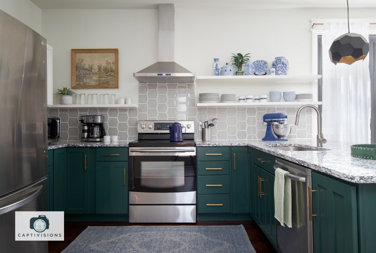
I used a satin finish on the black bathroom walls to reflect the light, which you can probably tell from the photos. It looks so much CLEANER than it did prior. So the question remains, would you dare??
Overwhelmed with color trends? Want to know how to choose the BEST neutrals, colors, and color combinations? Wish there was a no-fail system that creates cohesive and beautiful color schemes for any home with any finishes?
Now there is! I’ve been doing this for years, and now I’ll teach you how (including all the specific colors in BOTH Benjamin Moore and Sherwin-Williams paints). You can find out more HERE.








You’re KILLING me with this….I absolutely love love it!!!
Yes, Yes and Yes. I did in my bath in Ohio and doing at our lake house. I love it. Where is the time from?
Thanks, Kim! The tile was from Florida Bath & Surfaces in Santa Rosa Beach.
No I wouldn’t! Love the kitchen color
Elizabeth,
Thanks for weighing in! The kitchen wall color is Benjamin Moore Silken Pine 🙂
Love it!!
Thanks, Alyce!
YES! Love it!
Holy Midnite, it looks fantastic!!
Thanks so much, Jennie!
So much better in black & white! Think I might do this to my powder-room!
So much better in black & white! Think I might do this to my powder-room!
Thanks! Good luck with your powder room 😉
I think it’s stunning!
Thank you, dear!
Love it, just a few changes and it looks so much better.
Thanks so much, Celeste!
I really LOVE this. I have a bathroom that has a similar amount of white and wonder if I could make this look work. Would you have still chosen black if there was a window, and if the white was just a little creamy?
Yes, Lisa – because there’s so much contrast with the black, creamy trim should be fine. UNLESS, there’s a lot of white porcelain fixtures that make the creamy trim look dirty in comparison. You could always lighten up your trim a bit! Sherwin-Williams Pure White is a good one!
I love it! I would not have thought about it, not sure if I would “dare”! But love watching the amazing job you have done. Not surprised, love your style!
Thank you so much, Gloria! 🙂
Love it!
Thanks, Pam!
It is lovely, especially with the white millwork. I have a powder room I treated similarly, but used a very dark blue-green above the board and batten. Black wouldn’t have looked right in my house.
Susie,
I bet your dark blue-green looks gorgeous! I’ve done colors like that in bathrooms before, but this is the first time I’ve gone completely black.
It’s beautiful! The white balances out the black walls so it doesn’t look like you’re walking into a cave. My master bedroom has two black walls and I used white to balance it. The look is stunning, classic and WOW, black walls! I personally love it.
Thanks so much, Shannon!
Absolutely! The satin black looks so fresh and clean! Love how you brought the pop of green into the powder room, and the glints of sparkle in the framed prints. The floor tile is just beautiful! Great job, Kristie!
Oh, thank you, Laura!
Love it! Especially with the touch of green. Lovely.
Thanks, Patti!
The black definitely works, Kristie. Looks beautiful!
Thank you, Beth!
It’s beautiful, Kristie! I’m not sure I’m brave enough to try it, though. (I’ve loved everything I’ve seen in this vacation home redo!)
Thanks, Joanne! I’m so far behind getting out before/after stories on this vacation home, but there’s lots more left to show – it’s been finished and renting since mid-March. 🙂
I love it! It looks amazing, I would do it in a heartbeat! Flooring is great too. Job well done!
Thanks so much, Tina Marie!
LOVE IT!! Amazing what the perfect paint and flooring can do! I’m curious though – would you have used black if the bead board wasn’t there?
Teresa,
That’s a good question. I probably would have, but it definitely made the decision easier because of all the existing white. What you can’t really tell from the photos is that we also did black on the ceiling (there’s not any crown molding), which is lovely. If the white beadboard hadn’t been there, I might have left the ceiling white for some relief.
The black bathroom walls totally make a statement! They tie in nicely with the floors and since the tile in the shower was a classic white subway (with black trim) that worked too. That pop of green for the bathroom mirror was a nice touch. I’ve seen a few dark colored walls in the bathrooms of model homes. Navy blue and fuchsia also make a statement.
Thank you so much, Tamara! I think a navy blue bathroom is stunning and chic, too 🙂
That’s beautiful! Everything about it!
Thank you, Leigh Ann!
Love it!
Thanks, dear!
I like the black and white so much better. Not a fan of beige. I really like the patterned floor and the pop of color with the green that ties in with the kitchen as well.
Thanks, Carol! I have NEVER used beige in my personal homes. I’m with ya! 🙂
Such a simple, clean and classic transformation!
Thanks so much, Shelby!
Wow! I love, love, love it and would do the black walls in a heartbeat. For some reason, I’m not loving the green mirror. I know it ties with the kitchen, but I’m not feeling it.
Susie,
I have to admit – the mirror itself is not my favorite. It was an existing mirror from another part of the house, and I painted it. I like the color, but I’m thinking it may need a less glossy finish. The kitchen cabinets are oil-based (and that’s the paint I used), so I just think the mirror is a bit too glossy?? Always appreciate your input, Susie!
Yes, I think it’s the gloss, but also maybe it’s too ornate. I see a simple gold mirror in the space 🙂
Love you Kristie!!!!
Love this! What paint do you recommend – egg shell finish or something else that will stand up to moisture and humidity from regular bathroom use?
Thanks!
Cathy,
Any kind of sheen is helpful in standing up to moisture and humidity, and eggshell/satin is what I’d suggest for most applications.
Looks so good, big impact with paint and tile.
If i was looking for a beach rental and came across it I would be excited. So fun and fresh.
That’s good to hear, Alysa! If you ever want to visit Seagrove, FLA, look up 33 Palms! 🙂
Love it! Not sure I’m brave enough to try this, but it looks great. And that tile is amazing!
Thank you, Melanie! 😉
Love, Love, Love. If you can’t take a risk in a PR, then where. I am so embracing the color explosion in design!
Yay!!! Go for it, right???
Black and white bathrooms are the cats pajamas! And this one is gorgeous
Cat’s pajamas!!! Love that wording, Carol! 😉 Thanks so much!
I love it. good job.
Thank you, Salome!
Hi Kristie,
I love it. I was just thinking about using black wall paper, from one of my favorite brands Elitis , in my guest bath room to make it more funky. It has a bit of a 3D element to it. The rest of the bathroom is quite flat. So thank you for making me take the decision, once I saw your transformation. It looks fantastic!!
Awesome, Angelique – I’d love to see your bathroom transformation!
Eat your heart out, High Point! Kristie, this is such a fresh, clean take on a beach getaway. Nice and cool, totally unfussy, with glamour for miles! Perhaps instead of fretting so much about “timeless design,” we sometimes ought to consider which facets of the current offerings appeal to us and try jumping in with both feet! Thanks for the reminder!
Thank you, Sunny! I’m glad you like it 🙂
PS (only leaving this here because I know it will get moderated). IKEA curtains have been my best friends for “hanging them high” in the shower area of the bathroom. But I almost ordered the FJÄDERKLINT pattern the other day, and it would look fabulous with that cucumber green! It’s “leafy” without being too “palmy.” Check it out!
I will totally take a look at those, thank you so much!!!
Black in bathroom looks interesting, i think this colour looks better in modern interior.
Love it, love it, love it. I always love reading your color advice. This is a great read, As an Interior Designer and decor blogger, I agree with you that choosing a color to live with your home is daunting for many. The most popular question I get in the field, is what color? Then they say they just want white! Maybe it feels safe. Our world is very visual, and many of these conversations need images and sometimes a little trust for the professional. You showed your professional prowess here.
Thank you so much for your kind words, Deborah! I love following your work, as well. 😉
I did this 2 years ago in my bathroom that has white tile going 2/3 to 3/4 way up the walls and there are eaves in the small-ish bathroom. I did tri corn black (SW) on the walls and ceiling and a black and off white shower curtain and I absolutely love it! No regrets, not even for a moment! My house is mostly neutral and lighter colors and we needed a bit of drama.
Awesome, Tanya! The beauty of paint is that you can “take a risk” and paint over it fairly easily when you want a change. 🙂
I would do this in a New York minute. Perfect!!!!
I see the latest comment is from 2018 so I hope you’re still reading this! This is stunning and I’m thinking of doing it myself. Do you have crown molding? If so, did you paint it black also or leave it white?